Clear Data Visualization Design
Begin
14 pages · ~28 min
Clear Data Visualization Design
A training session on designing clear data visualizations that helps learners create effective, understandable charts and graphs.
What you’ll learn
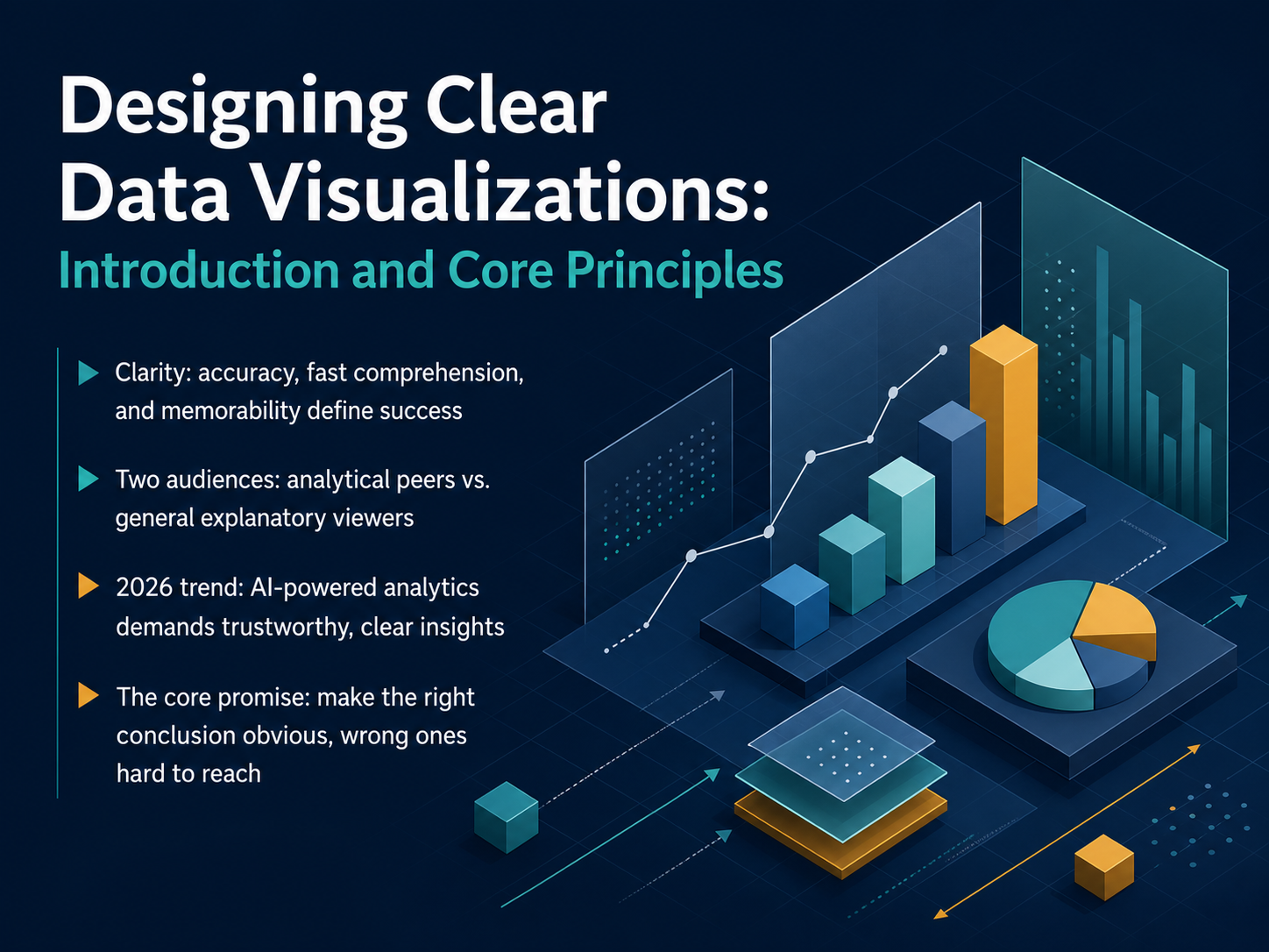
- 01Designing Clear Data Visualizations: Introduction and Core PrinciplesWelcome to Designing Clear Data Visualizations. If you create charts to explain patterns or relationships in a dataset, this course is for you. Today, we anchor our work in a simple goal: make the right conclusion obvious, and the wrong one hard to reach. Success means achieving accuracy, fast comprehension, and memorability. We will design for two distinct audiences. One is your analytical peers, who need precision. The other is a general explanatory viewer, who needs the signal, not the noise. A major trend in 2026 is the rise of AI-powered analytics. These tools can surface insights automatically, but they also raise the stakes. Trustworthy, clear presentation is now more critical than ever. Keep this core promise in mind: every design choice you make should guide your audience directly to the truth. Let's begin by exploring the foundation of all visual decisions, starting with how human visual perception works.infogram.comsganalytics.comelecte.net+21 min
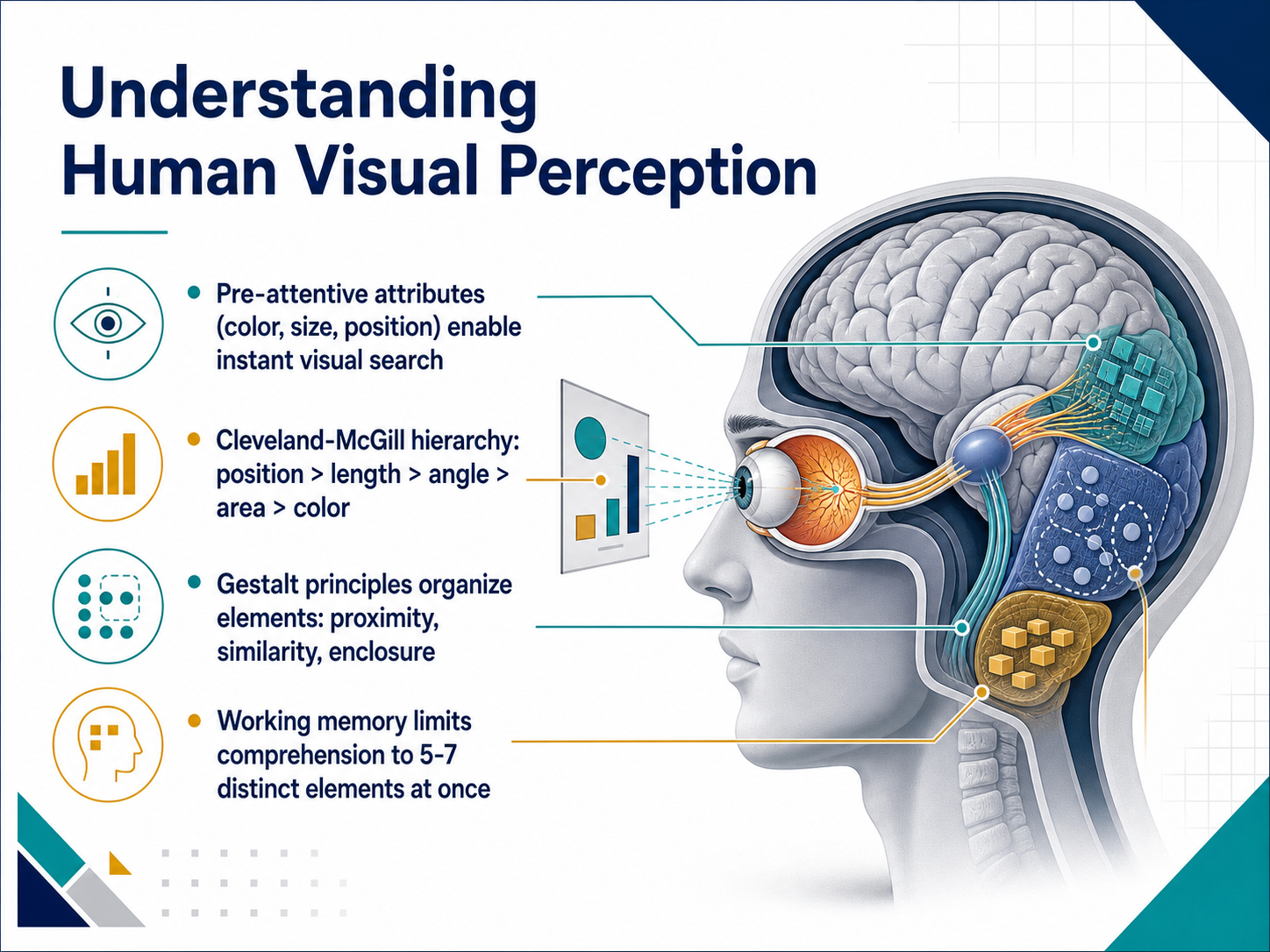
- 02Understanding Human Visual PerceptionNow let's look at why our eyes and brain work the way they do with charts. The first thing to understand is pre-attentive attributes. These are visual properties like color, size, and position that we process instantly, before we even consciously focus. To avoid overwhelming your audience, choose one pre-attentive attribute at a time to highlight your key data point. Next, there's a clear ranking of how accurately we read different visual cues. The Cleveland-McGill hierarchy tells us that position is the most precise, followed by length, then angle, then area, and finally color. So when you need precise comparisons, lean on position and length. Use area and color only when those top channels are already taken. Our perception also naturally groups elements together. Gestalt principles like proximity, similarity, and enclosure explain why we see items as connected when they are close, look alike, or share a border. Use these rules to organize your chart, not to accidentally create false connections. Finally, respect your audience's working memory. We can only hold about five to seven distinct elements at once. Label your most important patterns and limit the visual chunks in any single view. This keeps your chart instantly readable. Now, with perception in mind, let's explore how to match your chart type to your data and message in the next slide.
 doi.orgdoi.orgarxiv.org+22 min
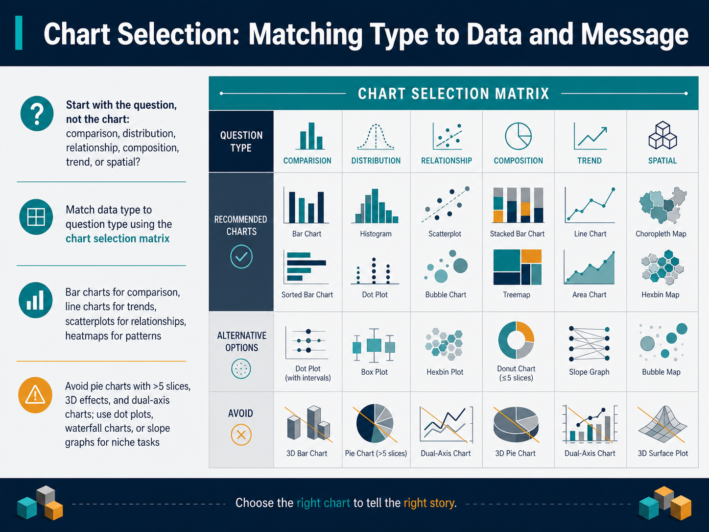
 - 03Chart Selection: Matching Type to Data and MessageNow let's talk about chart selection. The most common mistake is choosing a chart first. Instead, start with the question you need to answer. Are you showing a comparison, a distribution, a relationship, a composition, a trend, or a spatial pattern? Once you know the question, match it to your data type. Use a chart selection matrix to find your best options. In practice, choose bar charts for comparisons, line charts for trends over time, scatterplots for relationships between two continuous variables, and heatmaps for patterns across two categories. For composition, avoid pie charts that have more than five slices. Never apply 3D effects to flat data, and replace dual-axis charts with two separate panels. For niche tasks, reach for dot plots, waterfall charts, or slope graphs. The rule is simple: let the question drive the chart, not the other way around. Next, we'll explore the role of color in clarifying data.
 datafield.devdatafield.devclicdata.com+22 min
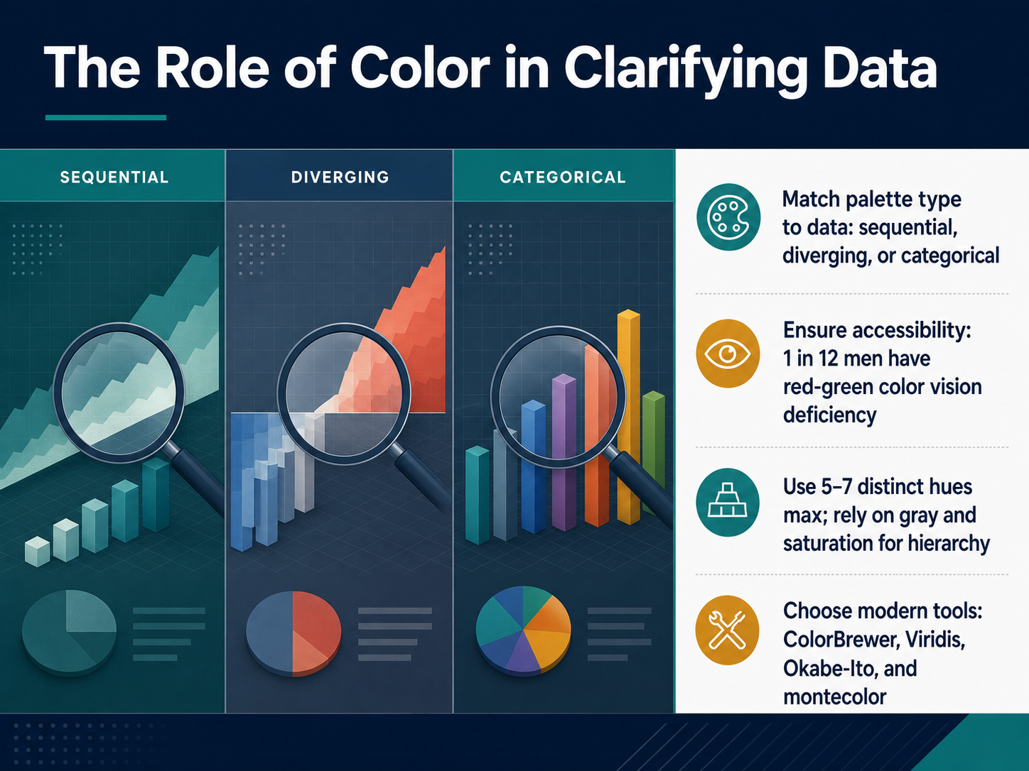
 - 04The Role of Color in Clarifying DataNow, let's focus on the role of color in clarifying your data. Your first step is to match the palette type to your data. For ordered numbers, choose a sequential palette that shifts from light to dark. For data with a meaningful midpoint, choose a diverging palette that uses two contrasting hues. And for categories, choose a categorical palette with distinct colors. Next, remember accessibility. Roughly one in twelve men has a red-green color vision deficiency, so avoid relying on red and green alone to convey meaning. Limit your palette to five to seven distinct hues at most. Use gray and variations in saturation to build visual hierarchy instead. Finally, choose modern tools to build safe palettes. You can rely on ColorBrewer, Viridis, Okabe-Ito, and the new montecolor package. These use perceptual science to ensure your colors stay clear for everyone. Next up, we will tackle decluttering: reducing cognitive load.
 zenodo.orgjoss.theoj.orgdata.europa.eu+21 min
 - 05Decluttering: Reducing Cognitive LoadLet's turn to decluttering and reducing cognitive load. The goal here is not extreme minimalism, but a Goldilocks balance. Too much clutter buries your data, but stripping a chart down to bare pixels can confuse your audience. Start by eliminating true chart junk. Remove heavy grids, redundant legends, and 3D bevels that add zero information. Next, use direct labeling. Placing labels right on the data points reduces eye-travel and speeds up reading. Finally, strategically apply white space and grouping. This helps the viewer see patterns instead of a wall of ink. When you're ready, we'll move on to annotations and narrative for explanatory visuals.
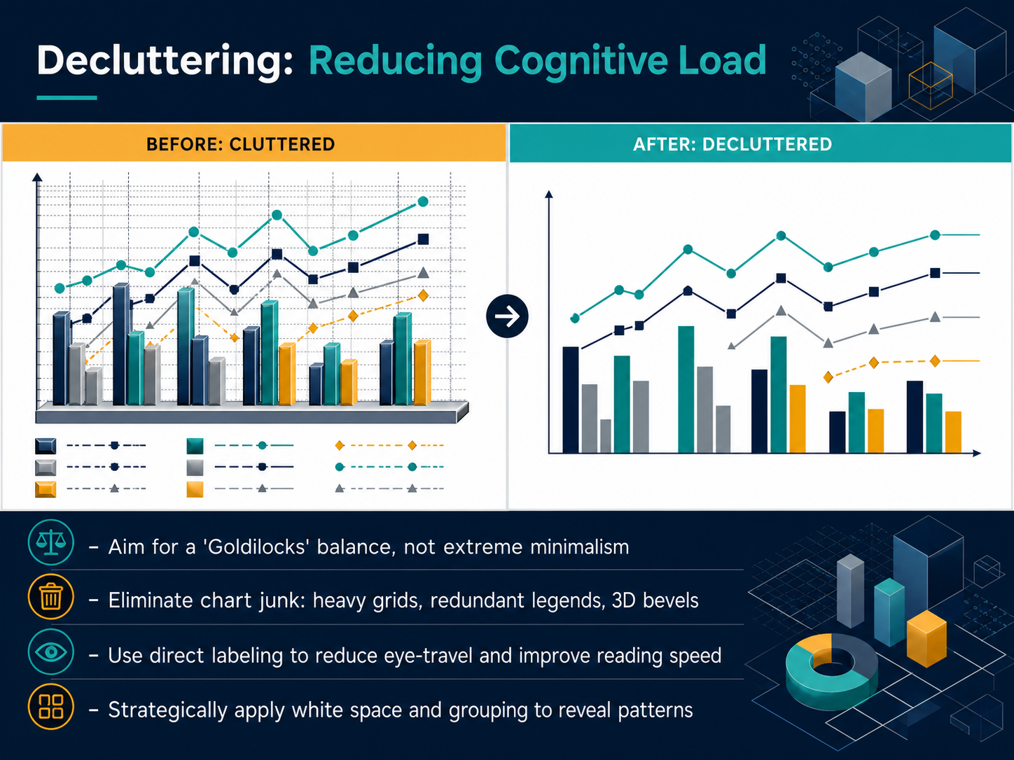 1 min
1 min - 06Annotations and Narrative for Explanatory VisualsNow, let's give our charts a clear voice through annotations and narrative. Your first rule is to write active titles that state the conclusion, not just the topic. Instead of 'Revenue Over Time,' try 'Profits Doubled in the Second Quarter.' This tells your audience the story upfront. Next, guide attention with direct labels, callouts, and shaded zones. Label key data points directly, so viewers don't have to hunt through a legend. Use a subtle highlight or a shaded area to immediately show what matters most. Balance is critical here. Provide enough context to avoid confusion, but don't overload the visual with so many notes that the data itself gets lost. Finally, always cite your sources and methodology prominently. Placing a clear source line under your chart builds reader trust and shows your work is credible. Coming up next, we'll look at handling uncertainty and variability honestly.
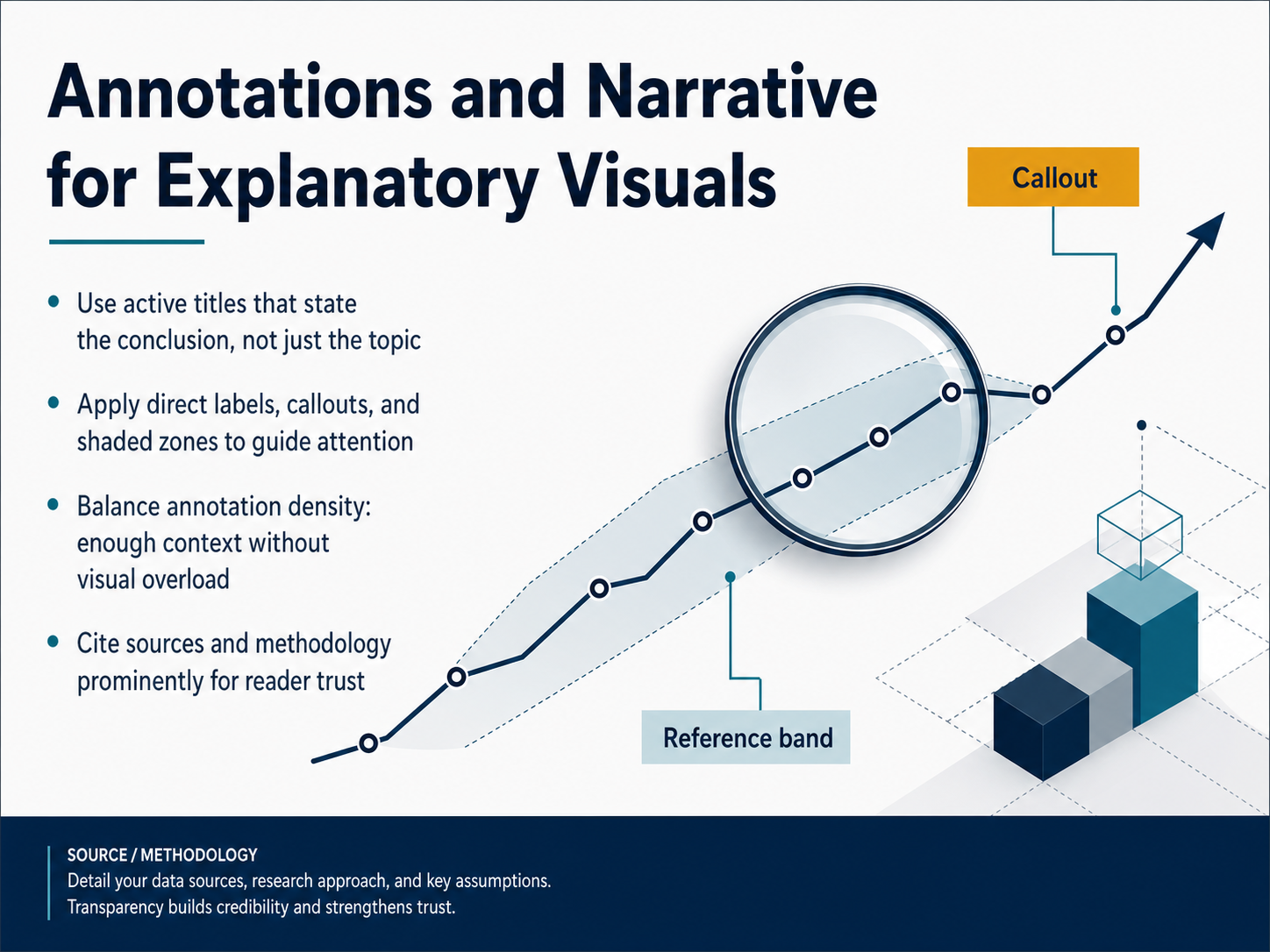 1 min
1 min - 07Handling Uncertainty and Variability HonestlyNow let's talk about handling uncertainty and variability honestly. The first rule is simple: always show confidence intervals and error bars transparently. Never distort the underlying data. To avoid misleading your audience, always start the y-axis at zero and avoid cherry-picked time ranges or exaggerated scales. Next, choose raincloud plots to reveal the full story. They combine raw data points, the density shape, and summary statistics all in one view. This helps you surface hidden patterns like bimodal distributions or outliers that simple bar charts miss. For a cleaner look, you can also choose violin and box plots to highlight distribution shape and variability directly. When you compare these options, remember that a box plot shows medians and quartiles, a violin plot adds density, and a raincloud plot adds individual points. Use these tools to prevent misinterpretation and build trust. By showing the full distribution, you let your audience judge the evidence for themselves. Up next, we'll carry these principles into designing for dashboards and reproducible reports.
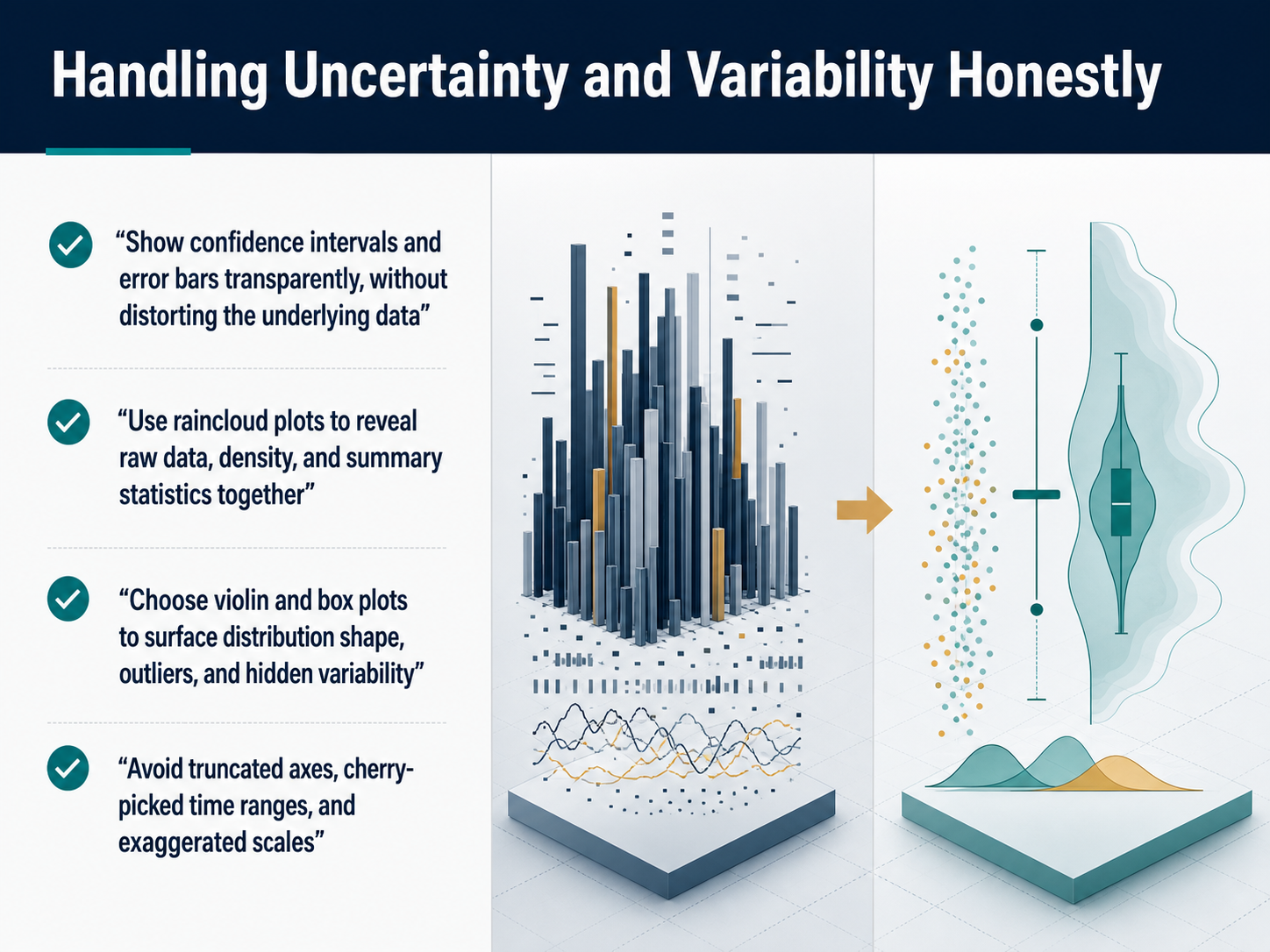 1 min
1 min - 08Designing for Dashboards and Reproducible ReportsNow let's talk about designing for dashboards and reproducible reports. Start by anchoring your primary KPIs in the top-left zone. Users scan in an F-pattern, so place the most critical metric where the eye lands first. Next, use small multiples with aligned scales to compare categories at a glance. When every chart shares the same axis, differences pop out instantly. For mobile, prioritize touch targets, stacked cards, and progressive disclosure. Show the top three or four KPIs as large tappable cards, and reveal details on demand instead of squeezing a desktop grid onto a phone. Finally, label your data sources, date range, update frequency, and methodology transparently. A clear timestamp and source note build trust and let users know exactly how fresh the data is. These habits make every dashboard scannable, reproducible, and ready for any screen. Up next, we'll explore the iterative testing and refinement process.
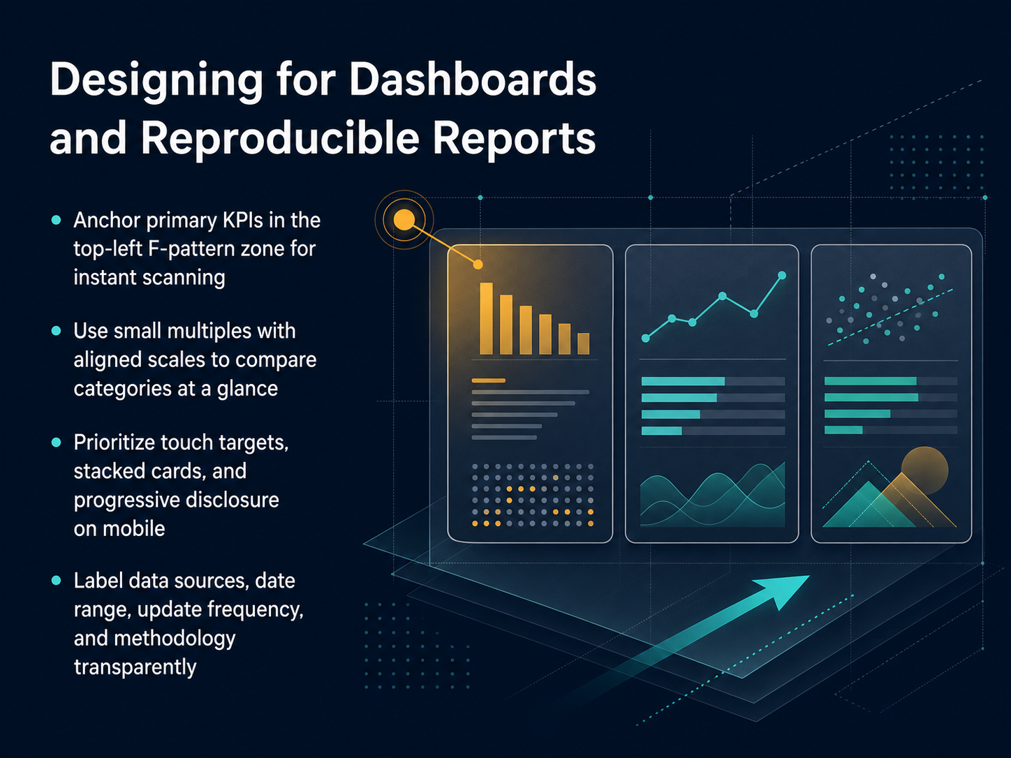 2 min
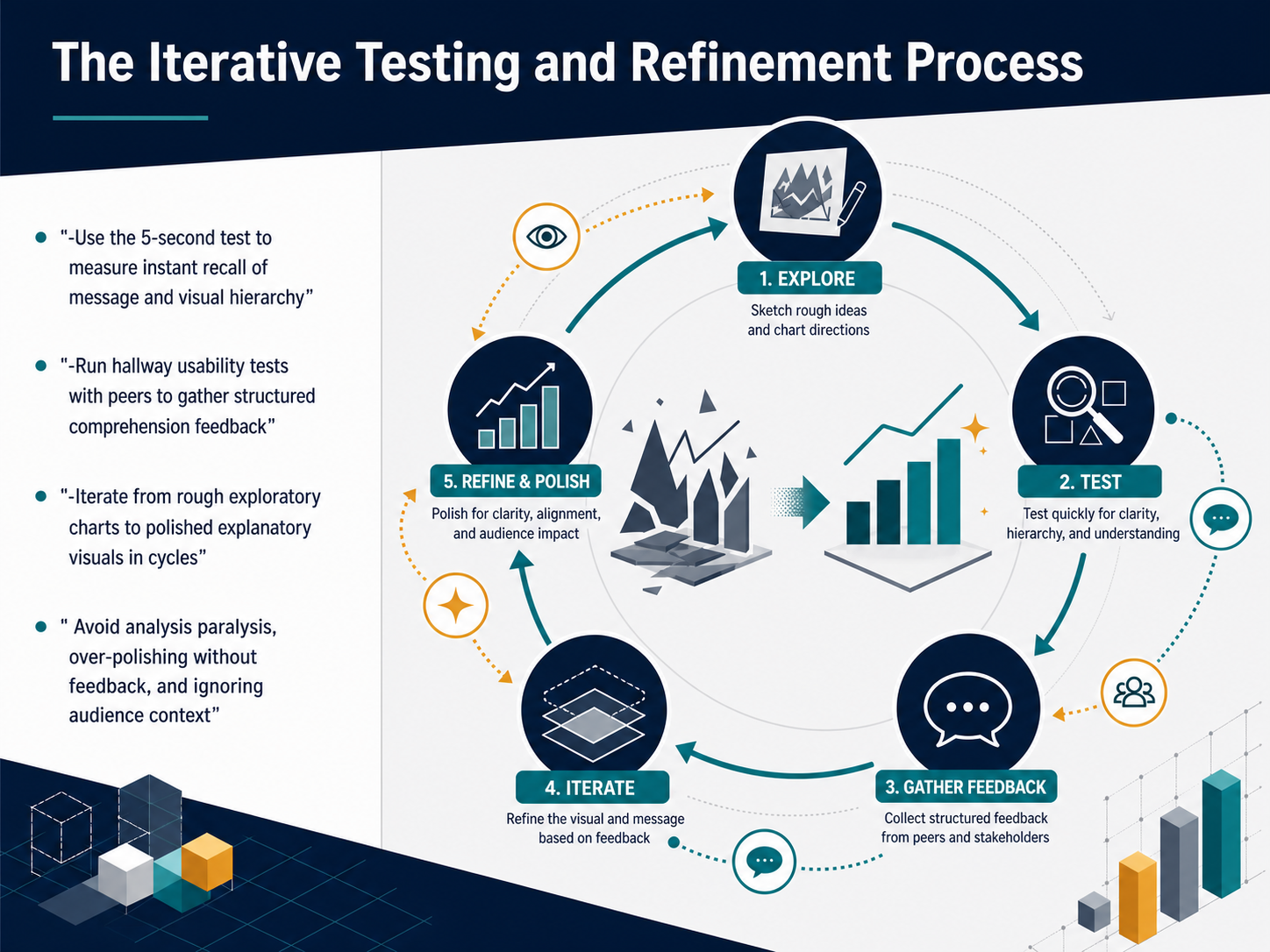
2 min - 09The Iterative Testing and Refinement ProcessLet's talk about the process of testing and refining your visualization. Your first draft is a hypothesis, and you need to test it. Start with the five-second test. Show your chart to a colleague for exactly five seconds, then hide it. Ask them what they remember. This measures whether your visual hierarchy and core message are landing instantly. If they miss the main point, you need to simplify the design. Next, run a hallway usability test. Grab a few peers, show them the chart, and ask structured questions. Can they accurately read the trend? Do they understand the units? Gather their feedback before you invest more time. Finally, iterate in cycles. Move from rough, exploratory charts to polished, explanatory visuals step by step. Avoid three common traps: analysis paralysis, where you keep tweaking without testing; over-polishing a chart that hasn't been validated by anyone else; and ignoring your audience's context. A chart that makes sense to you may confuse someone from a different department. Now, let's look ahead at emerging tools that can assist with these steps, specifically AI-assisted visualization in 2026.
 2 min
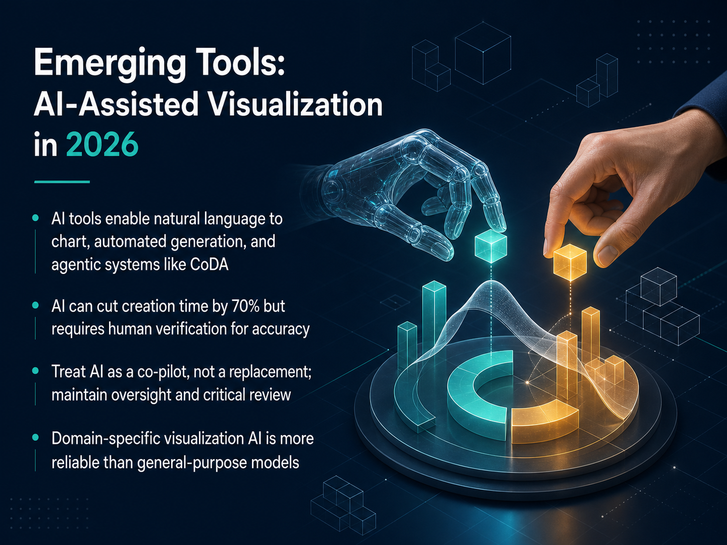
2 min - 10Emerging Tools: AI-Assisted Visualization in 2026Now let's look at the AI tools emerging in 2026. These systems let you generate charts from natural language, automate visual creation, and even work with agentic frameworks like CoDA that coordinate multiple models to refine a chart. AI can cut creation time by seventy percent, but you must verify every output for accuracy. Treat these tools as a co-pilot, not a replacement. Maintain your oversight and apply critical review. For example, a domain-specific assistant trained on your industry's data is far more reliable than a general-purpose model. Use AI to accelerate your workflow, but always choose, label, and compare with your own judgment. Up next, we'll explore your ethical responsibilities as a data visualization creator.
 1 min
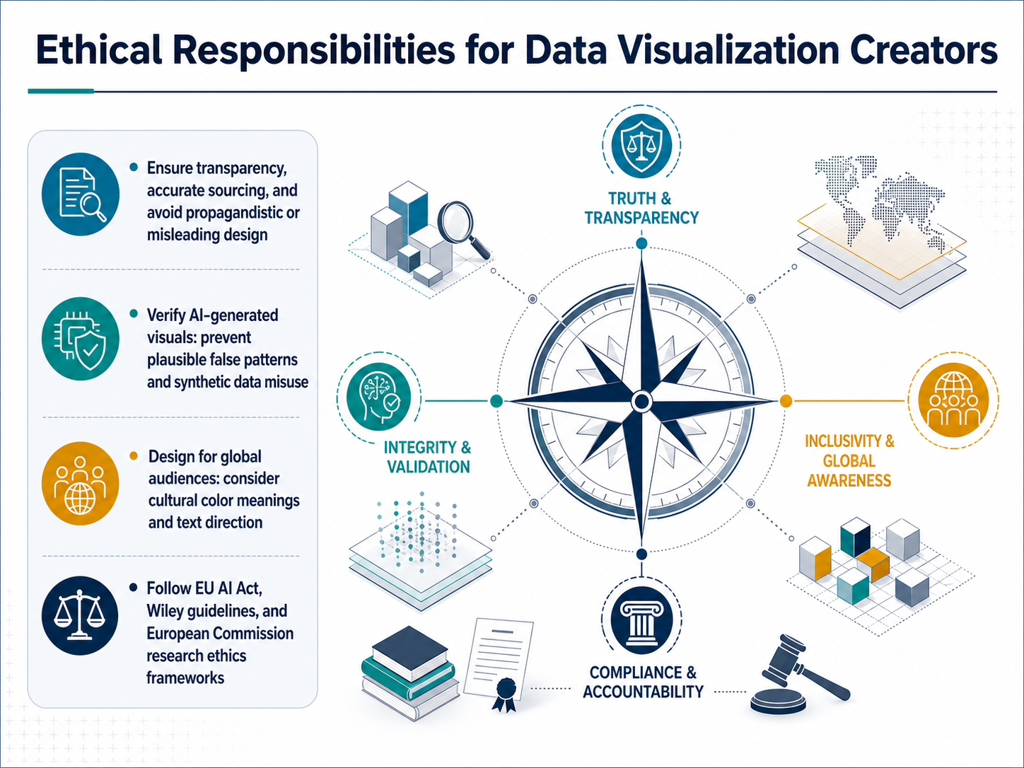
1 min - 11Ethical Responsibilities for Data Visualization CreatorsNow let's talk about your ethical responsibilities as a creator. Your first duty is transparency. Always cite your data sources clearly and design charts that explain, not persuade. Avoid any design choice that could mislead your audience. Next, verify any AI-generated visuals. AI tools can invent plausible but false patterns, so treat every AI output as a first draft. Compare it against your original data and remove any feature you cannot explain. When you design for a global audience, remember that color carries cultural meaning, and text direction varies across languages. Finally, follow the rules that apply to your work. Key frameworks include the EU AI Act, Wiley's publishing guidelines, and the European Commission's research ethics standards. These are not just boxes to check; they are your guide to building trust. Up next, we will focus on avoiding common visualization mistakes.
 1 min
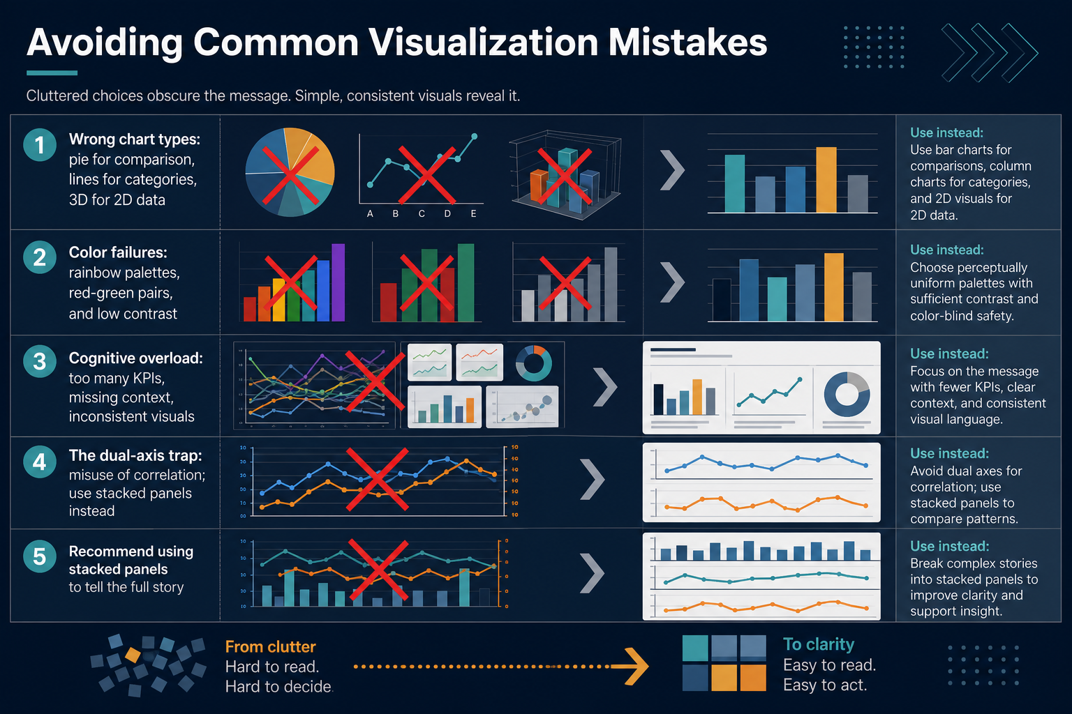
1 min - 12Avoiding Common Visualization MistakesMoving on to the traps that can mislead your audience, even when your intentions are good. First, common chart type mismatches. Using a pie chart to compare many values hides the difference in angles. A line chart connecting categories like product names implies a non-existent trend. And 3D effects on flat data distort true proportions. Instead, choose bar charts for comparison, and reserve lines for continuous time. Next, color failures. Rainbow palettes, red-green pairs, and low contrast make your chart unreadable for many people. Stick to a colorblind-safe, perceptually uniform palette. Now, two forms of cognitive overload. Showing too many KPIs at once, stripping away context like benchmarks, and mixing visual styles forces your viewer to work too hard. Limit each view to a few key metrics with clear labels. Finally, the dual-axis trap. Overlaying two scales can suggest false correlations. Use small multiples or stacked panels with aligned axes instead. These mistakes are fixable, and the fix is almost always simpler than the broken chart. Let's now put these rules into a repeatable process with Putting It All Together: A Clear Visualization Workflow.
 datafield.devdatafield.devclicdata.com+22 min
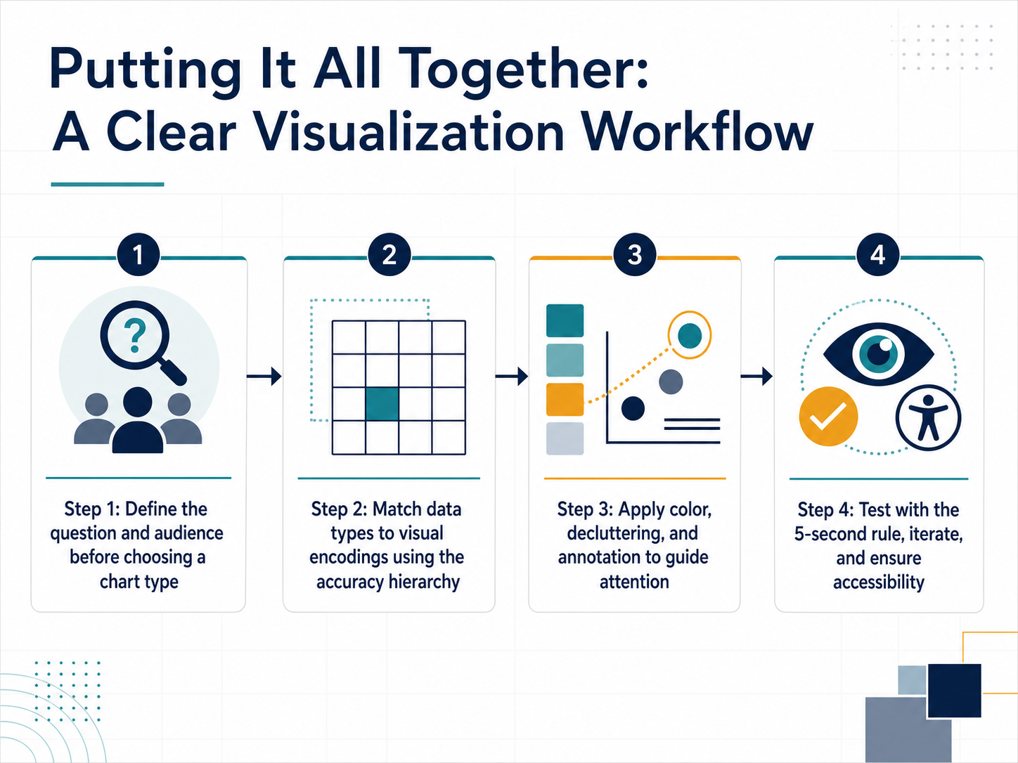
 - 13Putting It All Together: A Clear Visualization WorkflowNow let's put this all together into a repeatable workflow. Step one: before you touch any chart tool, define your question and your audience. Ask yourself, "What is the primary insight I need to communicate, and who needs to understand it?" Step two: match your data types to visual encodings using the accuracy hierarchy. Choose position or length for your most important comparisons, and reserve color or area for secondary details. Step three: apply your color, decluttering, and annotation principles to guide attention. Strip away the non-essential, and use text labels to make the takeaway obvious. Step four: test your result with the five-second rule. Show the visualization to someone for just five seconds, then ask them what they remember. If the main point isn't instantly clear, iterate on the design. Finally, ensure your chart is accessible—check the contrast, and confirm the message is not communicated by color alone. This workflow transforms visualization from a guessing game into a clear, repeatable process. Next, we'll wrap up with the key takeaways and your next steps.
 datafield.devdatafield.devclicdata.com+22 min
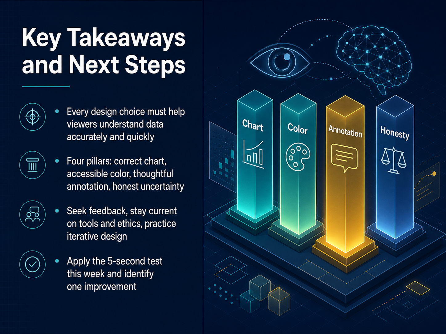
 - 14Key Takeaways and Next StepsLet's pull all of this together. Your goal is to help viewers understand data accurately and quickly. Every design choice you make should serve that goal. Remember the four pillars we covered. First, choose the correct chart type. Second, use accessible color. Third, add thoughtful annotation. Fourth, represent uncertainty honestly. To grow, seek feedback often. Stay current with tools and ethical practices. Practice iterative design. Your best chart today can be better tomorrow. Here is your concrete next step. Apply the 5-second test this week. Show someone your visualization for exactly five seconds, then ask them what they remember. Identify one thing to improve from that feedback. Small, steady improvements lead to truly clear communication. Thank you for investing this time in your craft. Now go make your data clear.
 infogram.comsganalytics.comelecte.net+22 min
Take the deck with you
Download this course as a file — free, no sign-up needed.
- PDF handoutEvery slide page, ready to print or share.15 pages · 3.7 MBDownload
- Narrated PowerPointThe deck that presents itself — every slide carries the digital human's narration video.15 pages · 14.4 MBDownload
- PowerPoint slidesThe full deck as a .pptx — open it in PowerPoint, Keynote, or Google Slides.15 pages · 3.6 MBDownload
Free to use in your own training — please keep the PersonWise credit page at the end.
Have your own deck? Turn it into a course
Sources consulted
Web sources consulted while building this course.
- 10 Trends in Data Visualization to Watch in 2026 — infogram.com
- Data Visualization Trends 2026: Top 10 to Watch | SG Analytics — sganalytics.com
- AI Data Visualization Trends 2026: 10 Key Developments — electe.net
- Data Visualization Trends In 2026: Why Traditional… — luzmo.com
- Data, BI and Analytics Trend Monitor 2026 — pages.denodo.com
- Comparing Pre-attentive Visual Variables in a Target Identification Task for Glanceable Visualizations — doi.org
- Systematic Variation of Preattentive Attributes to Highlight Relevant Data in Information Visualization — doi.org
- PatternSight: A Perceptual Grouping Effectiveness Assessment Approach for Graphical Patterns in Charts — arxiv.org
- Write, Rank, or Rate: Comparing Methods for Studying Visualization Affordances — doi.org
- Chapter 2: How the Eye Sees — Pre-Attentive Processing and... | Data Viz with Python — datafield.dev
- Chapter 5: Choosing the Right Chart: A Decision Framework f... | Data Viz with Python — datafield.dev
- Appendix C: Chart Selection Cheatsheet | Data Viz with Python | DataField.Dev — datafield.dev
- BI Chart Chooser: Pick the Right Chart Every Time — clicdata.com
- Choosing the Right Graph for Your Data: A Decision Tree Approach — statology.org
- Choosing the Right Chart Type (A Decision Tree That Helps) \u2014 CSV-X.com | csv-x.com — csv-x.com
- Creating accessible color cycles for data visualization — zenodo.org
- Qualpal: Qualitative Color Palettes for Everyone — joss.theoj.org
- POUR-CAF principles: Flexible — data.europa.eu
- Color Quest: An interactive tool for exploring color palettes and enhancing accessibility in data visualization — journals.plos.org
- Scientific Color Palette Generator | Colorblind-Safe Color Palettes | LabFig — labfig.com