Visual Hierarchy Design for Interfaces
Begin
15 pages · ~30 min
Visual Hierarchy Design for Interfaces
Learn to create clear visual hierarchies in UI design to guide users through content, improve readability, and enhance task completion.
What you’ll learn
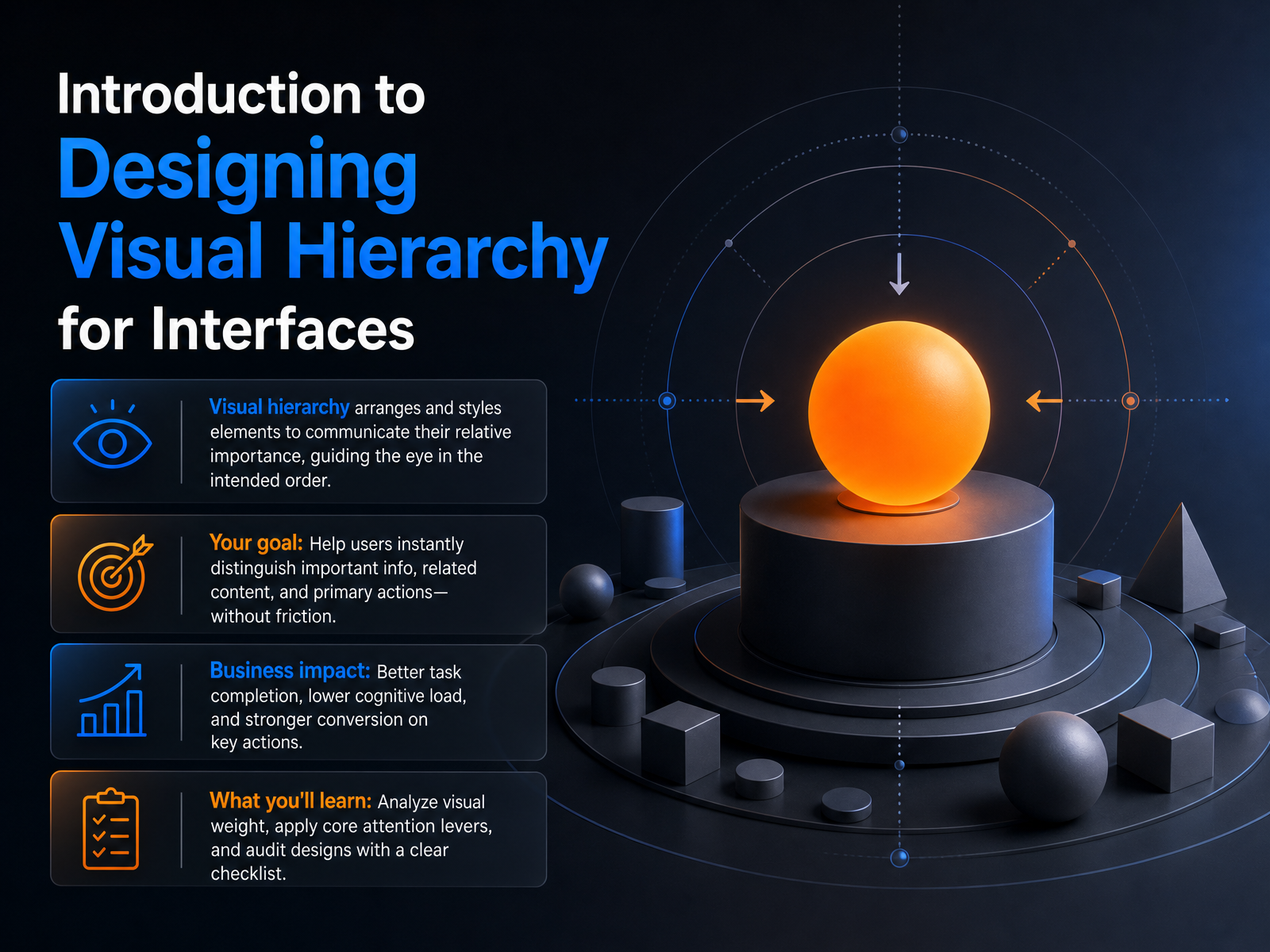
- 01Introduction to Designing Visual Hierarchy for InterfacesWelcome. In this course, we are going to solve a real interface problem: how to make sure users instantly see what matters, without friction. You have likely opened a screen and felt lost, unsure where to look first. That is a visual hierarchy problem. Visual hierarchy is simply the arrangement and styling of elements to communicate their order of importance. When we get it right, the eye is guided in the intended order. The bold headline lands first, the related content sits grouped together, and the primary action is exactly where the user expects it. Your goal is to help users distinguish important information, related content, and top-priority actions at a glance. The business impact is real: better task completion, lower cognitive load, and stronger conversion on the key actions. In the coming lessons, you will learn how to analyze visual weight, apply core attention levers like size and contrast, and audit your designs with a clear checklist. Let us start by understanding how users scan and perceive interfaces in the first place.nngroup.comassets.interaction-design.orgtextbookofusability.com+22 min
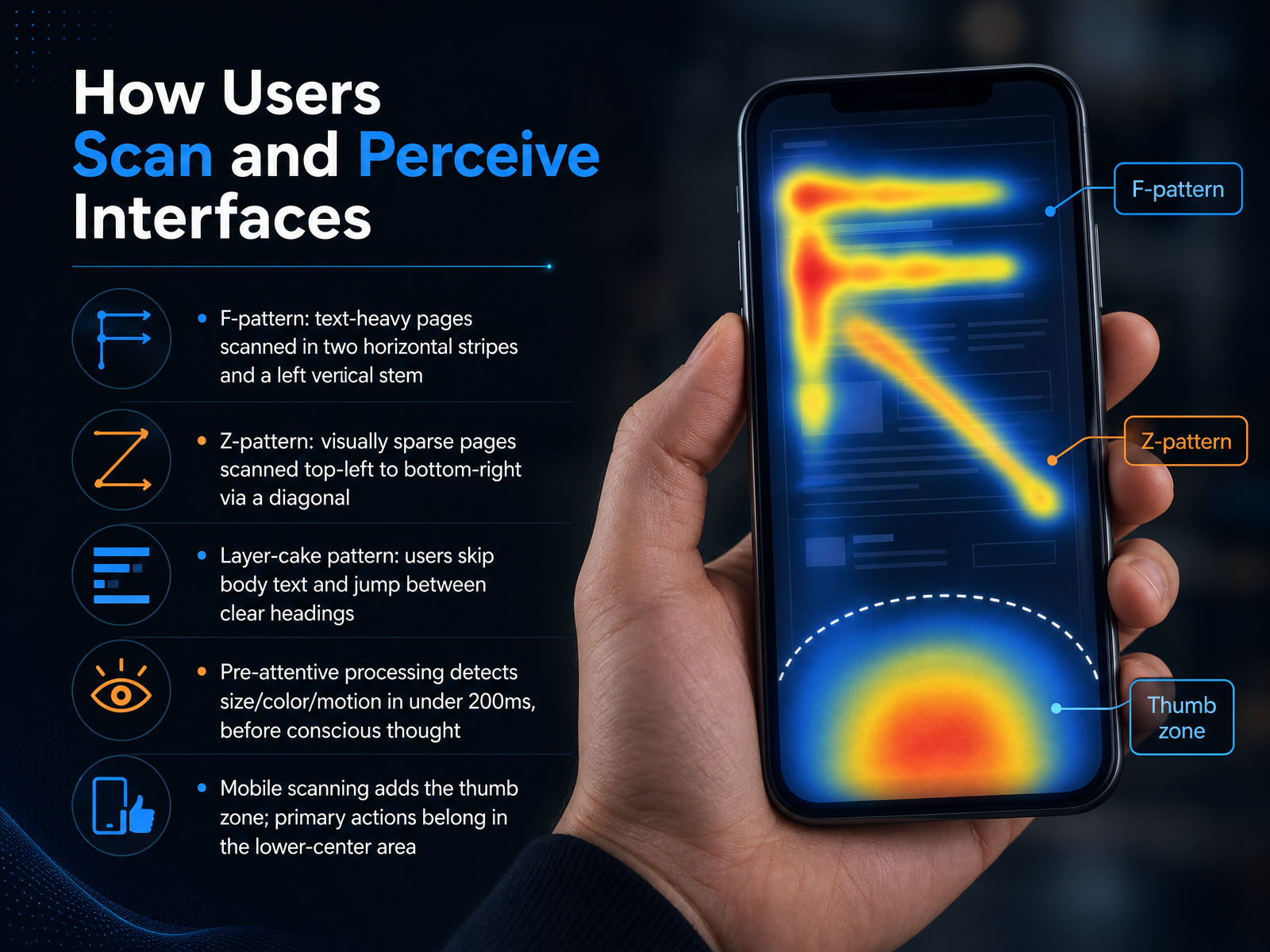
- 02How Users Scan and Perceive InterfacesLet's look at how people actually read your interface. This isn't about preference; it's about hardwired perception. When a page loads, users don't read every word — they scan for relevance. On text-heavy pages, that scan often follows an F-pattern. The eye moves horizontally across the top, drops down a bit for a shorter horizontal stripe, then sweeps down the left side. Think of a search results page or a long article without clear headings. It's the user taking the path of least effort. But when a page is visually sparse — like a landing page — the pattern shifts. Users scan from top-left to top-right, diagonally down to the bottom-left, and finish at the bottom-right. That's the Z-pattern. And sometimes, users skip body text entirely, jumping from heading to heading. We call that the layer-cake pattern. To influence where the eye lands, you need to understand pre-attentive processing. Our brains detect differences in size, color, and motion in under 200 milliseconds — before we're even consciously looking. It's an automatic reflex. Finally, on mobile, this all happens within the thumb zone. Primary actions belong in the lower-center area where they're reachable, not hidden at the top. Next, we'll move into the core levers for building visual weight.
 nngroup.comixdf.org99designs.com+22 min
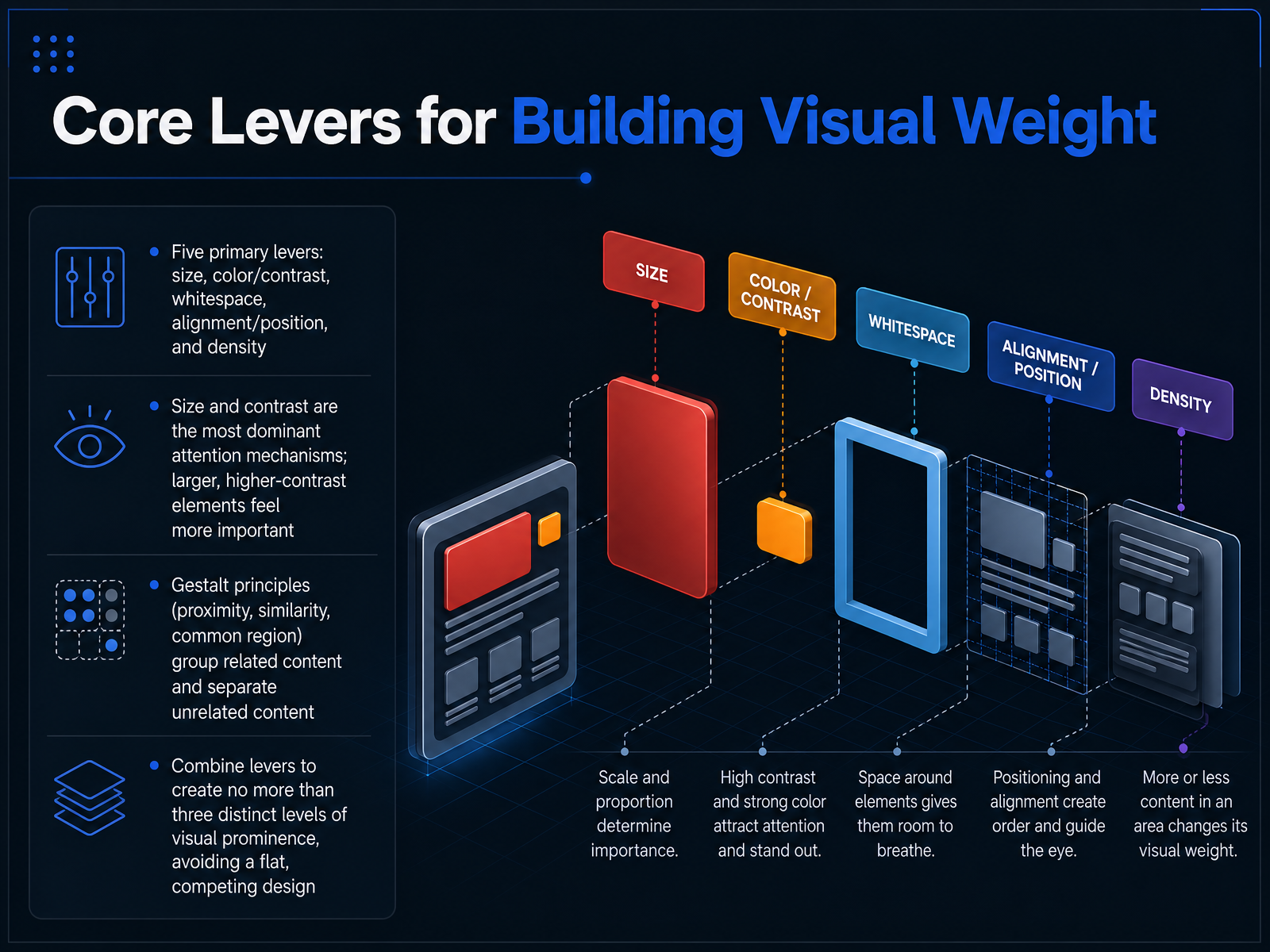
 - 03Core Levers for Building Visual WeightNow let's get practical and look at the core levers you can pull to build visual weight. Think of these as your primary tool kit: size, color and contrast, whitespace, alignment and position, and density. Of these, size and contrast are the most dominant attention mechanisms. Larger elements feel more important, and high-contrast elements pull the eye immediately. That's where the user's focus lands first. Alongside these levers, apply Gestalt principles—specifically proximity, similarity, and common region—to group related content and separate unrelated content. If a label sits directly above its text field, the proximity tells the user they belong together. Now here's a critical rule: combine these levers to create no more than three distinct levels of visual prominence. For example, a large, high-contrast headline, a medium subheading, and smaller body text. Sticking to three levels prevents a flat, competing design where nothing truly stands out. Next, we'll explore how typography serves as a dedicated hierarchy system.
 nngroup.comassets.interaction-design.orgtextbookofusability.com+22 min
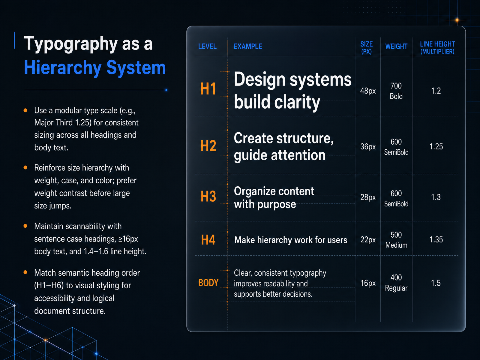
 - 04Typography as a Hierarchy SystemNow let's turn typography into a real system you can rely on. Think of a type scale as a set of predetermined sizes connected by a mathematical ratio, like the Major Third at 1.25. Instead of picking random pixel values, you multiply your base body size by the scale to get every heading level. This creates a consistent visual rhythm that feels intentional across the entire interface. Start by using weight to create contrast before you reach for huge size jumps. Often, moving from four hundred to seven hundred weight creates a much cleaner hierarchy than doubling the size. For readability, keep body text at a minimum of sixteen pixels, use sentence case for headings, and set line height between one point four and one point six. The most critical rule is to match the visual styling to the semantic H one through H six order. An H three should never look larger than the H two above it. This keeps the document structure logical for screen readers and for every user scanning the page. Next, we'll see how spacing ties this system together with grouping and vertical rhythm.
 subux.proalltools.devdesign.dev+21 min
 - 05Spacing, Grouping, and Vertical RhythmNow, let's move from color to the invisible structure that holds everything together: spacing, grouping, and vertical rhythm. Think of space as the silent organizer of your interface. First, use the principle of proximity. If you add more space above a heading than below it, the heading visually attaches to the content it introduces, not the text before it. This binds related pieces together. Second, apply a predictable spacing scale, like an eight-pixel grid. Consistent spacing creates a calm, scannable flow, and it makes your layout feel intentional rather than chaotic. For complex dashboards, chunk the information into cards. Grouping related metrics inside these clear boundaries turns a wall of data into navigable blocks and dramatically reduces cognitive load. Finally, embrace generous whitespace. It is not wasted space; it is a visual separator that reduces noise and lets your key metrics breathe. This supports the 'less is more' principle, helping users focus on what matters without feeling overwhelmed. Up next, we'll build on this by learning how spacing and scale contribute to directing attention to primary actions.
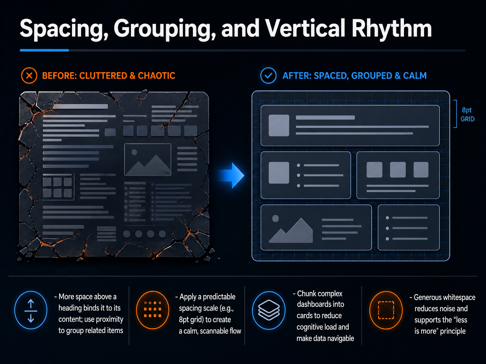 domo.comsoren-learning.siteeasy.bi+22 min
 - 06Directing Attention to Primary ActionsNow let's talk about directing attention to where it matters most: the primary action. When a user lands on your screen, they shouldn't have to hunt for what to do next. Make your main call-to-action button dominant. Give it a high-contrast solid fill and surround it with generous negative space. This is where the eye lands first. And here's a hard rule: use only one primary button per view. Any alternative path, like a "Learn more" or "See details," should be styled as a secondary outline button or even a simple text link. This creates a clear visual ranking. For touch interfaces, make sure every target is at least forty-four to forty-eight pixels in the easy-reach zones. Thumbs shouldn't have to stretch or aim precisely. Finally, avoid placing two buttons side by side with equal visual weight. This triggers what's known as Hick's Law, where too many equal choices cause decision paralysis. Demoting the secondary option from a button to a text link, without changing any copy, has been shown to shift up to eight percent of users toward the primary conversion path. So remember: one dominant button, clear hierarchy, and generous touch targets. Next, we'll explore the common pitfall of trying to make everything important at once, in "Avoiding the 'Everything is Important' Trap."
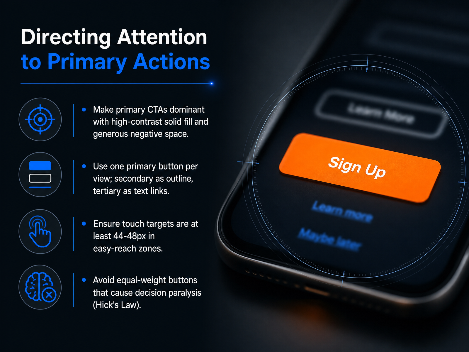 2 min
2 min - 07Avoiding the 'Everything is Important' TrapLet's talk about the number one visual hierarchy trap in dashboards. It's the moment when everything on screen screams for attention, and the result is that nothing stands out. We call this the 'Everything is Important' trap. When every element is highlighted, the screen feels flat, and the user's eye has no clear entry point.
To fix this, define a three-level KPI hierarchy. Level one is health indicators. These are the three to five metrics that answer 'Is everything okay?' in a ten-second glance. Place them at the very top with the most visual weight. Level two is diagnostic metrics. These group supporting data users need to scan to understand why a health metric moved. Level three is detail data, specific records accessed only through drill-down or expandable sections.
This technique is called progressive disclosure. Always show the summary first, and let users click to expand deeper views. This keeps the surface calm while still providing depth.
Finally, enforce a regular content audit. Set a widget budget. For every new metric you want to add, you must remove or hide an existing one. Intentional removal is the only way to protect visual clarity.
Up next, we'll apply these strategies directly to Designing for Complex Data Scenarios.
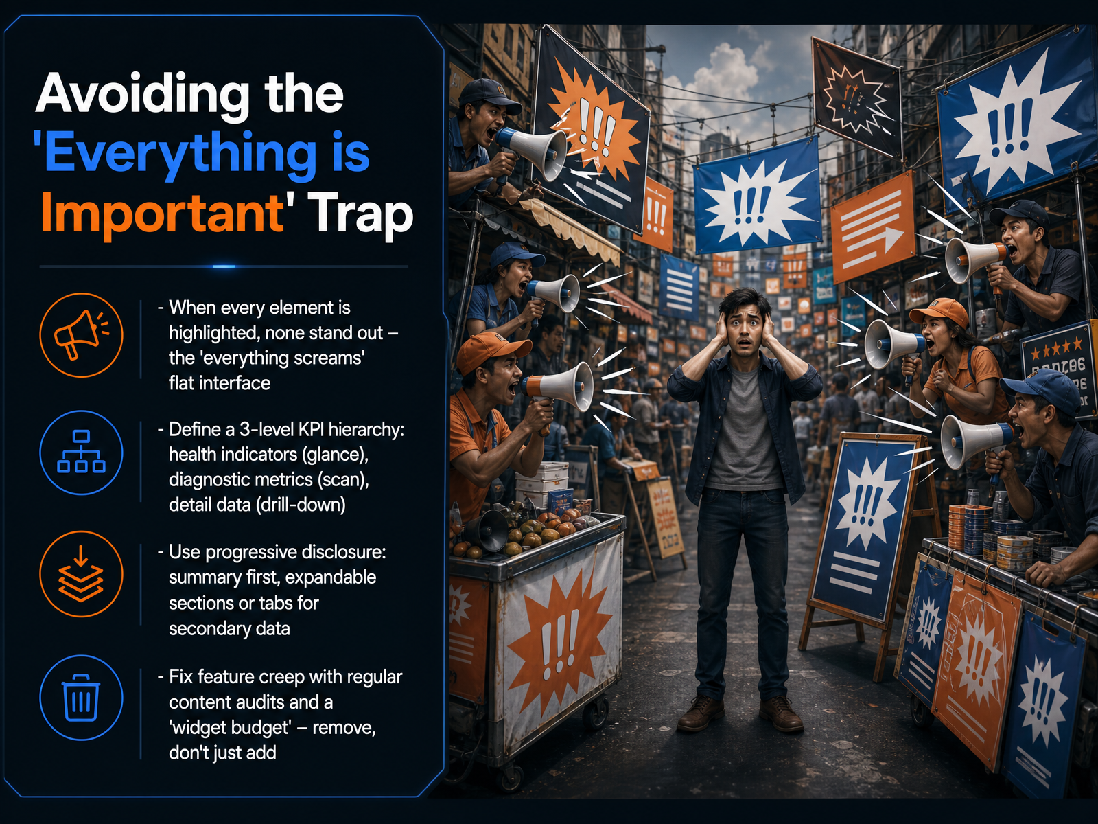 domo.comsoren-learning.siteeasy.bi+22 min
 - 08Designing for Complex Data ScenariosNow let's apply hierarchy to complex data scenarios, where the risk of overwhelming the user is highest. Your priority is to reduce cognitive load immediately. Start by using progressive disclosure. Place summary KPI cards above the fold, so users see the health of the system in seconds. Push the detailed breakdowns into expandable sections or tabs, accessible only when they are needed. Next, match the chart to the task. Use line charts for trends over time, horizontal bar charts for comparing categories, and sparklines to give a small, contextual trend right inside a KPI card. Then, aggressively reduce visual noise. Remove heavy gridlines, decorative borders, and any other non-data ink that competes for attention. Finally, transform raw data into intuitive structures. Use card-based layouts with consistent iconography. This helps users scan the screen like a story, rather than deciphering a spreadsheet. When you combine progressive disclosure with the right chart and a calm layout, you give your user a clear path through even the densest data. Up next, we'll look at how color and contrast strengthen that clarity.
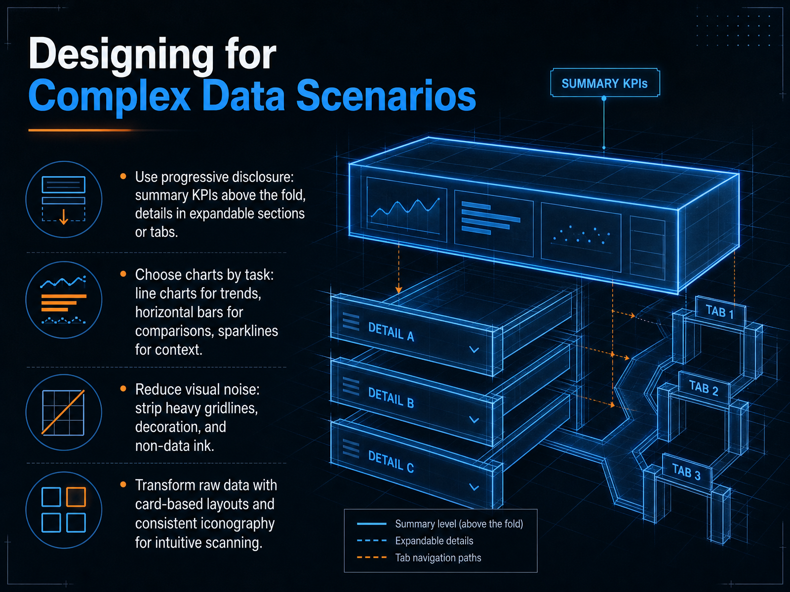 domo.comsoren-learning.siteeasy.bi+22 min
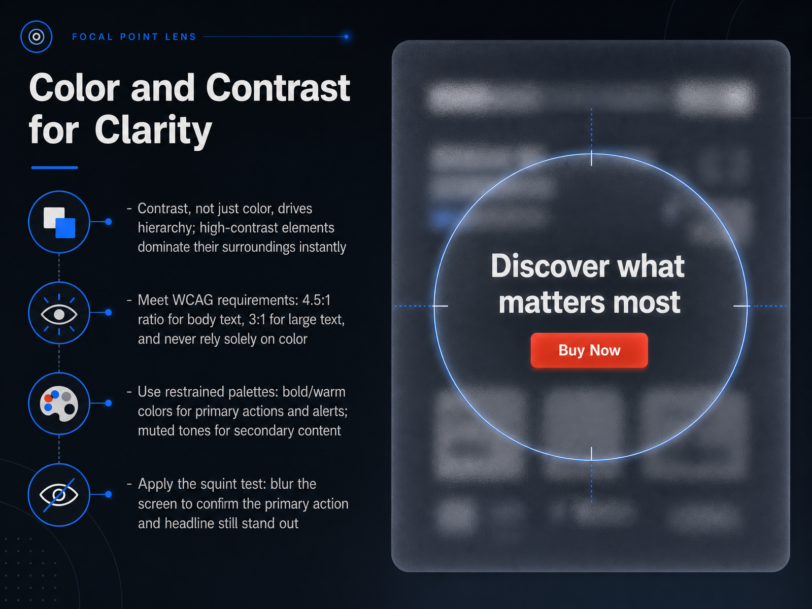
 - 09Color and Contrast for ClarityNow let's get practical about color and contrast for clarity. When building visual hierarchy, contrast is your most powerful tool. It's not really the color itself that matters, but the difference in lightness and darkness between an element and its background. High-contrast elements instantly dominate their surroundings and demand attention. Think of this as the volume control for your interface. To make sure your design works for everyone, meet the Web Content Accessibility Guidelines. That means a contrast ratio of at least four point five to one for body text, and three to one for large text. And never rely on color alone to communicate meaning. Add an icon or a text label so color-blind users don't miss it. Now, let's talk about your palette. Use restrained, muted tones for secondary content. Save bold or warm colors for primary actions, alerts, and critical information. That bright red button? Use it only when you really need to stop someone. Finally, here's a quick technique you can use right now. Apply the squint test. Blur the screen or simply squint your eyes until the details disappear. Can you still spot the headline and the primary action instantly? If not, your hierarchy needs more contrast. Up next, we'll move from principles to practice with some practical strategies for testing visual hierarchy.
 nngroup.comassets.interaction-design.orgtextbookofusability.com+22 min
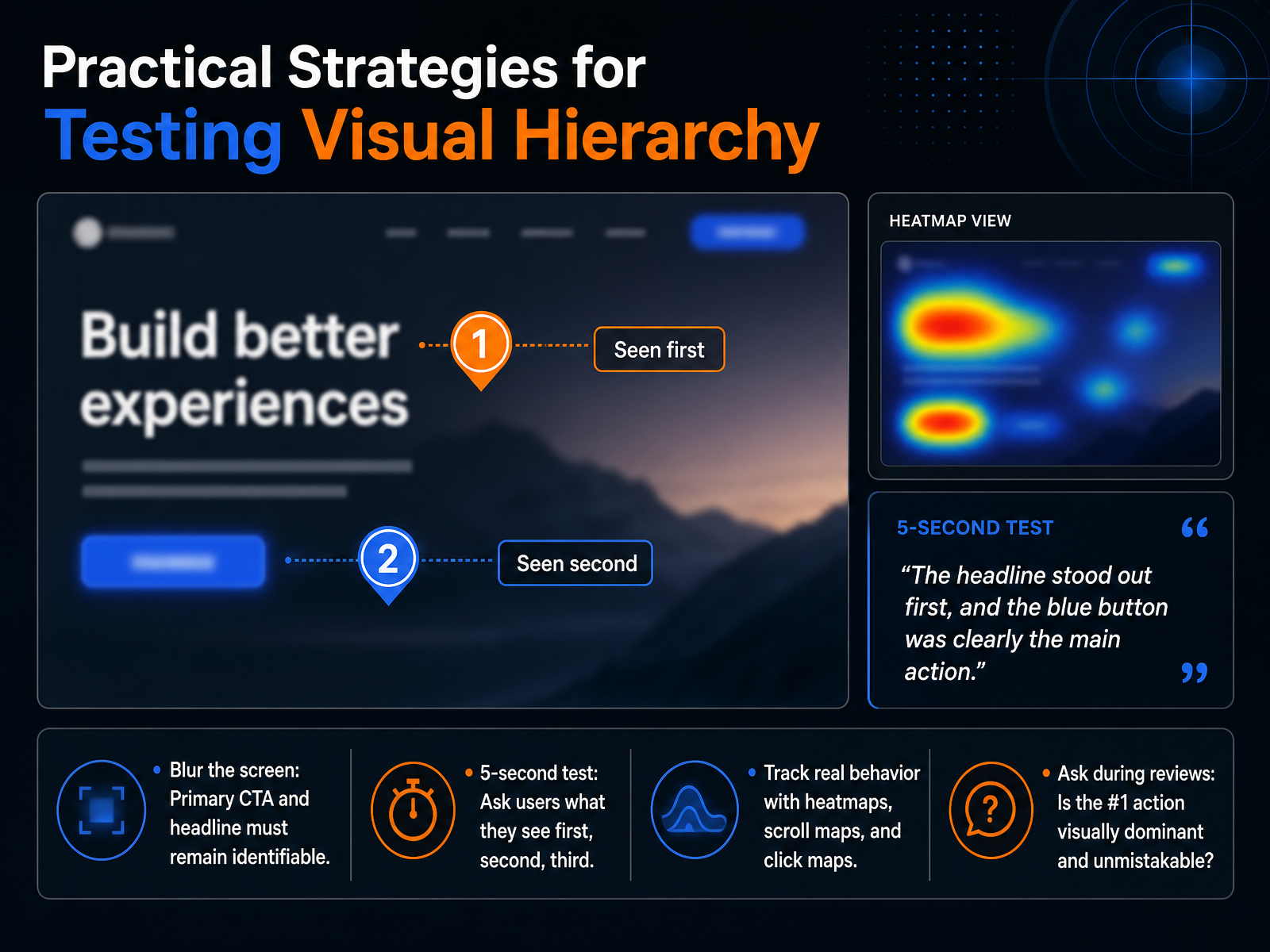
 - 10Practical Strategies for Testing Visual HierarchyLet’s move from designing hierarchy to actually testing whether it’s working. Visual hierarchy isn’t subjective, and these four practical tests prove it. First, blur the screen. Apply a heavy blur or squint until the page becomes shapes and color blocks. If your primary call-to-action and headline aren’t still identifiable in two seconds, your hierarchy is failing the most brutal diagnostic we have. Second, run a five-second test. Show a user the screen for exactly five seconds, then ask: what did you see first, second, and third. Their answer reveals the real hierarchy, not the one you intended in Figma. Third, track real behavior with heatmaps, scroll maps, and click maps. These tools show where attention actually pools and what gets interacted with, often confirming that equal-weight secondary buttons steal clicks from the primary action. Fourth, during every design review, ask one blunt question: is the number one action visually dominant and unmistakable? If anyone hesitates, you have a hierarchy problem. These four checks move you from hoping the design works to knowing it does. Next, we’ll apply these insights directly by fixing common visual hierarchy mistakes.
 nngroup.comassets.interaction-design.orgtextbookofusability.com+22 min
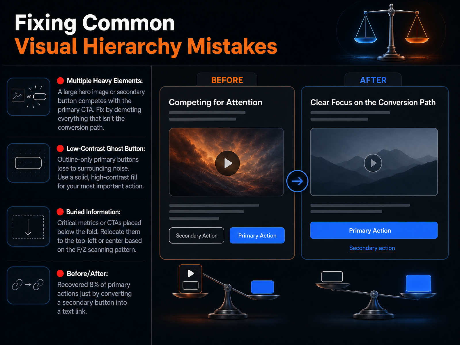
 - 11Fixing Common Visual Hierarchy MistakesLet's walk through three of the most common visual hierarchy mistakes I see in interfaces, and exactly how to fix them. First, multiple heavy elements. When a large hero image or a secondary button carries the same visual weight as your primary call to action, they compete for attention. The fix is simple: demote everything that isn't on the conversion path. For example, one test changed a Pay Later button into a plain text link, and eight percent of users shifted to the primary action with zero copy changes. Second, the low-contrast ghost button. An outline-only primary button gets lost in surrounding noise. Switch to a solid, high-contrast fill for your most important action so it dominates the view. Third, buried information. Critical metrics or CTAs placed below the fold are invisible during the first scan. Relocate them to the top-left or center based on the F or Z scanning pattern. Run the squint test: blur the page and verify you can still identify the primary action in under two seconds. Up next, we'll apply these principles to responsive and mobile hierarchy.
 domo.comsoren-learning.siteeasy.bi+22 min
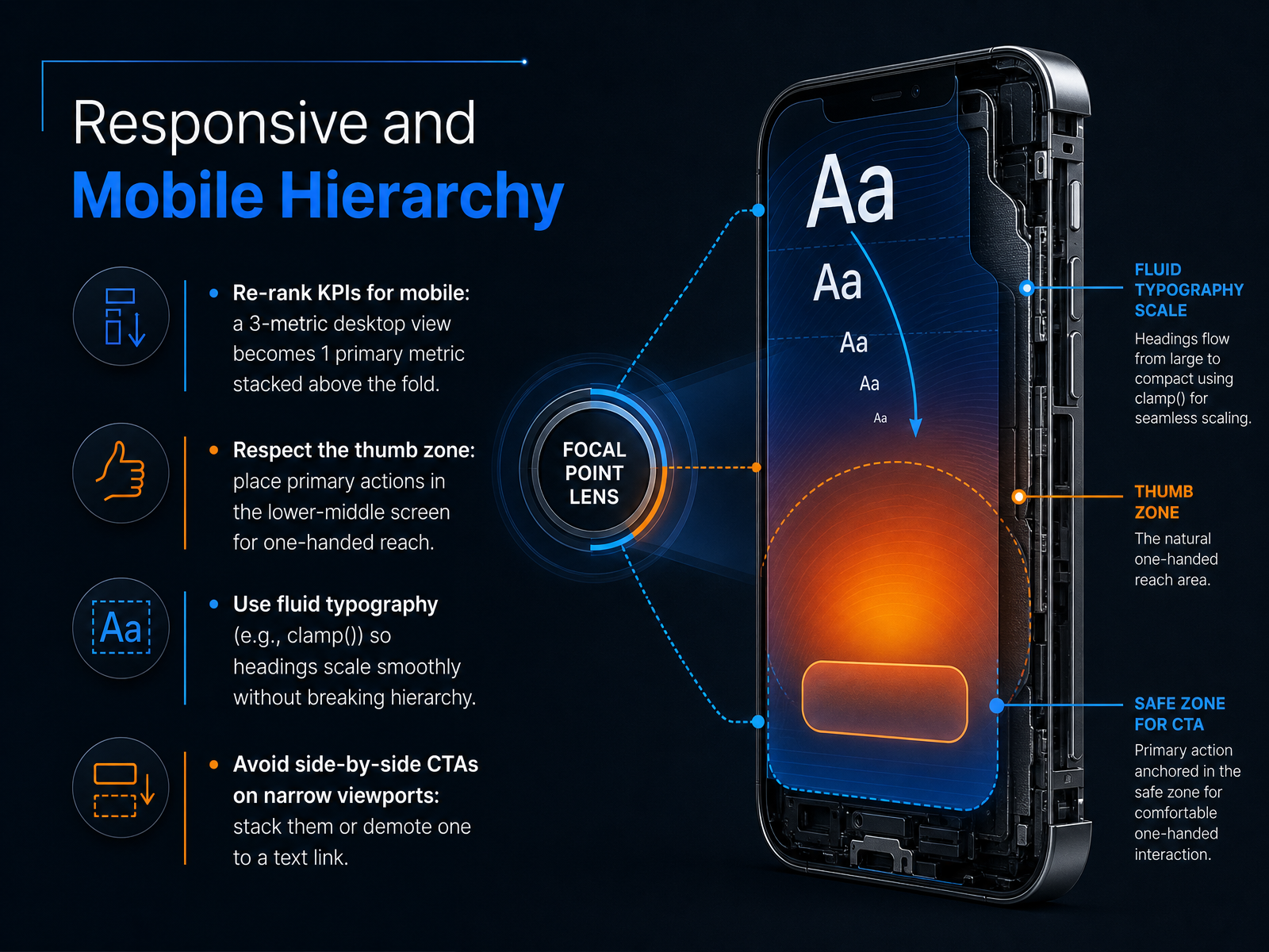
 - 12Responsive and Mobile HierarchyNow let’s talk about mobile and responsive hierarchy. The screen gets smaller, but the same rule applies: the most important information has to win. On a desktop dashboard, you might show three key performance indicators side by side. On a phone, re-rank those metrics. Stack the single most critical metric above the fold, large and unmistakable, so it answers the urgent question before the user scrolls. Then position your primary action deliberately. Respect the thumb zone. Place that main button in the lower-middle portion of the screen where one-handed reach feels natural, not in a top corner that makes the user stretch. For your typography, use a fluid function like clamp to let headings scale smoothly across screen sizes. This keeps your hierarchy intact without text feeling oversized on a phone or weak on a monitor. And when you have call-to-action buttons, resist putting them side by side on narrow viewports. Stack them vertically instead, or demote the secondary action to a simple text link. This removes choice paralysis and makes the next step obvious. Up next, we’ll shift from visual systems to stakeholder conversations in Selling Hierarchy: Negotiating with Stakeholders.
 subux.proalltools.devdesign.dev+22 min
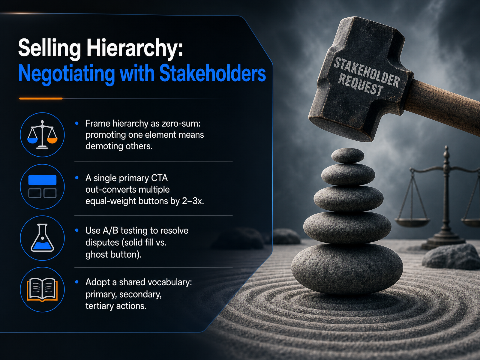
 - 13Selling Hierarchy: Negotiating with StakeholdersLet’s talk about selling hierarchy to stakeholders. When you’re in a design review, frame every promotion as a trade-off. Hierarchy is zero-sum: making one element more prominent means you intentionally demote another. A clear primary call-to-action doesn’t just guide users—it actually converts. Pages with a single dominant CTA routinely outperform those with multiple equal-weight buttons by two to three times, because users don’t have to negotiate competing signals. When you hit that classic debate—solid fill versus ghost button—don’t argue opinions. A/B test it. A quick test on one high-traffic page ends the discussion with data. And finally, give your team a shared vocabulary: primary, secondary, and tertiary actions. When everyone uses the same terms, negotiating which element deserves top billing becomes a structured decision, not a taste war. Up next, we’ll build a hierarchy audit checklist to put this vocabulary into practice.
 1 min
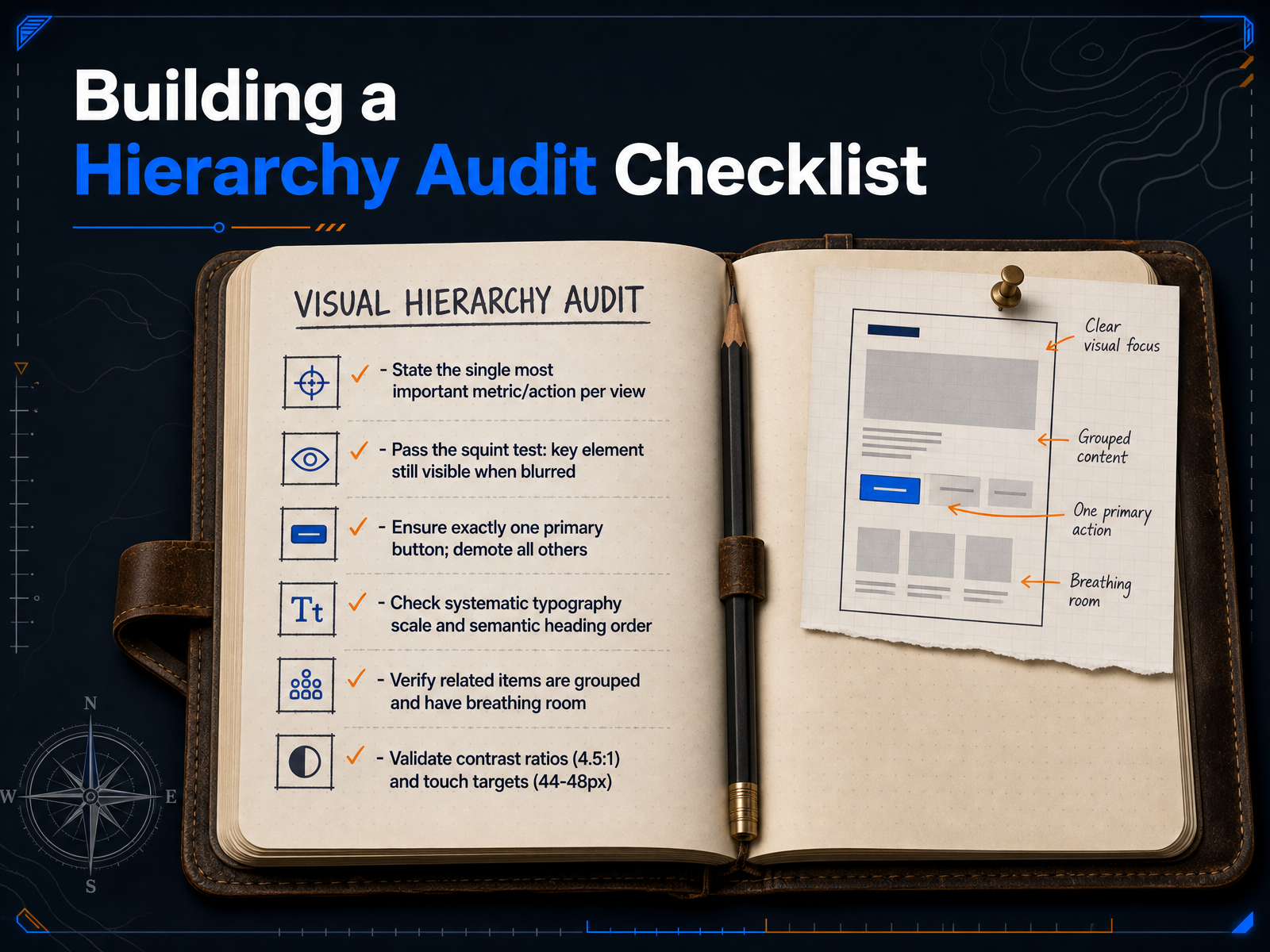
1 min - 14Building a Hierarchy Audit ChecklistLet’s turn everything we’ve covered into a practical audit checklist you can run on any screen. Walk through these six points and you’ll spot hierarchy problems in seconds. First, can you state the single most important metric or action on this view? If you can’t name it, the screen doesn’t have a primary task. Second, apply the squint test. Blur the screen until the text becomes illegible, and ask whether the key element is still visible. If everything disappears into a grey fog, the hierarchy needs work. Third, ensure exactly one primary button per view. Demote all other actions to secondary or tertiary styles. If two buttons compete visually, users hesitate. Fourth, check your typography scale and heading order. Skip no levels, and make sure visual size matches semantic importance. Fifth, verify that related items are grouped together and have enough breathing room. Proximity creates meaning, and white space reinforces it. Finally, validate contrast ratios at four point five to one and touch targets at a minimum of forty-four by forty-eight pixels. These numbers protect accessibility and real-world usability. Run this checklist early and often, and your interfaces will communicate clearly before users read a single word. Up next, we’ll wrap up with a summary and a look at how to continue practicing what you’ve learned.
 subux.proalltools.devdesign.dev+22 min
 - 15Summary and Continued PracticeLet's take a moment to pull all of this together. Over this course, you've learned that a clear visual hierarchy means doing three things really well. First, make your key information prominent so users know where to look immediately. Second, group related content so the structure becomes obvious before a single word is read. And third, highlight your primary actions so there's no doubt about what to do next. Remember, this isn't a series of one-off fixes. Visual hierarchy is a scalable system that reinforces user trust every time the screen loads. I want you to build this skill into a habit. Set a recurring fifteen-minute block each week to audit a live product using the checklist from this lesson. Squint at the screen and ask yourself: does the right element still dominate? To go deeper, I've included some essential resources. Explore Edward Tufte's work on data visualization, study the WCAG two-point-two guidelines for accessible contrast, and read up on mobile ergonomics to design for how people actually hold their devices. Thank you for joining me. You now have a repeatable framework for designing interfaces that guide, clarify, and reduce friction. Keep practicing, and those fifteen-minute audits will start paying off in every screen you design.
 nngroup.comassets.interaction-design.orgtextbookofusability.com+22 min
Take the deck with you
Download this course as a file — free, no sign-up needed.
- PDF handoutEvery slide page, ready to print or share.16 pages · 4.0 MBDownload
- Narrated PowerPointThe deck that presents itself — every slide carries the digital human's narration video.16 pages · 16.9 MBDownload
- PowerPoint slidesThe full deck as a .pptx — open it in PowerPoint, Keynote, or Google Slides.16 pages · 3.9 MBDownload
Free to use in your own training — please keep the PersonWise credit page at the end.
Have your own deck? Turn it into a course
Sources consulted
Web sources consulted while building this course.
- Visual Hierarchy in UX: Definition — nngroup.com
- https://assets.interaction-design.org/literature/topics/visual-hierarchy — assets.interaction-design.org
- Visual Hierarchy | Glossary | Textbook of Usability — textbookofusability.com
- What is Visual Hierarchy? — updated 2026 — ixdf.org
- What is Visual Hierarchy? | Figma — figma.com
- F-Shaped Pattern of Reading on the Web: Misunderstood, But Still ... — nngroup.com
- Visual Hierarchy: Organizing content to follow natural eye movement ... — ixdf.org
- Using F and Z patterns to create visual hierarchy in landing page designs — 99designs.com
- User interface layout optimization design based on eye tracking simulation | International Journal for Simulation and Multidisciplinary Design Optimization (IJSMDO) — ijsmdo.org
- F-Pattern and Z-Pattern - Fundamentals and Best Practices ... — seo-day.de
- Typography hierarchy – UX Best Practices and Guidelines | SubUX — subux.pro
- Typography Hierarchy - A System for Text - AllTools — alltools.dev
- Web Typography Complete Guide - Fonts, Scales, Hierarchy & Best Practices | design.dev — design.dev
- Modern Typography Guide: Fluid Type, Variable Fonts & Readability | FrontendTools — frontendtools.tech
- How Typography Hierarchy Boosts UI Usability | Raw.Studio — raw.studio
- Top 10 Dashboard Design Mistakes and How to Fix Them — domo.com
- Visual Hierarchy for Dashboards and Admin Panels — UX Fundamentals for Developers | Soren Learning — soren-learning.site
- Why Your Dashboard Confuses Users (And How to Fix It in a Sprint) — easy.bi
- Dashboard UI Design: 3 Principles for Reducing Cognitive Load and Improving Usability | WANDR — wandr.studio
- Dashboard Layout: Visual Hierarchy People Actually Use | IGC — intelligentgraphicandcode.com