Designing Responsive Layouts
Begin
16 pages · ~32 min
Designing Responsive Layouts
Learn to create mobile-first, adaptive layouts using CSS media queries and flexible grids.
What you’ll learn
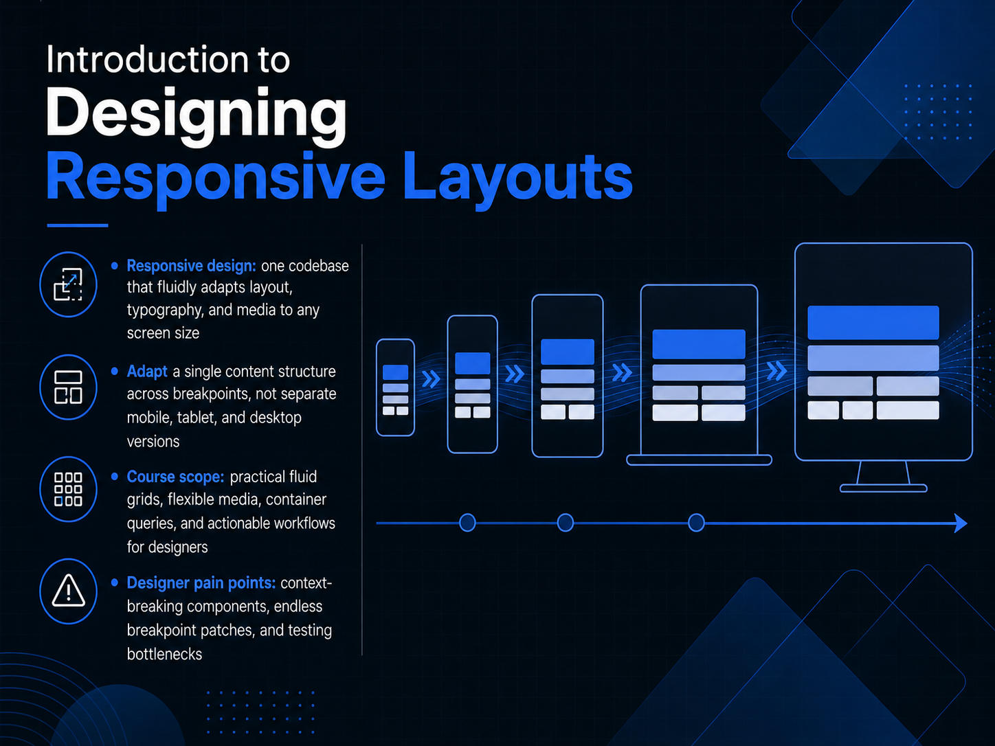
- 01Introduction to Designing Responsive LayoutsWelcome. In this course, we focus on designing responsive layouts, the single-codebase approach where one content structure fluidly adapts across every screen size. Instead of juggling separate mobile, tablet, and desktop versions, you will learn to adapt a single structure using breakpoints driven by content, not devices. Over the next few sessions, we will work through practical fluid grids, flexible media, and container queries, giving you actionable workflows that fit right into your design process. We will also address the pain points you know well: components that break their context, endless breakpoint patches, and testing bottlenecks. This is not about shrinking a desktop view. It is about building layouts that read the space they are given and respond intelligently. Let us start by clarifying a core distinction that shapes every decision you make: responsive versus adaptive design.developer.mozilla.orgsimpalm.comthelinuxcode.com+21 min
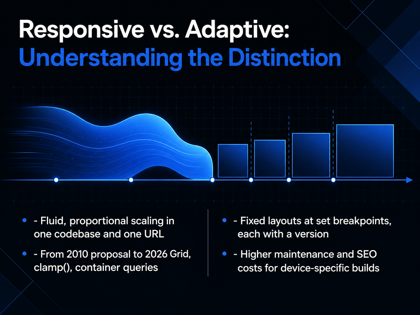
- 02Responsive vs. Adaptive: Understanding the DistinctionLet's start by clarifying a key distinction: responsive versus adaptive design. In responsive design, we use one codebase and one URL. The layout fluidly scales with proportional units, flexbox, and grid, reflowing content to fit any viewport. Adaptive design takes a different path. It delivers fixed layouts at specific breakpoints, essentially separate versions for different device categories. This approach often leads to higher maintenance overhead and can hurt SEO because you're managing multiple versions of the same content. The industry has evolved dramatically since Ethan Marcotte's original proposal in 2010. Today, we have powerful tools like CSS Grid, the clamp function for fluid typography, and container queries that let elements respond to their parent's size, not just the viewport. These modern capabilities give us far more control with less complexity. Next, we'll build on this foundation by exploring the core principles of responsive design.
 1 min
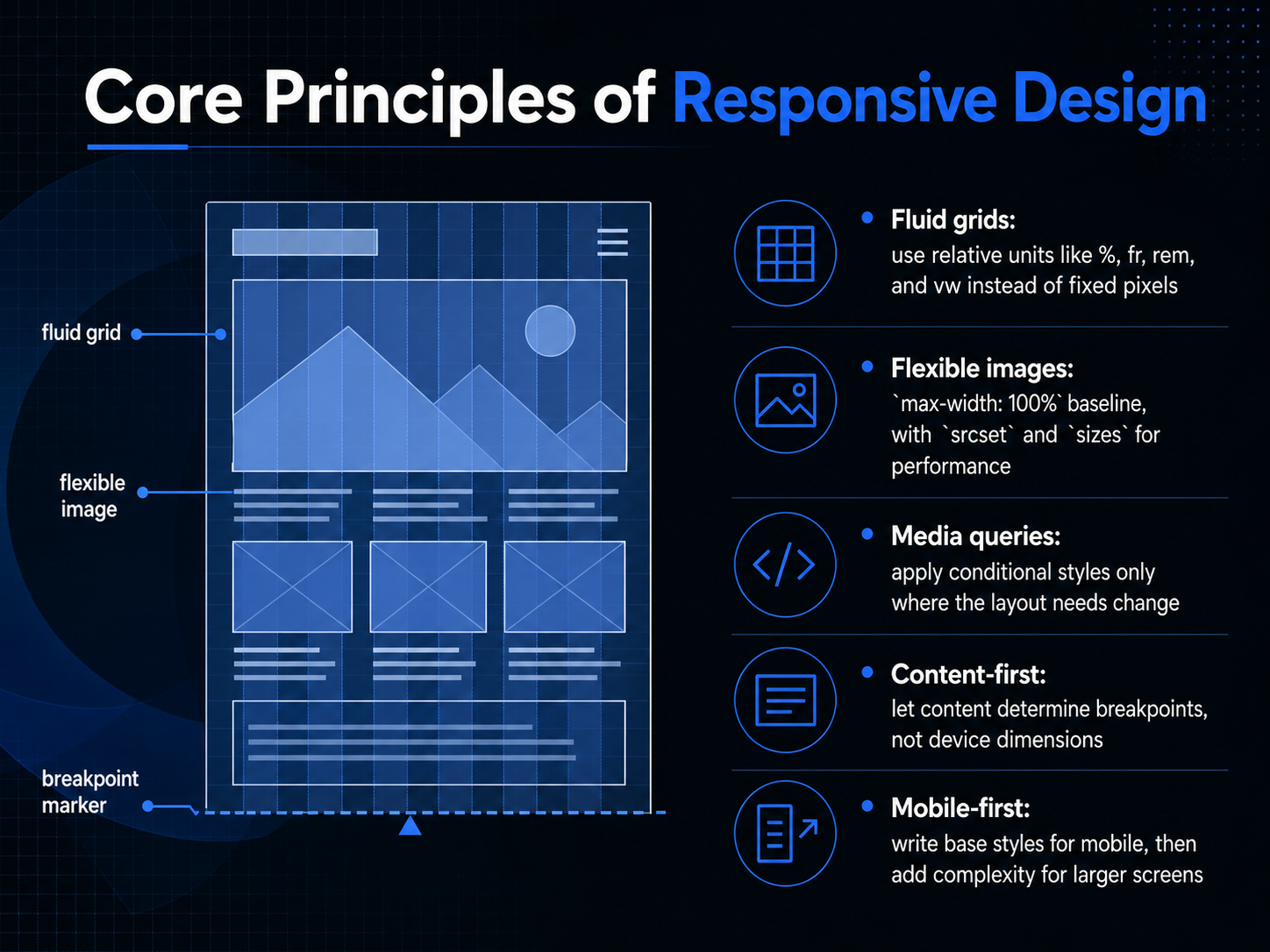
1 min - 03Core Principles of Responsive DesignThese five principles are the foundation of every responsive project. First, fluid grids. We trade fixed pixels for relative units: percentages, the fr unit in CSS Grid, rems, and viewport widths. This lets our layout scale proportionally. Second, flexible images. The baseline is max-width: one hundred percent to prevent overflow, but for performance, we should also implement srcset and sizes to serve the right resolution for each screen. Third, media queries. Think of them as conditional overrides, applied only where the layout actually needs to adapt, not as a catalog of every device on the market. Fourth, we design content-first. Let the content, not arbitrary device dimensions, determine where your breakpoints fall. And finally, mobile-first. Write your base styles for the smallest screen, then use min-width queries to layer in complexity as real estate grows. This keeps your code lean and avoids overriding desktop styles on mobile. Next, we'll apply these principles to vertical rhythm by establishing a clear content structure and hierarchy.
 2 min
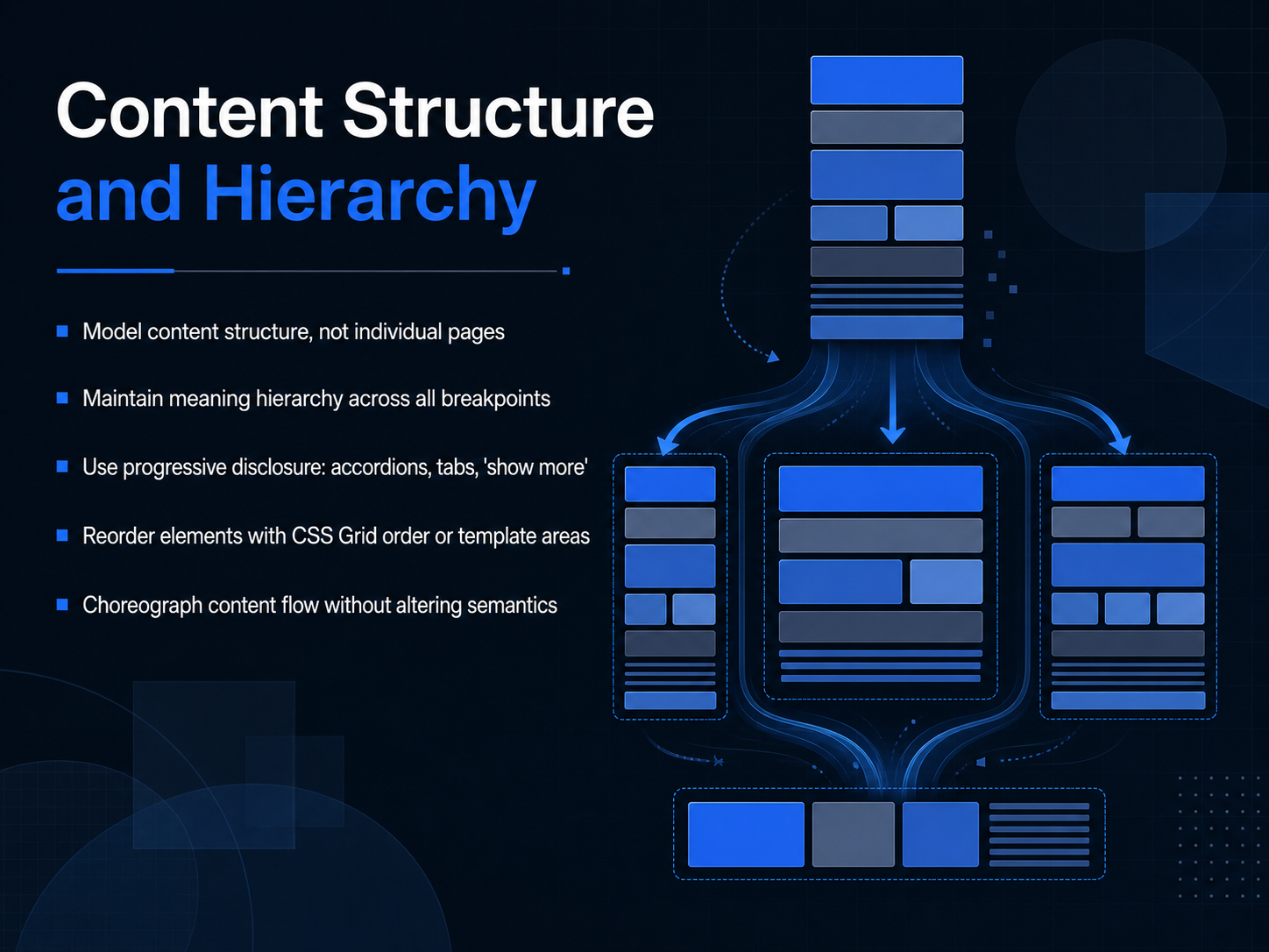
2 min - 04Content Structure and HierarchyLet's shift our focus now from individual pages to the underlying content structure. When we design responsively, we're not modeling page layouts in isolation. We're defining a single, meaningful content model that adapts everywhere. The key is to maintain the same semantic hierarchy across all breakpoints. A heading level one should stay a heading level one, whether it's on a wide desktop display or a narrow phone screen. That preserves meaning and accessibility as the layout shifts. To manage complexity, lean on progressive disclosure. Patterns like accordions, tabs, or a 'show more' button let you progressively reveal secondary content without overwhelming smaller viewports. For more dramatic reordering, you can use CSS Grid. Properties like grid-template-areas or the order property let you visually choreograph the content flow, moving a sidebar above the main article, for example, without ever altering the underlying HTML semantics. This keeps the document structure clean and logical. Up next, we'll explore how to apply these structural ideas within common layout patterns and component behavior.
 2 min
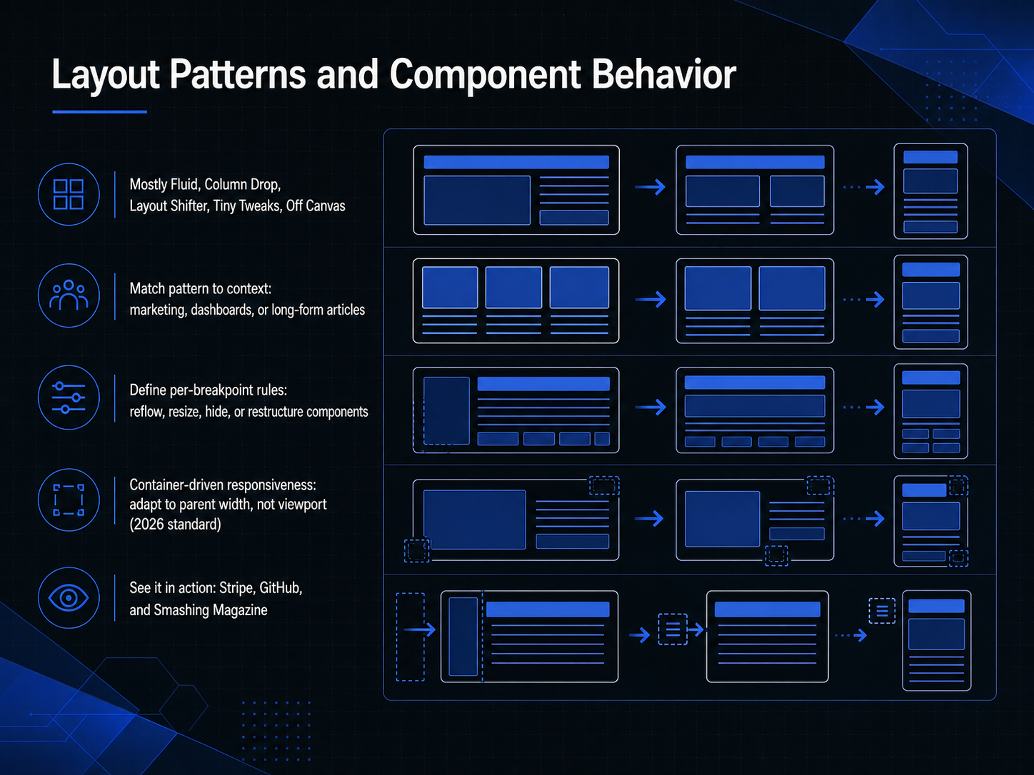
2 min - 05Layout Patterns and Component BehaviorNow, let's look at the core layout patterns that make responsive behavior predictable. We have mostly fluid, column drop, layout shifter, tiny tweaks, and off canvas. Each pattern serves a different purpose. For example, mostly fluid excels in long-form articles where text reflows naturally, while column drop is your go-to for dashboards with stacked card layouts. A layout shifter works well for marketing pages that need distinct visual structures at each breakpoint. The key is defining per-breakpoint rules for your components. You decide whether a component should reflow, resize, hide, or completely restructure. A major shift you'll want to prepare for is container-driven responsiveness, the upcoming twenty twenty-six standard. Instead of querying the viewport, components adapt directly to their parent container's width. This makes things like embedding a card in a sidebar versus a main column incredibly robust. You can see these principles in action on sites like Stripe for adaptive marketing, GitHub for complex dashboards, and Smashing Magazine for fluid reading layouts. Up next, we'll get tactical with breakpoints and design decisions.
 2 min
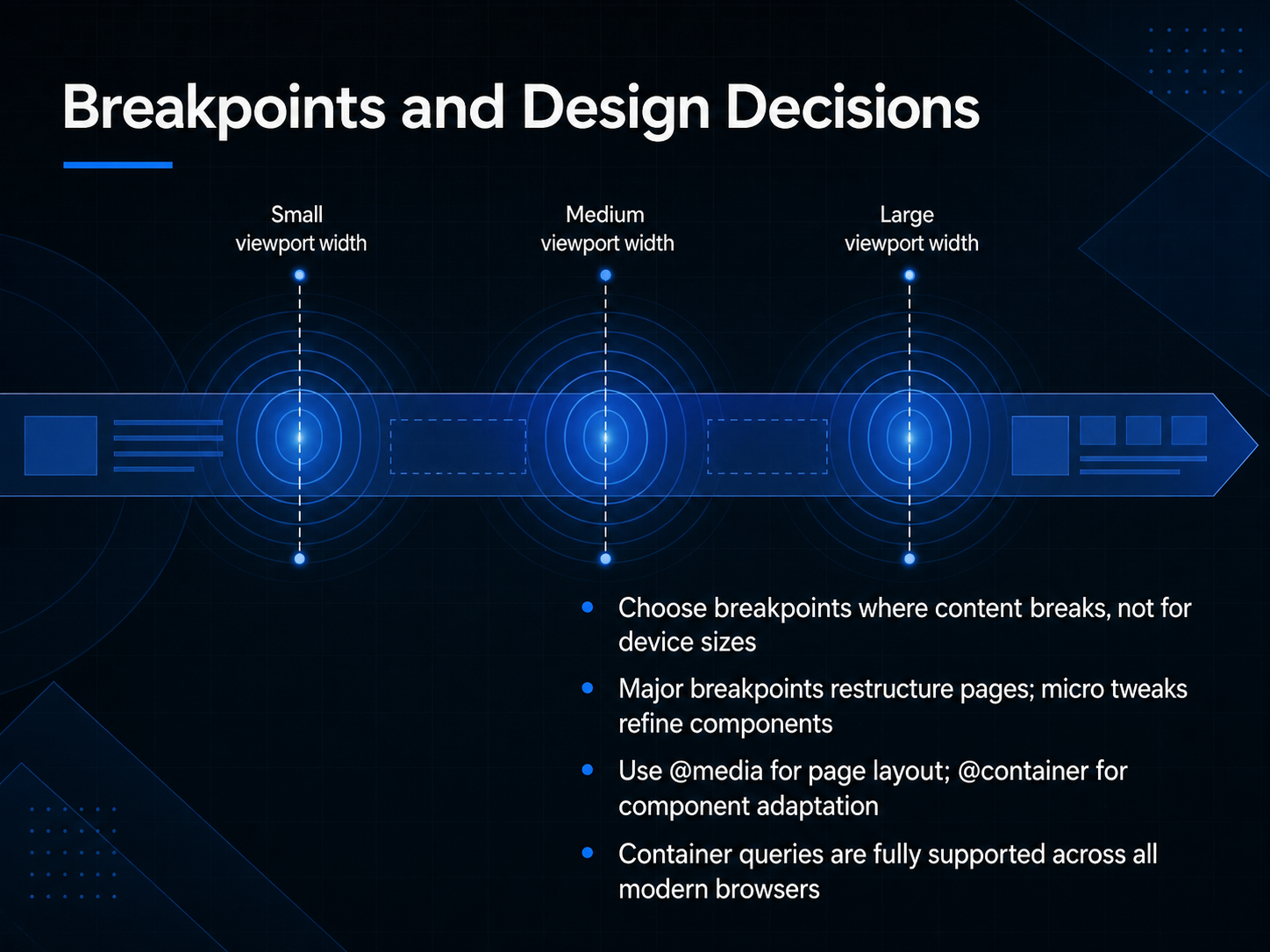
2 min - 06Breakpoints and Design DecisionsLet's talk about breakpoints, because where you set them changes everything. The best advice I can give you is to choose breakpoints where your content actually breaks, not where a specific device width happens to fall. Watch your layout. When a line of text gets too long, when a card grid feels cramped, that's your signal. Those are the moments that matter for your user, not a generic phone versus tablet cutoff. Think of breakpoints in two tiers. Major breakpoints are where you might restructure the entire page, shifting from a multi-column layout to a single stack. Micro tweaks, on the other hand, refine individual components, like adjusting the padding inside a button or changing a font size, without changing the overall page structure. And the tools for this are getting more precise. Use media queries, that familiar at- media rule, for your page-level layout changes. But for adapting a component based on its own available space, reach for container queries with the at- container rule. This is a huge shift. A card component can now reflow itself whether it's placed in a wide main content area or a narrow sidebar, without needing to know the viewport width. The good news is that container queries are fully supported across all modern browsers, so you can use them in production today. Next, let's build on this foundation and look at typography and readability across sizes.
 2 min
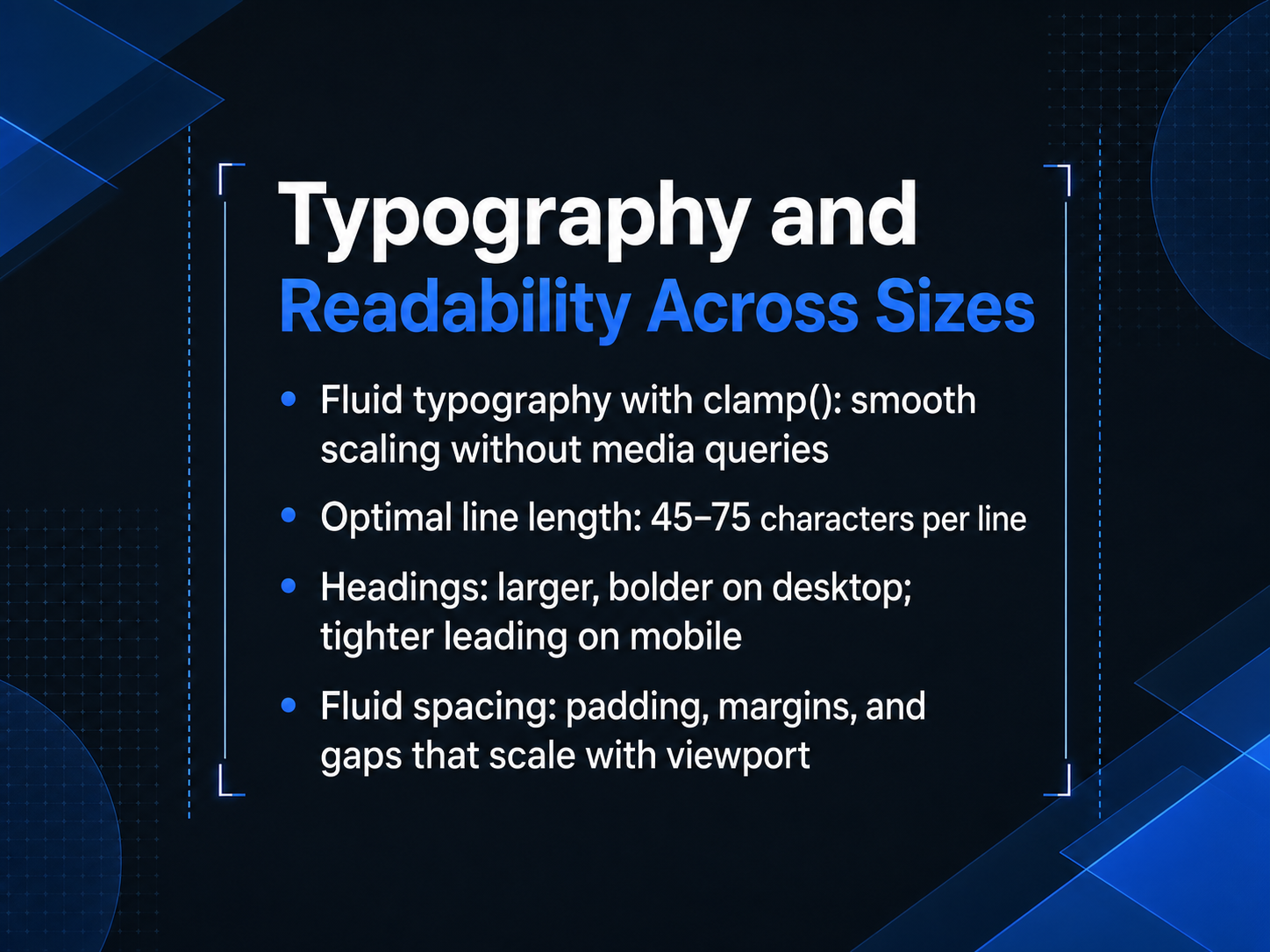
2 min - 07Typography and Readability Across SizesNow let's bring this responsive thinking to the words themselves. Getting typography right across devices is one of the most impactful things you can do for readability. A clean, modern approach is using the CSS clamp function. With clamp, you define a minimum size, a preferred viewport-based size, and a maximum size. The type scales smoothly between those bounds without a single media query. It is incredibly efficient. Next, always keep an eye on line length. The sweet spot for comfortable reading is between forty-five and seventy-five characters per line. Too wide, and the eye gets lost. Too narrow, and the rhythm breaks. For headings, think about their role at each size. On a wide desktop layout, they can be larger and bolder to anchor the page. On mobile, you'll want to tighten the leading to keep the multi-line block cohesive and save vertical space. The same fluid logic should apply to your spacing. Instead of fixed padding and margins, use units that scale with the viewport so that the visual breathing room feels proportional at every breakpoint. Up next, we'll apply these performance principles to images and media.
 2 min
2 min - 08Images, Media, and PerformanceLet's turn our attention to images, media, and performance. These elements have the single biggest impact on your layout's weight and speed across devices. First, let's tackle responsive images. Use the srcset and sizes attributes to swap resolution-appropriate files at different breakpoints. For true art direction, where the crop or composition changes by screen size, the picture element is your best tool. Now, file formats. For icons and logos, SVG is the clear winner: it stays crisp at any size. For photos, your primary format should be AVIF. It has over 96 percent browser support and delivers the best compression. Pair it with a WebP fallback, and a baseline JPEG for any remaining edge cases. This strategy alone is powerful. Serving correctly sized images typically reduces page weight by 40 to 60 percent. Finally, control loading priority. Lazy-load images that start off-screen to save bandwidth, and preload your largest contentful paint, or LCP, image using the fetchpriority hint. This ensures the hero shot loads instantly. Next, we'll explore how these images flow into a modern design system with grid and flexbox.
 2 min
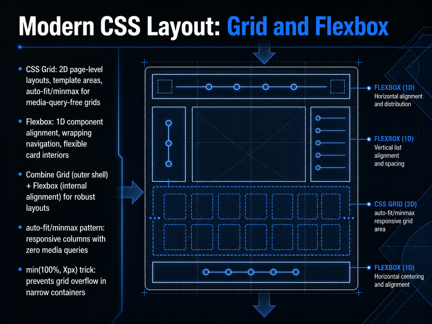
2 min - 09Modern CSS Layout: Grid and FlexboxAlright, now let’s turn to the two core layout tools that make truly responsive design possible: CSS Grid and Flexbox. Think of Grid as your two-dimensional, page-level blueprint. It’s perfect for defining the outer shell, using template areas to map out major sections, and the auto-fit and minmax pattern to create responsive columns without a single media query. Flexbox, on the other hand, is your one-dimensional alignment specialist. Use it inside components for things like wrapping navigation bars or flexible card interiors where you need items to distribute space evenly. The real power comes from combining them. Let Grid build the robust page structure, and then deploy Flexbox for the internal alignment of each component. A critical pattern to remember is the auto-fit and minmax trick. It lets your grid automatically add or remove columns based on available space, completely removing the need for breakpoints. And to prevent grid overflow in narrow containers, use the min function with 100 percent and a fixed pixel value. This ensures your grid never pushes past its parent. These strategies give you a layout that bends without breaking. Next, we’ll explore how Container Queries let us take this responsiveness to the component level.
 1 min
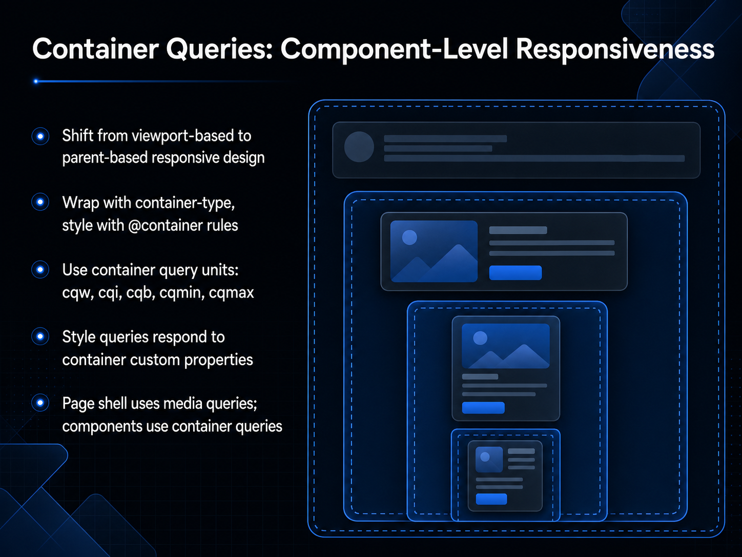
1 min - 10Container Queries: Component-Level ResponsivenessNow let's shift our perspective from the viewport to the component itself. Container queries let us build responsive behavior based on a parent container's size, not the overall browser window. This is a fundamental change for reusable design systems. To set it up, you declare a container-type on the parent, then write @container rules that target the styles inside. You can use container query units like cqw for width or cqi for inline size, and there are logical units for block direction as well, like cqb. There are also cqmin and cqmax for comparison values. Beyond sizing, style queries can respond to custom properties on the container, so you can adjust a card's visual treatment based on a theme variable set higher up. A practical model to remember is that the page shell still uses media queries for the overall layout shifts, while individual components use container queries for their own internal adaptations. This gives you a clean separation of concerns. Next, we'll look at responsive spacing and design tokens to keep those adaptations consistent.
 2 min
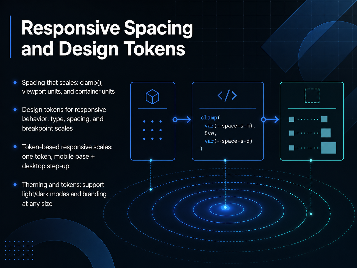
2 min - 11Responsive Spacing and Design TokensLet's talk about the white space that holds everything together. Responsive spacing is just as critical as your grid. Instead of fixed values, we use modern CSS functions like clamp to set a minimum, preferred, and maximum size. Viewport units, like v w and v h, let margins scale with the screen, while container units keep elements relative to their parent. This creates breathing room that feels intentional at every size. To manage this systematically, we define design tokens. These are abstract variables for type, spacing, and breakpoint scales. Think of it as a single source of truth. You set a mobile base size and a desktop step-up, then the token dynamically calculates the in-between. This same logic extends to theming. Your spacing tokens can adapt to light and dark modes, and adjust to branding without hard-coding new values. It keeps your visual language consistent and your code maintainable. Up next, we'll see how to bring all of this to life in a design handoff and developer collaboration.
 2 min
2 min - 12Design Handoff and Developer CollaborationLet's talk about the handoff, where our responsive intent becomes a built reality. Clear documentation is everything here. Don't just hand over static mockups. Instead, document how each component reflows at every single breakpoint. Annotate the column counts, the grid behavior, spacing tokens, and the specific component variants for each screen. To reduce ambiguity, use the tools we have. Figma's auto layout and constraints can model real CSS behavior. And annotation plugins let you specify rules directly on the canvas. The most common friction points are missing breakpoint documentation, ambiguous spacing, and unstated rules that developers have to guess. We can eliminate that. The strongest bridge is syncing your Figma tokens directly to CSS custom properties. This creates a single source of truth from design to production. Next, let's look at how to test and iterate these responsive layouts to make sure they hold up.
 2 min
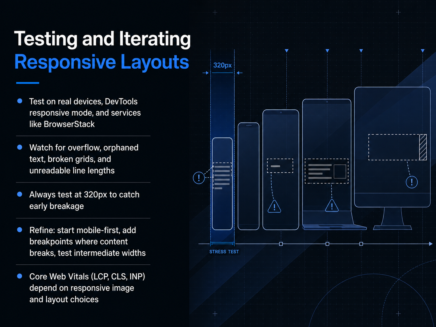
2 min - 13Testing and Iterating Responsive LayoutsLet's get into the real-world testing workflow that catches issues before your users do. First, diversify your testing environment. Real devices are essential for feeling touch targets and actual performance, but you should also use DevTools responsive mode for quick checks and services like BrowserStack for the device-and-browser combinations you don't own physically. As you test, actively hunt for the common culprits: horizontal overflow, orphaned text that breaks the reading flow, grids that collapse unexpectedly, and line lengths that stretch beyond a comfortable sixty to seventy-five characters. Always, without exception, test at a three hundred and twenty pixel viewport width to catch the earliest breakage. From there, your refinement process should be mobile-first. Start with the smallest screen, then progressively widen the viewport. Add a breakpoint only where the content actually breaks, and test those intermediate widths to make sure the layout doesn't fall apart between your major breakpoints. Finally, remember that your layout choices directly impact Core Web Vitals. Huge, unoptimized images crush your Largest Contentful Paint, and layout shifts from late-loading content will ruin your Cumulative Layout Shift score. Next, we'll look at how these practices scale into full responsive design systems.
 2 min
2 min - 14Responsive Design Systems and ScalingNow, let's talk about scaling these decisions through a design system. The goal is to embed responsive rules directly into reusable components, so a card behaves consistently whether it's in a sidebar, a grid, or a hero section. Start by defining tokens for spacing, type scale, and breakpoints that every component inherits. This removes guesswork and keeps the rhythm of your layout intact across screen sizes. For container-aware components, think of a card that switches from a horizontal layout in a wide grid to a stacked layout in a narrow sidebar, responding to its parent rather than just the viewport. To keep this system trustworthy, govern it with clear documentation, automated visual regression tests, and a structured design handoff workflow. Finally, consider how these structured tokens and rules will prepare your team for AI-assisted responsive design, where interfaces can adapt even more contextually and intelligently. Speaking of putting the system into practice, let's move on to putting it all together in a responsive design workflow.
 2 min
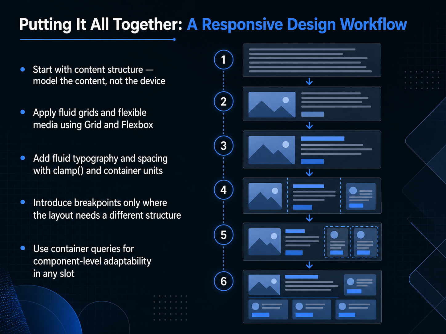
2 min - 15Putting It All Together: A Responsive Design WorkflowWhat does this look like when you put it all together? Let's walk through a responsive design workflow that starts with the right priorities. First, model the content structure, not the device. Decide what the information hierarchy is before you think about any screen size. Once that structure is solid, apply fluid grids and flexible media using Grid and Flexbox. This lets your layout breathe and adapt naturally. Next, add fluid typography and spacing with clamp and container units so text and white space scale smoothly without abrupt jumps. Now, introduce breakpoints only where the layout genuinely needs a different structure. Don't sprinkle them everywhere. Finally, use container queries for component-level adaptability in any slot. This makes individual modules responsive regardless of the viewport width. The result is a resilient, content-first design system that works across every context. Let's lock this in with our final slide on key takeaways and next steps.
 2 min
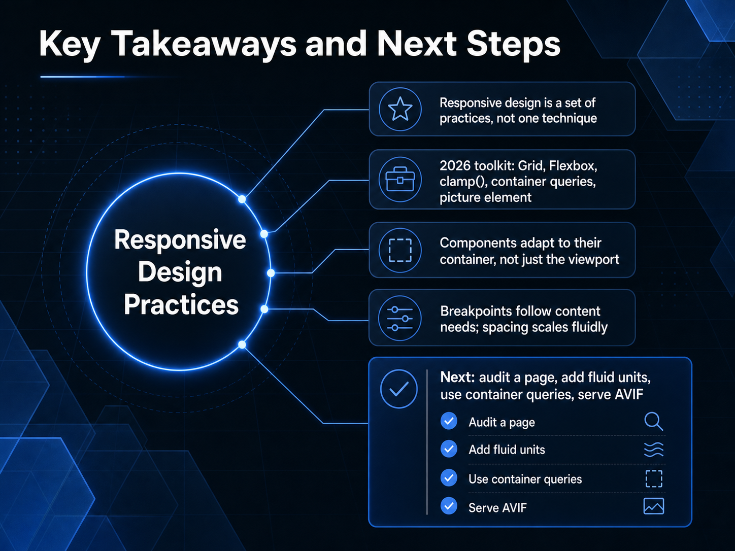
2 min - 16Key Takeaways and Next StepsWe've covered a lot of ground together, so let's anchor ourselves in the key takeaways before you head into your next project. First, responsive design isn't a single technique you can just bolt on. It's a suite of practices, a mindset for building flexible systems. Your two thousand twenty-six toolkit is powerful and precise: lean on CSS Grid for page-level structure, Flexbox for component alignment, clamp for fluid typography, container queries for context-aware modules, and the picture element with AVIF for sharp, fast-loading images. A core shift is this: components adapt to their container, not just the viewport. And breakpoints should follow content needs, while spacing scales fluidly with the user's screen. For your next step, I'd like you to try a practical exercise. Pick one page and audit its responsiveness. Then, swap in some fluid units, introduce a container query, and serve an AVIF image. Those small changes build lasting skill. Thank you for diving deep into responsive layouts with me. You have the tools and the vision, now go make the web feel effortless, everywhere.
 2 min
2 min
Take the deck with you
Download this course as a file — free, no sign-up needed.
- PDF handoutEvery slide page, ready to print or share.17 pages · 3.7 MBDownload
- Narrated PowerPointThe deck that presents itself — every slide carries the digital human's narration video.17 pages · 14.8 MBDownload
- PowerPoint slidesThe full deck as a .pptx — open it in PowerPoint, Keynote, or Google Slides.17 pages · 3.6 MBDownload
Free to use in your own training — please keep the PersonWise credit page at the end.
Have your own deck? Turn it into a course
Sources consulted
Web sources consulted while building this course.
- Responsive web design - Learn web development | MDN — developer.mozilla.org
- Responsive Web Design Best Practices: Complete Guide [2026] — simpalm.com
- What Is Responsive Web Design (RWD)? A Practical, Modern Guide (2026) – TheLinuxCode — thelinuxcode.com
- What is responsive web design: a developer's guide — cantydigital.com.au
- Responsive Web Design 2026: Principles, Best Practices — startdesigns.com