Begin
14 pages · ~28 min
Graphic Design Portfolio Websites
This training teaches graphic designers how to build effective portfolio websites that showcase their work and attract clients.
A digital instructor presents all 14 pages. Hold “Ask” at any point and ask out loud — the answer comes from this course. No sign-up needed.
What you’ll learn
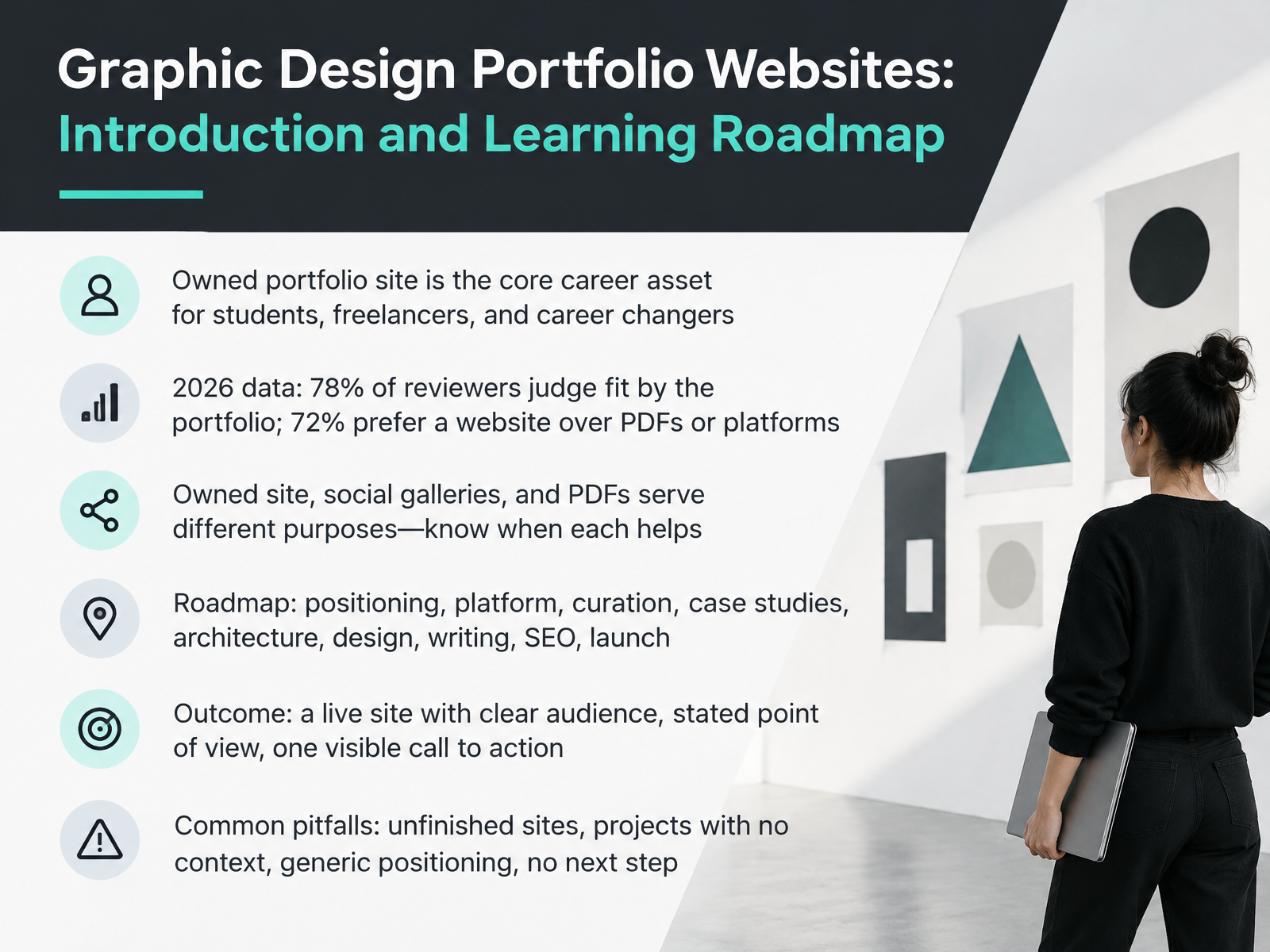
- 01Graphic Design Portfolio Websites: Introduction and Learning RoadmapWelcome. I'm glad you're here. This course helps you build a graphic design portfolio website that gets you interviews, clients, and clearer direction. You don't need a big budget or a perfect body of work. You need a site that shows how you think. In twenty twenty-six, seventy-eight percent of reviewers say the portfolio decides role fit, and seventy-two percent prefer a website over PDFs or platforms. Owned sites, social galleries, and PDFs each serve a purpose, so know when each helps. Together, we'll work through positioning, platform choice, curation, case studies, architecture, design, writing, search visibility, and launch. The goal is one live site with a clear audience, a stated point of view, and one visible call to action. Watch for common pitfalls: unfinished sites, projects without context, generic positioning, and no clear next step. Next, let's look at what reviewers actually judge, and how fast.adobe.designthecrit.cogrigora.co+22 min
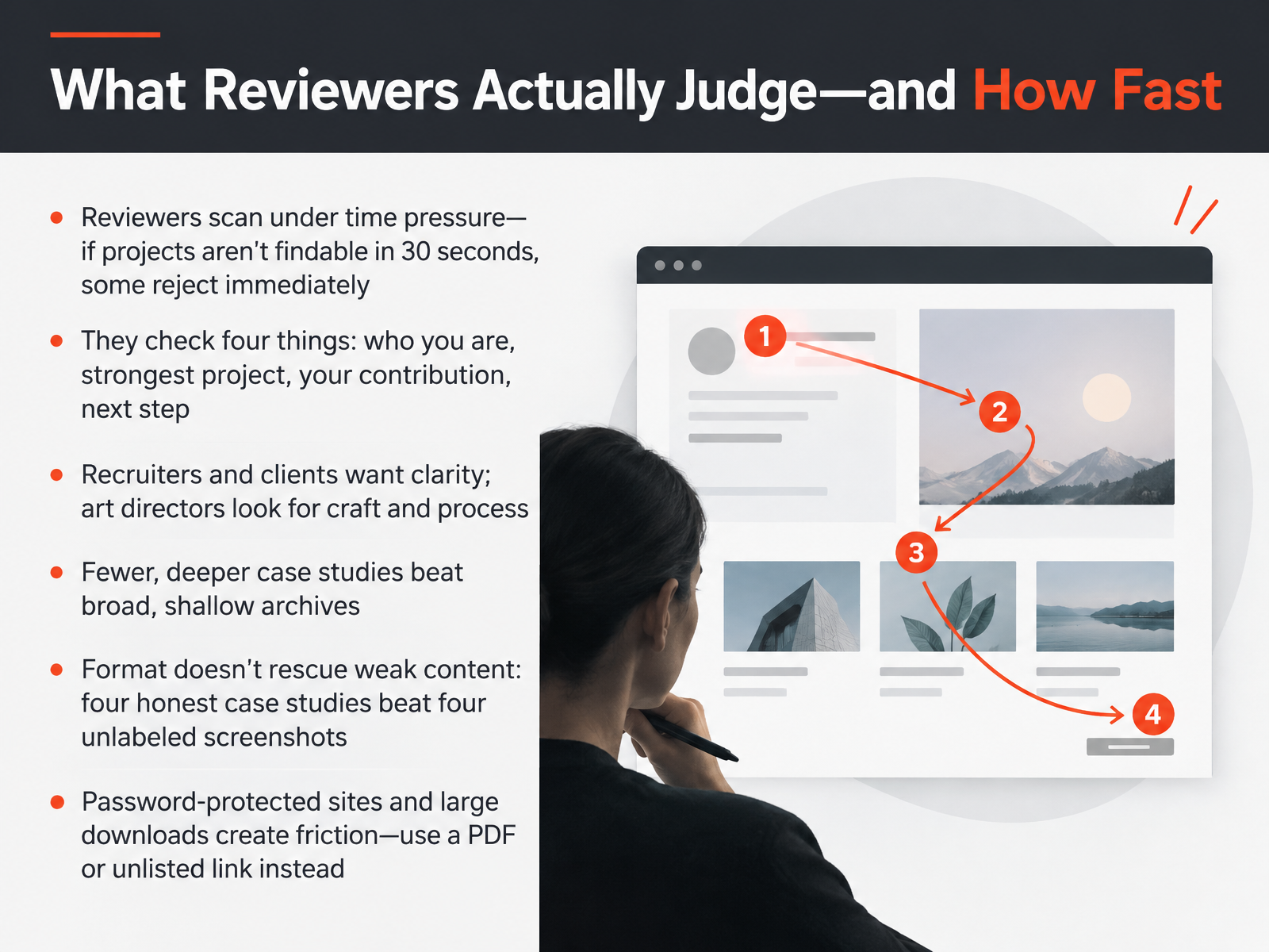
- 02What Reviewers Actually Judge—and How FastLet's talk about how reviewers actually judge your portfolio, and how fast they move. Many scan under real time pressure. If they can't find your projects within thirty seconds, some reject the site immediately. So make four things obvious: who you are, your strongest project, what you personally contributed, and the next step. Recruiters and clients want clarity. Art directors look for craft and process. Choose fewer, deeper case studies over a broad, shallow archive. Remember that format won't rescue weak content. Four honest case studies beat four unlabeled screenshots. Finally, remove friction. Password-protected sites and large downloads slow people down. Share a PDF or an unlisted link instead. Next, let's define your audience, goal, and positioning.
 adobe.designthecrit.cogrigora.co+21 min
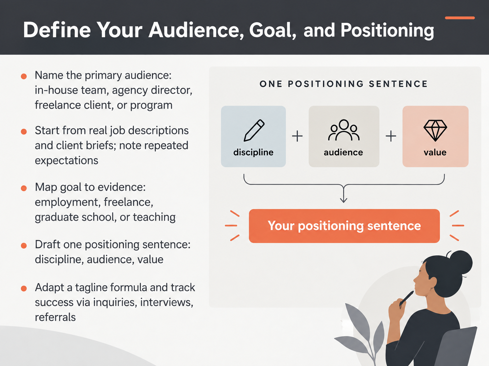
- 03Define Your Audience, Goal, and PositioningLet's talk about the foundation underneath every portfolio decision: knowing who you're speaking to and why. First, name your primary audience. Is it an in-house team, an agency director, a freelance client, or a graduate program? Next, start from real job descriptions and client briefs. Open a few postings you'd genuinely want, then note the expectations that repeat, such as systems thinking or brand craft. Map your goal to evidence. Employment calls for shipped work and clear outcomes. Freelance work rewards niche clarity. Graduate school and teaching value process and writing. Then draft one positioning sentence: your discipline, your audience, and the value you bring. You can adapt a tagline formula, something like action plus target plus outcome. Finally, track success through inquiries, interviews, and referrals. Next, choose a platform, domain, and professional email.
 thecrit.coframer.comstephenrollestone.com+22 min
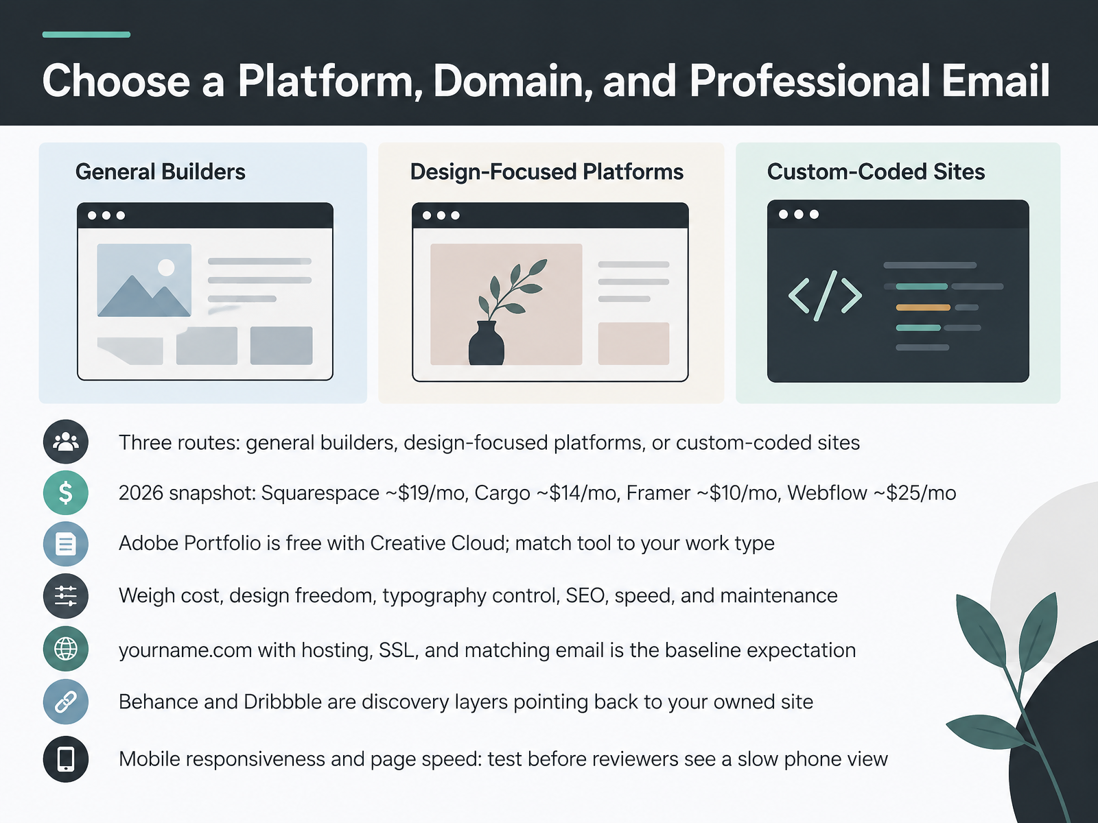
- 04Choose a Platform, Domain, and Professional EmailNow let's look at where your portfolio actually lives. You have three routes. General builders like Squarespace, design-focused platforms like Cargo and Framer, or a fully custom-coded site. As a snapshot for 2026, Squarespace runs about nineteen dollars a month, Cargo about fourteen, Framer about ten, and Webflow about twenty-five. If you have Creative Cloud, Adobe Portfolio is free, so start there with a limited budget. Match the tool to your work. Motion-led projects suit Framer, while web design benefits from Webflow's flexibility.
Weigh cost, design freedom, typography control, search visibility, speed, and ongoing maintenance. Then reserve your name dot com with hosting, an SSL certificate, and a matching email address. Reviewers treat that as the baseline. Behance and Dribbble are discovery layers, so point them back to your own site. Before you share anything, test on your phone. Check mobile responsiveness and page speed, because a slow phone view can cost you a review.
Next, let's select and curate the work.
 tinyctl.devtoolradar.comcolorlib.com+22 min
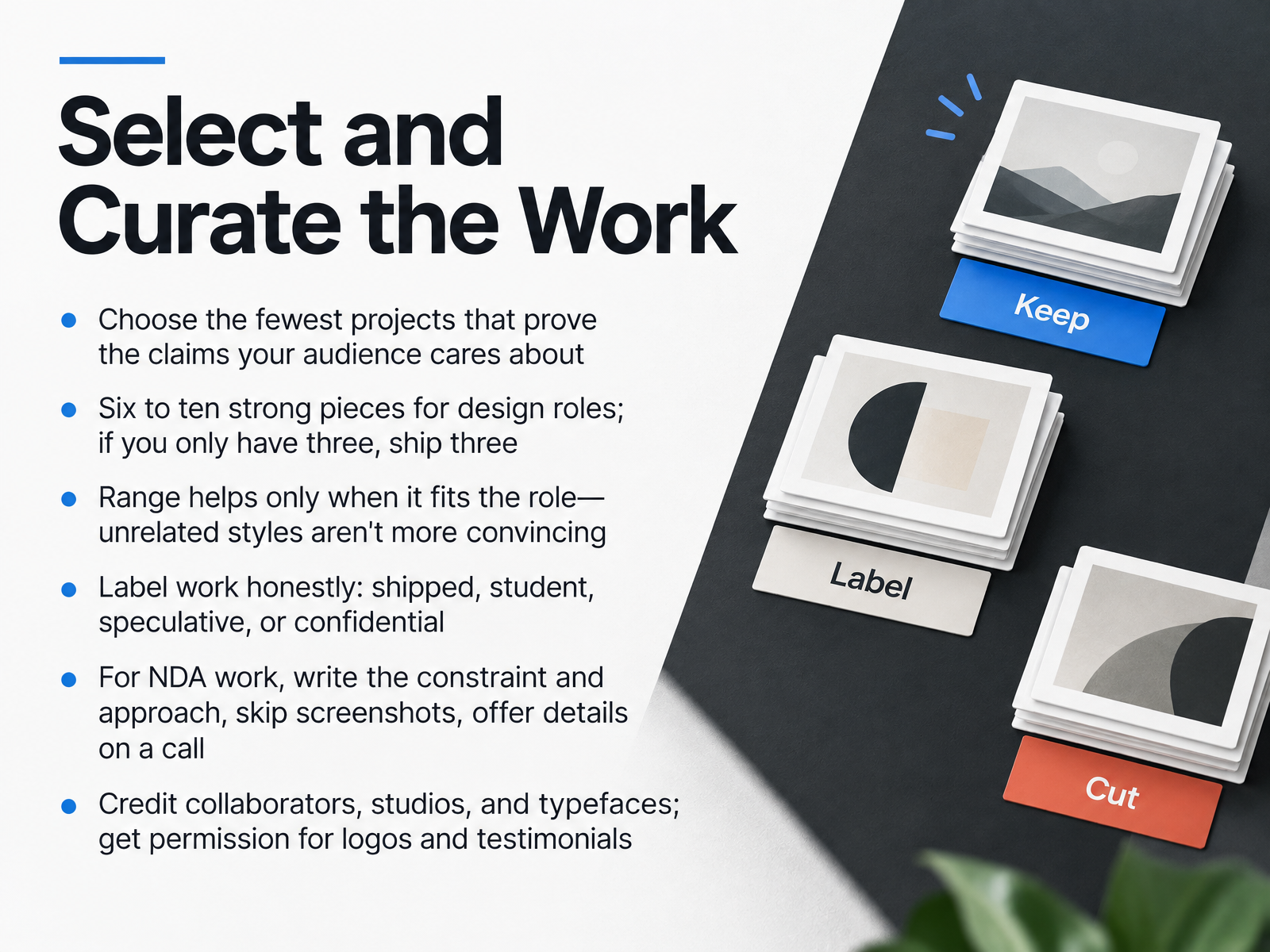
- 05Select and Curate the WorkLet's talk about selecting and curating the work. Choose the fewest projects that prove the claims your audience cares about. Six to ten strong pieces works for design roles, and if you only have three, ship three. Range helps only when it fits the role, so skip unrelated styles that don't convince anyone. Label each piece honestly as shipped, student, speculative, or confidential. For NDA work, write the constraint and your approach, skip screenshots, and offer details on a call. Credit collaborators, studios, and typefaces, and get permission before posting logos or testimonials. Next, we'll look at how to structure case studies that show thinking.
 adobe.designthecrit.cogrigora.co+21 min
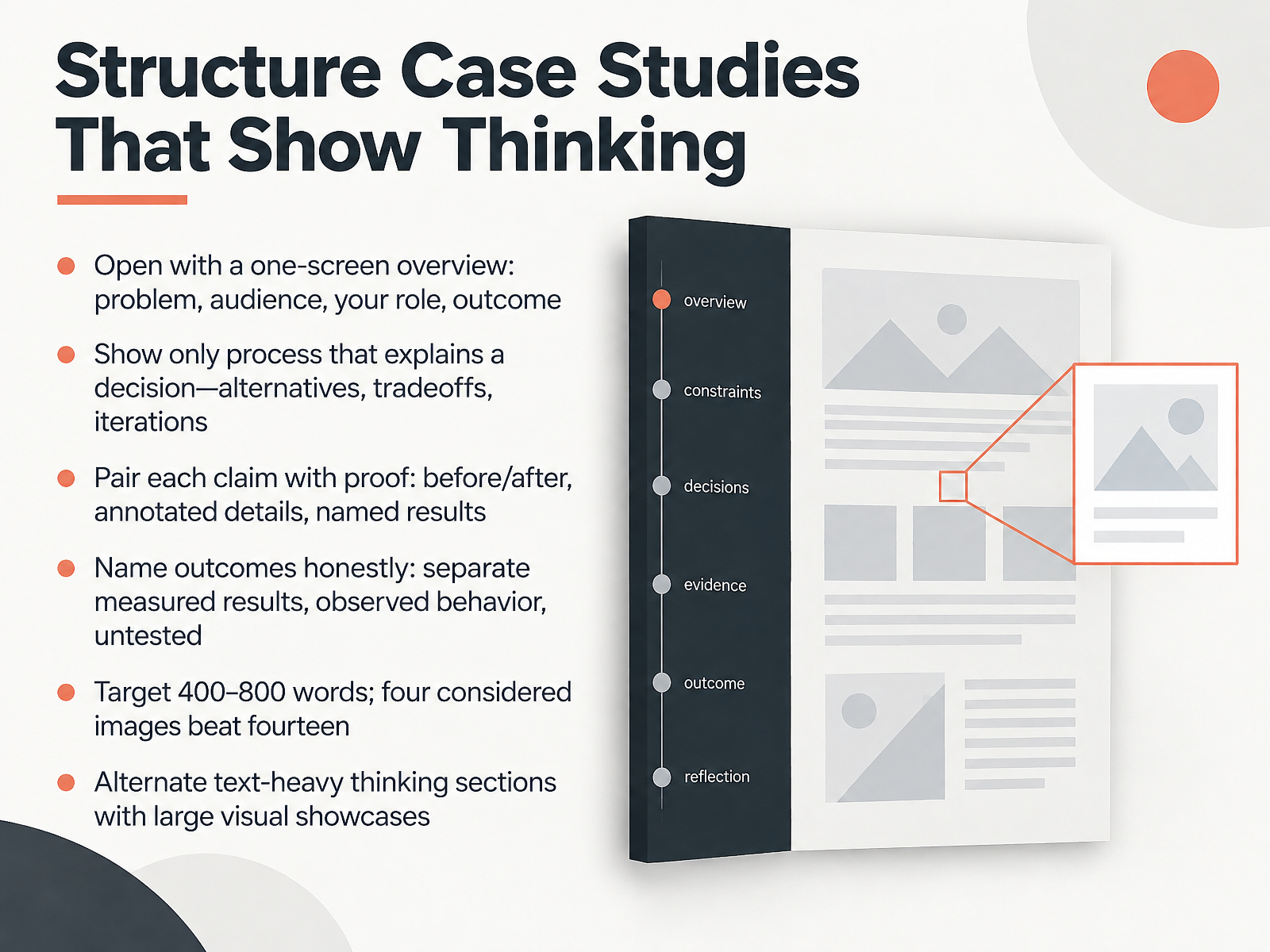
- 06Structure Case Studies That Show ThinkingNext, let's structure case studies that actually show your thinking. Start with a one-screen overview covering the problem, audience, your role, and the outcome. A hiring manager should grasp the whole project in seconds. Then show only the process that explains a decision, like alternatives, tradeoffs, or iterations. Pair every claim with proof: a before and after, an annotated detail, or a named result. Name outcomes honestly, and separate measured results from observed behavior and things still untested. A plain page with four honest case studies beats a beautiful one full of screenshots. Aim for four hundred to eight hundred words, because four considered images beat fourteen. Alternate text-heavy thinking sections with large visual showcases. Now let's move into site architecture, navigation, and browsing UX.
 adobe.designthecrit.cogrigora.co+22 min
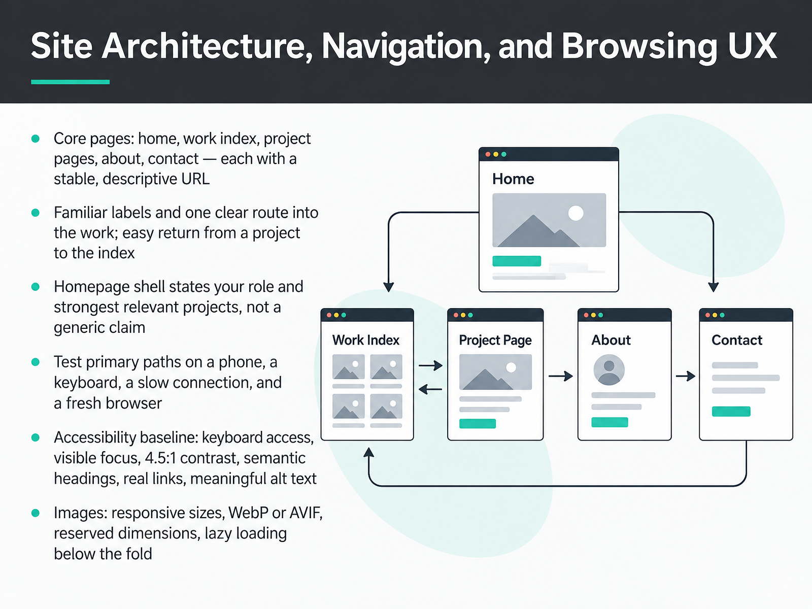
- 07Site Architecture, Navigation, and Browsing UXNext, let's shape how people move through your site. Start with five core pages: home, work index, project pages, about, and contact. Give each a stable, descriptive URL, like work slash brooklyn-bakery-branding rather than project seven. Use familiar labels and one clear route into the work. Then make returning easy, so a reviewer can get from a project back to the index in one click. On your homepage, state your role and your strongest relevant projects, not a generic claim. If you have limited time, keep the structure simple first. Then test the primary paths on a phone, with a keyboard, on a slow connection, and in a fresh browser. For accessibility basics, check keyboard access, visible focus, four point five to one contrast, semantic headings, real links, and meaningful alt text. For images, serve responsive sizes in WebP or AVIF, reserve dimensions to prevent layout shift, and lazy load below the fold. Next, we'll look at Performance and Accessibility Essentials.
 thecrit.coaccessibility.huit.harvard.eduthecrit.co+22 min
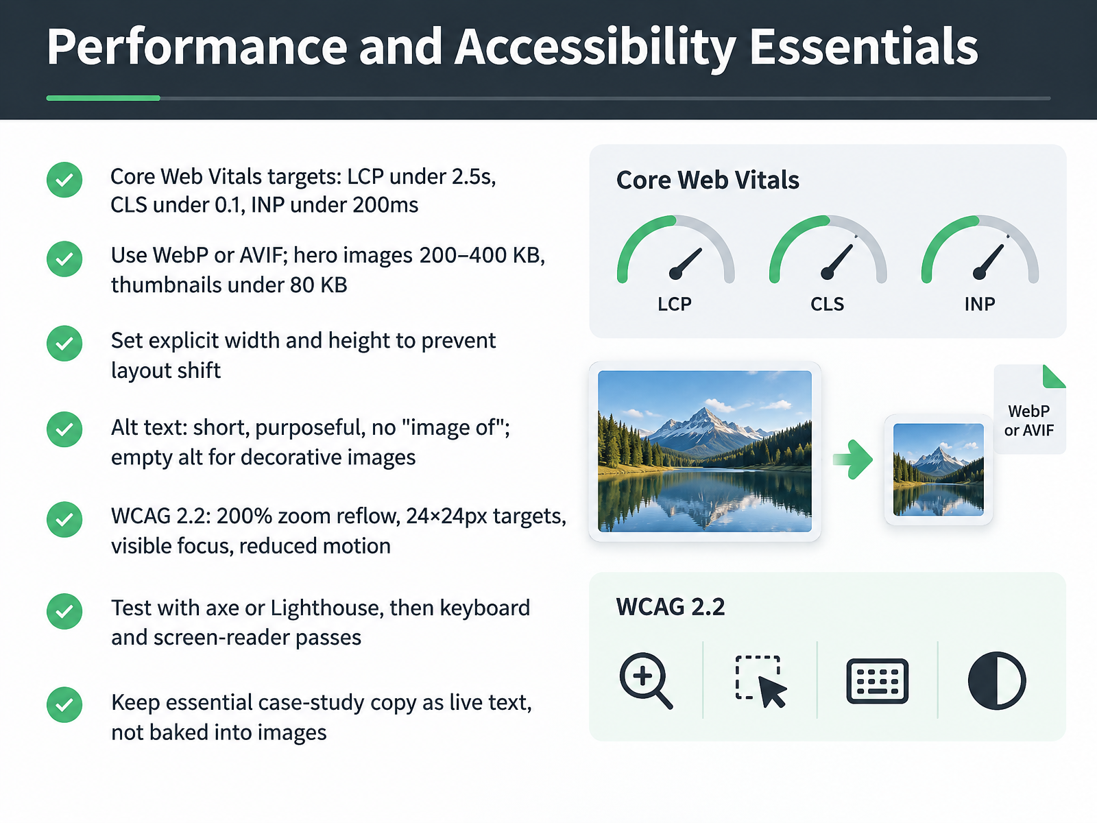
- 08Performance and Accessibility EssentialsNext, let's make your portfolio fast and accessible, because reviewers notice both. Aim for Largest Contentful Paint under two point five seconds, layout shift under zero point one, and interaction response under two hundred milliseconds. Export hero images as WebP or AVIF, kept between two hundred and four hundred kilobytes, with thumbnails under eighty kilobytes. Set explicit width and height on every image so nothing jumps while the page loads. Write short, purposeful alt text, and skip phrases like image of. For decorative images, leave the alt attribute empty. Meet WCAG two point two by testing two hundred percent zoom reflow, twenty four pixel targets, visible focus, and reduced motion. Run axe or Lighthouse first, then do a keyboard pass and a screen reader pass. Finally, keep essential case-study copy as live text, not baked into images. These checks take an afternoon, and they keep your work readable for every reviewer, including the hiring manager on a slow phone. Speaking of which, let's look at visual design and typography for the portfolio itself.
 thecrit.coaccessibility.huit.harvard.eduthecrit.co+22 min
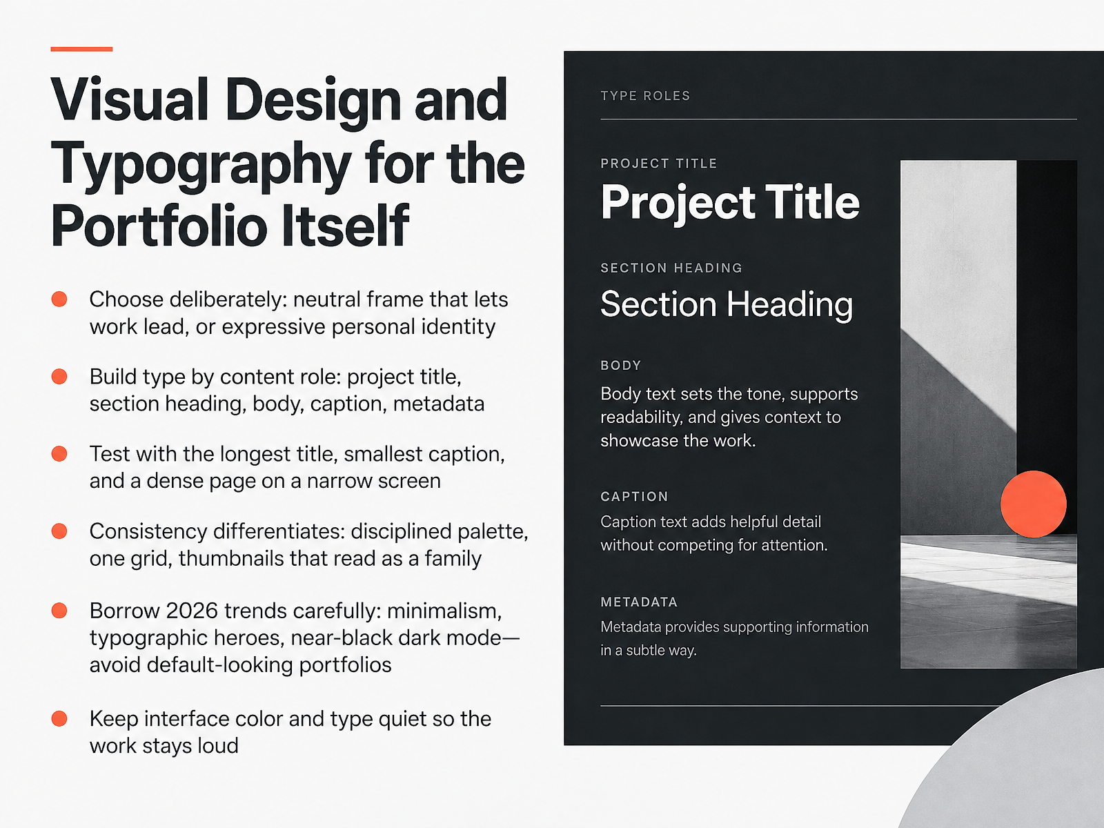
- 09Visual Design and Typography for the Portfolio ItselfNow let's talk about the look of the portfolio itself. Decide deliberately between a neutral frame that lets your work lead, or an expressive identity that signals your taste. Either can work, so choose with intent. Next, build type by content role: project title, section heading, body, caption, and metadata. Give each one a job, and name the style by its purpose. Then test with real pressure: the longest project title, the smallest caption, and a dense page on a narrow screen. Consistency is what differentiates you. Keep a disciplined palette, one grid, and thumbnails that read as a family. Borrow the 2026 trends carefully, like minimalism, typographic heroes, and near-black dark mode, but avoid portfolios that look default. Keep interface color and type quiet so the work stays loud. A recruiter scanning between meetings should see your projects first, not your layout. So before you present to a client or reviewer, run that test and let your work carry the pitch. Next, we move on to writing the homepage, about page, and project copy.
 framer.comadobe.designthecrit.co+22 min
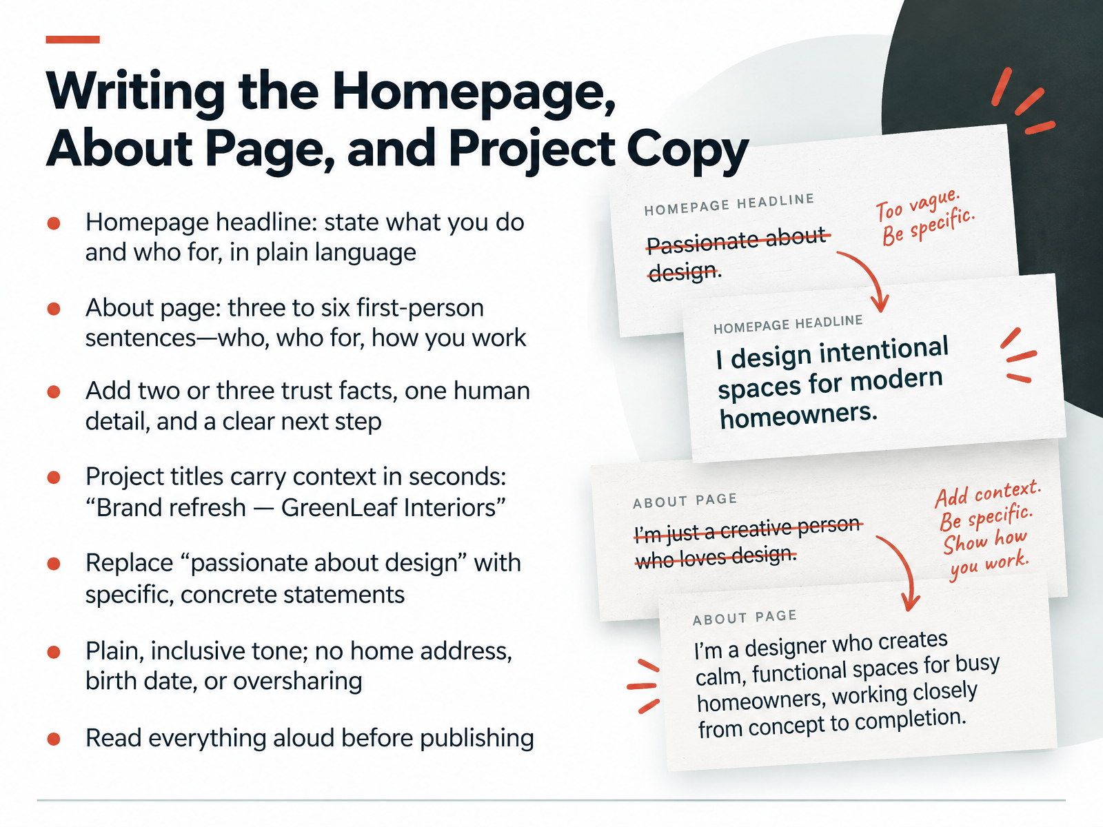
- 10Writing the Homepage, About Page, and Project CopyNow let's write the words. Start with your homepage headline. State what you do and who for, in plain language. Your About page can be three to six first-person sentences covering who you are, who you work for, and how you work. Then add two or three trust facts, one human detail, and a clear next step like your email. Project titles should carry context in seconds, so write brand refresh, GreenLeaf Interiors. Replace passionate about design with something specific and concrete. Keep your tone plain and inclusive, and leave out your home address, birth date, or anything you would not tell a stranger. Before publishing, read everything aloud. That simple test catches awkward phrasing and shows whether your writing sounds like you talking to someone. Next, we'll look at contact paths and clear calls to action.
 copyexamples.comthecrit.coframer.com2 min
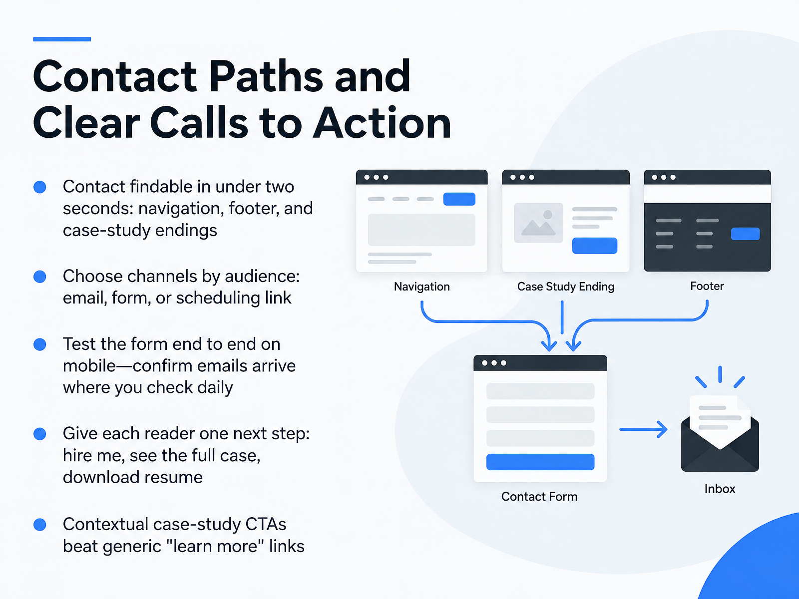
- 11Contact Paths and Clear Calls to ActionNext, let's make sure people can actually reach you. Your contact link should be findable in under two seconds, so place it in the navigation, in the footer, and at the end of each case study. Choose your channels by audience: email for direct pitches, a short form for casual inquiries, or a scheduling link for calls. Then test the form end to end on your phone, and confirm the emails arrive in the inbox you check daily. A recruiter hitting a broken form is the most damaging launch mistake, and it stays invisible until someone finds it. Give each reader one clear next step, like hire me, see the full case, or download my resume. And write contextual calls to action at the end of case studies, which beat a generic learn more link every time. Now let's look at SEO, Metadata, and Discoverability.
 copyexamples.comthecrit.coframer.com1 min
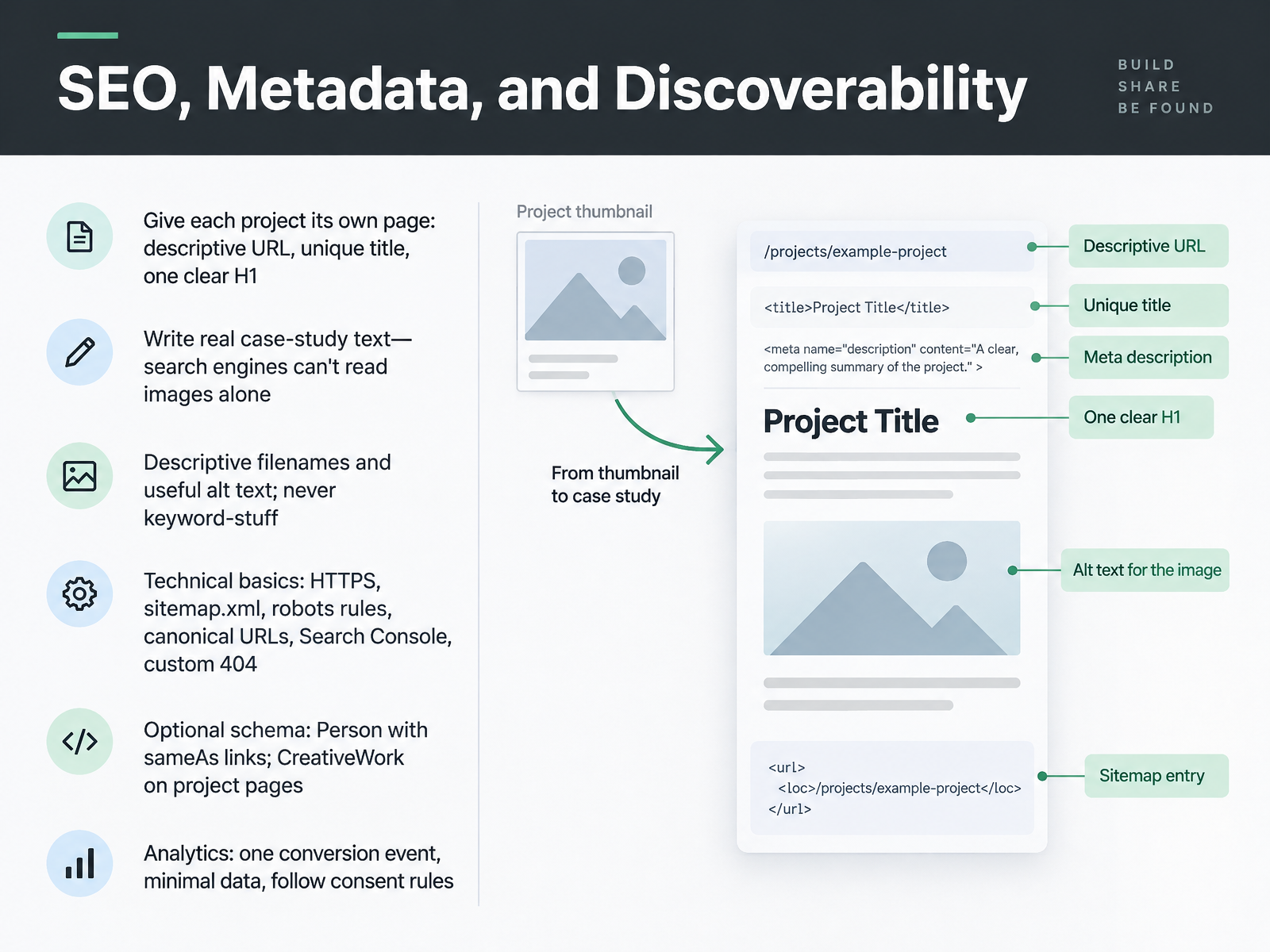
- 12SEO, Metadata, and DiscoverabilityNext, let's make your work findable. Give each project its own page, with a descriptive address like work slash bakery branding, a unique title, and one clear H one. Then write real case study text. Search engines can't read images alone. Clients reading a pitch want that story too. Name files descriptively and write useful alt text, but never stuff keywords. Cover the technical basics: secure HTTPS, a sitemap file, robots rules, canonical addresses, Search Console, and a custom four oh four page. Optionally add schema, a Person entry with sameAs links, and CreativeWork on project pages. Finally, track one conversion event, collect minimal data, and follow consent rules. Do the page structure and text first, and the rest gets easier. Next, we'll look at launch, feedback, and continuous improvement.
 thecrit.cothecrit.coaccessibility.huit.harvard.edu+21 min
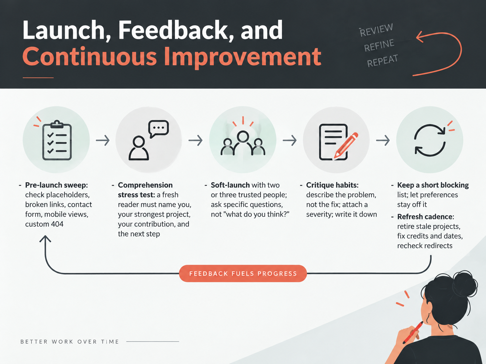
- 13Launch, Feedback, and Continuous ImprovementLet's talk about launch and what comes after it. First, run a pre-launch sweep. Check for placeholder text, broken links, a contact form that actually sends, mobile views, and a custom four oh four page. Then do a comprehension stress test. Ask a fresh reader to name you, your strongest project, your contribution, and the next step. If they stumble, fix the hierarchy, not the reader. Next, soft-launch with two or three trusted people. Ask specific questions, like whether it is clear what you do, instead of what do you think. When you collect critique, describe the problem rather than the fix, attach a severity, and write it down. Keep a short blocking list for broken flows and wrong facts. Let preferences stay off it. Finally, set a refresh cadence. Retire stale projects, fix credits and dates, and recheck redirects. A live portfolio with small issues beats a perfect one that never ships. Next, we'll cover your action plan, rubric, and common pitfalls.
 thecrit.coaccessibility.huit.harvard.eduthecrit.co+22 min
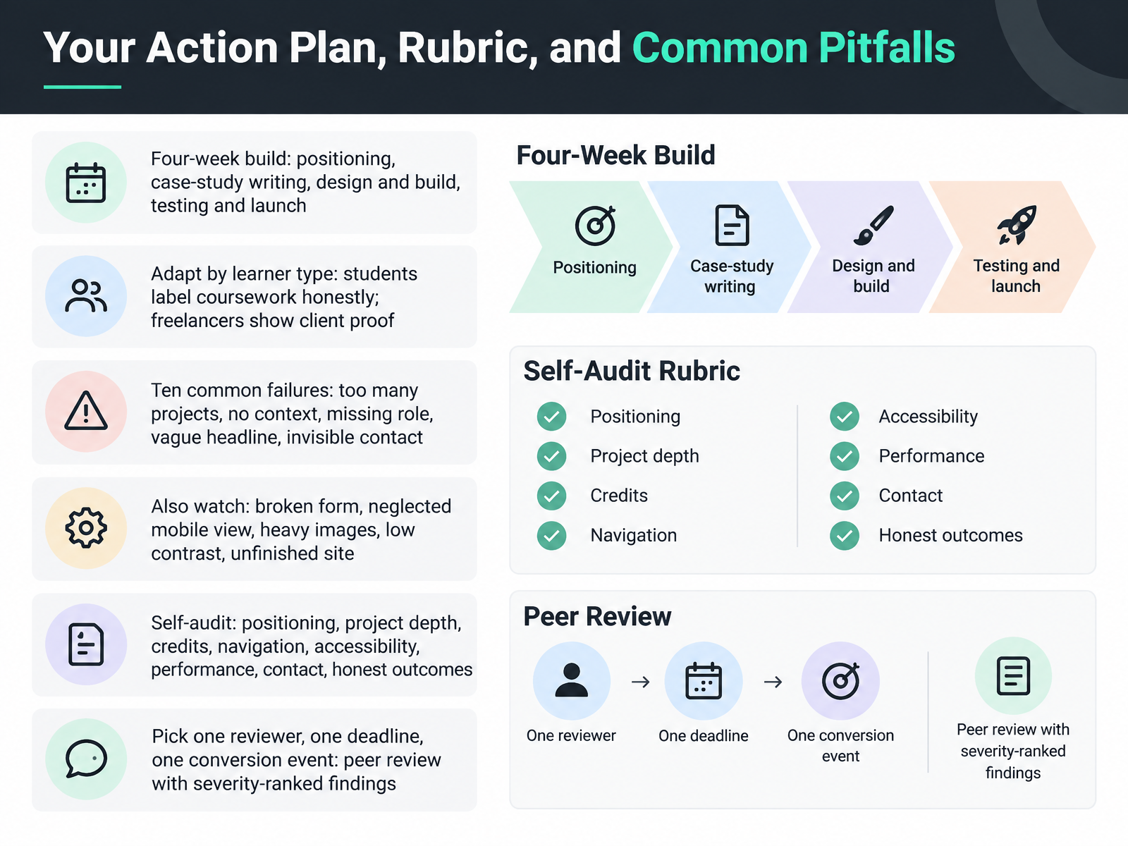
- 14Your Action Plan, Rubric, and Common PitfallsHere is where it all comes together. Give yourself four weeks: first positioning, then case-study writing, then design and build, then testing and launch. Adapt this to your situation. Students, label coursework honestly. Freelancers, show client proof. Avoid the common failures: too many projects, no context, a missing role, a vague headline, and invisible contact details. Also watch the broken form, the neglected mobile view, heavy images, low contrast, and the unfinished site. Then run a self-audit across positioning, project depth, credits, navigation, accessibility, performance, contact, and honest outcomes. Finally, pick one reviewer, one deadline, and one conversion event, then ask for severity-ranked findings. Set the date, ship it, and keep iterating. Your perspective is the work only you can present, so thank you for building with me. Keep going, and launch with confidence.
 adobe.designthecrit.cogrigora.co+21 min
Take the deck with you
Download this course as a file — free, no sign-up needed.
- PDF handoutEvery slide page, ready to print or share.15 pages · 3.2 MBDownload
- Narrated PowerPointThe deck that presents itself — every slide carries the digital human's narration video.15 pages · 13.0 MBDownload
- PowerPoint slidesThe full deck as a .pptx — open it in PowerPoint, Keynote, or Google Slides.15 pages · 3.2 MBDownload
Free to use in your own training — please keep the PersonWise credit page at the end.
Have your own deck? Turn it into a course
Sources consulted
Web sources consulted while building this course.
- Ask Adobe Design: How can applicants stand out when applying to design jobs? — adobe.design
- The Complete Design Portfolio Guide (2026): From Zero to Hired — thecrit.co
- Do Recruiters Look at Portfolio Websites? The Evidence — grigora.co
- What format should your portfolio be in 2026? — creativelivesinprogress.com
- Puente | Remote Graphic Designer Jobs — puentetalent.com
- Portfolio Tagline Examples: 50+ Real Headlines That Work (2026) — thecrit.co
- 12 of our favorite graphic design portfolio examples in 2026 — framer.com
- Montreux – Stephen Rollestone — stephenrollestone.com
- About us examples for graphic designers — copyexamples.com
- 7 design portfolio examples that win work | Pitch — pitch.com
- Best Website Builders for Designers in 2026: Tested and Ranked — tinyctl.dev
- Best Portfolio Website Builders (2026) | Toolradar — toolradar.com
- 10 Best Free Portfolio Website Builders 2026 (Tested and Compared) - Colorlib — colorlib.com
- Best Graphic Design Portfolio Websites: Where to Host Your Work (2026) — madegooddesigns.com
- Squarespace Alternatives 2026: 8 Portfolio Builders Compared on Price, SEO & Design | popout.page — popout.page
- Image Optimization for Portfolios: Format, Size, Loading, and Alt Text | The Crit — thecrit.co
- Write helpful Alt Text to describe images - Digital Accessibility — accessibility.huit.harvard.edu
- Portfolio Accessibility: A Practical WCAG 2.2 Review | The Crit — thecrit.co
- Authoring Meaningful Alternative Text — section508.gov
- Image SEO Best Practices | Google Search Central — developers.google.com