Designing Status Messages and Alerts
Begin
12 pages · ~24 min
Designing Status Messages and Alerts
Learn to design effective status messages and alerts that provide clear, actionable feedback to users in any application.
What you’ll learn
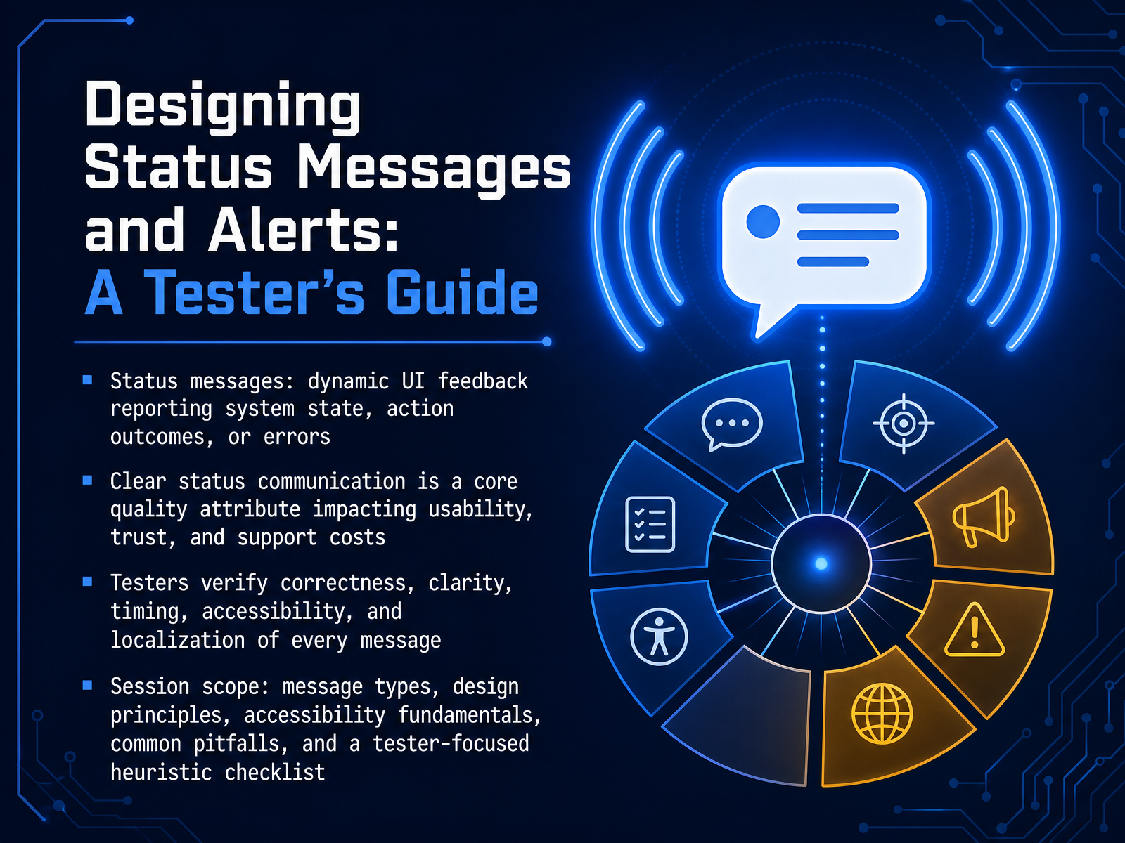
- 01Designing Status Messages and Alerts: A Tester's GuideWelcome to Designing Status Messages and Alerts: A Tester's Guide. By the end of this session, you will know how to evaluate the messages that keep users informed and build their trust. Let's start with the basics. Status messages are dynamic pieces of feedback. They report the system's state, confirm an action, or describe an error. As a tester, clear status communication is a core quality attribute you own. It directly impacts usability, user trust, and even support costs. Throughout this session, we will cover message types, key design principles, accessibility fundamentals, and common pitfalls to avoid. You will also get a practical, tester-focused checklist to use in your daily work. Next, we will explore why visibility of system status is more than just words.developer.mozilla.orga11ypath.comaccessible-data-interfaces.com+21 min
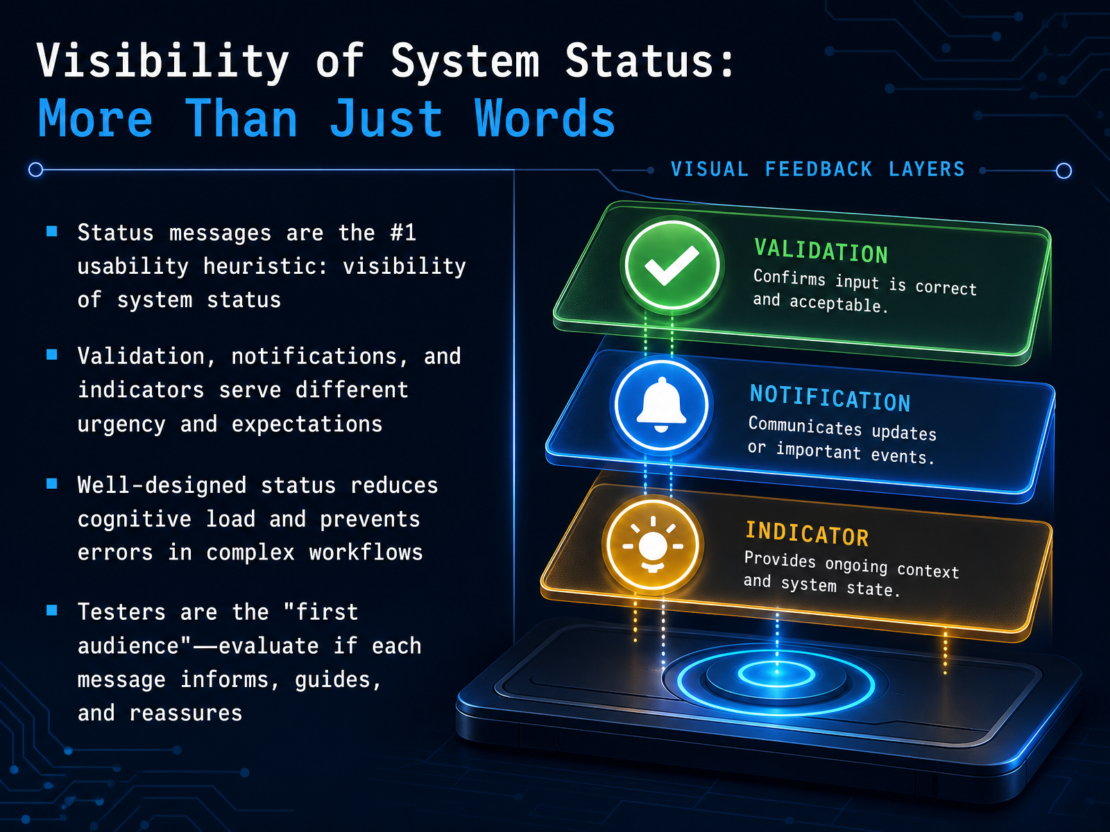
- 02Visibility of System Status: More Than Just WordsNow, let's get into the core of status communication. The slide title says, "Visibility of System Status: More Than Just Words." That's because the first and most fundamental usability heuristic is exactly this: keeping the user informed about what's going on. In software testing, you are the first audience for every message. Your job is to evaluate whether a status message, a validation, or a notification truly informs, guides, and reassures the user. These three serve different purposes. Validations are tied to a user's action, like an error message after a form submission. Notifications are about system-level events, often unrelated to the current task. Indicators are passive and contextual, like a badge showing new activity. A well-designed message reduces cognitive load. It prevents errors in complex workflows by making the right information visible at the right time, without overwhelming the user. As you test, always ask: does this message correctly match its urgency and guide the user forward? Next, we'll move on to how we classify these messages by their type, severity, and persistence.
 nngroup.comdl.acm.orgtoptal.com+22 min
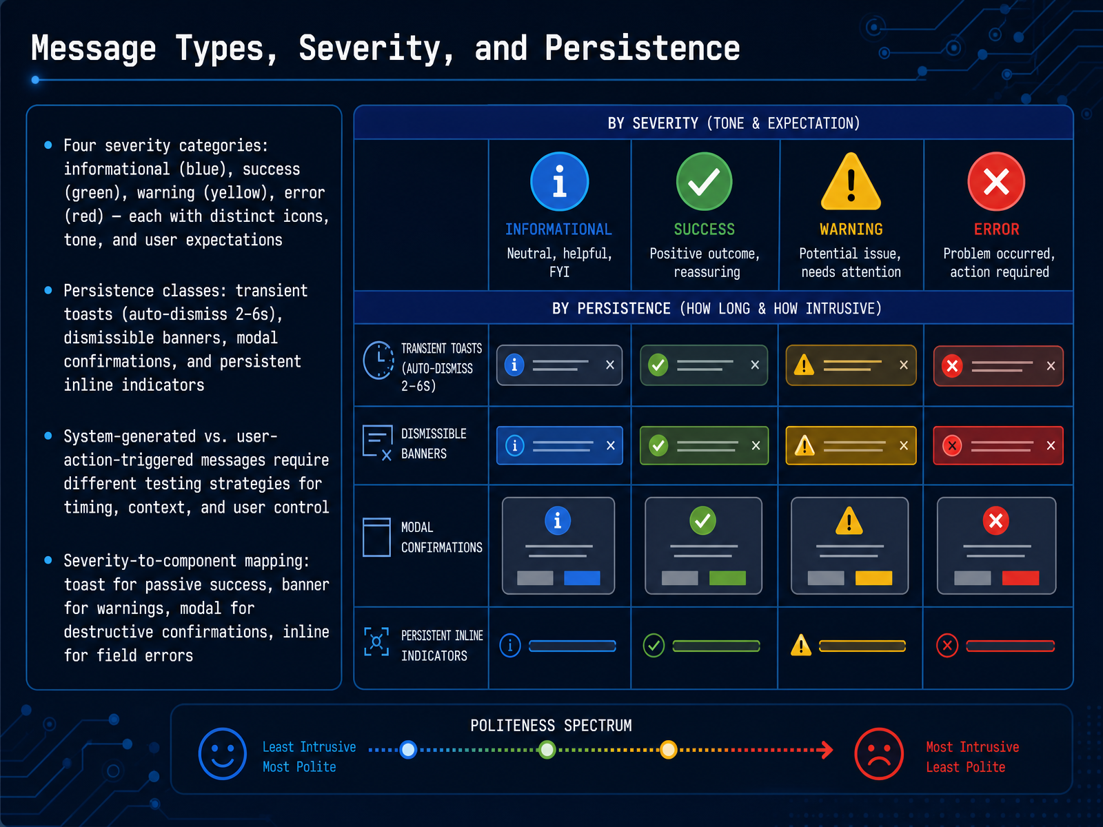
 - 03Message Types, Severity, and PersistenceNow, let's break down the four severity categories you'll use to design status messages. First, informational messages use a blue color with a neutral icon. They provide context but don't require action. Success messages appear in green with a checkmark, confirming an action completed. Warnings are yellow, signaling a potential issue the user should review. Errors are red, indicating a failure that blocks progress. Each color and icon sets a clear user expectation before they read a single word. Next, we classify messages by persistence. Transient toasts auto-dismiss in two to six seconds for passive confirmations. Dismissible banners stay until the user closes them, suitable for warnings. Modal confirmations block the interface for destructive actions, demanding explicit approval. Persistent inline indicators remain next to the relevant field, like a validation error. Testing strategies also change based on the message trigger. System-generated messages need checks for timing and context accuracy. User-action-triggered messages need verification that the correct feedback appears after every possible input. Finally, map severity to the right component. Use a toast for a passive success, a banner for a warning, a modal for a destructive confirmation, and an inline indicator for a field error. This mapping ensures the message's urgency matches its visual weight. Up next, we'll explore the anatomy of a good status message.
 buttondown.comlinkedin.compaste.twilio.design+22 min
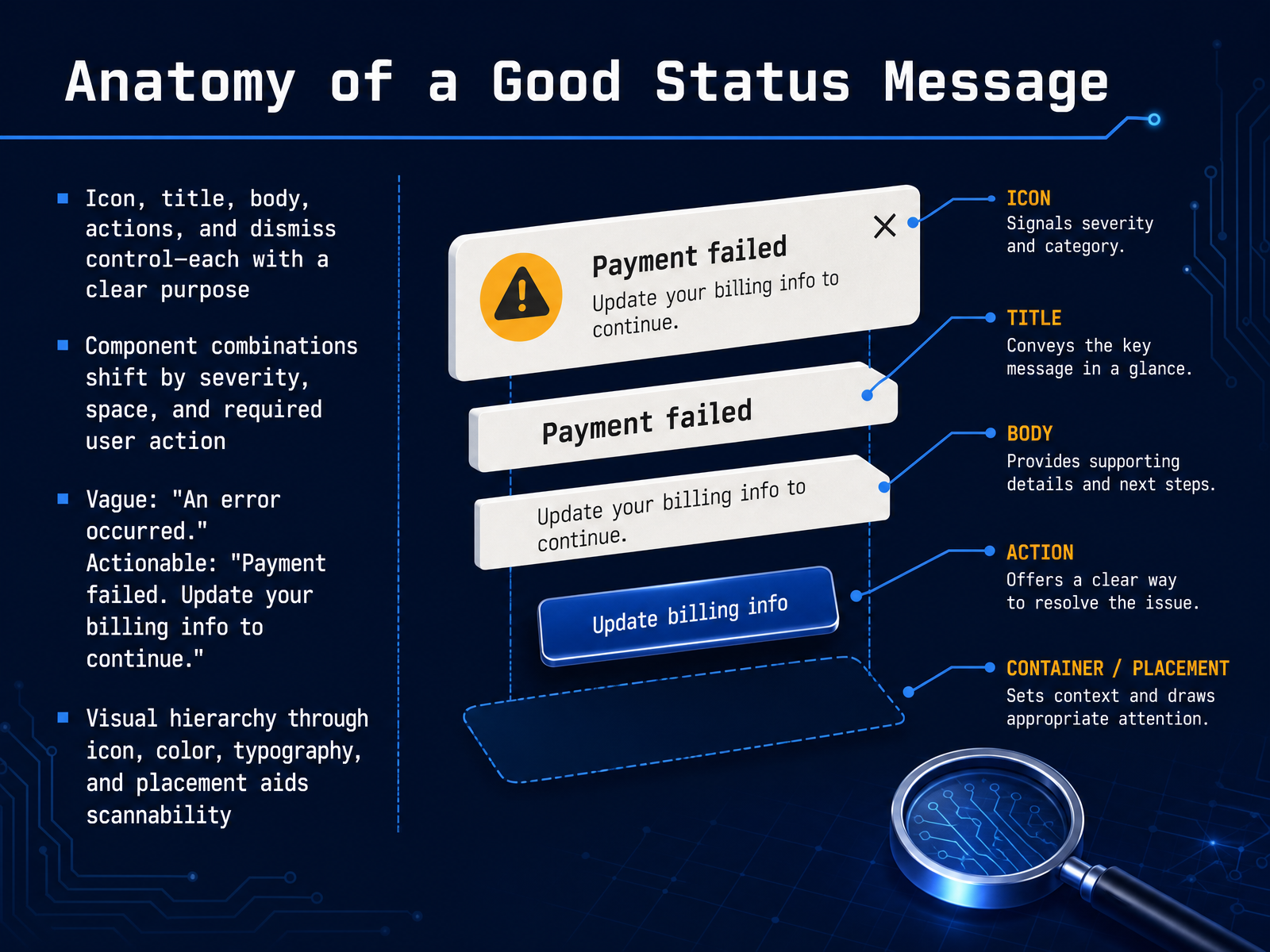
 - 04Anatomy of a Good Status MessageNow let's look at the anatomy of a good status message. Every effective message has five key parts, each with a clear purpose: an icon, a title, the body, possible actions, and a dismiss control. The combination of these components shifts depending on severity, available space, and whether you need to take action. For example, a vague message might say, "An error occurred." An actionable version would say, "Payment failed. Update your billing info to continue." Notice how the second example tells you what happened and what to do next. Visual hierarchy also matters. Use icons, color, typography, and placement together to guide the eye and make the message easy to scan. When you design messages this way, users can quickly understand the situation and respond correctly. Next, we'll explore timing, dismissal, and queue management.
 nngroup.comdl.acm.orgtoptal.com+21 min
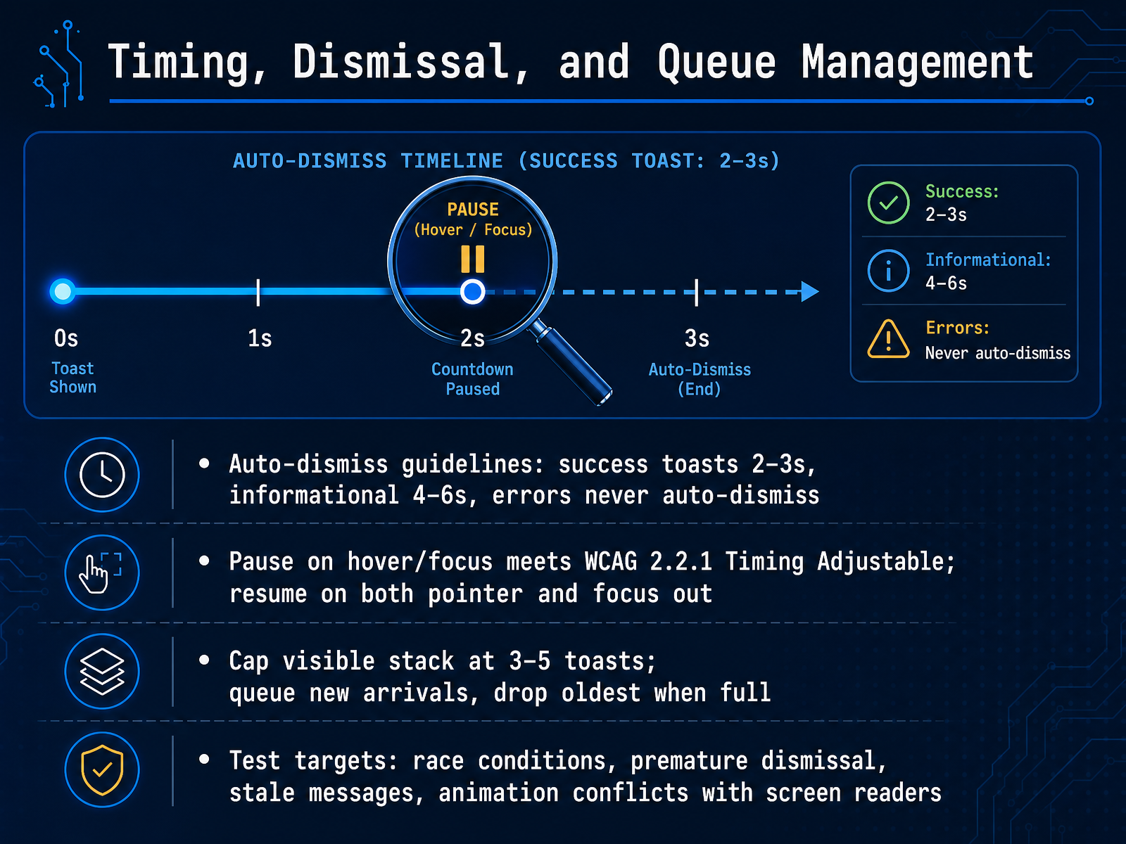
 - 05Timing, Dismissal, and Queue ManagementNow let's get specific about timing, dismissal, and queue management—the mechanics that make status messages reliable and accessible. Auto-dismiss timing is not a single number. Use two to three seconds for brief success confirmations like 'Saved' or 'Copied.' Use four to six seconds for informational messages that contain a little more detail. And never auto-dismiss error messages. Users must be able to read and act on errors at their own pace. Accessibility requires that any auto-dismiss timer pauses when the user hovers or moves focus into the toast. This meets W C A G two point two point one, Timing Adjustable. The timer resumes only after both pointer and focus leave the area. When multiple toasts fire in quick succession, limit the visible stack to three to five toasts. Queue new arrivals and drop the oldest when the queue is full. Now, what should you test? Race conditions where a toast dismisses before the next one appears. Premature dismissal that cuts off the message. Stale messages that show outdated state. And animation conflicts with screen readers that can cause announcements to overlap or repeat. In the next slide, we'll examine core design principles for status messages.
 buttondown.comlinkedin.compaste.twilio.design+21 min
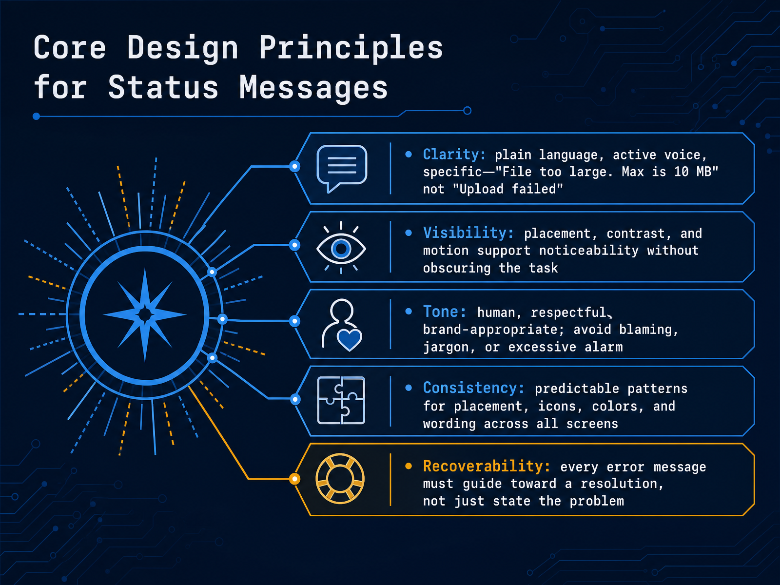
 - 06Core Design Principles for Status MessagesNow let's walk through the core design principles for status messages. Think of these as your checklist every time you craft an alert. First, clarity. Always use plain language and active voice. Instead of a vague 'Upload failed,' guide the user with 'File too large. Max is ten megabytes.' Second, visibility. Your message needs to be noticed, so place it near the related element, use strong contrast, and consider subtle motion. But never let the alert permanently block the user's task. Next, tone. Be human and respectful. Avoid blaming the user, skip technical jargon, and don't sound alarmist for minor issues. Fourth, consistency. Use predictable patterns for placement, icons, colors, and wording across every screen. This builds trust and helps users recognize what each message means instantly. Finally, recoverability. Every error message must guide toward a resolution. Don't just state the problem; provide a clear next step so the user can move forward. Those five principles—clarity, visibility, tone, consistency, and recoverability—are the foundation of effective status communication. Next, we'll apply these ideas to ensure everyone can access your messages, as we cover Accessibility Essentials: WCAG four point one point three and ARIA Live Regions.
 nngroup.comdl.acm.orgtoptal.com+22 min
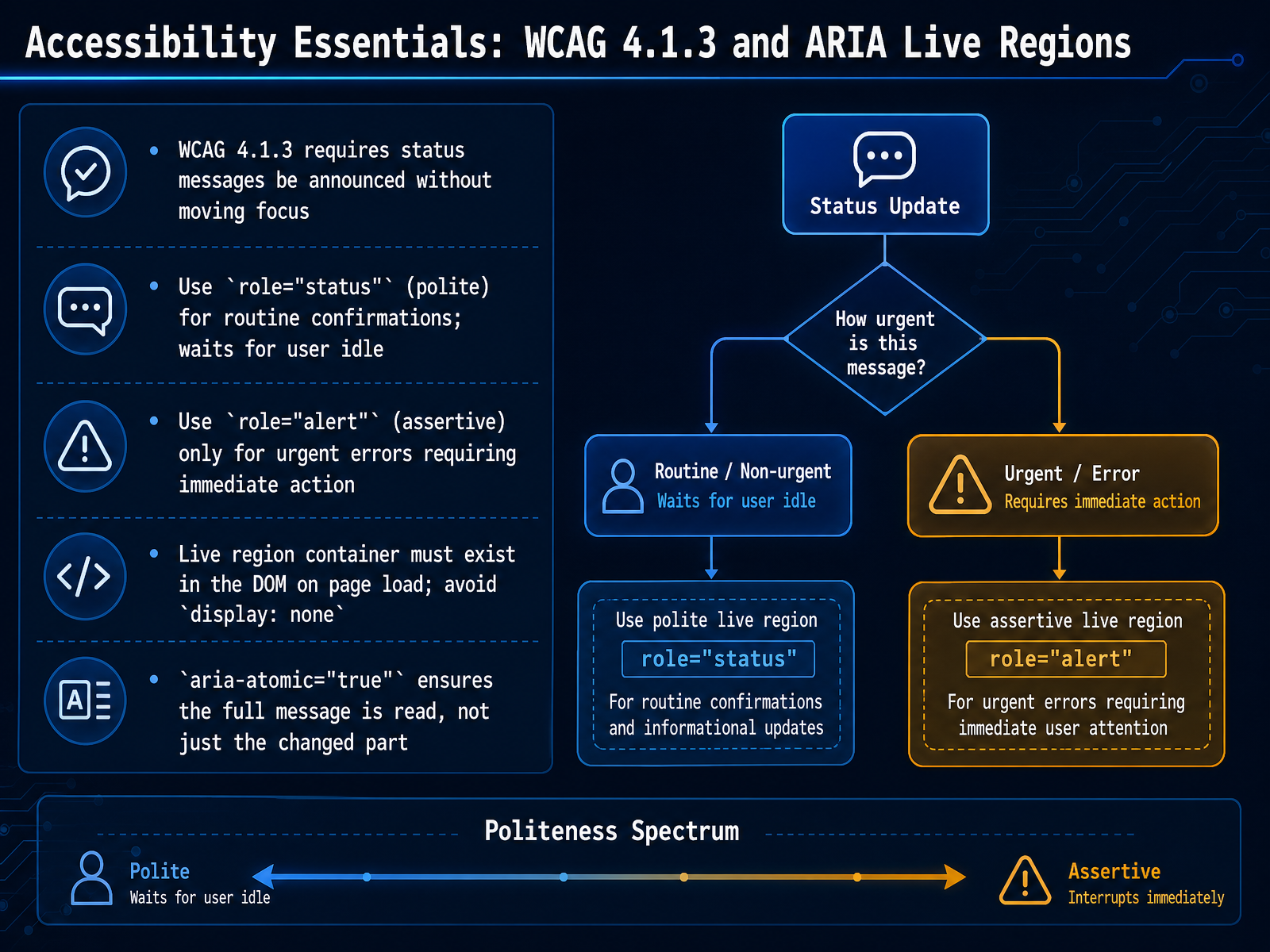
 - 07Accessibility Essentials: WCAG 4.1.3 and ARIA Live RegionsLet's turn now to the accessibility rules that govern status messages: WCAG Success Criterion 4.1.3 and ARIA live regions. This criterion requires that status messages be announced to screen reader users without moving their focus. That means you never yank the user away from their current task just to deliver a confirmation or an error. Instead, you use a live region. For routine confirmations, such as "Saved" or "18 results returned," use the status role, which is polite. It waits until the user is idle before speaking. For urgent errors that block the user from proceeding, such as a session expiry or a payment declined, use the alert role, which is assertive and interrupts immediately. Reserve assertive for truly critical situations; overusing it makes an interface unusable. The live region container must exist in the DOM on page load. If you inject it at the same moment you set the text, screen readers will miss the announcement. So place an empty container in your initial HTML and update its text content later. Also, avoid hiding the container with display none, which removes it from the accessibility tree. Finally, set aria-atomic to true on self-contained messages. This ensures the full message is read, not just the changed word. Use false only for chat logs or feeds where you want only new items announced. Next, we'll put these concepts into practice with Accessibility in Practice: Focus, Keyboard, and Screen Readers.
 developer.mozilla.orga11ypath.comaccessible-data-interfaces.com+22 min
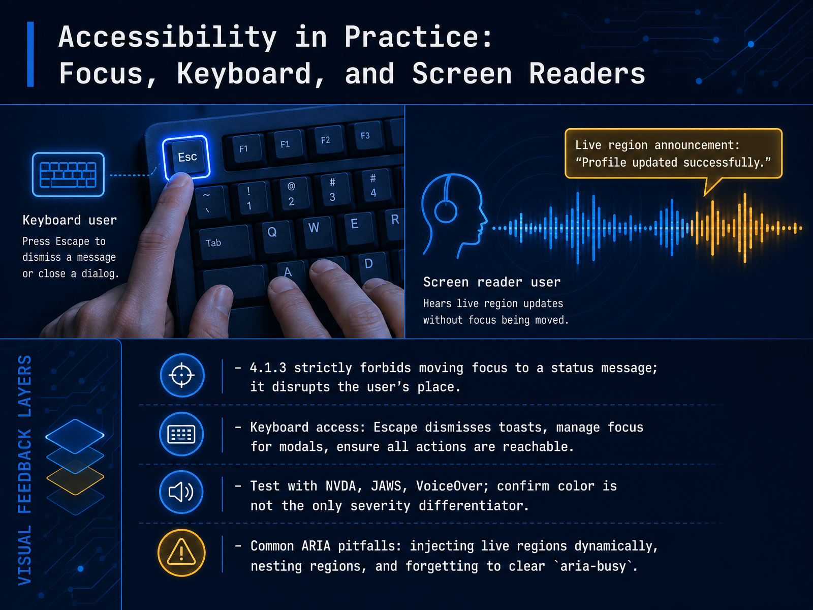
 - 08Accessibility in Practice: Focus, Keyboard, and Screen ReadersLet's now move from theory into practice, and look at what accessible status messages and alerts demand from your keyboard and screen reader testing. Remember, WCAG criterion 4.1.3 strictly forbids moving focus to a status message. That design choice disrupts the user's place, and is actually worse than providing no announcement at all. Instead, the message must be exposed through a live region so the screen reader speaks it while the user stays exactly where they are. When you test keyboard access, confirm that the Escape key dismisses toasts and modals. For modals, verify that focus is managed correctly—trapped inside the modal, and then returned to the triggering element when it closes. You must also ensure that every interactive element is reachable and operable with the keyboard alone. Next, you need to test with real assistive technology. Run your flows through NVDA, JAWS, and VoiceOver to confirm that announcements are reliable. A critical check here is to verify that color is never the only way to differentiate severity. The screen reader must announce the urgency or error state through text, not just a visual color change. Finally, watch out for common ARIA pitfalls. Avoid injecting live regions into the DOM dynamically, because screen readers often miss elements created after the initial page load. Never nest a live region inside another live region, as this can cause double announcements. And don't forget to clear the aria-busy attribute after loading completes; leaving it set to true will silence all future updates. Next, we'll explore common pitfalls and anti-patterns in more detail.
 developer.mozilla.orga11ypath.comaccessible-data-interfaces.com+22 min
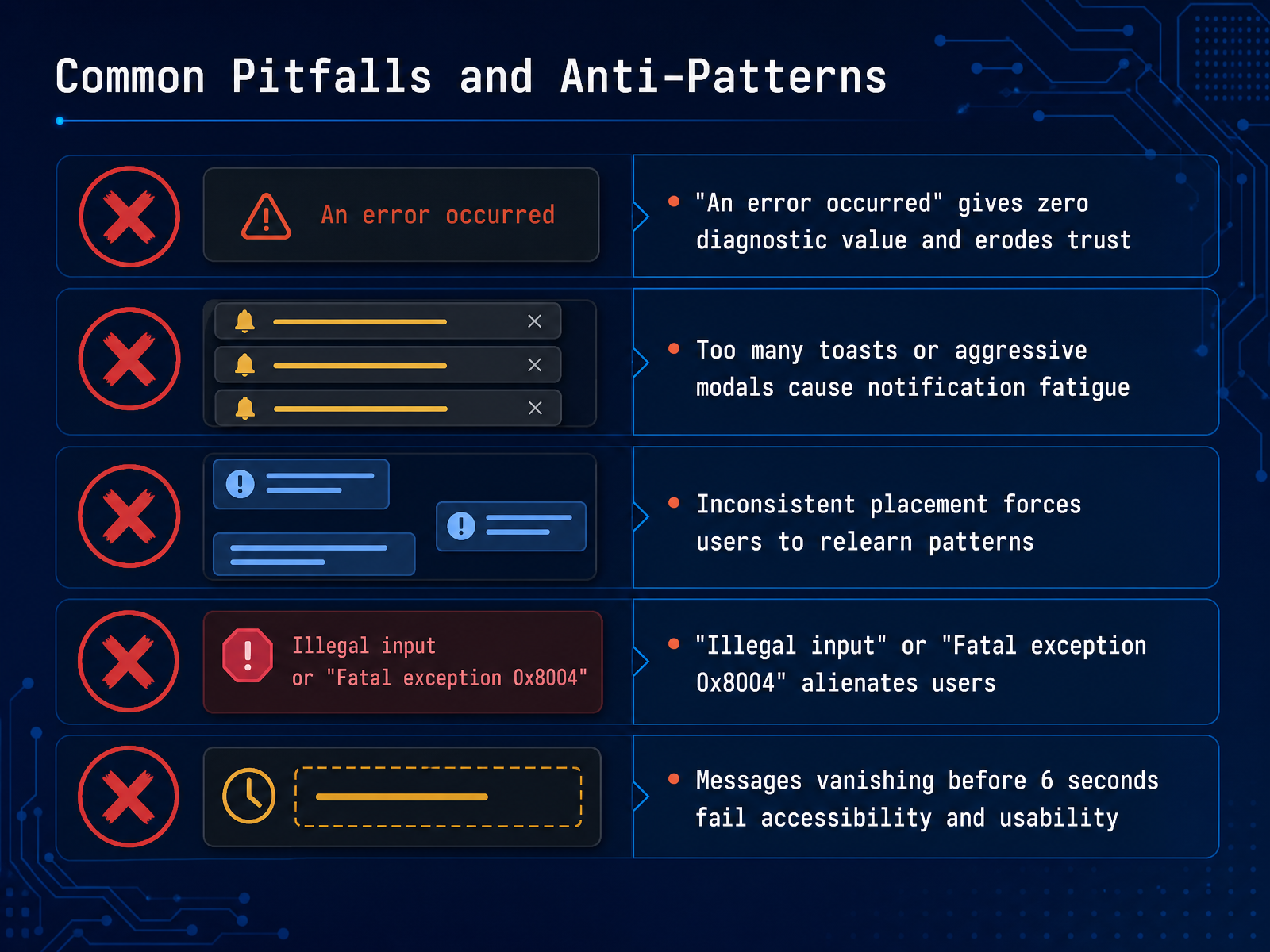
 - 09Common Pitfalls and Anti-PatternsNow let's look at the common pitfalls that can undermine your status messages. First, avoid messages with zero diagnostic value. An alert that simply says 'An error occurred' tells the user nothing. It erodes trust and blocks recovery. Second, watch out for notification fatigue. Too many toasts or aggressive modal dialogs overwhelm users and train them to dismiss everything, including critical alerts. Third, keep placement consistent. If warnings appear at the top in one view and the bottom in another, you force users to relearn the pattern every time. Fourth, never use alienating jargon. Terms like 'Illegal input' or 'Fatal exception 0x8004' are meaningless and intimidating to most people. Always translate technical codes into plain, actionable language. Finally, respect accessibility and readability. Messages that vanish in under six seconds fail users who read slowly, have cognitive disabilities, or are simply distracted. A good rule is to keep transient messages visible for at least five seconds, and pause auto-dismiss timers when the user hovers over them. Up next, we move from avoiding mistakes to building a structured approach for testing status messages.
 nngroup.comdl.acm.orgtoptal.com+22 min
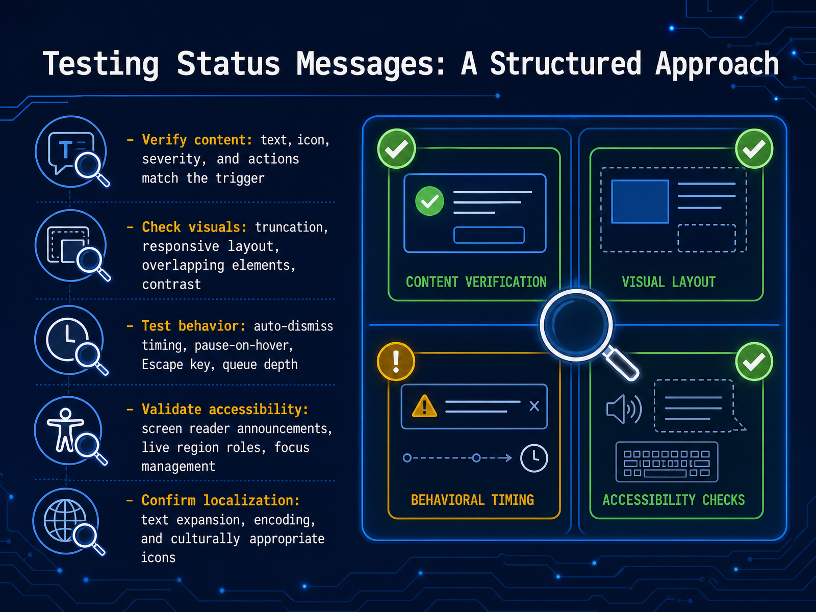
 - 10Testing Status Messages: A Structured ApproachNow let's bring structure to how we test status messages. You can think of this as your five-point checklist. First, verify content. Confirm that the text, icon, severity level, and any action buttons precisely match the trigger event. Second, check visuals. Look for text truncation on small screens, broken responsive layouts, overlapping elements, and sufficient color contrast. Third, test behavior. This includes auto-dismiss timing, where the timer should pause on hover, and dismissing the message with the Escape key. Also test the queue depth, typically capped at three visible toasts. Fourth, validate accessibility. Ensure screen readers announce the message using correct ARIA live region roles, like 'status' for success and 'alert' for errors, without moving focus. Check that focus management is correct. Lastly, confirm localization. Test for text expansion in other languages, proper character encoding, and culturally appropriate icons. Each of these areas is a potential failure point, so work through them methodically. Next, we'll move into heuristics and a tester's checklist for status messages.
 buttondown.comlinkedin.compaste.twilio.design+22 min
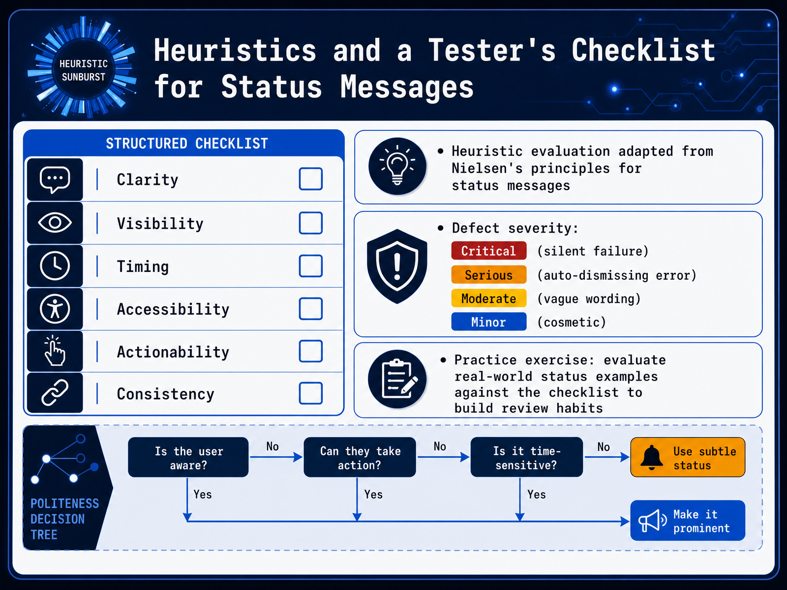
 - 11Heuristics and a Tester's Checklist for Status MessagesNow let's structure your testing with a dedicated checklist and some practical heuristics. When you review a status message, assess it across six dimensions: Clarity, Visibility, Timing, Accessibility, Actionability, and Consistency. This framework is adapted from Nielsen's usability principles, specifically tailored for status communication. Always keep the user's perspective at the center. Next, classify any defect you find using a severity scale. A silent failure is Critical, because the system leaves the user with no information. A serious bug is an auto-dismissing error message that disappears before the user can read it. A moderate severity issue is vague wording that doesn't help the user fix the problem. Minor defects are cosmetic issues, like a misaligned icon. To build muscle memory, practice with a real-world example. Take a live status message from any application and evaluate it against your checklist. Does it tell you what happened, what to do next, and why it matters? This habit turns a checklist into a natural part of your testing process. Let's move on to our final slide, where we'll wrap up by framing status messages as essential safety nets for your users.
 nngroup.comdl.acm.orgtoptal.com+22 min
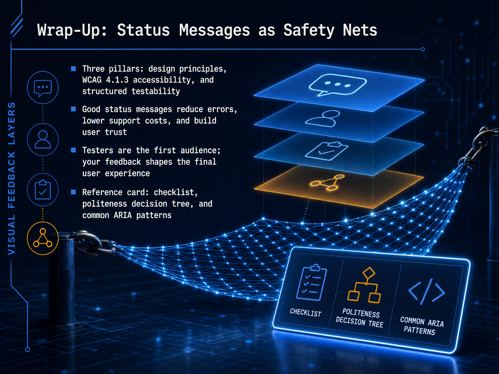
 - 12Wrap-Up: Status Messages as Safety NetsLet's bring everything together. Status messages are safety nets, and they rest on three pillars. First, solid design principles that guide when and how to communicate. Second, WCAG criterion 4.1.3, which ensures messages reach assistive technology without moving focus. And third, structured testability, so every message can be verified. Good status messages reduce user errors, lower support costs, and build trust. As a tester, you are the first audience. Your feedback on clarity, timing, and accessibility directly shapes the final experience. Use your reference card. It includes a checklist, a politeness decision tree, and common ARIA patterns like role equals status and role equals alert. Thank you for completing this module. Carry these practices into your next testing cycle, and you will help build software that speaks clearly to every user.
 developer.mozilla.orga11ypath.comaccessible-data-interfaces.com+22 min
Take the deck with you
Download this course as a file — free, no sign-up needed.
- PDF handoutEvery slide page, ready to print or share.13 pages · 3.5 MBDownload
- Narrated PowerPointThe deck that presents itself — every slide carries the digital human's narration video.13 pages · 12.5 MBDownload
- PowerPoint slidesThe full deck as a .pptx — open it in PowerPoint, Keynote, or Google Slides.13 pages · 3.3 MBDownload
Free to use in your own training — please keep the PersonWise credit page at the end.
Have your own deck? Turn it into a course
Sources consulted
Web sources consulted while building this course.
- ARIA live regions - MDN Web Docs - Mozilla — developer.mozilla.org
- Live Regions Deep Dive: ARIA Alerts & Status — A11yPath — a11ypath.com
- ARIA Live Regions for Dynamic Data — Accessible Data Interfaces — accessible-data-interfaces.com
- Choosing Between Polite and Assertive ARIA Live Regions — Accessible Data Interfaces — accessible-data-interfaces.com
- WCAG 4.1.3 Status Messages — ARIA Live Regions Guide | Accessibility.build — accessibility.build
- Indicators, Validations, and Notifications: Pick the Correct ... — nngroup.com
- Getting Users' Attention in Web Apps in Likable, Minimally Annoying Ways | Proceedings of the 2016 CHI Conference on Human Factors in Computing Systems — dl.acm.org
- A Comprehensive Guide to Notification Design | Toptal® — toptal.com
- Communicating status changes | Developer — develop.kde.org
- Overview - Designing messages - Atlassian Design — atlassian.design
- Designing Toast Messages for Accessibility • Buttondown — buttondown.com
- 🍞 Design Guidelines For Toast Messages UX. With practical guidelines to keep in mind when designing toasts and snackbars for notifications ↓ | Vitaly Friedman — linkedin.com
- Toast - Paste: The Design System for building Twilio customer experiences — paste.twilio.design
- Designing Toast Messages for Accessibility | by Sheri Byrne-Haber ... — sheribyrnehaber.medium.com
- How long should a temporary notification (toast) appear? — ux.stackexchange.com