Open Source Data Visualization Tools
Begin
13 pages · ~26 min
Open Source Data Visualization Tools
This training helps data professionals select open source visualization tools and design effective workflows.
What you’ll learn
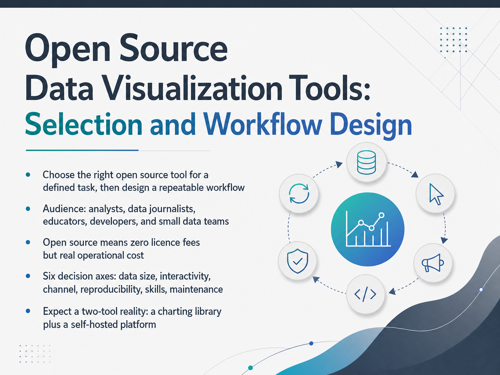
- 01Open Source Data Visualization Tools: Selection and Workflow DesignWelcome. This course helps you choose open source data visualization tools and design a workflow your team can actually repeat. We are speaking to analysts, data journalists, educators, developers, and small data teams. Here is the core idea. Pick the right tool for a defined task, then build a repeatable process around it. Open source means zero licence fees, but real operational cost. Someone has to deploy it, patch it, and maintain it. So we will compare tools across six decision axes: data size, interactivity, channel, reproducibility, skills, and maintenance. And expect a two-tool reality: a charting library for custom work, plus a self-hosted platform for dashboards. Let's start with what open source actually buys you.interactive-data-visualization.comyoungju.devgithub.com+21 min
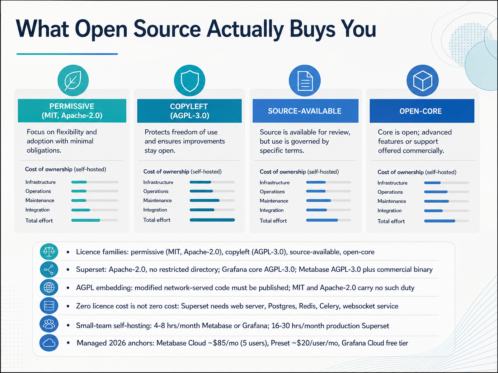
- 02What Open Source Actually Buys YouLet us look at what open source actually buys you. Start with the licence family, because it shapes everything downstream. Permissive licences like MIT and Apache two point zero let you embed and modify freely. Copyleft licences like AGPL three point zero carry a duty: if you modify the code and serve it over a network, you must publish those changes. Superset ships under Apache two point zero, with no restricted directory. Grafana core and Metabase use AGPL three point zero, and Metabase also offers a commercial binary. Next, remember that zero licence cost is not zero cost. Superset needs a web server, Postgres, Redis, Celery, and a websocket service to run in production. For small teams, self-hosting Metabase or Grafana takes roughly four to eight hours a month. A production Superset cluster runs sixteen to thirty hours a month. If you would rather not carry that load, managed options set your anchor. Metabase Cloud starts near eighty five dollars a month for five users. Preset starts around twenty dollars per user per month. And Grafana Cloud has a free tier. So compare licence terms, count your operational hours, then decide self-hosted versus managed. The 2026 Tool Landscape in One Page.
 basedash.comtoolvitals.comtoolvitals.com+22 min
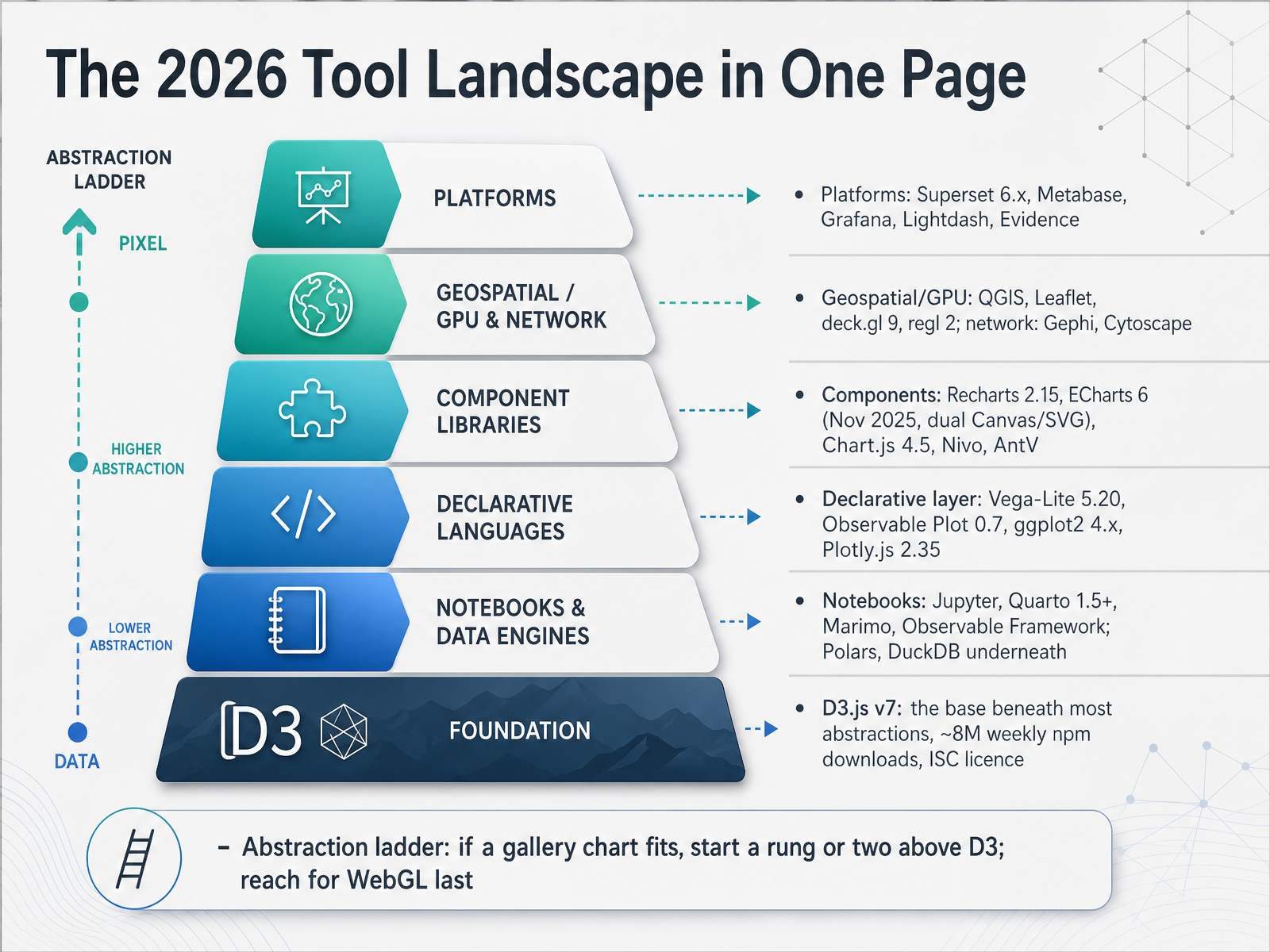
 - 03The 2026 Tool Landscape in One PageLet's put the whole landscape on one page. Think of it as an abstraction ladder, and where you stand on that ladder is your first real decision. At the bottom sits D3 version seven. It's the base beneath most of these abstractions, roughly eight million weekly downloads on npm, under a permissive I S C licence. You write it directly less often now, but almost everything else stands on it. Above that comes the declarative layer, where you describe the chart instead of drawing it: Vega-Lite five point twenty, Observable Plot, ggplot2 four, and Plotly two point thirty five. Next, components like Recharts, ECharts six, Chart.js, Nivo, and AntV, which give you sensible defaults for standard dashboard charts. Then platforms: Superset, Metabase, Grafana, Lightdash, and Evidence, where the user clicks and gets a chart. Geospatial and GPU work lives lower down, with QGIS, Leaflet, deck dot g l, and regl, while Gephi and Cytoscape handle networks. Notebooks and engines round it out, including Jupyter, Quarto, Marimo, Polars, and DuckDB. So here's the rule: if a gallery chart fits, start a rung or two above D3. Reach for WebGL last. That ladder is the frame, and next we'll look at the dimensions that decide which rung you actually stand on: reading the landscape, the comparison dimensions that matter.
 interactive-data-visualization.comyoungju.devgithub.com+22 min
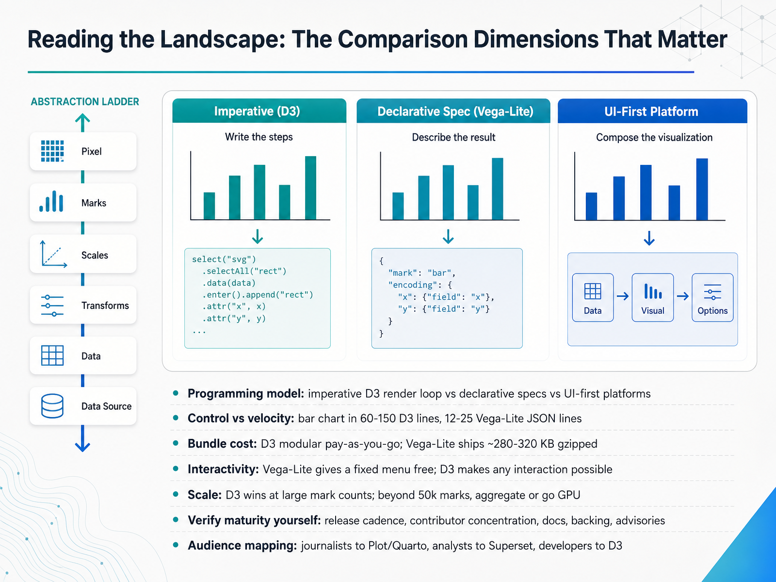
 - 04Reading the Landscape: The Comparison Dimensions That MatterLet's look at the comparison dimensions that actually matter. First, the programming model. D3 is imperative, meaning you own the render loop. Vega-Lite is declarative, so you describe the chart and a compiler builds it. Second, control versus velocity. A standard bar chart takes roughly sixty to one hundred fifty lines in D3, but only twelve to twenty-five lines of JSON in Vega-Lite. Third, bundle cost. D3 is modular, so you pay only for the modules you import. Vega-Lite ships its compiler and runtime together, around two hundred eighty to three hundred twenty kilobytes gzipped. Fourth, interactivity. Vega-Lite gives you a fixed menu of interactions almost free. D3 makes any interaction possible, at a cost per handler. Fifth, scale. D3 wins at large mark counts. Beyond fifty thousand marks, aggregate your data or move to a GPU path. Sixth, verify maturity yourself. Check release cadence, contributor concentration, documentation, backing, and security advisories. Finally, map the tool to your audience. Journalists lean toward Plot and Quarto. Analysts lean toward Superset. Developers reach for D3. Let's move on to Selection Criteria That Actually Matter.
 interactive-data-visualization.comyoungju.devgithub.com+22 min
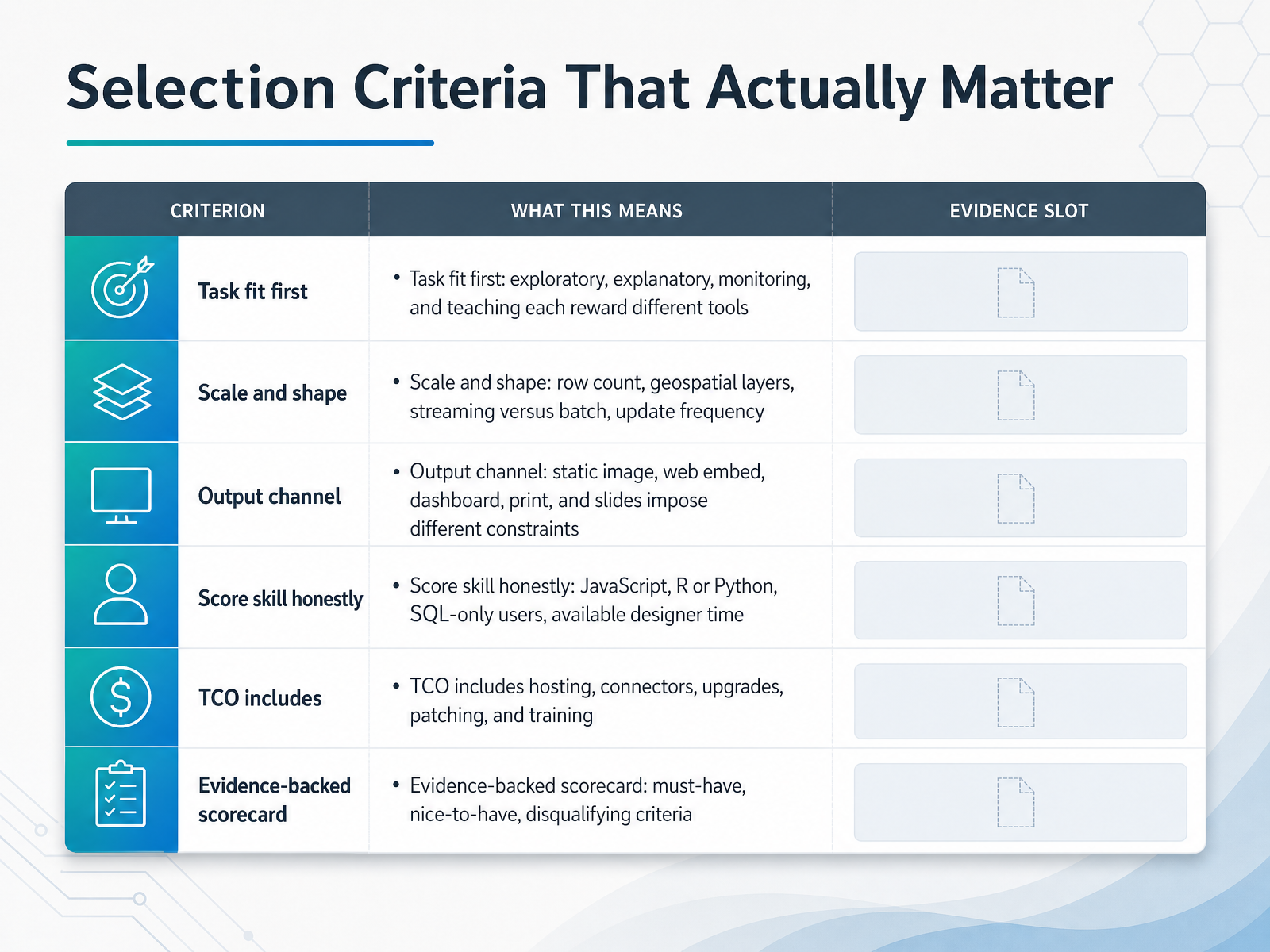
 - 05Selection Criteria That Actually MatterLet's move on to selection criteria that actually matter. Start with task fit. Exploratory, explanatory, monitoring, and teaching work each reward different tools. A live monitoring wall and a one-off explainer graphic are not the same purchase. Next, scale and shape. Ask about row count, geospatial layers, streaming versus batch, and update frequency. A tool that handles ten million rows comfortably may feel wrong for a small weekly report. Then consider your output channel. Static image, web embed, dashboard, print, and slides each impose different constraints. An embed needs an API and authentication. A print piece needs vector output and real text labels. Score your team's skills honestly. Who writes JavaScript, R, or Python? Who is SQL only? How much designer time is available? This single line often decides the shortlist. And count total cost of ownership, not just licence price. That includes hosting, connectors, upgrades, patching, and training. Finally, build an evidence-backed scorecard with three columns: must-have, nice-to-have, and disqualifying. Test against your own data before you commit. Workflow Design: From Raw Data to Published Visual.
 nfpstack.comdoi.orgdisabilityworld.org+22 min
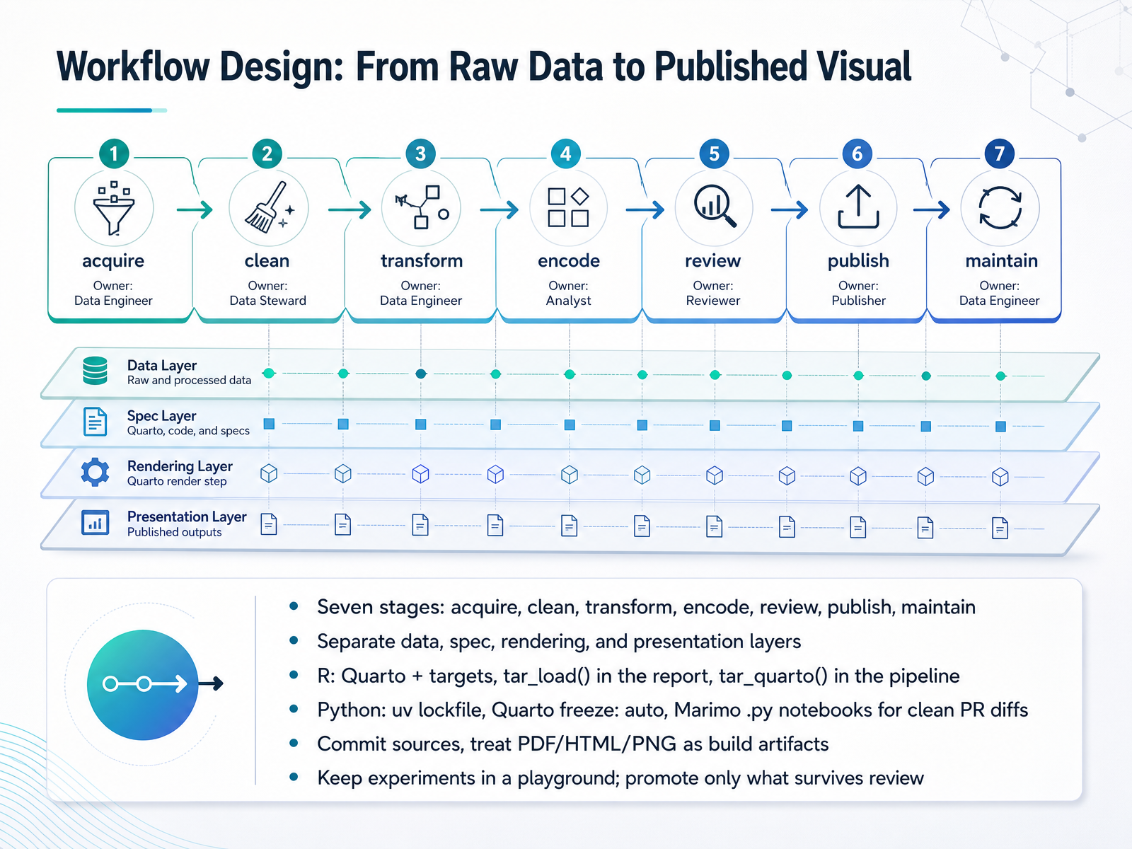
 - 06Workflow Design: From Raw Data to Published VisualNow let's design the workflow that takes raw data all the way to a published visual. Think of it as seven stages: acquire, clean, transform, encode, review, publish, and maintain. Keep those stages in separate layers: data, spec, rendering, and presentation. That separation is what lets you swap a chart type without breaking your pipeline. In R, pair Quarto with targets. Load results into the report with tar_load, and render through the pipeline with tar_quarto. In Python, lock dependencies with uv, set Quarto freeze to auto, and use Marimo dot py notebooks so pull requests show clean diffs. One rule to internalize: commit your sources, and treat PDF, HTML, and PNG as build artifacts you regenerate. Keep experiments in a playground folder, and promote only what survives review. That is the whole loop. Next, let's look at the tool paths themselves, starting with libraries and grammar-based frameworks.
 carpentries-incubator.github.ioquarto.orgtakumidev.tech+22 min
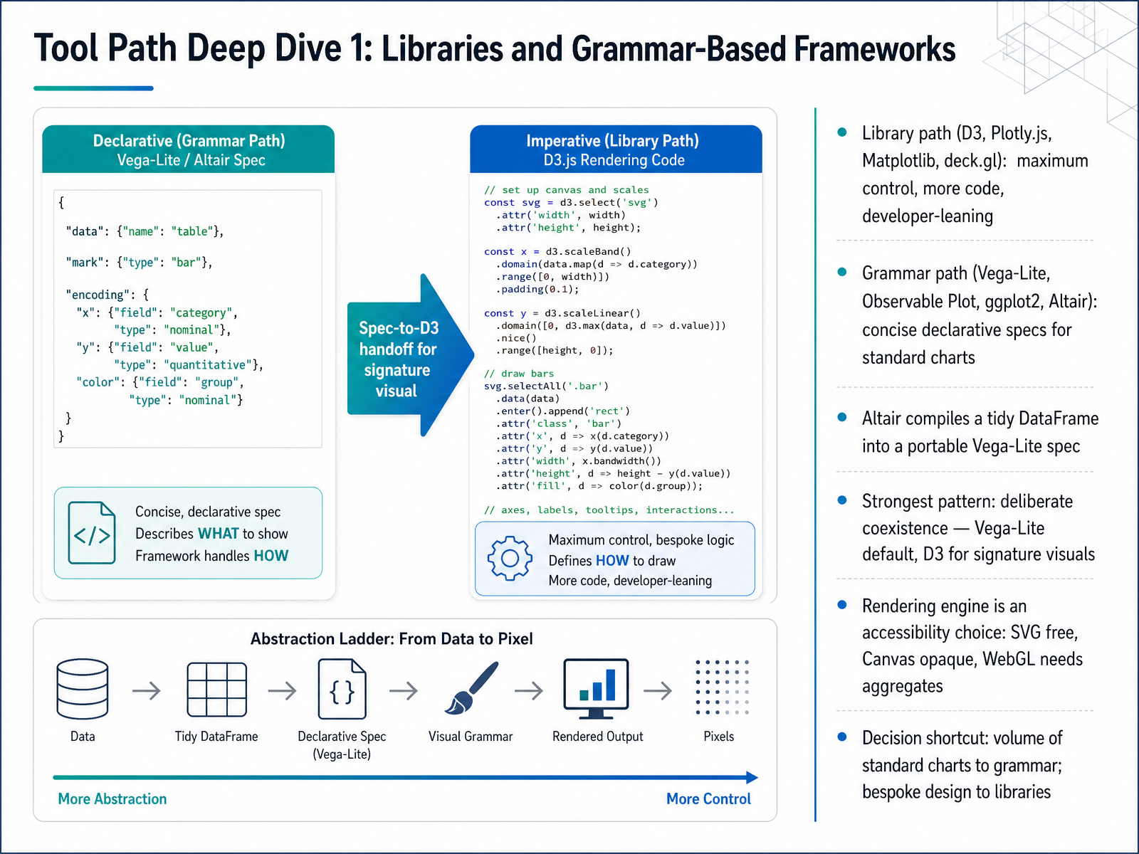
 - 07Tool Path Deep Dive 1: Libraries and Grammar-Based FrameworksNow let's walk the tool paths. Start with two families. The library path includes D3, Plotly.js, Matplotlib, and deck.gl. These give you maximum control, but you write more code, so they lean developer. The grammar path includes Vega-Lite, Observable Plot, ggplot2, and Altair. Here you write a concise, declarative spec, and the framework builds standard charts for you. Altair is a good example. It compiles a tidy DataFrame into a portable Vega-Lite spec, so the same chart can render in a notebook and on the web. The strongest production pattern is deliberate coexistence. Make Vega-Lite your default, and reserve D3 for one or two signature visuals. Also treat the rendering engine as an accessibility choice. SVG keeps chart elements free and readable by assistive tech. Canvas is opaque, so pair it with a data table. WebGL needs aggregated data to stay fast. Here is your shortcut. If the work is a volume of standard charts, choose the grammar path. If the design is bespoke, choose the libraries. Next, we look at platforms.
 interactive-data-visualization.comyoungju.devgithub.com+22 min
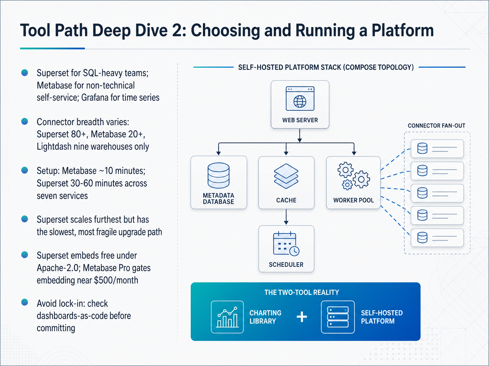
 - 08Tool Path Deep Dive 2: Choosing and Running a PlatformNow let's compare the three platform paths you're most likely to choose. Superset suits SQL-heavy teams. Metabase wins for non-technical self-service. Grafana is built for time series. Connector breadth varies widely. Superset supports over eighty sources, Metabase around twenty, and Lightdash only nine warehouses. Setup differs too. Metabase takes about ten minutes. Superset takes thirty to sixty minutes across seven services. That complexity pays off at scale, but Superset also has the slowest, most fragile upgrade path. Watch licensing. Superset embeds free under Apache 2.0. Metabase Pro gates embedding near five hundred dollars a month. Before you commit, check dashboards-as-code to avoid lock-in. Next, designing for the audience and the medium.
 basedash.comtoolvitals.comtoolvitals.com+21 min
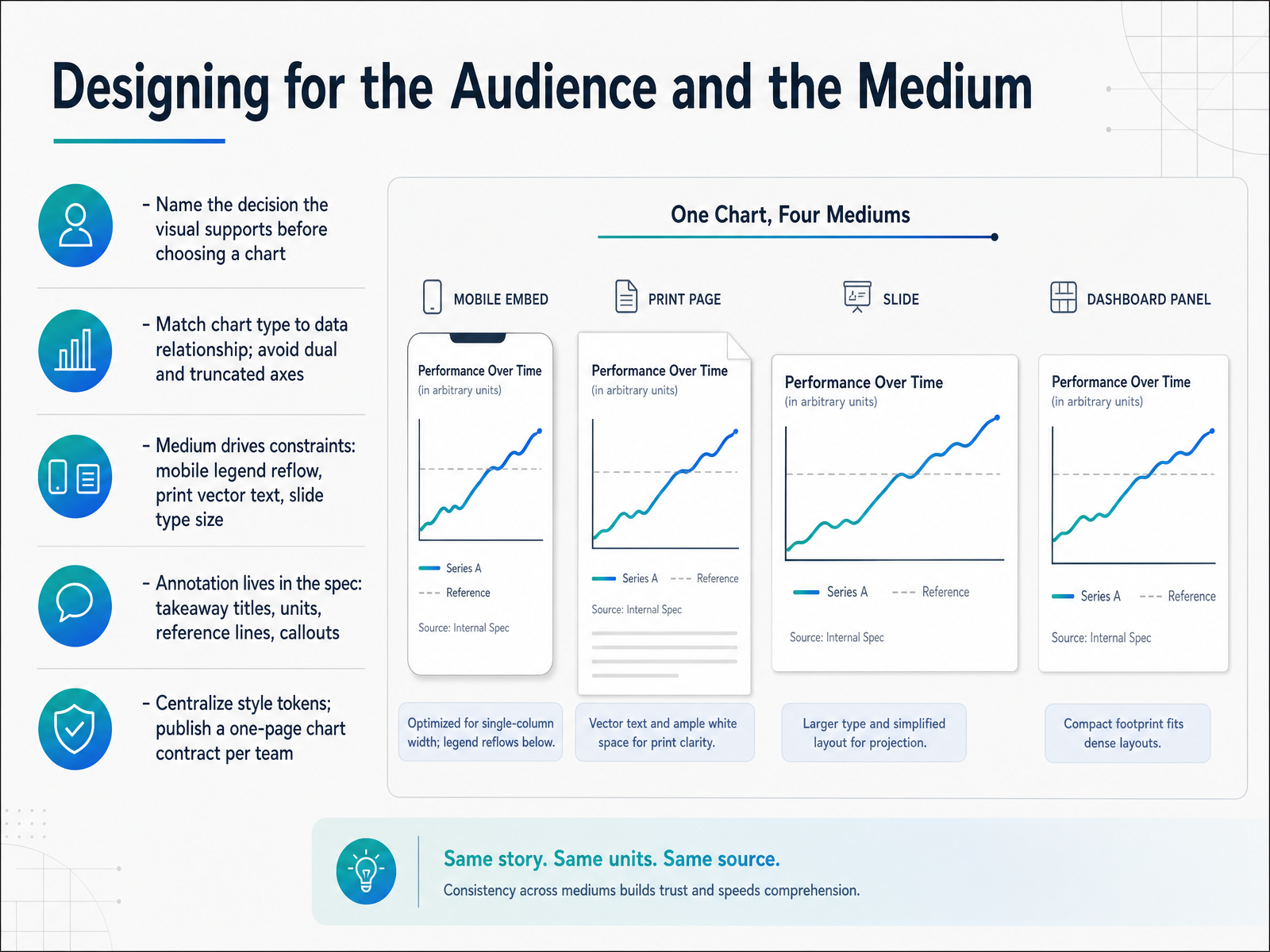
 - 09Designing for the Audience and the MediumNow let's talk about designing for the audience and the medium. Before you pick a chart, name the decision it supports. That single sentence tells you what to show and what to leave out. Then match the chart type to the data relationship. Comparing categories calls for bars. Change over time calls for a line. And as a rule, avoid dual axes and truncated axes, because they quietly mislead. The medium shapes your constraints. A mobile chart may need its legend reflowed to the bottom. A print export needs vector text so labels stay crisp. A slide needs type big enough to read from the back of the room. Treat annotation as part of the spec, not a finishing touch. Write takeaway titles, label units, add reference lines, and place callouts that explain the point. Finally, centralize your style tokens, your colors, fonts, and spacing, and publish a one-page chart contract per team. That contract is what keeps ten charts looking like one system. Next, we look at Accessibility as a Selection Criterion, Not a Retrofit.
 accessibility.buildbasedash.comtoolvitals.com+22 min
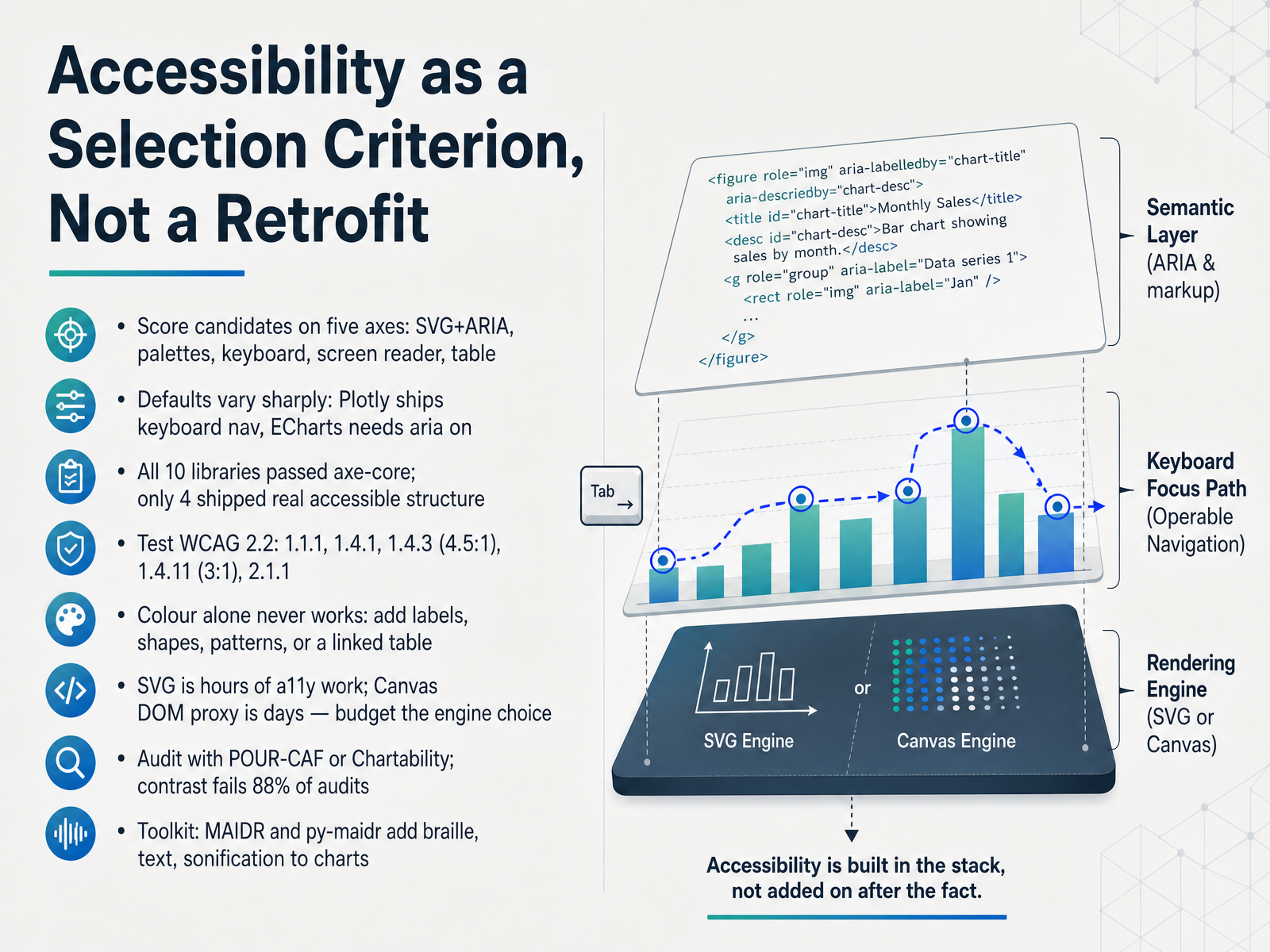
 - 10Accessibility as a Selection Criterion, Not a RetrofitAccessibility is a selection criterion, not a retrofit. So score candidate libraries on five axes: SVG with ARIA semantics, colour-blind-safe palettes, keyboard-navigable data points, a screen-reader description hierarchy, and an alternative table view. Defaults vary sharply. Plotly ships keyboard arrow-key navigation out of the box. ECharts has a strong aria option, but you have to turn it on. In one audit of ten libraries, axe-core reported zero violations for all ten, yet only four shipped any real accessible structure. That tells you automated scanners are blind to charts. Test against WCAG 2.2: non-text content, use of colour, text contrast at four point five to one, non-text contrast at three to one, and keyboard access. Colour alone never works, so add direct labels, shapes, patterns, or a linked data table. Budget the engine choice too: SVG accessibility is hours of work, while a Canvas DOM proxy layer is days. Audit with POUR-CAF or Chartability, where contrast fails eighty-eight percent of audits. And for non-visual access, MAIDR and py-maidr add braille, text, and sonification to charts. Next, Hands-On Evaluation: Scorecard and Pilot.
 accessibility.buildnfpstack.comdoi.org+22 min
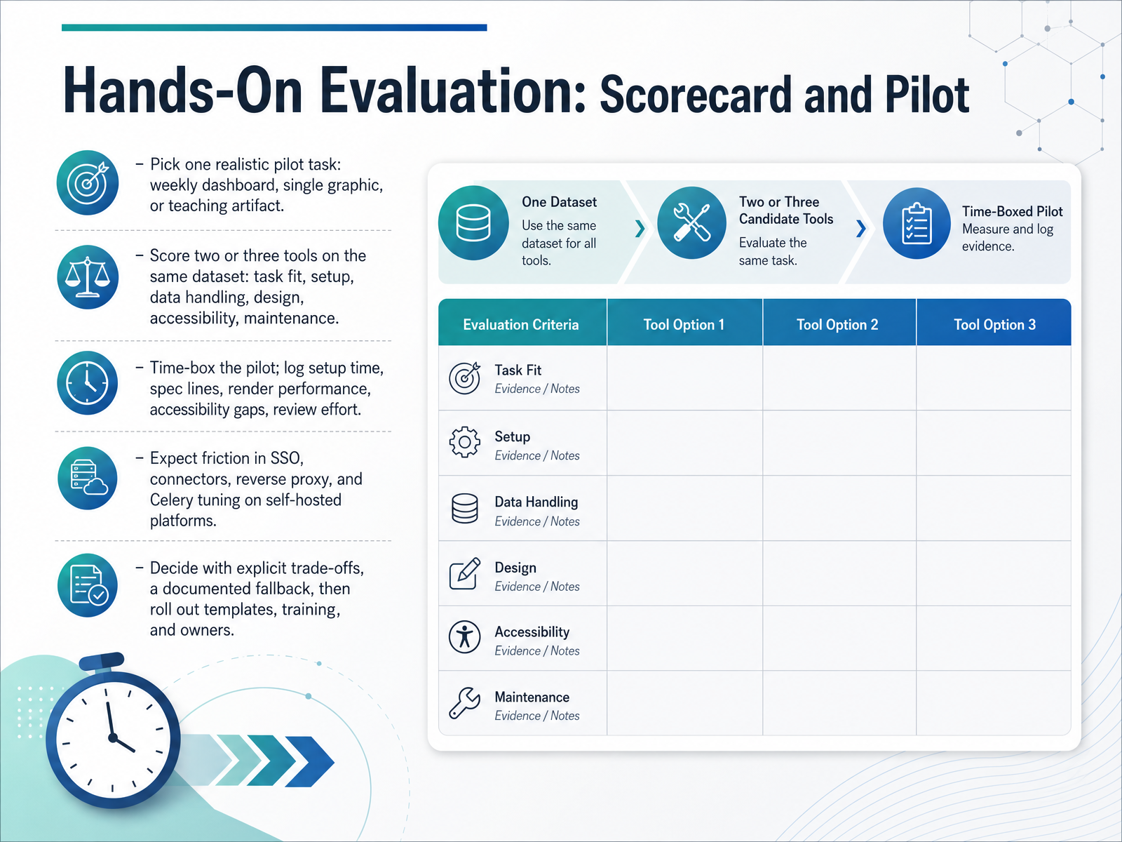
 - 11Hands-On Evaluation: Scorecard and PilotNow let's move from criteria to practice. On this slide, you run a hands-on pilot before you commit. Start by picking one realistic pilot task, such as a weekly dashboard, a single graphic, or a teaching artifact. Then score two or three tools on exactly the same dataset, using consistent criteria: task fit, setup effort, data handling, design, accessibility, and long-term maintenance. Time-box the pilot so it stays a test, not a project. Log setup time, specification lines, render performance, accessibility gaps, and review effort as you go. Expect friction on self-hosted platforms, especially around single sign-on, connectors, reverse proxy setup, and Celery tuning. Celery is the worker system many platforms use to run scheduled or long queries in the background. By the end, decide with explicit trade-offs, document a fallback tool, and only then roll out templates, training, and clear owners. The pilot is your evidence, not your opinion. Next, we look at keeping these choices healthy over time, in Governance, Sustainability, and Risk.
 nfpstack.comdoi.orgdisabilityworld.org+22 min
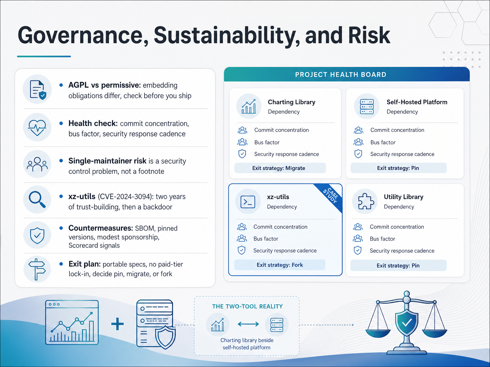
 - 12Governance, Sustainability, and RiskLet's talk about governance, sustainability, and risk. Licensing comes first: copyleft licenses like A G P L impose embedding obligations, while permissive licenses like Apache two point zero and M I T do not. Check before you ship. Next, run a health check on the projects you depend on. Look at commit concentration, bus factor, and security response cadence. Single-maintainer risk is a security control problem, not a footnote. The xz-utils backdoor, tracked as C V E 2024 3094, showed how two years of trust-building can end in a supply chain compromise. Countermeasures: generate an S B O M, pin versions, sponsor modestly, and read Open S S F Scorecard signals. Finally, keep an exit plan: portable specs, no paid-tier lock-in, and a clear decision to pin, migrate, or fork. Next, let's move into the practical playbook: a cheat sheet, templates, and a thirty sixty ninety day plan.
 basedash.comtoolvitals.comtoolvitals.com+22 min
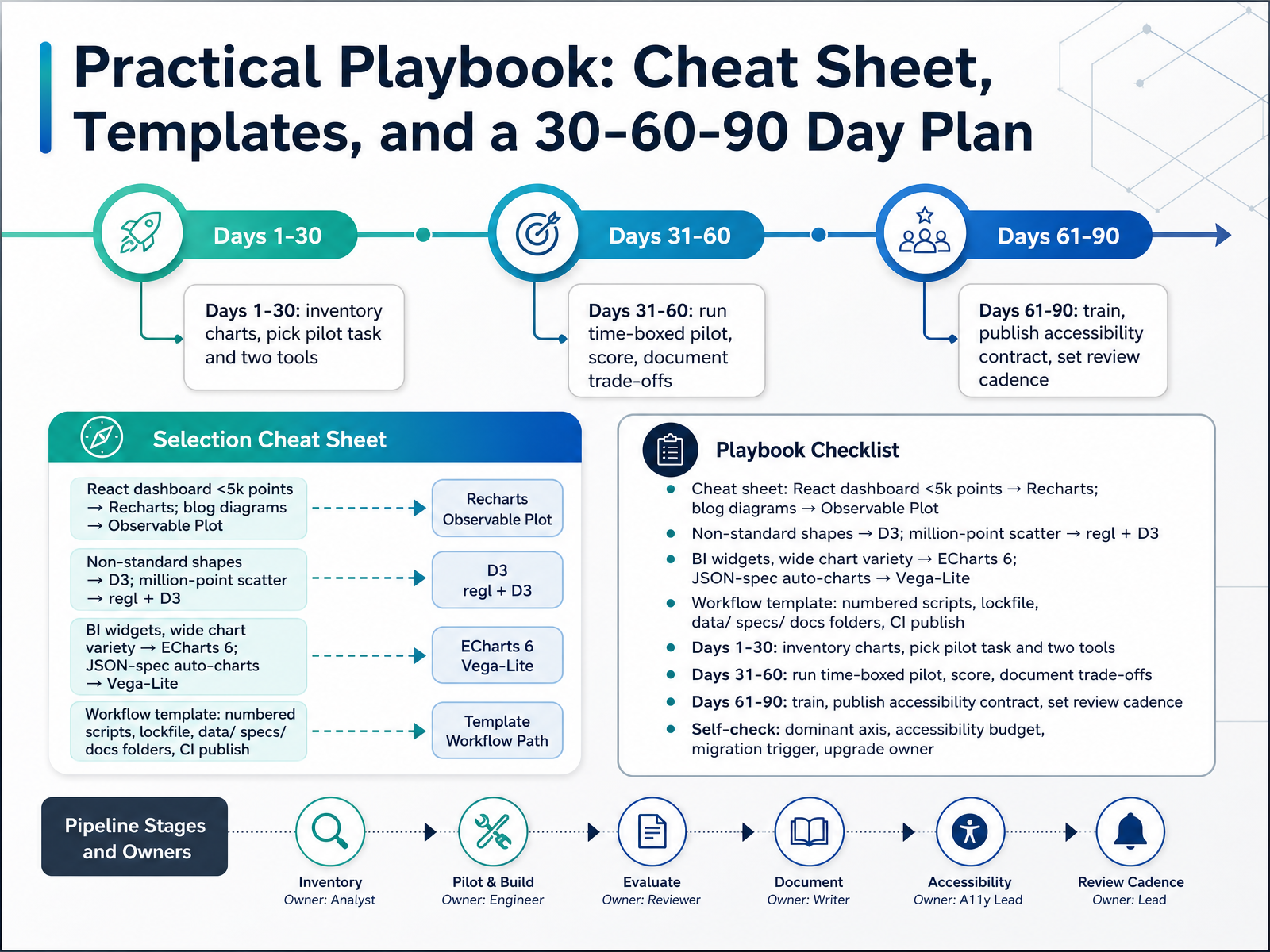
 - 13Practical Playbook: Cheat Sheet, Templates, and a 30-60-90 Day PlanLet's close with a practical playbook you can act on tomorrow. Keep a cheat sheet for tool selection. For a React dashboard under five thousand points, choose Recharts. For blog diagrams, use Observable Plot. For non-standard shapes like Sankey or force layouts, drop down to D3. For a million-point scatter, pair regl with D3. For BI widgets and wide chart variety, ECharts 6 is a strong default. And when charts are generated from a JSON spec, Vega-Lite fits cleanly. For your workflow template, use numbered scripts, a lockfile, and clear data, specs, and docs folders. Then automate publishing through continuous integration so outputs stay current. Now the thirty-sixty-ninety plan. In days one to thirty, inventory your existing charts, then pick one pilot task and two tools to compare. In days thirty-one to sixty, run a time-boxed pilot, score each tool, and document the trade-offs. In days sixty-one to ninety, train your team, publish an accessibility contract, and set a review cadence. Finally, run the self-check: what is your dominant chart type, what is your accessibility budget, what triggers a migration, and who owns upgrades? Use this plan, and your selection decisions become repeatable. Thank you for working through this course, and go build something clear and accessible.
 basedash.comtoolvitals.comtoolvitals.com+22 min
Take the deck with you
Download this course as a file — free, no sign-up needed.
- PDF handoutEvery slide page, ready to print or share.14 pages · 3.6 MBDownload
- Narrated PowerPointThe deck that presents itself — every slide carries the digital human's narration video.14 pages · 16.2 MBDownload
- PowerPoint slidesThe full deck as a .pptx — open it in PowerPoint, Keynote, or Google Slides.14 pages · 3.4 MBDownload
Free to use in your own training — please keep the PersonWise credit page at the end.
Have your own deck? Turn it into a course
Sources consulted
Web sources consulted while building this course.
- D3 vs Vega-Lite — Architecture Tradeoffs | IDV Guide — interactive-data-visualization.com
- Web Data Visualization Libraries 2026 — D3, Plot, Visx, Recharts, ECharts, Vega-Lite Compared (Deep Dive) | Chaos and Order — youngju.dev
- apache/superset — github.com
- D3.js VS Apache Superset - compare differences & reviews? — saashub.com
- Metabase vs Superset vs Lightdash (2026) · ShipGarden — shipgarden.com
- Best open source BI tools compared 2026 | Basedash — basedash.com
- Top 25 BI & Dashboards Tools — June 2026 | ToolVitals — toolvitals.com
- Top 38 BI & Dashboards Tools — September 2026 | ToolVitals — toolvitals.com
- Compare Data Visualization Tools | The Open Source Drop — opensourcedrop.com
- The Modern Data Stack: Open-source edition — datafold.com
- Analytics and Visualisation — nfpstack.com
- Evaluating Geovisualizations Based on Open Data: An Integrative Framework for Engagement, Openness, and Accessibility — doi.org
- Accessible Data-Visualisation Tooling in 2026 — disabilityworld.org
- Accessible Charts & Data Visualization Guide (SVG, WCAG 2.2) | Accessibility.build — accessibility.build
- Chartability/POUR-CAF — github.com
- Introduction to targets: Reproducible Reports with Quarto — carpentries-incubator.github.io
- Using Python – Quarto — quarto.org
- Escaping Office Software with Quarto and Python — takumidev.tech
- vdss-fs26-ds24t/dataviz-project-template — github.com
- Structuring Reproducible Research Projects in R: A Workflow with renv, Quarto, and GitHub :: Posit Open Source — opensource.posit.co