Begin
13 pages · ~26 min
Digital Accessibility: Patterns and Pitfalls
Explore real-world digital accessibility examples to identify effective patterns, strengths, and common pitfalls for building inclusive digital experiences.
A digital instructor presents all 13 pages. Hold “Ask” at any point and ask out loud — the answer comes from this course. No sign-up needed.
What you’ll learn
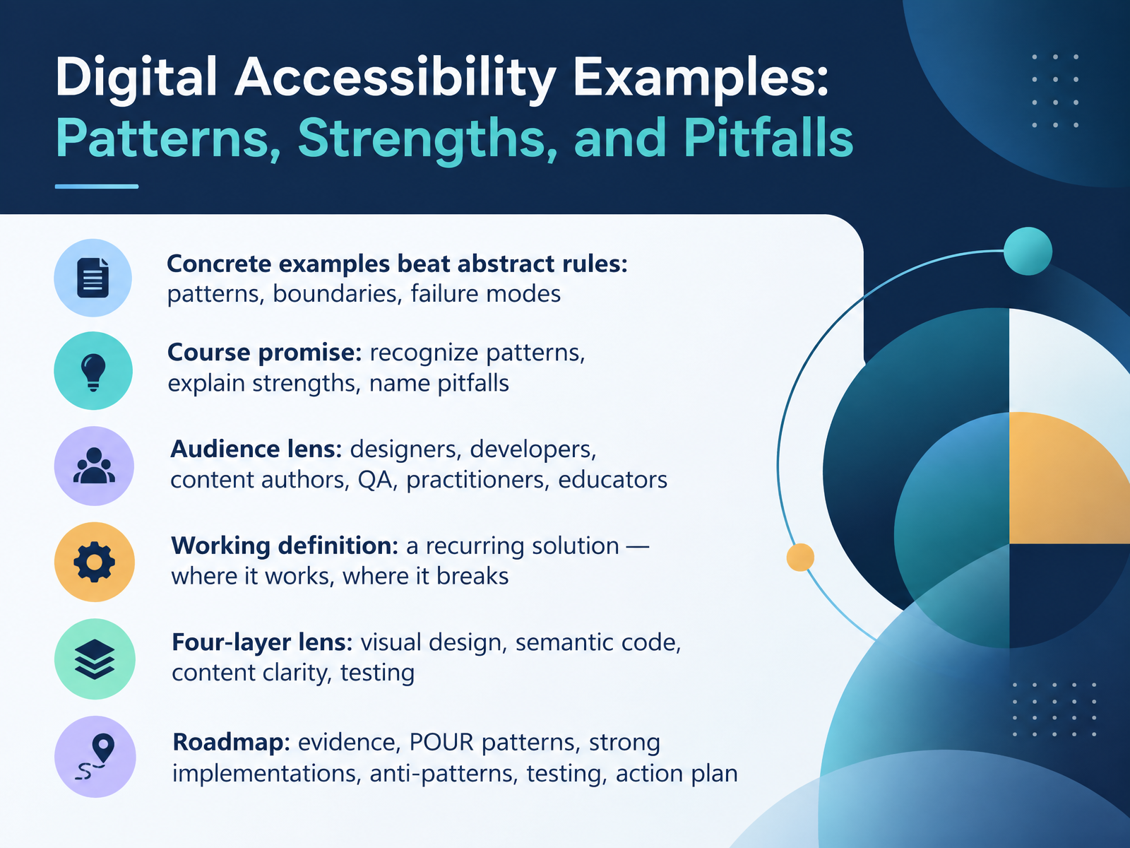
- 01Digital Accessibility Examples: Patterns, Strengths, and PitfallsWelcome. This course is called Digital Accessibility Examples: Patterns, Strengths, and Pitfalls. Our goal is simple. Concrete examples beat abstract rules. So together, we will recognize patterns, explain their strengths, and name the pitfalls clearly. This is built for working peers: designers, developers, content authors, quality assurance teams, accessibility practitioners, and educators. Here is our working definition. A pattern is a recurring solution, and we will always ask two questions. Where does it work, and where does it break? We will look through four layers: visual design, semantic code, content clarity, and testing. Each layer names its user impact and its tradeoff. For example, a visible focus indicator helps keyboard users, and it can conflict with a minimalist visual style. Stay with that framing. Then our roadmap: evidence, POUR patterns, strong implementations, anti-patterns, testing, and an action plan. Let's get started.w3.orgw3c.github.iow3.org+21 min
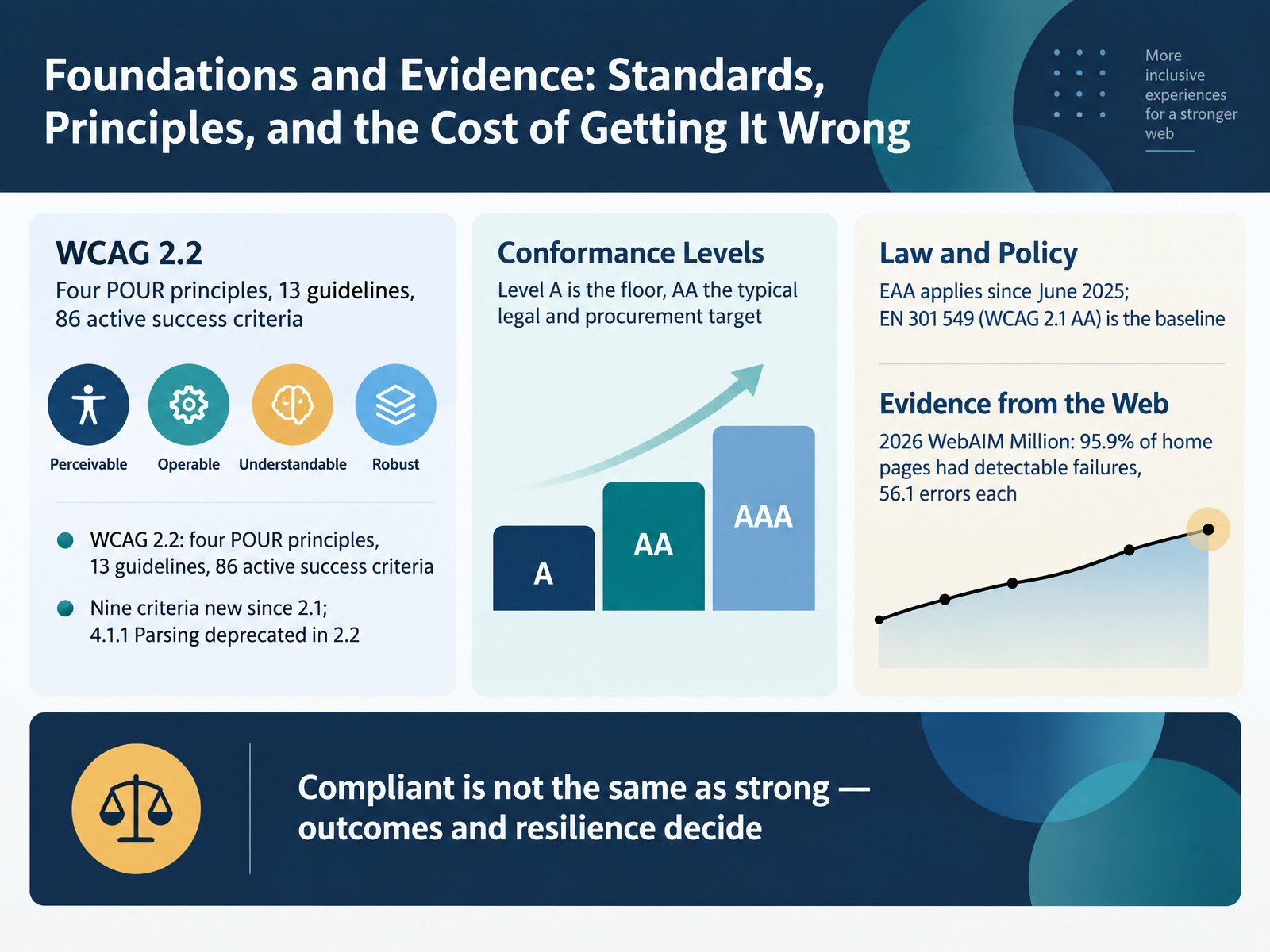
- 02Foundations and Evidence: Standards, Principles, and the Cost of Getting It WrongLet us ground this in standards and evidence. WCAG 2.2 gives us four principles, thirteen guidelines, and eighty-six active success criteria. Nine criteria are new since 2.1, and 4.1.1 Parsing is deprecated. Level A is the floor. Level AA is the typical legal and procurement target. The European Accessibility Act has applied since June 2025, with EN 301 549 referencing WCAG 2.1 AA as the baseline. Now the evidence. The 2026 WebAIM Million found ninety-five point nine percent of home pages had detectable failures, averaging fifty-six point one errors each. Compliant is not the same as strong. Outcomes and resilience decide. Next, the Big Six failures as a shared baseline for judging examples.
 w3.orgw3c.github.iow3.org+21 min
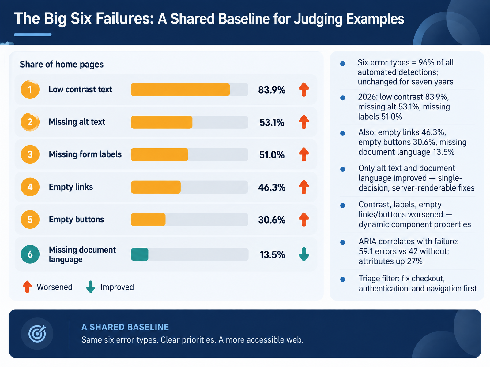
 - 03The Big Six Failures: A Shared Baseline for Judging ExamplesLet's set a shared baseline for judging examples: the Big Six failures. Six error types account for ninety-six percent of all automated detections, and that list has not changed in seven years. In twenty twenty-six: low contrast, eighty-three point nine percent. Missing alt text, fifty-three point one. Missing labels, fifty-one point zero. Then empty links, forty-six point three. Empty buttons, thirty point six. Missing document language, thirteen point five. Only alt text and document language improved. Both are single-decision, server-renderable fixes. Contrast, labels, empty links, and empty buttons got worse. These are dynamic component properties, often driven by design tokens or injected widgets. Notice the ARIA correlation: pages with ARIA averaged fifty-nine point one errors, versus forty-two without, while attributes rose twenty-seven percent. So use a triage filter. Fix checkout, authentication, and navigation first. Those flows carry the highest user impact. Next, we move into perceivable patterns: text alternatives, media, contrast, and reflow.
 webaim.orgaccessibility.buildwebaim.org+22 min
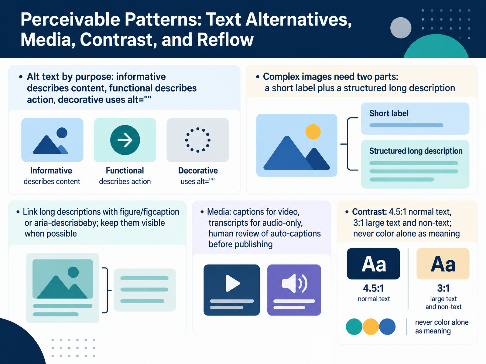
 - 04Perceivable Patterns: Text Alternatives, Media, Contrast, and ReflowNow let's look at Perceivable patterns, starting with text alternatives. Alt text is written by purpose. Informative images describe content. Functional images describe the action, like "Search." Decorative images use an empty alt value, so assistive tech skips them. Complex images, like charts or maps, need two parts: a short label, plus a structured long description with real headings or a table. Link long descriptions with figure and figcaption, or aria-describedby, and keep them visible when possible. That benefits screen reader users and also people with cognitive or reading disabilities. For media, captions cover prerecorded video, transcripts cover audio-only, and auto-captions need human review before publishing. On contrast, normal text needs a ratio of four point five to one. Large text and non-text elements need three to one. Never use color alone to carry meaning. One tradeoff to note: more detail helps everyone, but bloated alt text causes reader fatigue. Keep the short label brief and move depth into the long description. Next, we move into Operable patterns: keyboard, focus, targets, and motion.
 w3c.github.iow3c.github.ioweb.dev+22 min
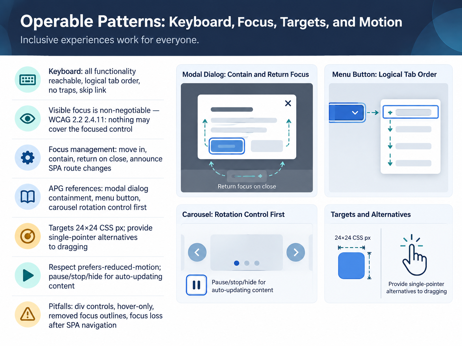
 - 05Operable Patterns: Keyboard, Focus, Targets, and MotionNext, let's look at operable patterns for keyboard, focus, targets, and motion. Start with the keyboard: every function must be reachable, the tab order must be logical, there must be no keyboard traps, and a skip link should let users bypass repeated blocks. Visible focus is non-negotiable. Under WCAG 2.2, success criterion 2.4.11, no author-created content may cover the focused control. Then manage focus deliberately. When a dialog opens, move focus in and contain it. On close, return focus to the invoking element. And on single-page app route changes, announce the new context. The ARIA Authoring Practices Guide is your reference here. It covers modal dialog containment, the menu button pattern, and the carousel, where the rotation control is the first element in the tab sequence. For pointer users, targets should be at least twenty-four by twenty-four CSS pixels, and any drag operation needs a single-pointer alternative under 2.5.7. Respect prefers-reduced-motion, and give pause, stop, and hide controls for auto-updating content. Watch these pitfalls: div elements acting as controls, hover-only interactions, removed focus outlines, and focus loss after a single-page app navigation. All of these block users who cannot use a mouse. Next, we move on to understandable and robust patterns: semantics, forms, and status messages.
 w3.orggithub.comw3.org+22 min
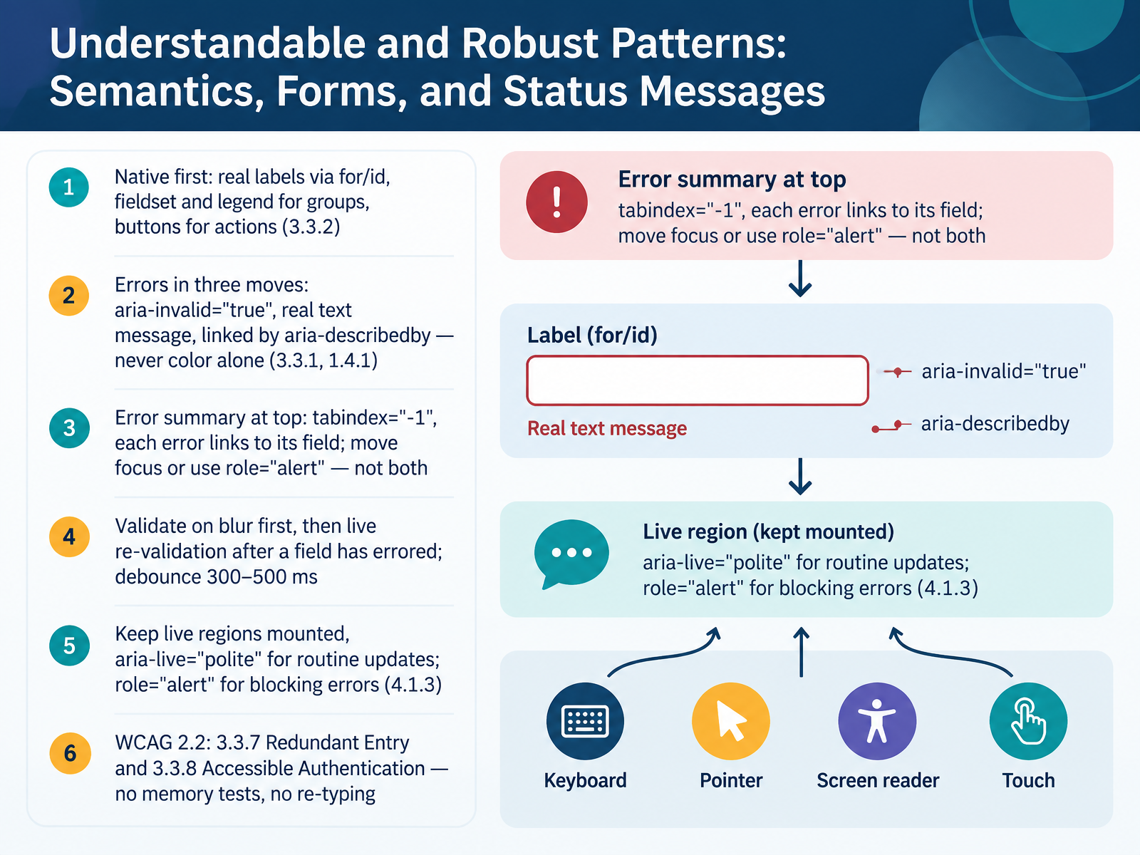
 - 06Understandable and Robust Patterns: Semantics, Forms, and Status MessagesNow let's look at Understandable and Robust patterns. Start native first. Use real labels tied with for and id. Group related controls with fieldset and legend. Use real buttons for actions. That satisfies 3.3.2. Errors take three moves: set aria-invalid to true, write the message as real text, and link it with aria-describedby. Never signal an error with color alone. On submit, show an error summary at the top with tabindex of minus one, each item linking to its field. Move focus there or use role alert, not both, or the message is announced twice. For timing, validate on blur first, then re-validate live only after a field has errored, debounced by three hundred to five hundred milliseconds. Keep live regions mounted. Use aria-live polite for routine updates and role alert for blocking errors. Under WCAG 2.2, remember 3.3.7 Redundant Entry and 3.3.8 Accessible Authentication. No memory tests, no re-typing data you already have. Next, Strong Implementation 1: Accessible Design Systems and Component Libraries.
 w3.orgw3c.github.iow3.org+22 min
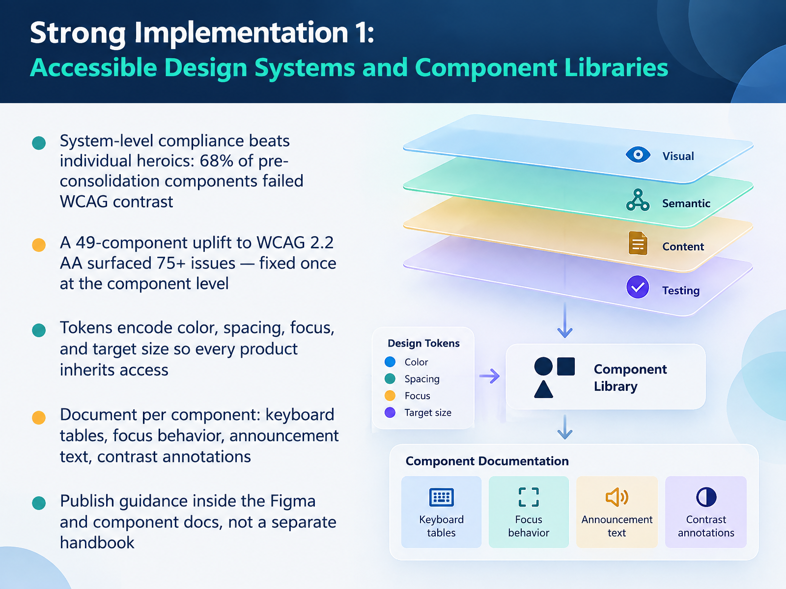
 - 07Strong Implementation 1: Accessible Design Systems and Component LibrariesLet's look at what strong implementation actually looks like in practice, starting with accessible design systems and component libraries. The core idea is simple. System level compliance beats individual heroics. In one consolidation effort, sixty eight percent of existing components failed WCAG contrast, which made compliance an individual responsibility rather than a system property. A second example: a forty nine component uplift to WCAG two point two double A surfaced more than seventy five issues, things like missing focus states, small touch targets, and low contrast. Those fixes happened once at the component level, not repeatedly in every product. Tokens do the heavy lifting. Encode color, spacing, focus, and target size as tokens, and every product inherits access by default, in both light and dark modes. Then document each component precisely. Keyboard tables. Focus behavior. Announcement text. Contrast annotations. The tradeoff is upfront effort, but it removes sprint rework later. Finally, publish that guidance inside Figma and the component docs, not in a separate handbook nobody reads. If accessibility lives on the component page, it becomes the default. Next, we move from systems to specific journeys: Strong Implementation Two, worked flows across long form content, checkout, and data visualization.
 w3.orggithub.comw3.org+22 min
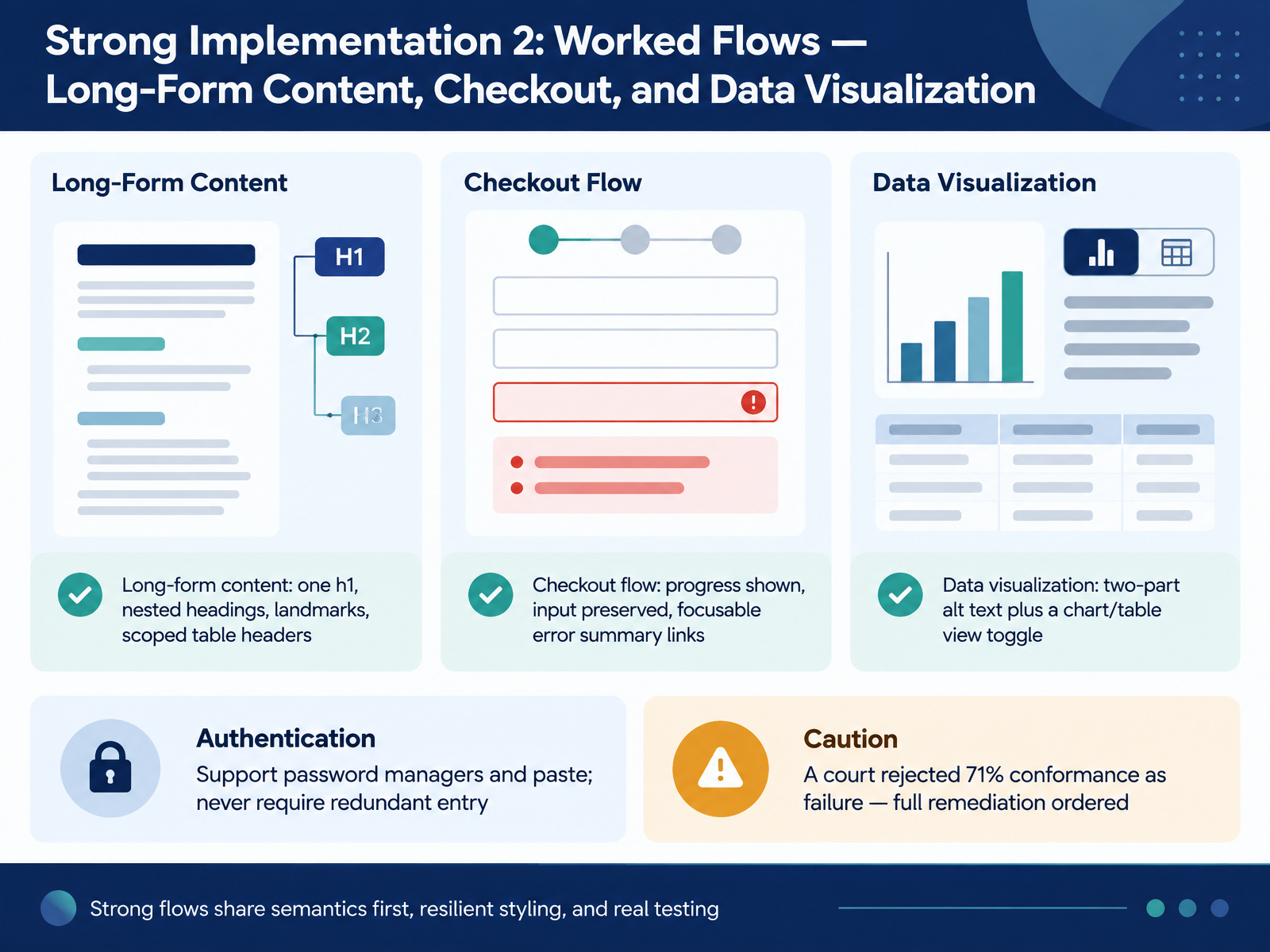
 - 08Strong Implementation 2: Worked Flows — Long-Form Content, Checkout, and Data VisualizationLet's walk through three strong implementations. First, long-form content. One h1. Nested headings that reflect structure. Landmarks so screen reader users can jump between regions. And table headers scoped to their rows or columns. Second, checkout. Show progress. Preserve every input after an error. And make the error summary links focusable, so a keyboard user lands on the field that failed. Third, data visualization. Use two-part alt text: a short description, then a full long description. Add a chart and table view toggle, because a table is often the best alternative. For authentication, support password managers, allow paste, and never require redundant entry. What do these flows share? Semantics first, resilient styling, and real testing with keyboards and screen readers. One caution. A French court rejected seventy-one percent conformance as a failure and ordered full remediation. Next, common pitfalls by discipline: a catalog of anti-patterns.
 w3c.github.iow3c.github.ioweb.dev+22 min
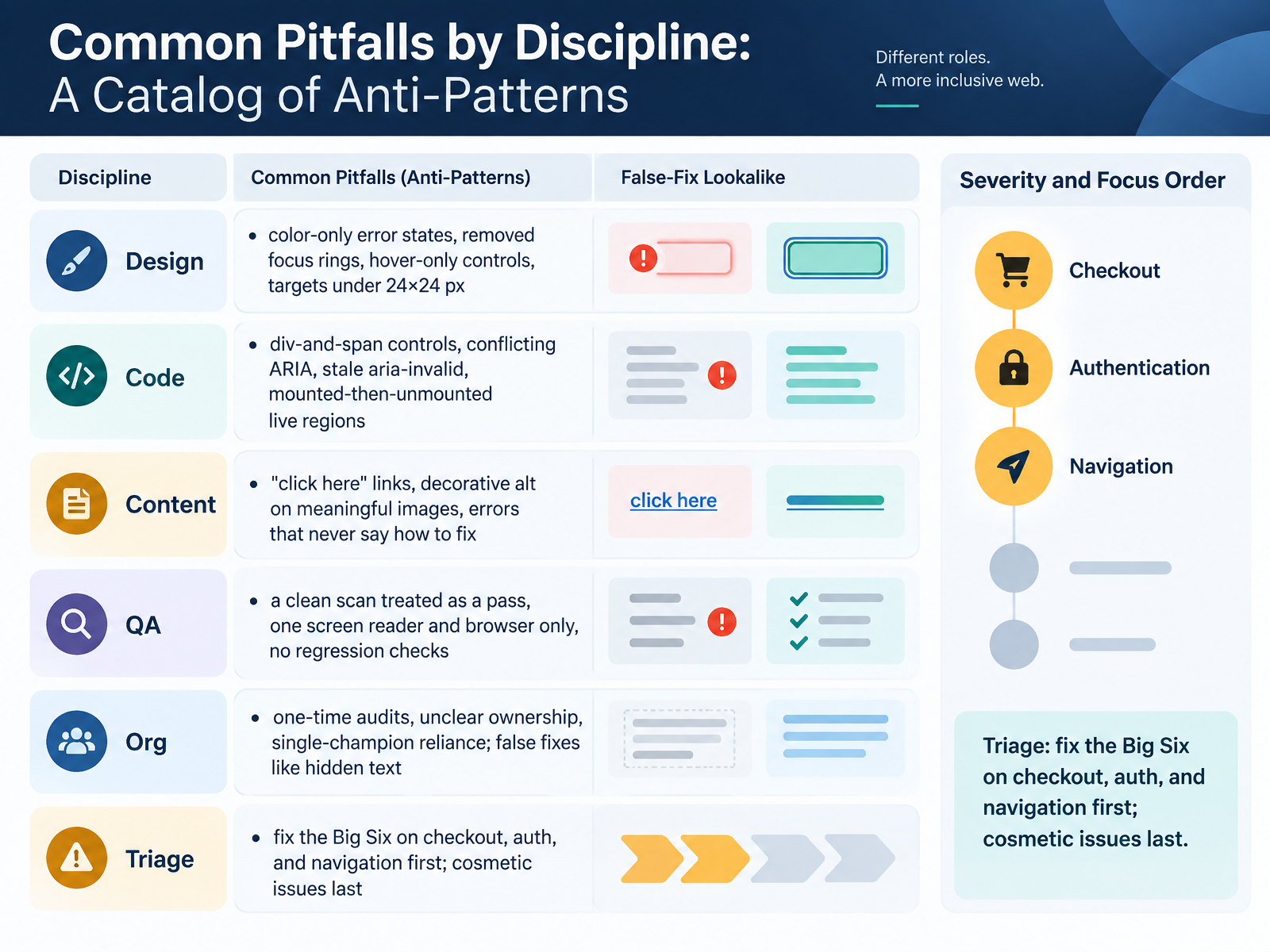
 - 09Common Pitfalls by Discipline: A Catalog of Anti-PatternsNow let's name the anti-patterns, discipline by discipline, so you can recognize them on sight. In design: error states signaled by color alone, focus rings removed, controls that appear only on hover, and targets smaller than twenty-four by twenty-four pixels. In code: div-and-span controls that lose their name, role, and keyboard support, conflicting ARIA, stale aria-invalid after a fix, and live regions mounted then unmounted, which silently drops announcements. In content: links that just say click here, decorative alt text on meaningful images, and error messages that never say how to fix the problem. In QA: treating a clean scan as a pass, testing one screen reader and browser only, and skipping regression checks. Organizationally: one-time audits, unclear ownership, reliance on a single champion, and false fixes like hidden text. For triage, fix the Big Six on checkout, authentication, and navigation first, and treat cosmetic issues last. Note the pattern: the failures that improved, alt text and document language, are server-rendered single decisions, while the ones that worsened live in dynamic components. Next, testing and validation, from automated checks to real users.
 webaim.orgaccessibility.buildwebaim.org+22 min
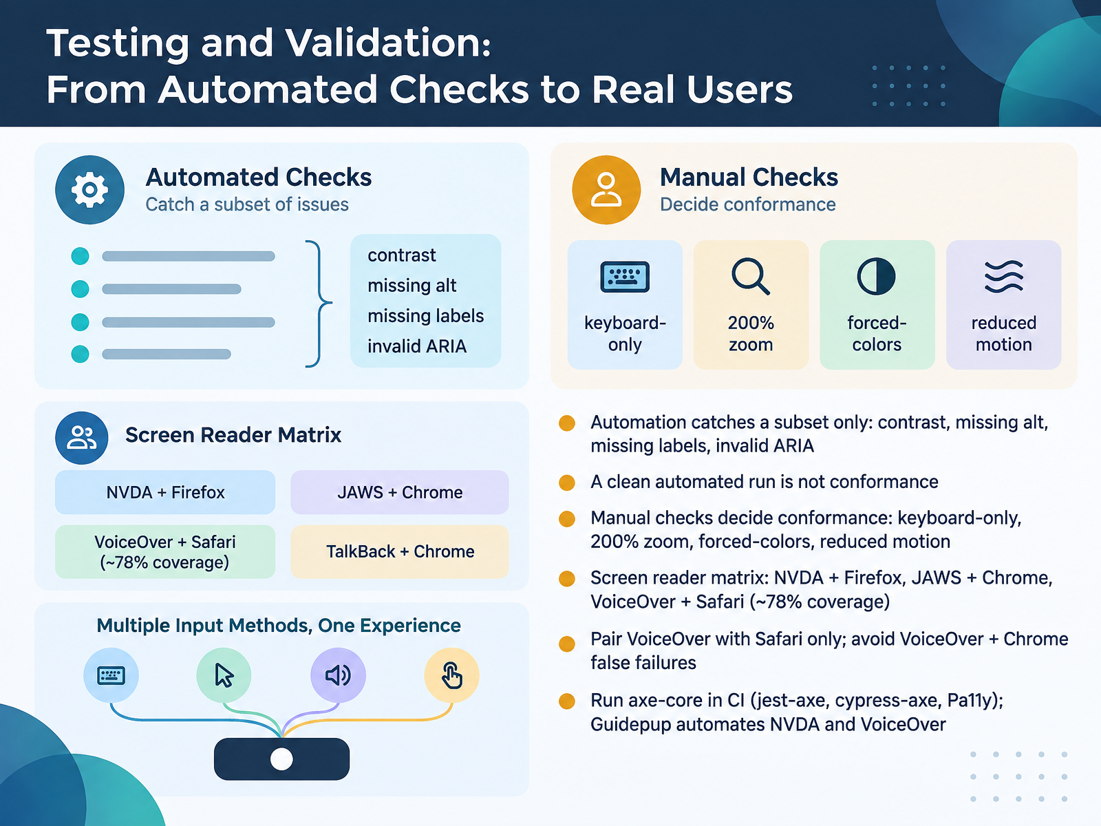
 - 10Testing and Validation: From Automated Checks to Real UsersNow let's look at testing and validation, from automated checks to real users. Start with what automation can and cannot do. Automated tools catch a subset only. That means contrast, missing alt text, missing labels, and invalid ARIA. And here is the key point: a clean automated run is not conformance. Manual checks decide conformance. Those include keyboard-only operation, two hundred percent zoom, forced-colors mode, and reduced motion. Then test a screen reader matrix. NVDA with Firefox, JAWS with Chrome, and VoiceOver with Safari together cover roughly seventy eight percent of real-world usage. Pair VoiceOver with Safari only, because VoiceOver with Chrome produces false failures. For CI, run axe-core through jest-axe, cypress-axe, or Pa11y. And Guidepup can automate NVDA and VoiceOver. Next, we move to teaching and scaling, turning these examples into team practice.
 w3.org2 min
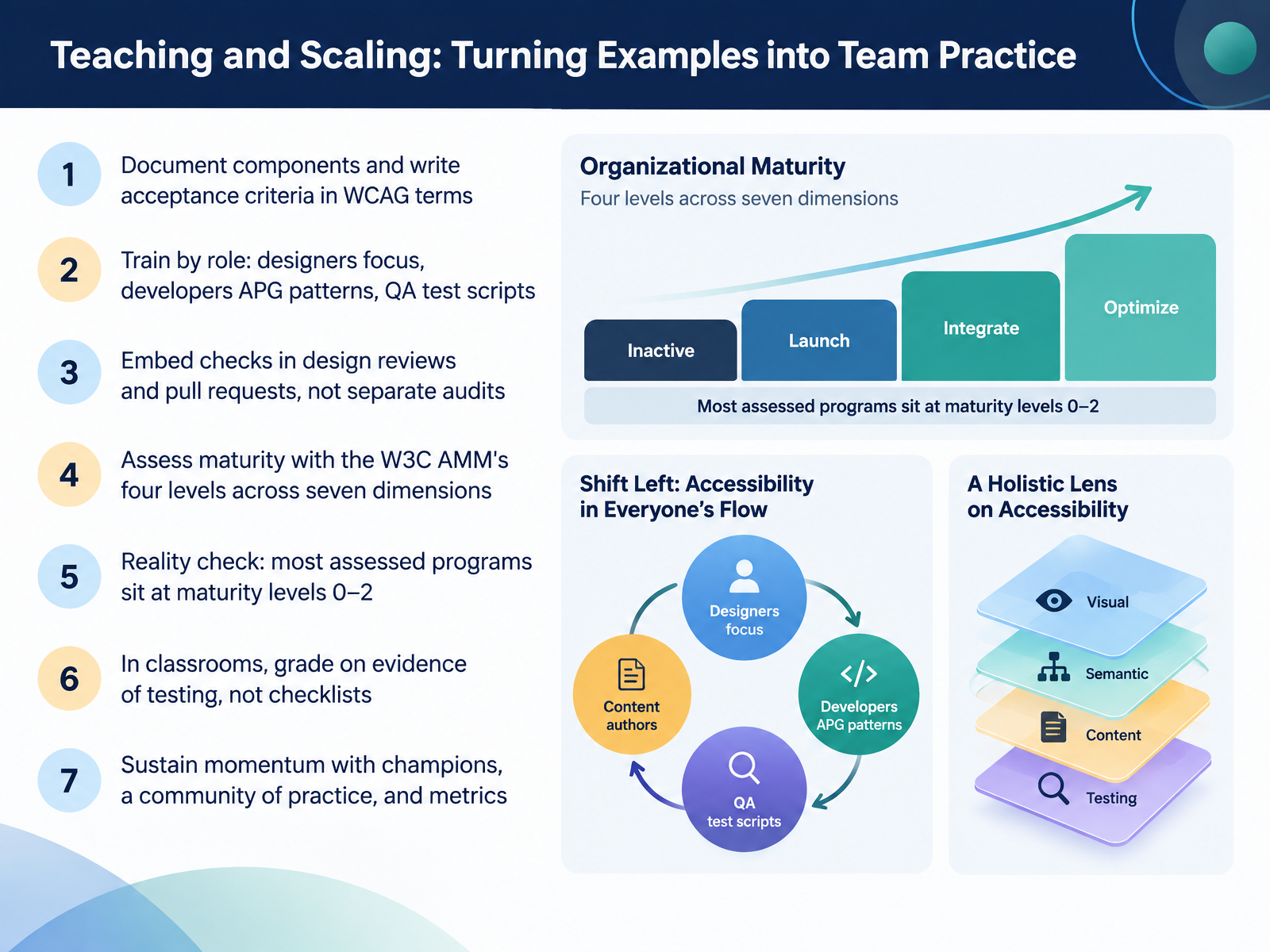
 - 11Teaching and Scaling: Turning Examples into Team PracticeLet's talk about turning examples into team practice. First, document components and write acceptance criteria in WCAG terms, for example, all text meets a contrast ratio of four point five to one. Then train by role. Designers focus on focus order and focus states. Developers follow the ARIA Authoring Practices patterns. QA writes test scripts. Next, embed checks in design reviews and pull requests, not separate audits. Assess maturity with the W3C Accessibility Maturity Model, which has four levels, Inactive, Launch, Integrate, and Optimize, across seven dimensions. A reality check: most assessed programs sit at levels zero to two. In classrooms, grade on evidence of testing, not checklists. Sustain momentum with champions, a community of practice, and metrics. Where Enforcement and Standards Are Heading in 2026 to 2030.
 w3.org2 min
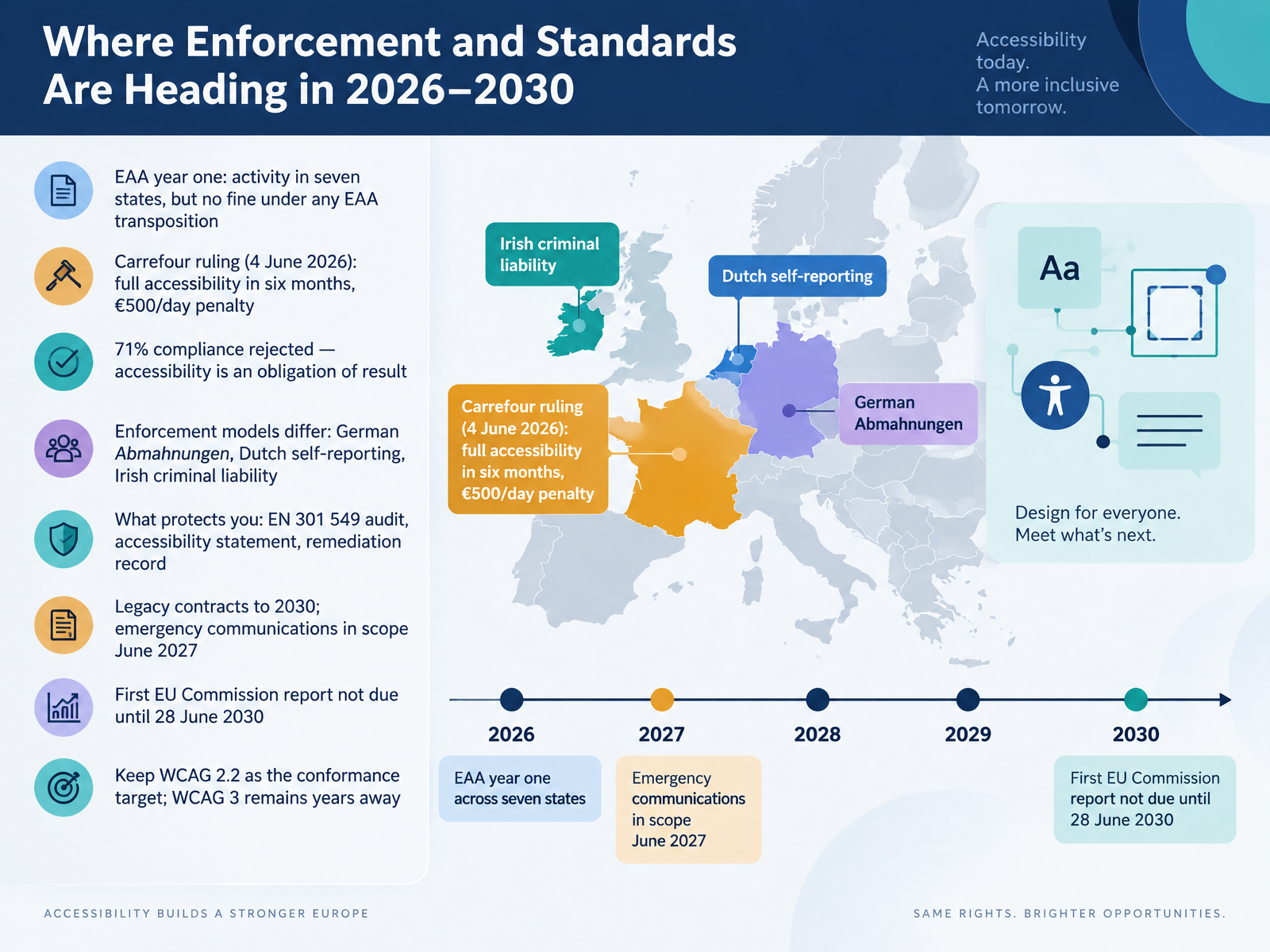
 - 12Where Enforcement and Standards Are Heading in 2026–2030Now let's look ahead to where enforcement and standards are heading between 2026 and 2030. Year one of the European Accessibility Act brought activity in at least seven member states, but no fine issued under any EAA transposition. Then came the Carrefour ruling on the fourth of June, 2026. A French court ordered full accessibility within six months, with a penalty of five hundred euros per day. Carrefour argued it was seventy-one percent compliant. The court rejected that. Accessibility is an obligation of result, so seventy-one percent is a fail. Enforcement models differ too. Germany relies on Abmahnungen, private warning letters. The Netherlands runs mandatory self-reporting. Ireland carries criminal liability. What protects you is an EN 301 549 audit, a current accessibility statement, and a remediation record. Legacy contracts run to 2030, emergency communications come into scope in June 2027, and the first Commission report is not due until the twenty-eighth of June, 2030. So keep WCAG 2.2 as your conformance target. WCAG 3 remains years away. Next, we'll wrap up by applying these patterns, strengths, and pitfalls to your own work.
 w3c.github.iow3.orgw3.org+22 min
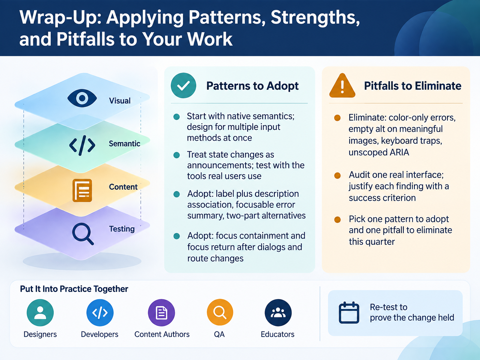
 - 13Wrap-Up: Applying Patterns, Strengths, and Pitfalls to Your WorkLet's bring it together and turn these patterns into practice. Start with native semantics, and design for multiple input methods at once. Treat state changes as announcements, and test with the tools real users actually rely on. So, adopt label plus description association. Adopt a focusable error summary, and two-part alternatives. Also adopt focus containment, and focus return after dialogs and route changes. Then eliminate the recurring pitfalls: color-only errors, empty alt on meaningful images, keyboard traps, and unscoped ARIA. To make this concrete, audit one real interface, and justify each finding with a specific success criterion from WCAG 2.2. Where possible, include users with disabilities in your testing. Remember, accessibility maturity is a continuous process, not a one-time fix. So pick one pattern to adopt and one pitfall to eliminate this quarter. Thank you for your attention throughout this course. You now have a practical framework, so go apply it, keep testing, and keep improving. Your work genuinely expands who can use what you build.
 w3.orgw3.orgw3c.github.io+22 min
Take the deck with you
Download this course as a file — free, no sign-up needed.
- PDF handoutEvery slide page, ready to print or share.14 pages · 3.3 MBDownload
- Narrated PowerPointThe deck that presents itself — every slide carries the digital human's narration video.14 pages · 14.4 MBDownload
- PowerPoint slidesThe full deck as a .pptx — open it in PowerPoint, Keynote, or Google Slides.14 pages · 3.2 MBDownload
Free to use in your own training — please keep the PersonWise credit page at the end.
Have your own deck? Turn it into a course
Sources consulted
Web sources consulted while building this course.
- What's New in WCAG 2.2 | Web Accessibility Initiative (WAI) | W3C — w3.org
- Web Content Accessibility Guidelines (WCAG) 2.2 — w3c.github.io
- Introduction to Understanding WCAG 2.2 | WAI | W3C — w3.org
- How to Meet WCAG (Quickref Reference) — w3.org
- Web Content Accessibility Guidelines (WCAG) 2.2 Errata — w3.org
- WebAIM: The WebAIM Million - The 2026 report on the accessibility of the top 1,000,000 home pages — webaim.org
- State of Web Accessibility 2026: Report & Statistics — accessibility.build
- March 2026 Newsletter — webaim.org
- https://www.codeslog.com/en/posts/webaim-million-2026/ — codeslog.com
- WebAIM Million 2026: Same Six Failures, Worse Numbers | accessibility.chat — accessibility.chat
- Complex Images | Web Accessibility Initiative (WAI) | W3C — w3c.github.io
- HTML5: Techniques for providing useful text alternatives — w3c.github.io
- Images | web.dev — web.dev
- Complex Images | ta11y — ta11y.org
- [Draft] Image alternatives available - WCAG 3 Support Material | WAI | W3C — w3.org
- Carousel (Slide Show or Image Rotator) Pattern | APG | WAI | W3C — w3.org
- content/patterns/dialog-modal/dialog-modal-pattern.html at main · w3c/aria-practices — github.com
- Menu and Menubar Pattern | APG | WAI | W3C — w3.org
- Patterns | APG | WAI | W3C — w3.org
- Developing a Keyboard Interface | APG | WAI | W3C — w3.org