Instructional Design Storyboard Patterns
Begin
14 pages · ~28 min
Instructional Design Storyboard Patterns
Explore instructional design storyboard examples to identify effective patterns, strengths, and common pitfalls for improving course creation skills.
What you’ll learn
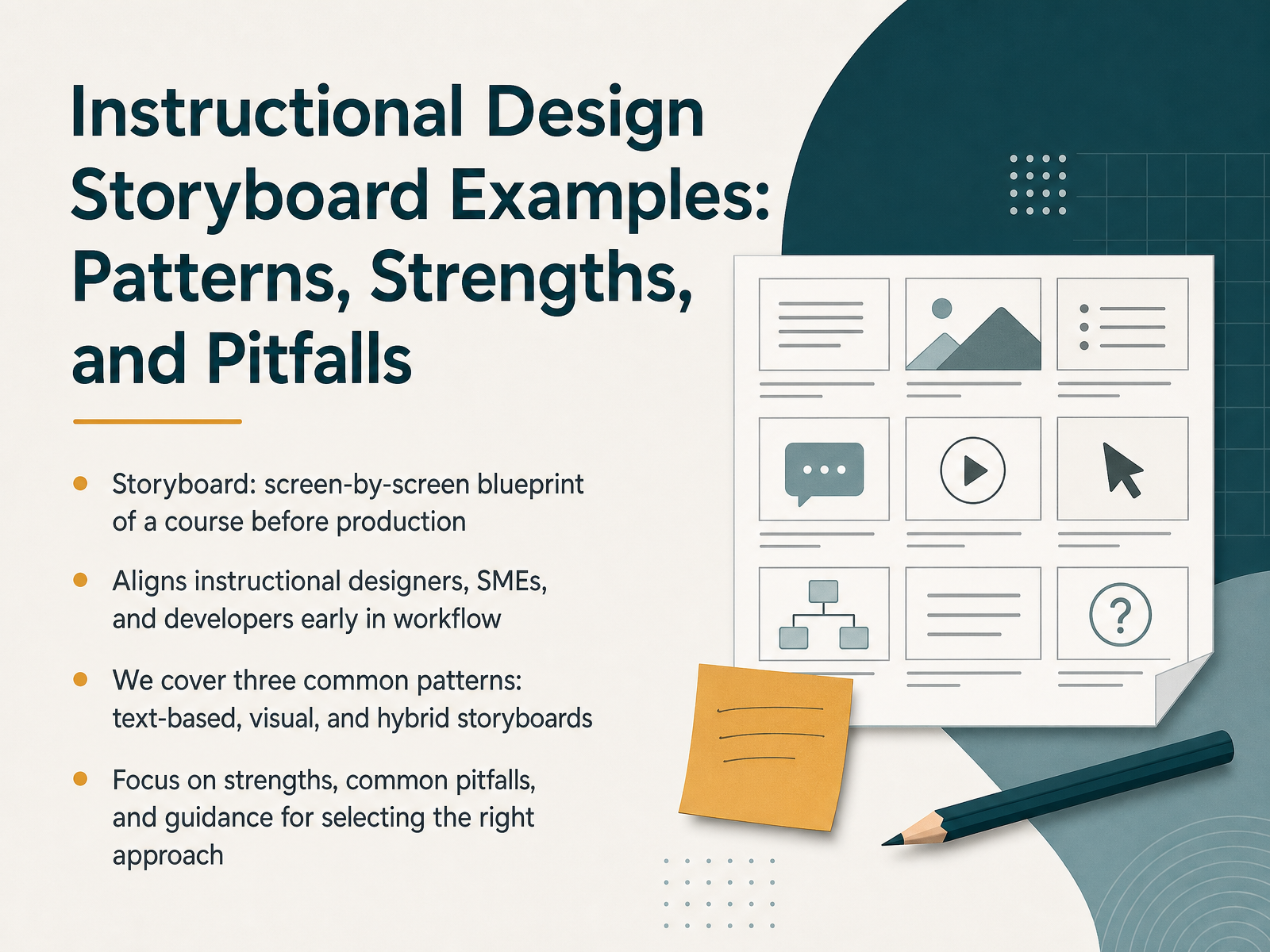
- 01Instructional Design Storyboard Examples: Patterns, Strengths, and PitfallsWelcome, everyone. Whether you are an instructional designer, a course creator, or a subject-matter expert, getting from raw content to a finished course is full of decisions. Today, we are going to talk about the tool that makes those decisions visible and collaborative: the storyboard. Think of it as a screen-by-screen blueprint captured before any production begins. It aligns us, the SMEs, and the developers early in the workflow, so everyone agrees on the learning experience before costly development starts. We will cover three common patterns you will likely recognize: text-based storyboards, visual storyboards, and the increasingly popular hybrid approach that blends both. For each one, we will examine its core strengths, its common pitfalls, and practical guidance for selecting the right approach for your specific project. Let's get started. First, we will look at why storyboarding plays a central role in the workflow and who needs a seat at the table.teachfloor.comrosariamarraffino.cominstructional-designs.net+22 min
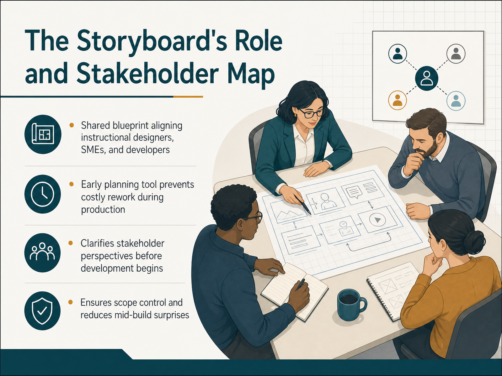
- 02The Storyboard's Role and Stakeholder MapLet's ground ourselves in what a storyboard really is: a shared blueprint that aligns instructional designers, subject-matter experts, and developers before production begins. Think of it as the architectural drawing for your course—the single reference point that keeps everyone moving in the same direction. The storyboard's role is strategic. It's an early planning tool that prevents costly rework later. When we catch content gaps or flow issues in the storyboard, we fix them in a document—not in a fully built module. That's where the real savings happen. The stakeholder map is just as important. Each player brings a different lens: the SME focuses on accuracy, the designer on learning flow, the developer on feasibility. The storyboard clarifies these perspectives up front, so we don't discover conflicting priorities mid-build. It also ensures scope control by defining exactly what screens, interactions, and assessments will be delivered. That reduces mid-build surprises and keeps the project on track. So as we move into the core components and fields, keep that align-first mindset—it will guide every storyboard decision you make.
 teachfloor.comrosariamarraffino.cominstructional-designs.net+21 min
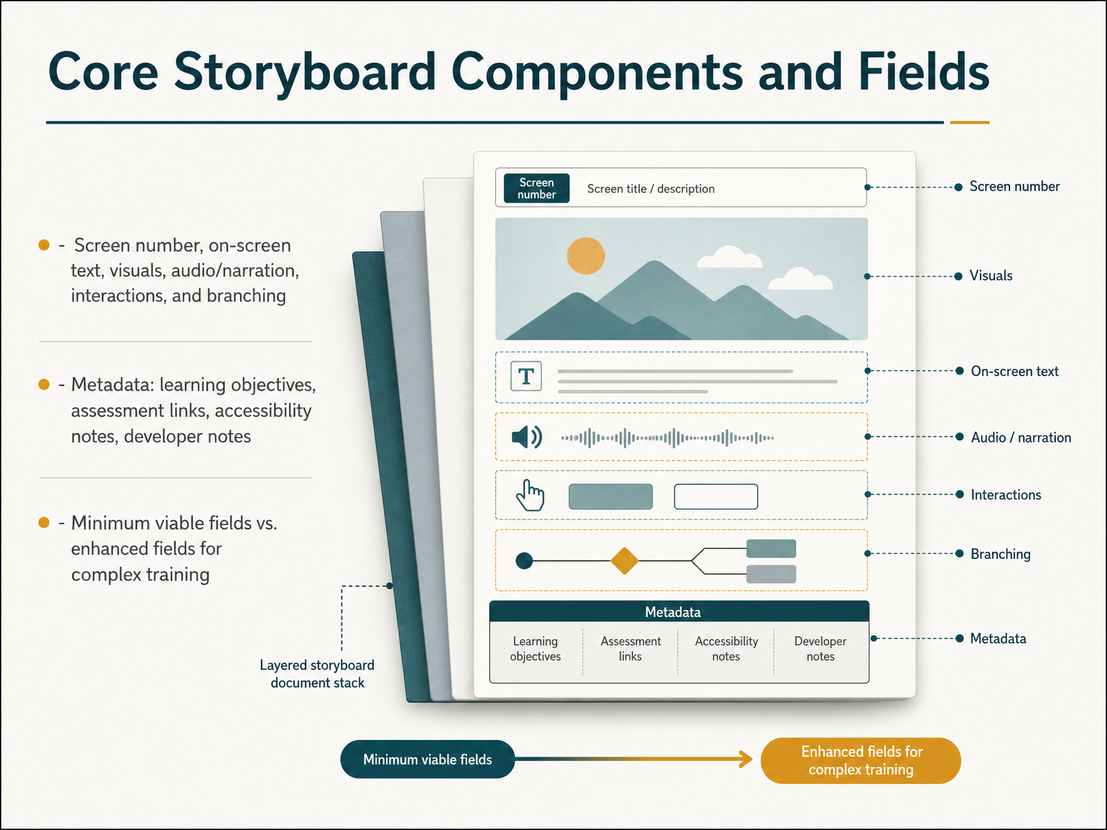
 - 03Core Storyboard Components and FieldsLet’s break down the anatomy of a storyboard. At its core, every screen needs a few essentials: a screen number, the on-screen text, a description of any visuals, the audio or narration script, and notes on interactions and branching logic. Think of these as the baseline—the minimum viable fields. For complex training, we layer in metadata. That includes the learning objective tied to that screen, links to any assessments, accessibility notes, and quiet-but-critical developer instructions. A metadata row is your best defense against scope creep and mid-build surprises. Here’s a practical rule of thumb: if your developer can build the screen without asking a question, your storyboard has enough detail. If your SME can verify accuracy without wading through visual noise, you’ve chosen the right format. Getting this balance right—enough structure for clarity, but not so much that it stifles iteration—is the difference between a storyboard that guides and one that gathers dust. Next, let’s look at our first pattern: the text-based storyboard, and where it truly shines.
 teachfloor.comrosariamarraffino.cominstructional-designs.net+21 min
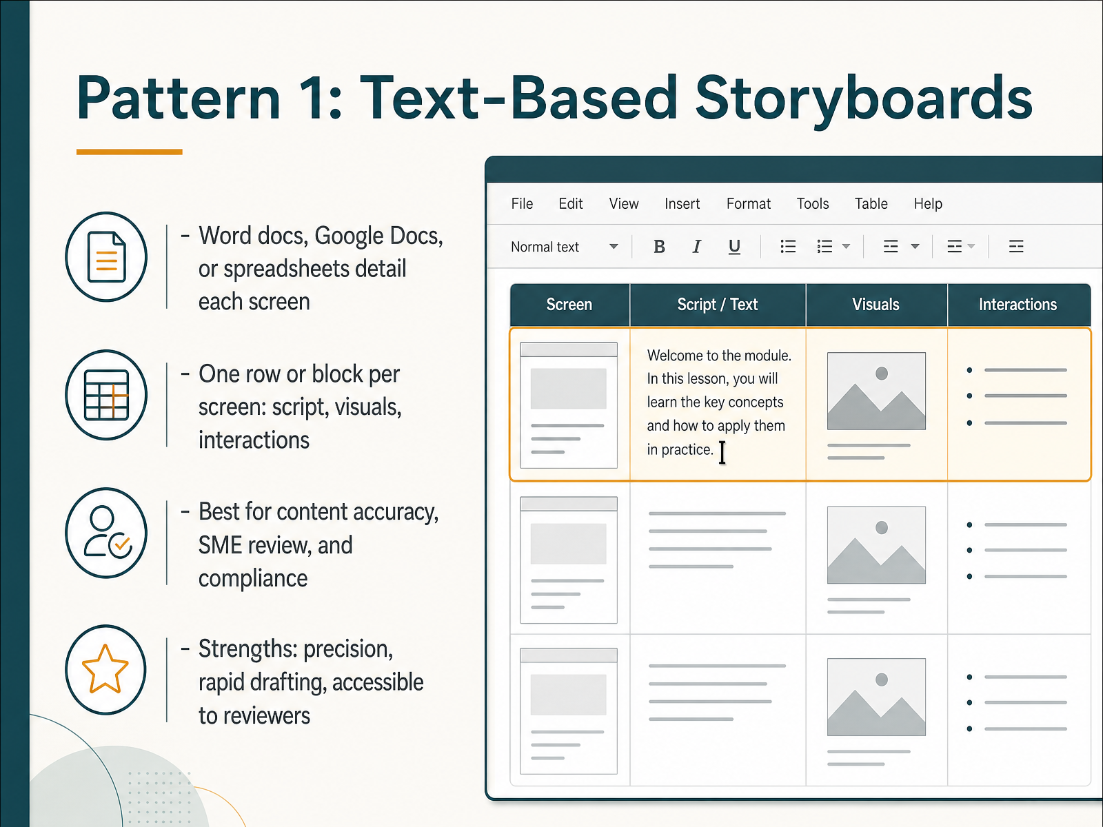
 - 04Pattern 1: Text-Based StoryboardsLet’s look at the first pattern—text-based storyboards. These live in tools you already know: Word, Google Docs, or spreadsheets. The core idea is simple—one row or one block per screen, capturing the script, the on-screen visuals, and any interactions.
Where does this pattern shine? When content accuracy is mission-critical. Think compliance training, policy updates, or anything requiring rigorous SME review. Because everything is written out, your subject matter expert can focus purely on the substance—verifying that the information is correct—without getting distracted by colors, layouts, or visual polish.
The strengths are practical. You can draft rapidly, iterate quickly, and version-track changes with ease. And crucially, it’s accessible—any reviewer can open a Word document and comment without needing design tools or specialized knowledge.
But beware the pitfalls. A text-based storyboard gives no visual sense of the final product. Graphic designers may interpret your descriptions differently than you intended, leading to rework. And for complex branching scenarios, a long, linear document can become difficult to navigate and review.
Keep this pattern in your toolkit for projects where the message matters more than the medium. Now, let’s contrast that with our second pattern, visual and wireframe storyboards.
 teachfloor.comrosariamarraffino.cominstructional-designs.net+22 min
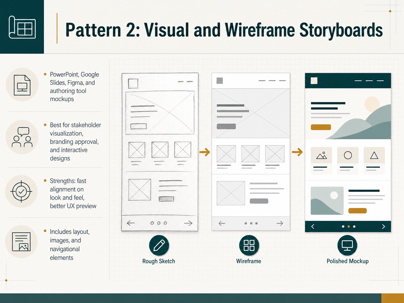
 - 05Pattern 2: Visual and Wireframe StoryboardsNow let's turn to the second major pattern: visual and wireframe storyboards. This is where we move beyond text and start showing stakeholders what the course will actually look like. You can build these in PowerPoint, Google Slides, Figma, or directly inside your authoring tool as mockups. The core idea is that each slide or screen includes layout, images, and navigational elements, giving reviewers a true preview of the learner experience. The strengths here are significant. If you need stakeholder buy-in on look and feel, or you need formal approval on branding, this format gets you there fast. It also helps you catch UX issues before development, because you can see the interface logic up front. That said, be aware of the pitfalls. Visual storyboards take more time to build and iterate than text-based ones, and if stakeholders get fixated on color choices or font sizes, you can find yourself in endless revision loops. My advice is simple: use visual storyboards when look and feel is a central approval point, and protect yourself by collecting feedback on layout and interaction first, before you open the door to detailed design polish. Up next, we'll look at how hybrid and rapid-prototype approaches blend the best of both worlds.
 teachfloor.comrosariamarraffino.cominstructional-designs.net+22 min
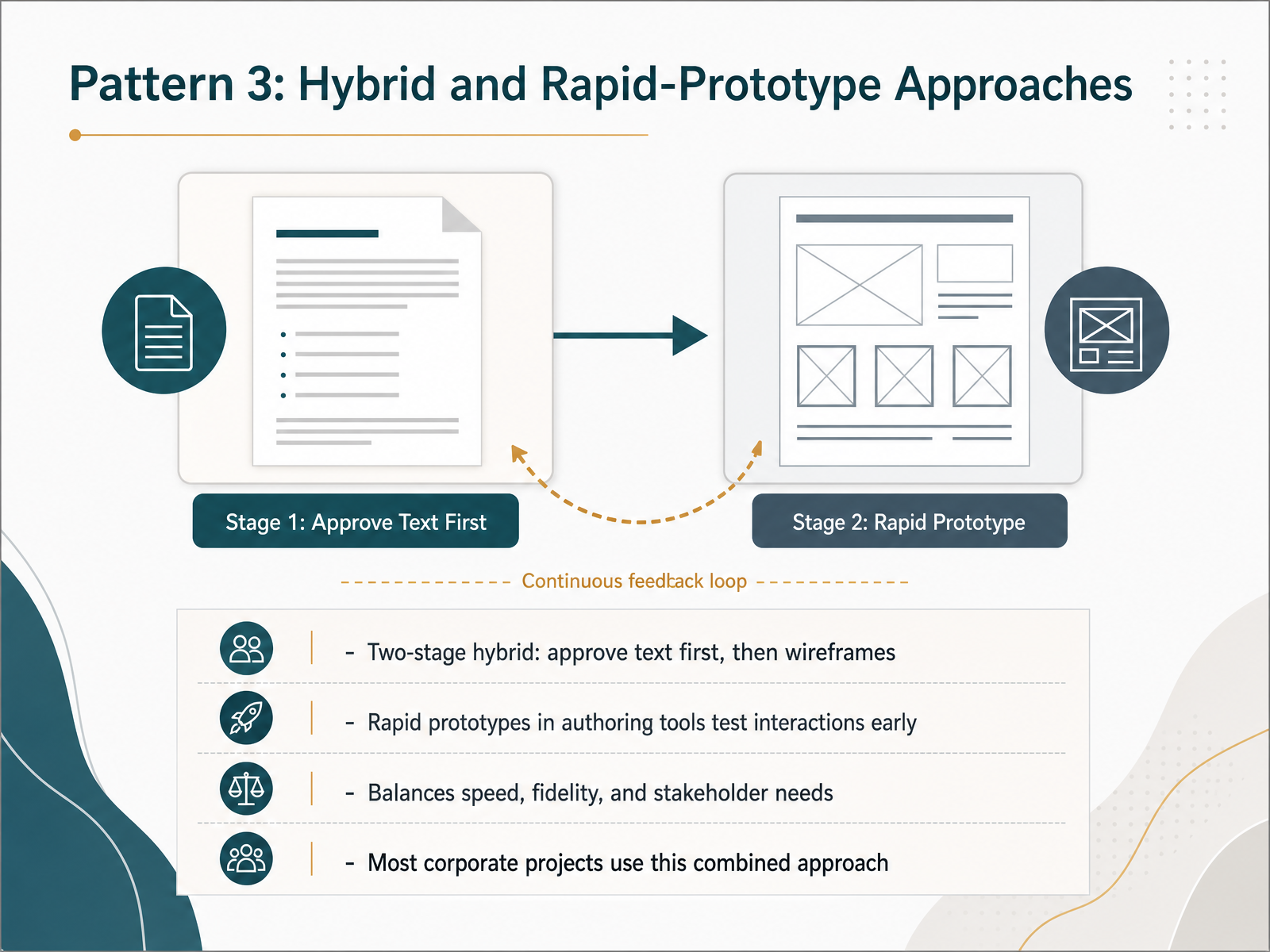
 - 06Pattern 3: Hybrid and Rapid-Prototype ApproachesNow let's talk about the hybrid and rapid-prototype approach. This is where we combine the discipline of text with the clarity of visuals. The most effective pattern I've seen is a two-stage process. First, you get the text approved. The narration script, the on-screen text, the flow, and the content logic. This is where you bring in your subject matter experts to focus purely on accuracy. Once that's locked down, you move to stage two and build low-fidelity wireframes. These are simple layout sketches, not polished designs. They let stakeholders see where elements will sit and how the interactions will flow without getting distracted by colors or branding. If you need to test more complex interactions, you can take this a step further and build a rapid prototype directly in your authoring tool. This gives everyone a clickable version of the experience early, so you can validate the feel of the course before committing to full production. This hybrid method balances speed and fidelity perfectly. It gives stakeholders one focused question to answer at each stage, and it keeps SMEs from getting sidetracked by visual details. That is why most corporate projects adopt this combined approach. Now, let's look at a concrete example of this in action with a scenario-based training project.
 teachfloor.comrosariamarraffino.cominstructional-designs.net+21 min
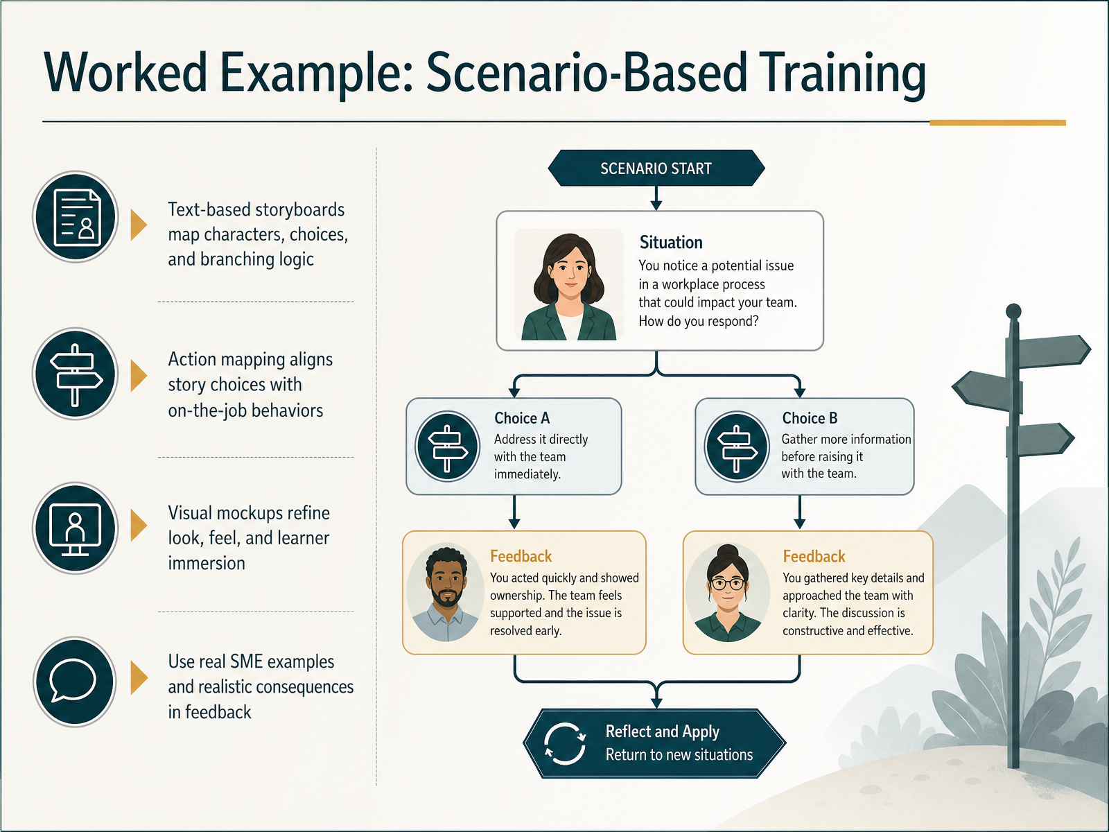
 - 07Worked Example: Scenario-Based TrainingLet’s walk through a worked example of scenario-based training storyboards. The key here is layering three planning artifacts. First, a text-based storyboard that maps your characters, their choices, and the branching logic. Think of it as the script for every decision point. Second, anchor that story to real on-the-job behaviors using action mapping. If your scenario choices don’t align with what learners actually do at work, you’ve built a clever simulation of the wrong thing. Third, add visual mockups. These refine the look and feel early, so you’re not discovering a poor layout after development begins. Throughout, ground the scenarios in real SME examples and write feedback that shows realistic consequences. For instance, if a learner chooses to ignore a de-escalation step, the feedback should show the customer’s frustration escalating. That’s how learners internalize the stakes. In practice, start with action mapping to define the core behaviors. Then draft your scenario script around those behaviors, and only then build visual mockups. This keeps your story both engaging and aligned to performance goals. Now, let’s contrast that with a compliance and linear content example.
 timhorganlxd.comemilylewislxd.comnicolekrynski.com+22 min
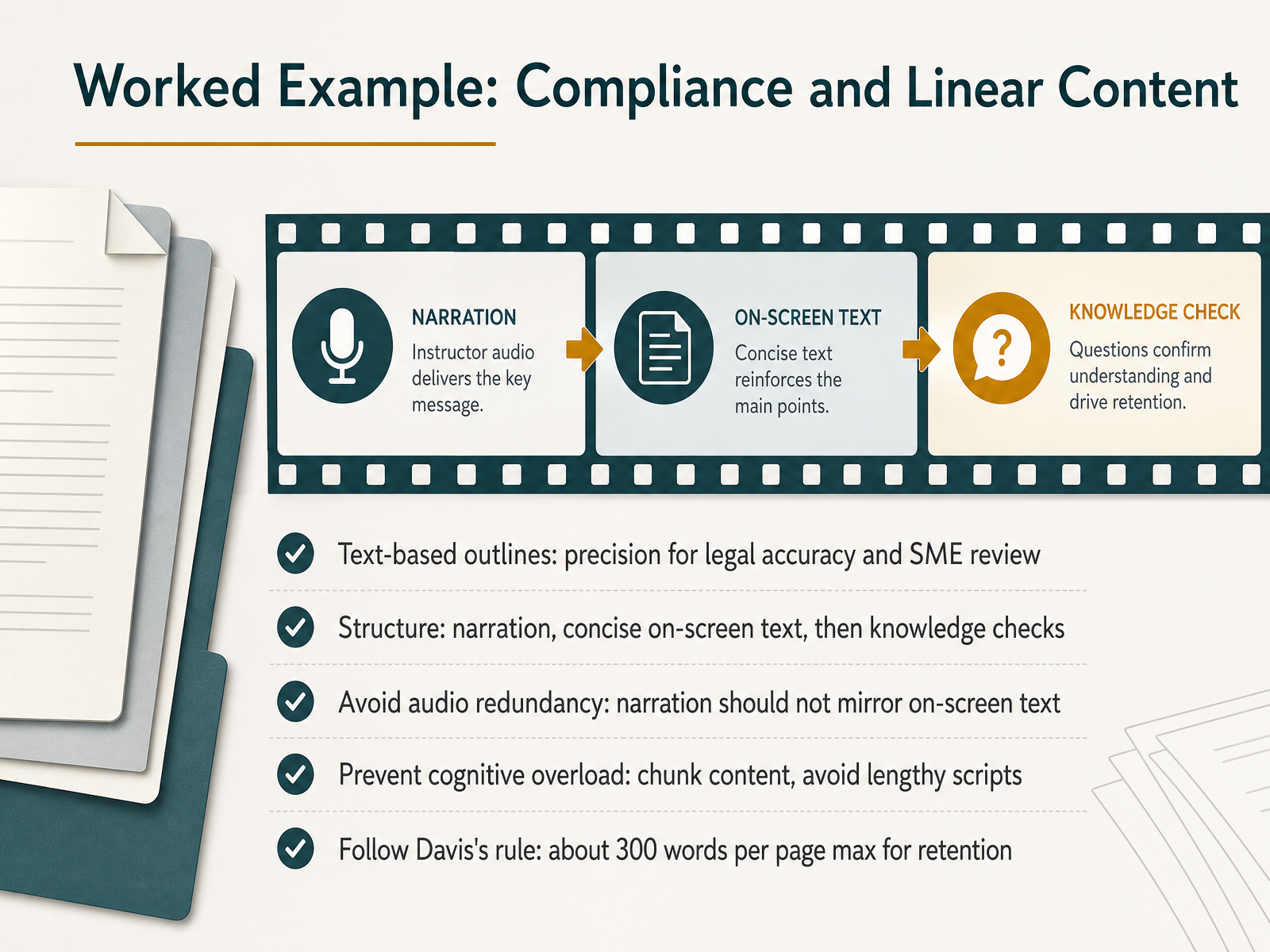
 - 08Worked Example: Compliance and Linear ContentLet's look at a worked example that puts these principles into practice: compliance and linear content. This is where text-based outlines really shine, because they give you the precision needed for legal accuracy and clean SME review. Your structure should follow a simple rhythm: narration carries the explanation, concise on-screen text reinforces the key point, and then a knowledge check locks it in. Now here is the trap to avoid: audio redundancy. If your narration simply mirrors the on-screen text, learners will tune out. Let the audio drive the page while tight text supports it. Also, prevent cognitive overload by chunking content into digestible pieces. Avoid lengthy scripts. A useful benchmark is Davis's rule: aim for about three hundred words per page max. If you exceed that, retention drops. So, keep it tight, give your SMEs a clean text outline to review, and you will keep compliance training crisp rather than overwhelming.
 elearningindustry.comeleapsoftware.compvplive.net+21 min
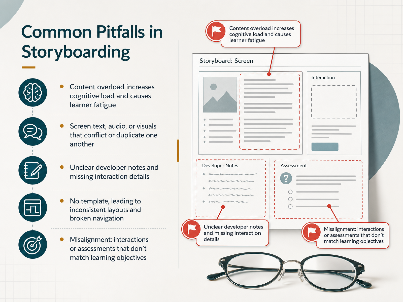
 - 09Common Pitfalls in StoryboardingLet's turn to the common pitfalls that can quietly undermine a storyboard. The first and most frequent one is content overload. When we crowd a single screen with dense text or multiple media elements, we raise the learner's cognitive load and invite fatigue. A good rule of thumb is to keep a traditional page near three hundred words or under two minutes of narration. If you need more, break it up. Use click-to-reveal interactions or split the content across multiple screens. Next, watch for conflicting or duplicated messages. If the audio script says one thing while the on-screen text says another, the learner receives no clear message at all. And if narration simply reads the text aloud verbatim, that's redundant and patronizing. Let the audio drive the page while text and visuals support it. Another major issue is vague developer notes. If you don't specify the interaction, the branching, or the feedback in detail, the developer will guess, and the result will miss your intent. Also, beware of working without a consistent template. Inconsistent layouts break navigation flow and make the course feel disjointed. Finally, ensure every interaction and assessment maps back to a stated learning objective. If the quiz doesn't measure the objective, the whole design is misaligned. Recognizing these pitfalls early gives us a path to avoid them. Next, let's look at how review and alignment keep our storyboards on track.
 elearningindustry.comeleapsoftware.compvplive.net+22 min
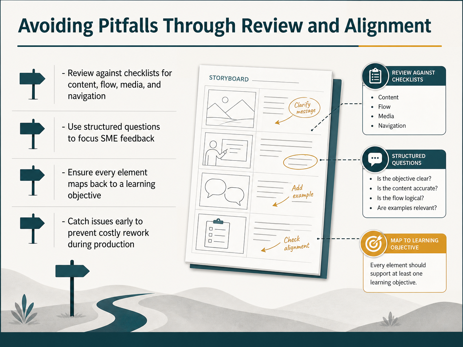
 - 10Avoiding Pitfalls Through Review and AlignmentSo how do we steer clear of these pitfalls before they become expensive problems? The answer is review and alignment. First, review your storyboard against concrete checklists, covering content accuracy, instructional flow, media choices, and navigation logic. This turns a vague gut check into a systematic pass. Second, give your subject matter experts structured questions rather than an open invitation to rewrite. Ask them specifically about factual accuracy and whether the examples ring true for the audience. That keeps their feedback focused where it matters most. Third, verify that every on-screen element and interaction maps back to a learning objective. If something doesn't serve an objective, it's probably scope creep. And fourth, catch issues now. A change on paper takes minutes, but the same change during production means re-recording audio, rebuilding graphics, and re-testing interactions. That is where timelines slip. Reviewing early keeps your storyboard a blueprint and not a source of rework. Now, let's turn to choosing the right pattern for your project.
 elearningindustry.comeleapsoftware.compvplive.net+21 min
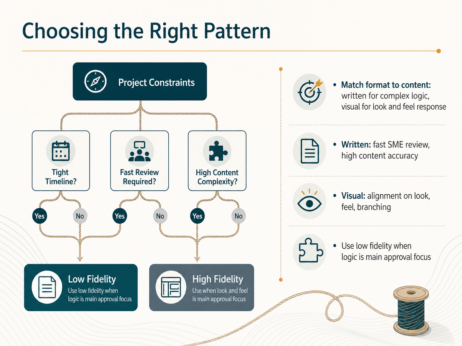
 - 11Choosing the Right PatternSo how do we decide which pattern fits the moment? Start with the content itself. If your course is driven by complex logic, branching pathways, or dense narration, a written storyboard is your best friend. It gives subject matter experts a fast, focused review lane, and it keeps content accuracy at the center of the conversation. On the other hand, if your success depends on the look, the feel, or the emotional response to visuals, a visual storyboard is the way to go. It gets everyone aligned on layout and user experience before a single asset is produced. Here is a practical tip that saves real time. When the main approval focus is the logic, keep the fidelity low. Simple wireframes prevent reviewers from getting lost in font choices when they should be validating the decision flow. If you need both kinds of sign-off, consider a two-stage pass. Let the text carry the content review first, then bring in the visual wireframes for the look and feel. One focused question at a time means fewer stalled reviews. In practice, this simple match between content and format unblocks approvals fast. Now let us talk about the tools and templates that make these patterns easy to execute.
 teachfloor.comrosariamarraffino.cominstructional-designs.net+21 min
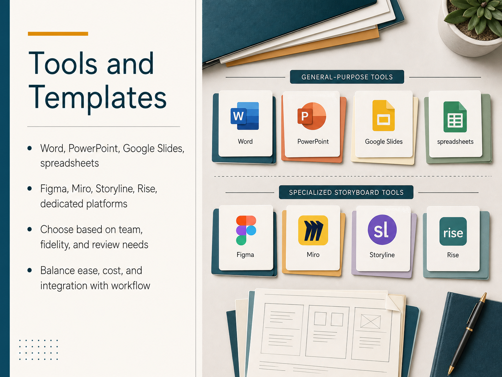
 - 12Tools and TemplatesLet’s talk about the tools you’ll actually use to build and share your storyboards. There’s no single right answer here—it really comes down to your team, the fidelity you need, and how you handle reviews. For rapid, text-heavy drafts, Word or Google Docs are hard to beat. Track changes and commenting make SME feedback straightforward. If you need something more visual, PowerPoint or Google Slides let you sketch wireframes and layouts that stakeholders can instantly picture. For collaborative, big-picture planning, Miro or Figma are excellent for mapping out the learner journey and iterating in real time. And when you’re ready to move toward development, tools like Storyline or Rise let you storyboard and build in the same environment, which saves time but can feel more like production than planning. Spreadsheets also earn their keep, especially for tracking content inventories or review status across many modules. As you choose, balance ease of use, cost, and how well the tool integrates with your existing workflow. The best storyboard tool is the one your team will actually use consistently. Coming up, we’ll put this into practice with a hands-on evaluation exercise.
 storyflow.soarticulate.comaicoursecreator.eskilled.io+21 min
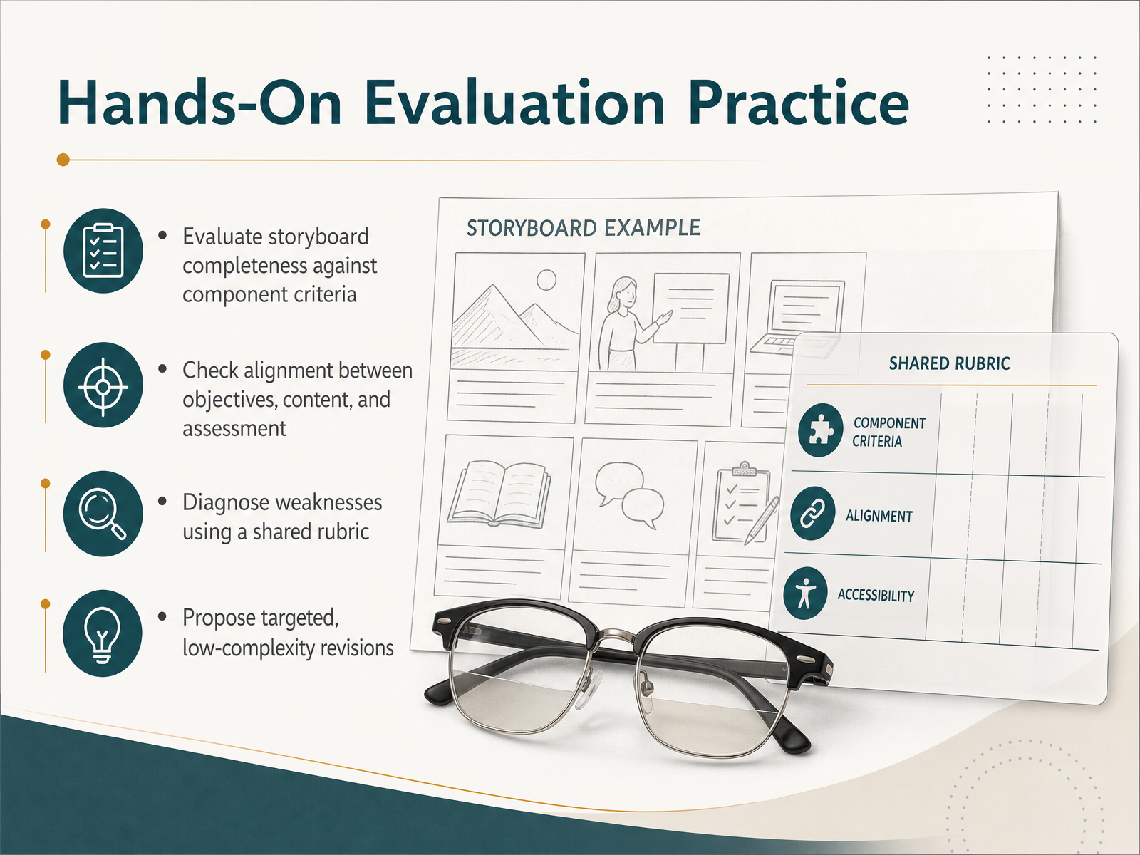
 - 13Hands-On Evaluation PracticeLet's put all of this into practice. Take a storyboard you're currently working on, or one you've recently finished, and evaluate it against the core component criteria we've covered. The goal here is to check alignment between your stated learning objectives, the content you've included, and your planned assessments. Ask yourself if every screen is pulling its weight or if some content has drifted off-topic. A shared rubric is invaluable here. It turns what could feel like a subjective critique into a structured diagnosis, helping you name specific weaknesses rather than vague concerns. Once you spot an issue, propose a targeted, low-complexity revision. For example, if a screen is overloaded with text, don't redesign the whole module; simply split the content into two screens or convert a paragraph into a click-to-reveal interaction. If the audio script and on-screen text are redundant, decide which one leads and rewrite the other to support it. Small, surgical fixes keep your momentum and prevent scope creep. After you've practiced on your own project, we'll consolidate everything into a practical action plan for your next storyboard.
 elearningindustry.comeleapsoftware.compvplive.net+22 min
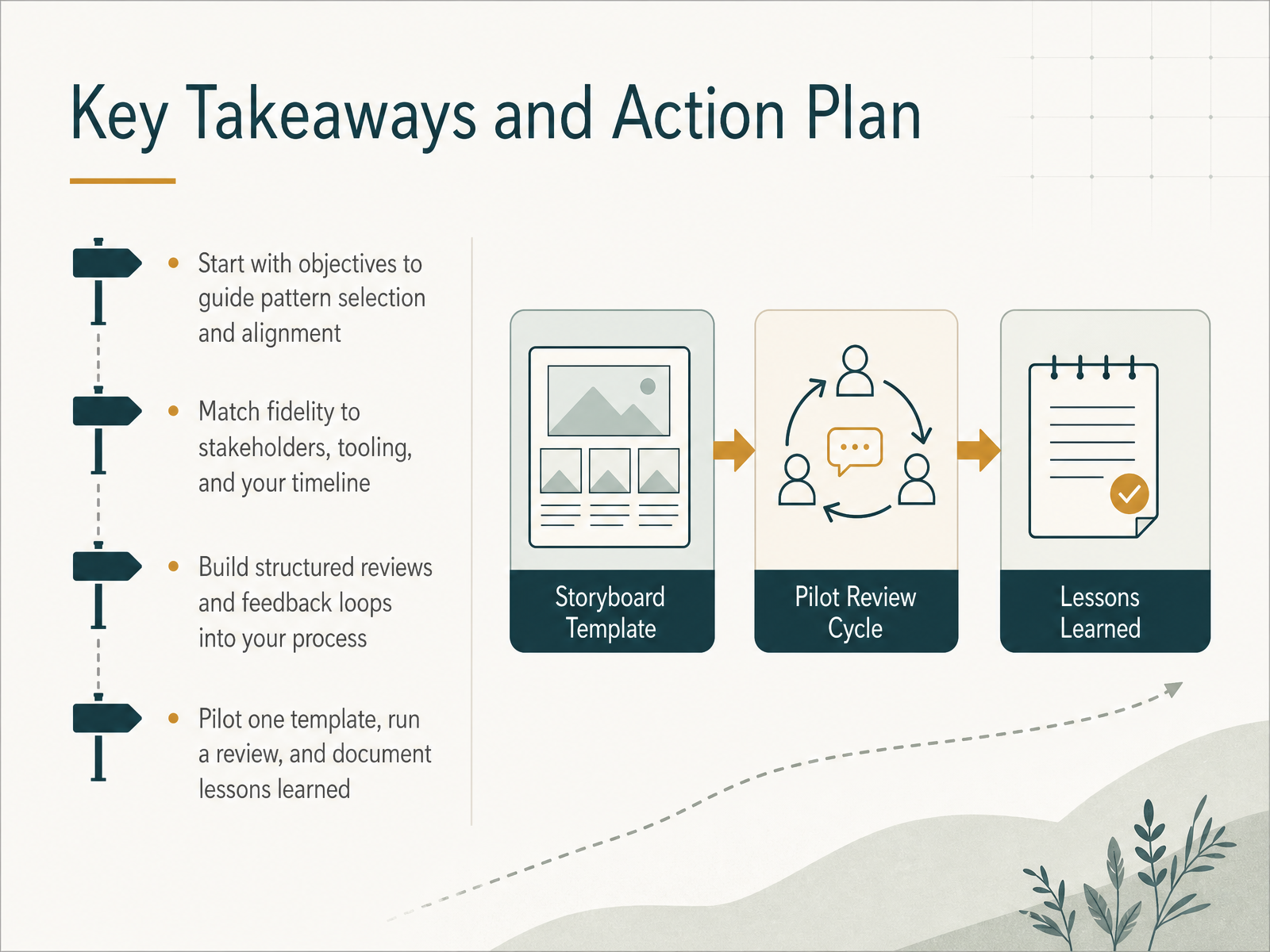
 - 14Key Takeaways and Action PlanWe have covered a lot of ground, so let us anchor it in four practical takeaways. Start with your learning objectives. They are the compass for everything, guiding which storyboard pattern you choose and keeping every screen aligned to the goal. Next, match your storyboard fidelity to your stakeholders, your tools, and your timeline. A simple text document can be perfect for a fast SME review, while a visual wireframe may be better when selling a look and feel to a client. Third, build structured reviews and feedback loops directly into your process. Whether that is a formal sign-off meeting or inline comments in a shared doc, make sure feedback is consolidated and clear before development begins. Finally, commit to a pilot. Choose one template, run it through a full project, review how it held up, and document what you learned. That small investment of time will refine your approach more than any theory. Thank you for your time and attention. I hope you feel equipped to choose your next storyboard pattern with confidence. Go make something great.
 elearningindustry.comeleapsoftware.compvplive.net+22 min
Take the deck with you
Download this course as a file — free, no sign-up needed.
- PDF handoutEvery slide page, ready to print or share.15 pages · 3.4 MBDownload
- Narrated PowerPointThe deck that presents itself — every slide carries the digital human's narration video.15 pages · 14.1 MBDownload
- PowerPoint slidesThe full deck as a .pptx — open it in PowerPoint, Keynote, or Google Slides.15 pages · 3.2 MBDownload
Free to use in your own training — please keep the PersonWise credit page at the end.
Have your own deck? Turn it into a course
Sources consulted
Web sources consulted while building this course.
- What is a Storyboard? | Teachfloor — teachfloor.com
- Types of Storyboards for e-learnings - Rosaria Marraffino Learning & Communication — rosariamarraffino.com
- General 2 — Instructional Designs — instructional-designs.net
- How to create an effective instructional design storyboard | SessionLab — sessionlab.com
- Innovative elearning ideas, elearning topics and examples: Elearning storyboard and its elements — elearningletters.com
- Scenario-Based Storyboards — timhorganlxd.com
- Scenario Course — emilylewislxd.com
- Nicole Krynski - Scenario Based eLearning — nicolekrynski.com
- JOY CHEN - Scenario-based eLearning — joychenlearning.com
- Scenario-based eLearning — Melanie Adkison Learning Experience Designer — melanielxd.com
- 7 Common Instructional Design Pitfalls in E-learning Storyboards — elearningindustry.com
- Storyboarding mistakes and how to avoid them — eleapsoftware.com
- 5 Pitfalls to Avoid When Creating eLearning Storyboards — pvplive.net
- 5 Blunders to Avoid While Storyboarding a Course — thinkingkaplearning.com
- How to Build a Storyboard: Best Practices for Instructional Designers — litmos.com
- The 11 Best AI Tools for Instructional Designers (2026) — storyflow.so
- Highly Customizable Course Authoring with Storyline | Articulate — articulate.com
- 100 Best Instructional Design Tools & Software (2026 Guide) — aicoursecreator.eskilled.io
- Best Tools for Instructional Designers in 2026 — liquidweb.com
- eLearning Storyboard Template for Instructional Designers — ispringsolutions.com