Begin
14 pages · ~28 min
Museum Interpretive Label Writing
This training helps museum staff and volunteers write clear, engaging interpretive labels that connect visitors with objects and enhance their understanding of exhibits.
A digital instructor presents all 14 pages. Hold “Ask” at any point and ask out loud — the answer comes from this course. No sign-up needed.
What you’ll learn
- 01Writing Interpretive Labels for Museum ObjectsWelcome. I am glad you are here. This course is about writing interpretive labels for museum objects. Our goal is a shared, repeatable standard you can actually use, whether you work in a museum, a gallery, a classroom, or a publishing team. So what does interpretive mean? It means translating research into visitor-facing meaning. A label should inform, orient, and invite looking. It should not just describe. We will cover tombstones, standard, extended, group, and digital labels. And we will work toward one core outcome: a draft-and-review process that takes you from rough text to format-ready copy. Here is a principle to hold onto. Visitors sample content non-sequentially. They wander, they skim, they jump ahead. So every label must stand alone. As you listen, keep one object from your own collection in mind. Now let us look at what interpretation does for visitors.exhibits.si.eduvam.ac.uktate.org.uk+22 min
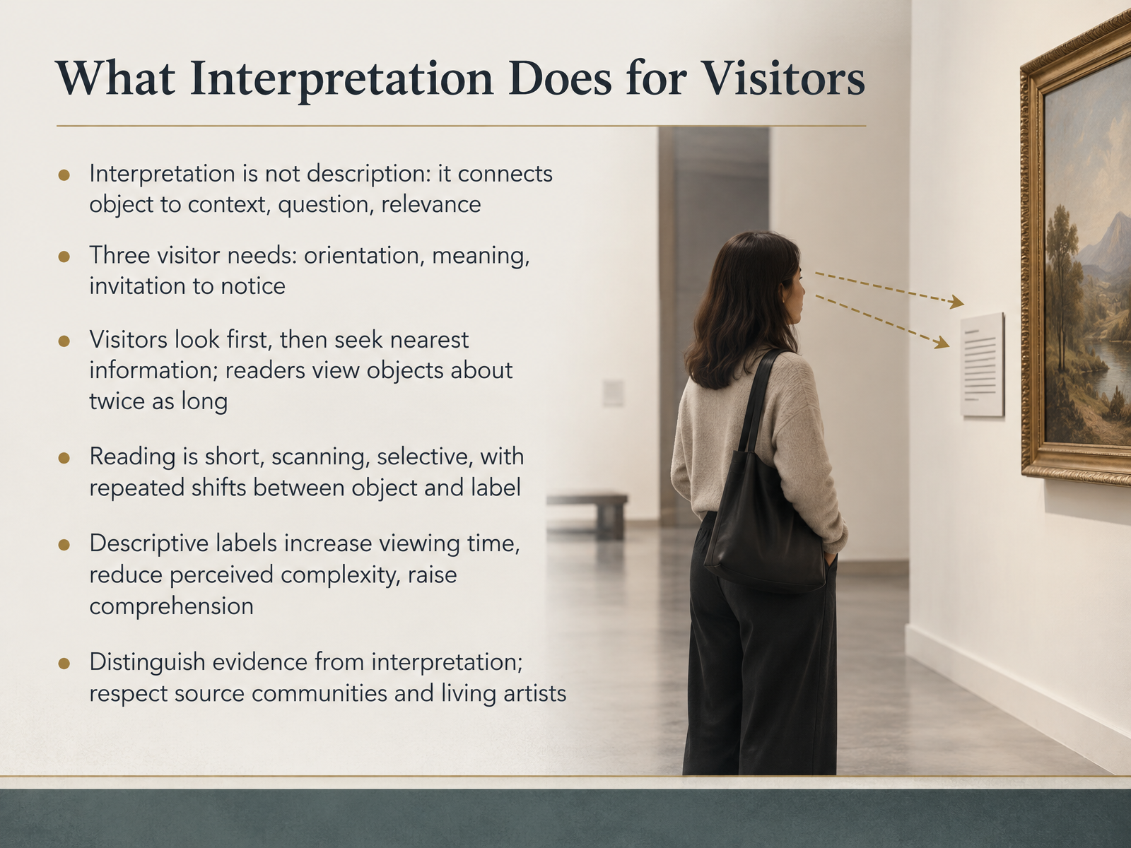
- 02What Interpretation Does for VisitorsLet's move on to what interpretation actually does for visitors. First, a working definition. Interpretation is not description. Description tells visitors what they are looking at. Interpretation connects the object to context, to a question, to something that matters. Practically, good labels serve three visitor needs: orientation, meaning, and an invitation to notice. Your visitors also behave in predictable ways. They look first, then reach for the nearest information, and readers tend to view objects about twice as long as non-readers. Reading itself is short, scanning, and selective, with repeated shifts between object and label. Eye-tracking research bears this out: labels get relatively few fixations, but those fixations are longer and heavier, because reading text costs more attention than the artwork itself. The payoff is real. Descriptive labels increase viewing time, reduce perceived complexity, and raise comprehension. Two guardrails as you write. Separate evidence from interpretation, so visitors know what is documented versus what is inferred. And respect source communities and living artists, whose voices may belong in the label itself. For your current project, ask which of the three needs each label is serving, and cut the rest. Next, we look at audiences, segments, and what they need.
 journals.plos.orgexa.aimdpi.com+22 min
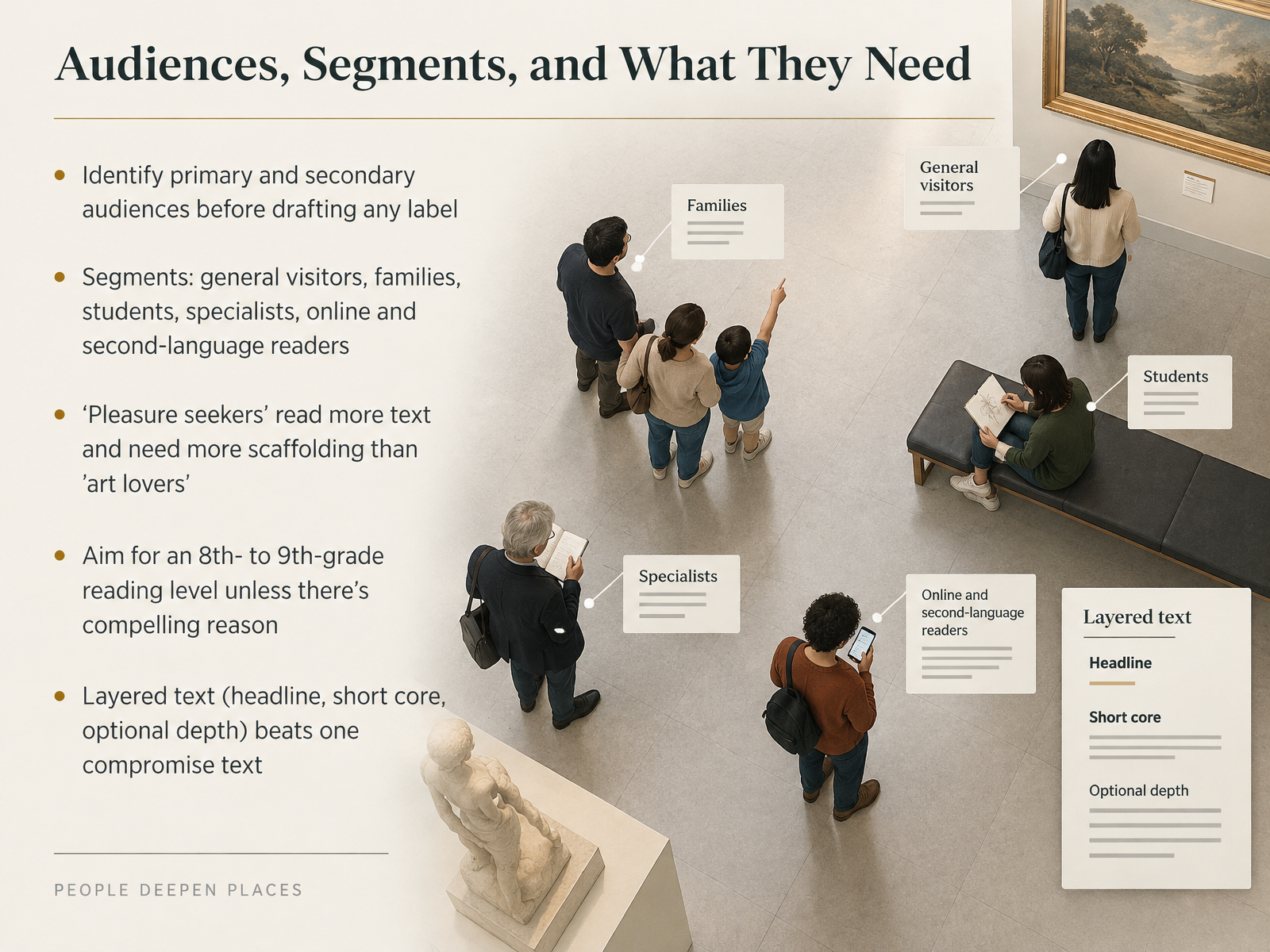
- 03Audiences, Segments, and What They NeedBefore you draft a single word, name your primary and secondary audiences. Your primary audience shapes the core message. Secondary audiences may need a different entry point. In practice, your visitors include general visitors, families, students, specialists, online readers, and people reading in a second language. Research on visitor motivation adds a useful distinction. So-called pleasure seekers tend to read more label text and need more scaffolding. Art lovers often move faster and want less. That means one label cannot serve everyone equally well. As a working rule, aim for an eighth to ninth grade reading level unless you can name a compelling reason to go higher. And remember that layered text beats one compromise text every time. A headline, a short core, and optional depth let each visitor choose their own path. So before approval workflows begin, ask who this label is really for. That answer will guide every choice that follows. Next, we look at choosing the object and the interpretive angle.
 exhibits.si.edusifacilities.si.edudigital.gov+22 min
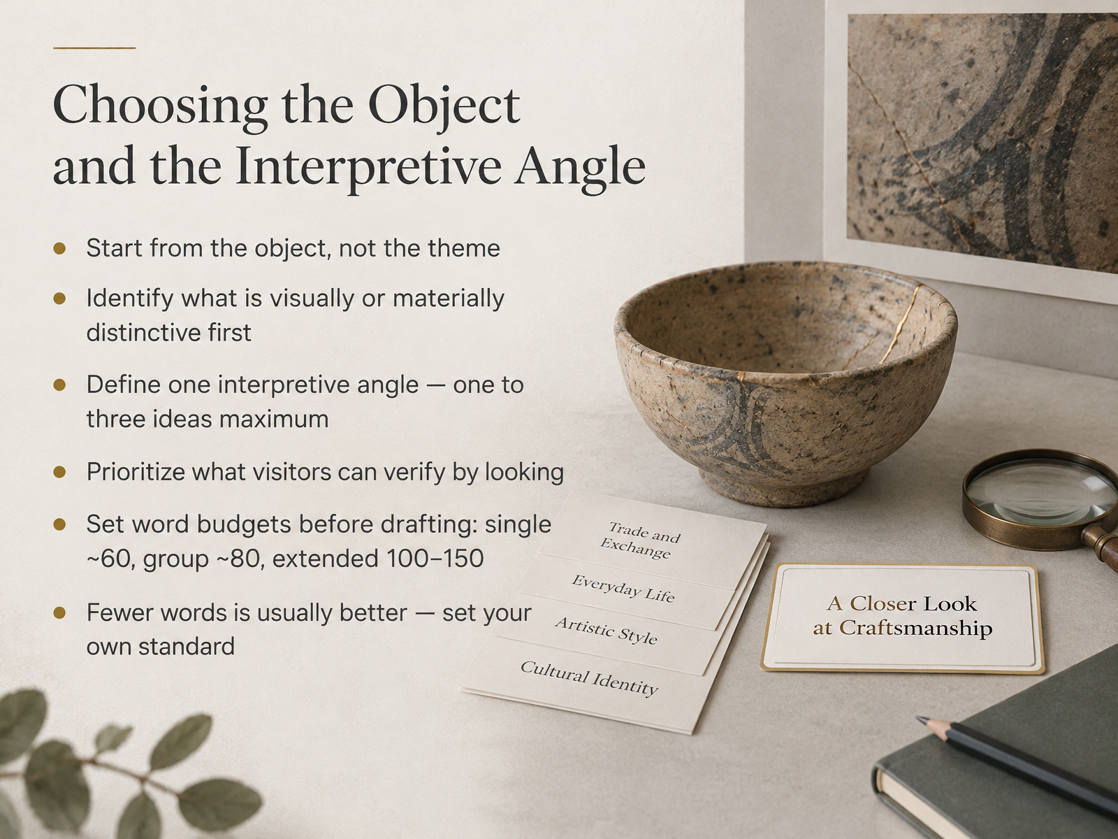
- 04Choosing the Object and the Interpretive AngleLet's talk about where a label actually begins. It begins with the object, not the theme. Theme-first writing pulls you toward abstraction. Object-first writing keeps you grounded in something the visitor is already looking at. So start by identifying what is visually or materially distinctive. Is it the glaze, the joinery, the scale, the wear pattern? That detail becomes your entry point. From there, define one interpretive angle, and hold yourself to one to three ideas maximum. Prioritize what visitors can verify by looking, so the label rewards attention rather than replacing it. Before you draft, set a word budget. As a working range, single labels around sixty words, group labels around eighty, extended labels one hundred to one hundred fifty. Many museums land closer to thirty or fifty. Fewer words is usually better, so set your own standard and make it deliberate. Take a moment: which object in your collection gives you one clear, verifiable angle? As we move on, we will look at structuring the label from first line to close.
 getty.edugetty.eduexhibits.si.edu+22 min
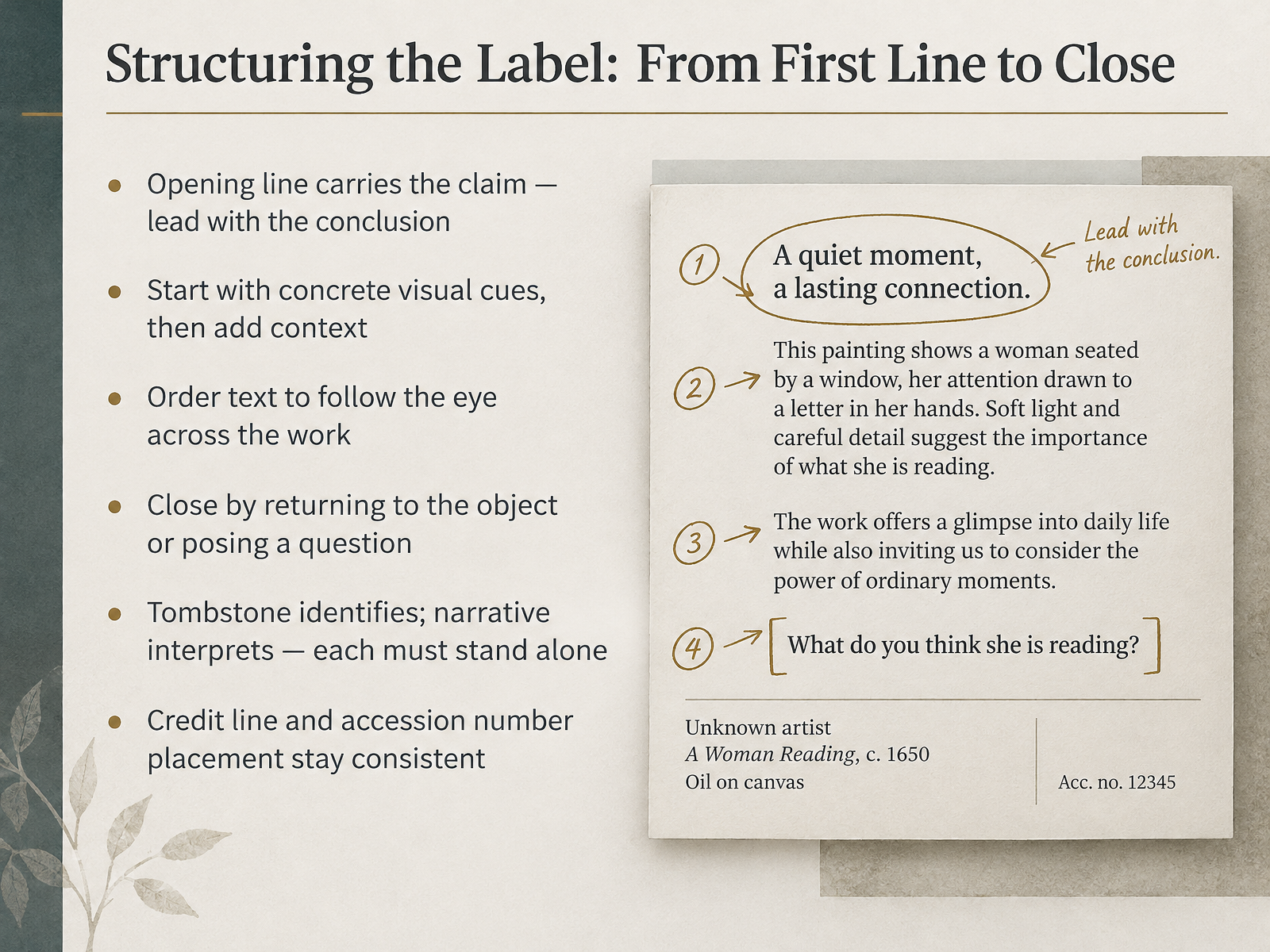
- 05Structuring the Label: From First Line to CloseNow let's look at how a label is actually structured, from its first line to its close. The opening line carries the claim. Lead with the conclusion, not a warm-up. So instead of a sentence about the artist's early life, you might open with the one thing the object itself demonstrates. From there, start with concrete visual cues, then add context. Point to what the viewer can see before you explain why it matters. Order the text to follow the eye across the work. If the composition moves left to right, let your sentences do the same. Close by returning to the object or posing a question, so the reader looks up rather than away. And keep two systems distinct. The tombstone identifies. The narrative interprets. Each must stand alone, because visitors often read only one. Finally, credit line and accession number placement should stay consistent across every label in the show. Pick a convention, document it, and hold it through every deadline. Next, we turn to language itself, in Language That Working: Clarity, Tone, and Vocabulary.
 getty.edulearn.ncartmuseum.orgartic.edu+22 min
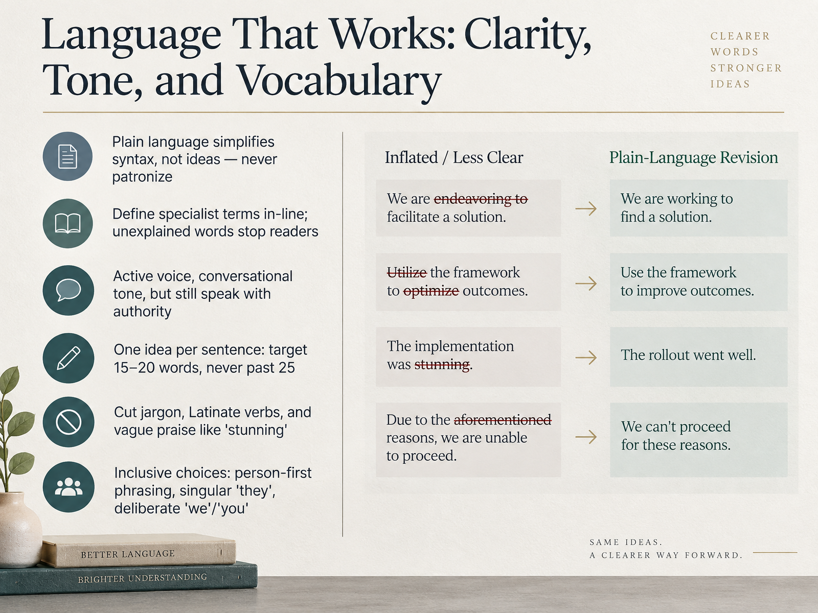
- 06Language That Works: Clarity, Tone, and VocabularyLet's look at language itself. The goal is clarity that never patronizes. Plain language simplifies syntax, not ideas, so define specialist terms in line. When a visitor meets an unfamiliar word that goes unexplained, they often stop reading. Write in active voice with a conversational tone, but still speak with authority. Aim for one idea per sentence, roughly fifteen to twenty words, and never past twenty five. Cut jargon, Latinate verbs, and vague praise such as stunning. Instead, choose precise words like bold or innovative. For inclusive choices, prefer person-first phrasing, use singular they, and decide deliberately whether we means the museum, a community, or everyone. Quick test: read your label aloud, and revise anything that makes you stumble. Next, we move on to tombstones, credit lines, and caption conventions.
 exhibits.si.eduvam.ac.ukgetty.edu+11 min
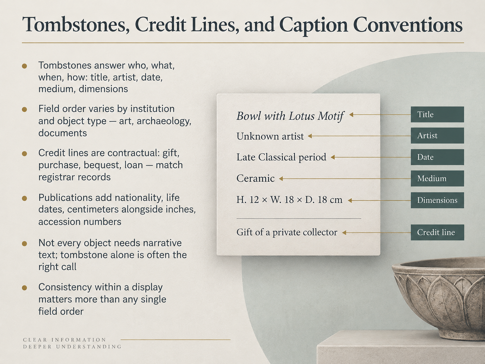
- 07Tombstones, Credit Lines, and Caption ConventionsLet's turn now to tombstones, credit lines, and caption conventions. The tombstone is the stable, factual core of any label. It answers who, what, when, and how: title, artist, date, medium, and dimensions. But the field order is not universal. Art museums tend to lead with artist or title, archaeology often leads with culture and place, and document collections may lead with creator and date. Check your institution's house style before you assume a sequence. Credit lines are different. They are contractual, not stylistic. Gift, purchase, bequest, and loan language must match registrar records exactly, because donors and lenders have legal expectations. In publications, you will usually add nationality, life dates, centimeters alongside inches, and accession numbers. Now, here is a decision criterion worth remembering. Not every object needs narrative text. Sometimes the tombstone alone is the right call, especially when an object supports the larger story without carrying it. And consistency within a single display matters more than any one preferred field order. A visitor should not have to relearn how to read your labels as they move through the gallery. So ask yourself: across your current exhibition, are your tombstones consistent, and do your credit lines match the registrar's records? That is the standard to hold. Next, we will look at writing for physical, digital, and published formats.
 getty.edulearn.ncartmuseum.orgartic.edu+22 min
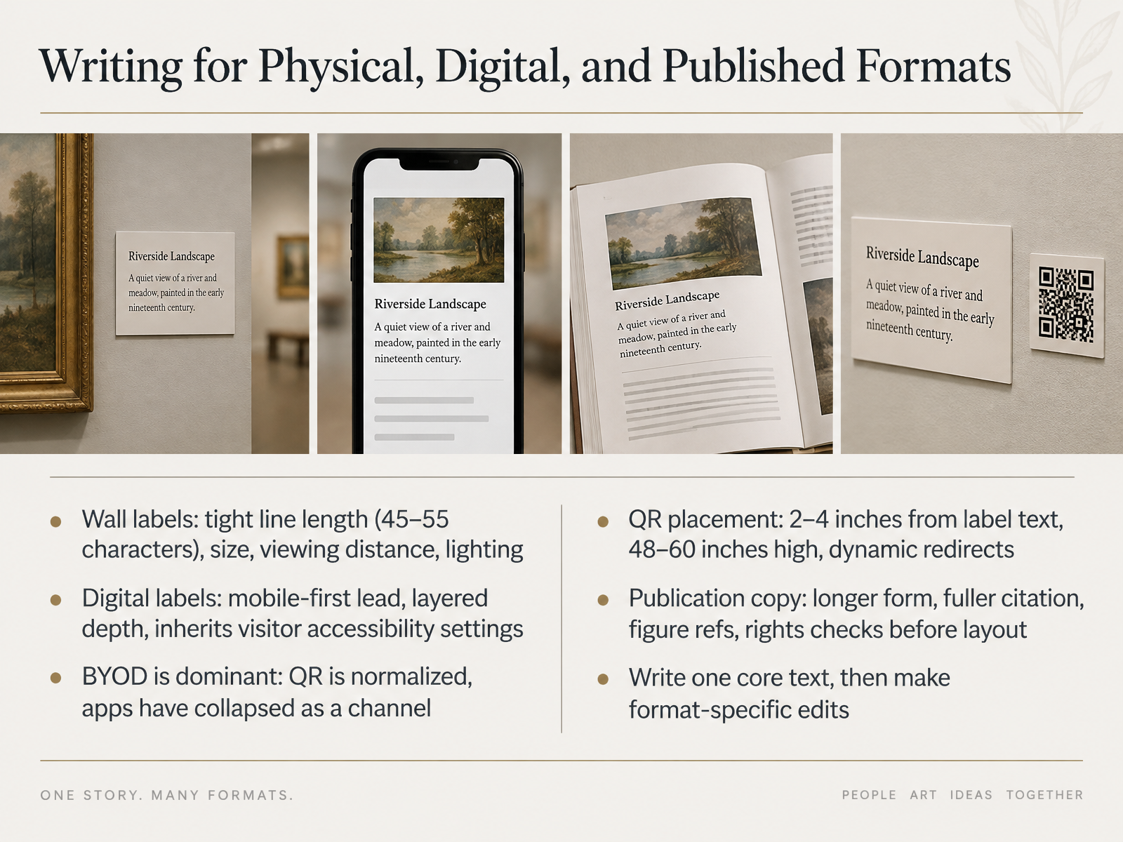
- 08Writing for Physical, Digital, and Published FormatsNow let's look at how one core text adapts across formats. Start with the wall label. Keep your line length tight, around forty five to fifty five characters, and design for the viewing distance and the lighting in the room. For digital labels, lead mobile first, then layer the depth behind it. Remember, bring your own device now dominates. QR codes are normalized, and native apps have collapsed as a channel. Place your QR code two to four inches from the label text, at forty eight to sixty inches high, and use a dynamic redirect so you can fix links without reprinting. Publication copy is different again. It runs longer, carries fuller citation, includes figure references, and needs rights checks before layout. Here is the discipline that holds it together. Write one core text first, then make format specific edits. Before your next project, decide which format owns which details, and let the others inherit from it. That is the point where formats stop competing. Next, let's turn to research, verification, and handling uncertainty.
 exhibits.si.edugetty.edu2 min
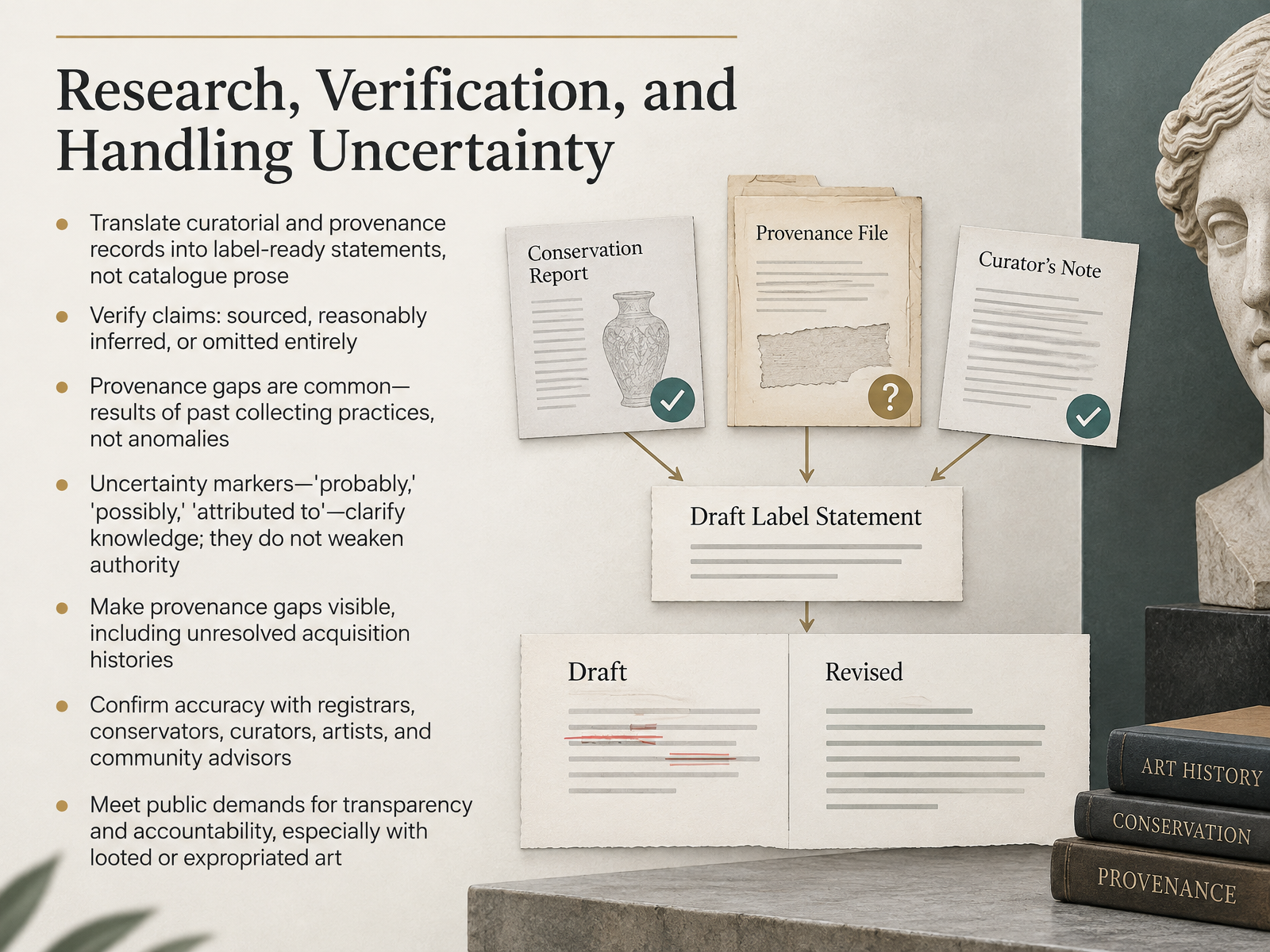
- 09Research, Verification, and Handling UncertaintyLet's turn now to research, verification, and handling uncertainty. Your job at the label is translation. Take curatorial and provenance records and convert them into label-ready statements, not catalogue prose. Then sort every claim into one of three outcomes: sourced, reasonably inferred, or omitted entirely. But remember, provenance gaps are not anomalies. They are the normal result of past collecting practices that prioritized acquisition over documentation. So when you encounter a gap, make it visible. And please, do not treat words like probably, possibly, or attributed to as weaknesses. Uncertainty markers clarify the status of knowledge. They show visitors where evidence ends and inference begins, which makes your institution more accountable, not less. Before you publish, confirm accuracy with registrars, conservators, curators, artists, and community advisors. That is also where you meet public demands for transparency and accountability, especially with looted or expropriated art. A useful takeaway: uncertainty, openly stated, is a form of authority. Next, we look at rights, permissions, and image credits.
 2 min
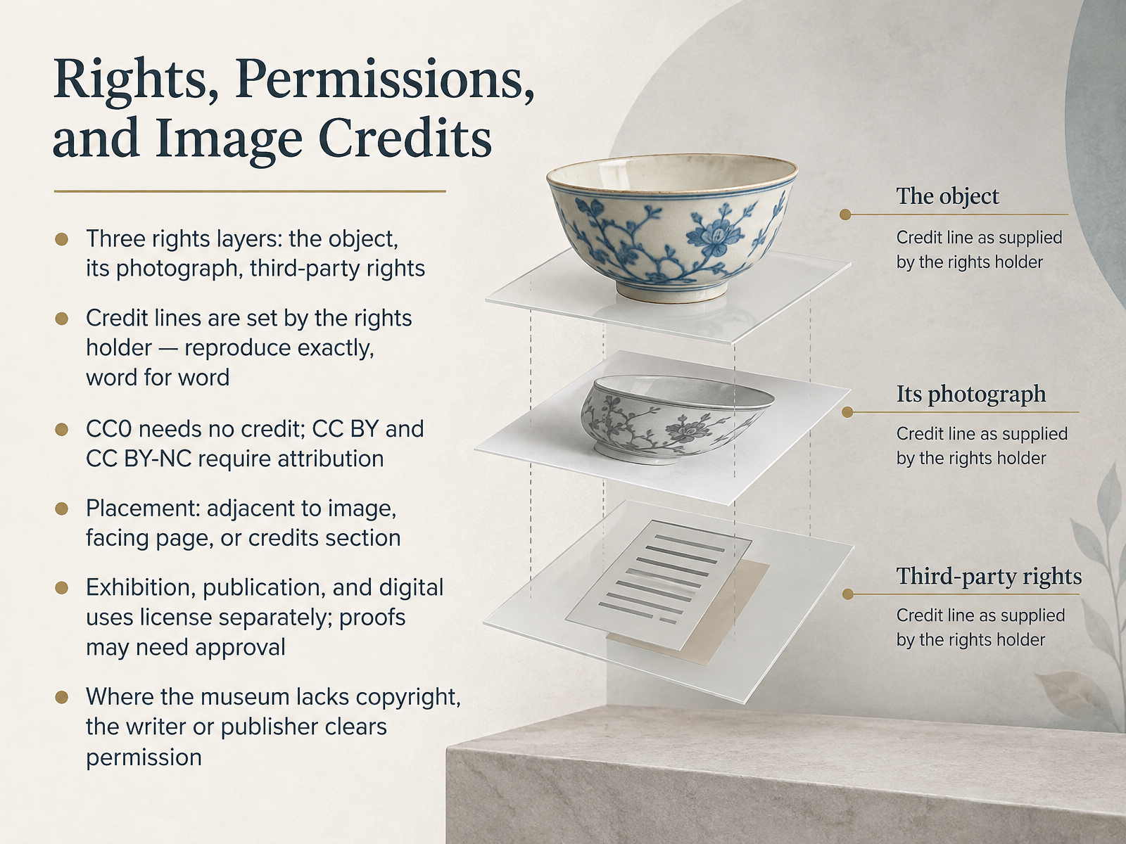
- 10Rights, Permissions, and Image CreditsNow let's talk about rights, permissions, and image credits. When you place an image, you are actually managing three separate rights layers: the object itself, the photograph of it, and any third party rights, such as the artist's estate. A useful habit is to ask, for every image, who owns each layer. Credit lines are set by the rights holder, so reproduce them exactly, word for word. For example, the Prado requires its credit line to appear next to the image or on the credit page. Under Creative Commons, CC0 needs no credit, while CC BY and CC BY-NC require attribution. Placement matters too. Credits can sit adjacent to the image, on the facing page, or in a credits section. Keep in mind that exhibition, publication, and digital uses license separately, and proofs may need approval before you print. Where the museum does not hold copyright, the writer or publisher clears permission directly. So before you publish, check each image's rights layer and credit wording. That groundwork pays off. Next, we turn to accessibility and inclusive design for label text.
 2 min
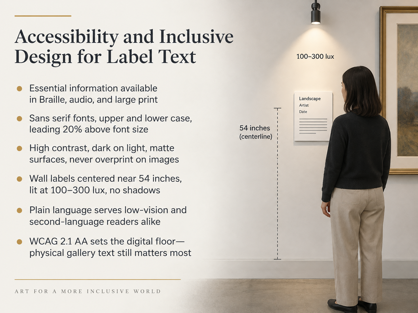
- 11Accessibility and Inclusive Design for Label TextLet's turn to accessibility and inclusive design, because accessible label text is not a separate track. It is simply good label text done well. Start with essentials. Key information should also be available in Braille, audio, and large print, so visitors who cannot read print still get the core story. For typography, use sans serif fonts in upper and lower case. Set leading about twenty percent above the font size. Keep high contrast, dark on light, with matte surfaces. Never overprint text on images, because that destroys legibility for low vision readers. Wall labels work best centered near fifty-four inches, lit between one hundred and three hundred lux, with no shadows. Plain language serves low-vision readers and second-language readers alike. And remember, WCAG two point one double A sets the digital floor, but your physical gallery text still matters most. Before we move on, check one label in your own space against these criteria. Next, we look at review, testing, and revision in practice.
 exhibits.si.edusifacilities.si.edudigital.gov+22 min
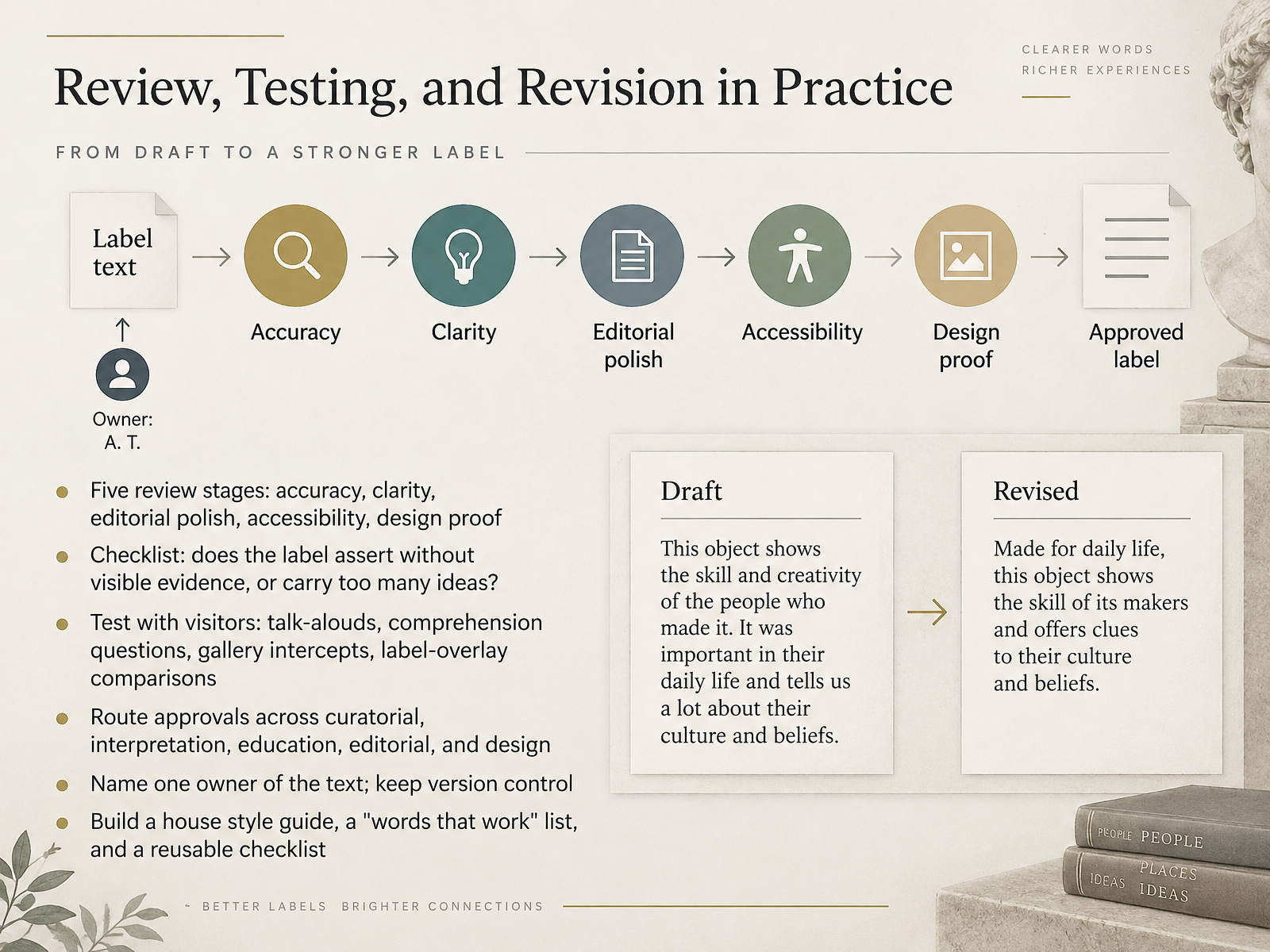
- 12Review, Testing, and Revision in PracticeNow let us look at how review, testing, and revision work in practice. Think of review as five stages, each with its own job. First, accuracy. Second, clarity. Third, editorial polish. Fourth, accessibility. And fifth, a design proof, so the final text actually fits the panel. Run every label through a simple checklist. Does it assert something without visible evidence in the object? Does it carry more than one idea at once? Then test with real visitors. Talk-alouds, comprehension questions, gallery intercepts, and label-overlay comparisons all reveal what readers actually take away. Route approvals deliberately across curatorial, interpretation, education, editorial, and design. Name one owner of the text, and keep tight version control. Over time, build a house style guide, a words that work list, and a reusable checklist. Which of those three could your team start this quarter? Next, we turn to rewriting difficult labels and contested objects.
 getty.eduexhibits.si.edugetty.edu+12 min
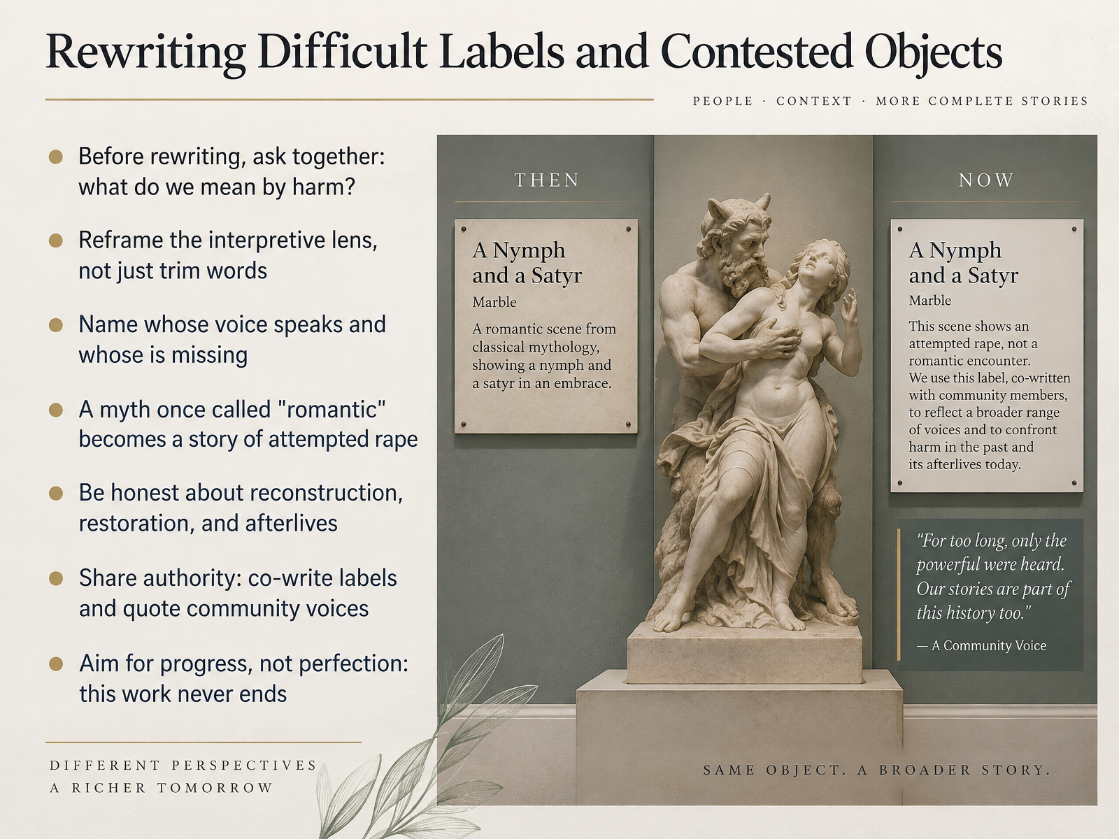
- 13Rewriting Difficult Labels and Contested ObjectsNow let's talk about rewriting difficult labels and contested objects. This is the part of the work that asks the most of us, and it rarely goes smoothly. Start by asking your colleagues together: what do we mean by harm? That shared definition matters more than any single label. From there, reframe the interpretive lens rather than just trimming words. Ask whose voice speaks in the label, and whose is missing. Consider the Nelson-Atkins example: a myth long described as romantic became a story of attempted rape, and visitors preferred the honesty. Be transparent about reconstruction and restoration, as with the Chinese relief where new research revealed a nineteen thirties rebuild. Share authority by co-writing with community partners and quoting their words directly. And remember, this work never ends. Aim for progress, not perfection. Now let's move into putting it to work.
 1 min
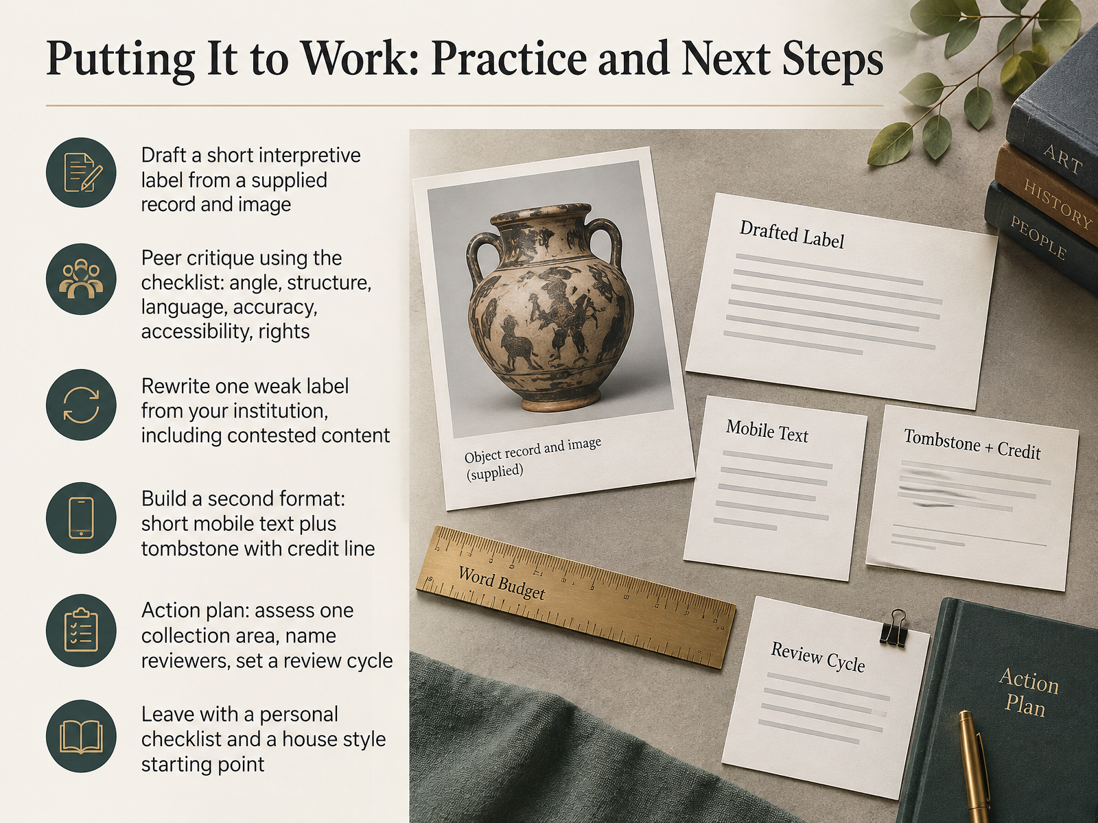
- 14Putting It to Work: Practice and Next StepsLet's bring this all together and get you writing. Start by drafting a short interpretive label from a supplied record and image. Then critique each other's work using the checklist: angle, structure, language, accuracy, accessibility, and rights. That peer review surfaces blind spots in minutes, not weeks. Next, rewrite one weak label from your own institution, and make sure it deals with contested content, because that is where the stakes are highest. From there, build a second format: short mobile text alongside a tombstone with a proper credit line, so your core message travels across media. Then commit to an action plan. Assess one collection area, name your reviewers, and set a review cycle you can actually sustain. You will leave with a personal checklist and a starting point for house style. Thank you for your attention, and go write something your visitors will remember.
 getty.edugetty.eduexhibits.si.edu+21 min
Take the deck with you
Download this course as a file — free, no sign-up needed.
- PDF handoutEvery slide page, ready to print or share.15 pages · 4.3 MBDownload
- Narrated PowerPointThe deck that presents itself — every slide carries the digital human's narration video.15 pages · 14.5 MBDownload
- PowerPoint slidesThe full deck as a .pptx — open it in PowerPoint, Keynote, or Google Slides.15 pages · 4.2 MBDownload
Free to use in your own training — please keep the PersonWise credit page at the end.
Have your own deck? Turn it into a course
Sources consulted
Web sources consulted while building this course.
- The Smithsonian Institution's Guide to Interpretive Writing for Exhibitions — exhibits.si.edu
- Writing Gallery Text at the V&A — vam.ac.uk
- BETTER, — tate.org.uk
- Practical guidelines — bmitpglobalnetwork.org
- COMPLETE GUIDE — getty.edu
- Psychophysiological and behavioral responses to descriptive labels in modern art museums | PLOS One — journals.plos.org
- Short but meaningful: visitors’ experiences underlying time spent looking at artworks and labels — exa.ai
- Cognitive Style and Visual Attention in Multimodal Museum Exhibitions: An Eye-Tracking Study on Visitor Experience — mdpi.com
- A Study of Labels, Groups, and Readers in an Egyptian Mummy Gallery — informalscience.org
- Looking to Read: How Visitors Use Exhibit Labels in the Art Museum - Universität Wien — ucrisportal.univie.ac.at
- Smithsonian Guidelines for Accessible Exhibition Design — sifacilities.si.edu
- Plain language guide series - Digital.gov — digital.gov
- Readability | Digital Museums Canada — digitalmuseums.ca
- Resources for Curators of Library Exhibitions: Accessibility in ... — guides.library.ucsb.edu
- QUICK GUIDE — getty.edu
- A practical guide for text interpretation — museumdevelopmentyorkshire.org.uk
- Exhibition Planning and Label Writing 101: Top Tips — learn.ncartmuseum.org
- How to Read a Label | The Art Institute of Chicago — artic.edu
- Deciphering what the information in a museum label means — mintmuseum.org
- Writing on the Wall | Index Magazine | Harvard Art Museums — harvardartmuseums.org