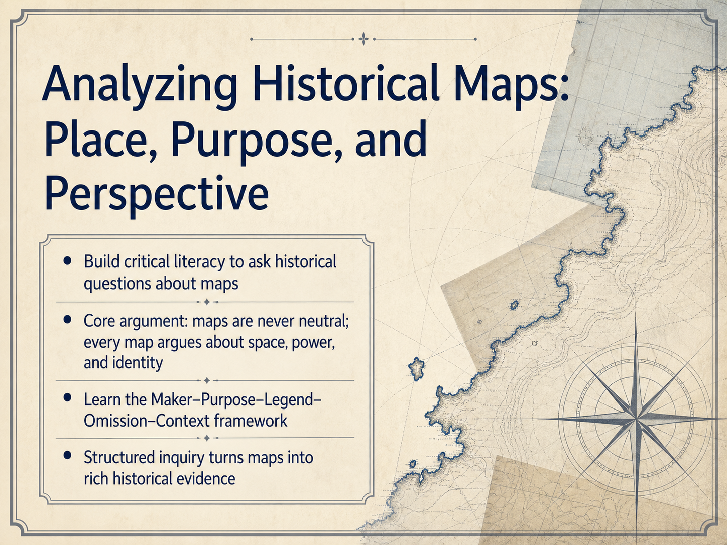
Analyzing Historical Maps
Begin
15 pages · ~30 min
Analyzing Historical Maps
This training teaches participants to analyze historical maps by examining place, purpose, and perspective to deepen their understanding of historical context.
What you’ll learn
- 01Analyzing Historical Maps: Place, Purpose, and PerspectiveWelcome. In this course we will treat historical maps not as simple illustrations, but as primary sources we can question and investigate. The core idea is this: maps are never neutral. Every map makes an argument about space, about power, and about identity. To explore that argument, we will work with a structured framework: Maker, Purpose, Legend, Omission, and Context. Think of each step as a question you can ask of any map. Together, these questions turn a flat image into rich historical evidence. You become the detective, and the map itself becomes a witness. As you move through the course, ask yourself what the map is really showing you, and what it might be leaving out. Let us begin with the most basic starting point: who made this map, and why. That is next, in Part One: The Maker and the Purpose.1 min
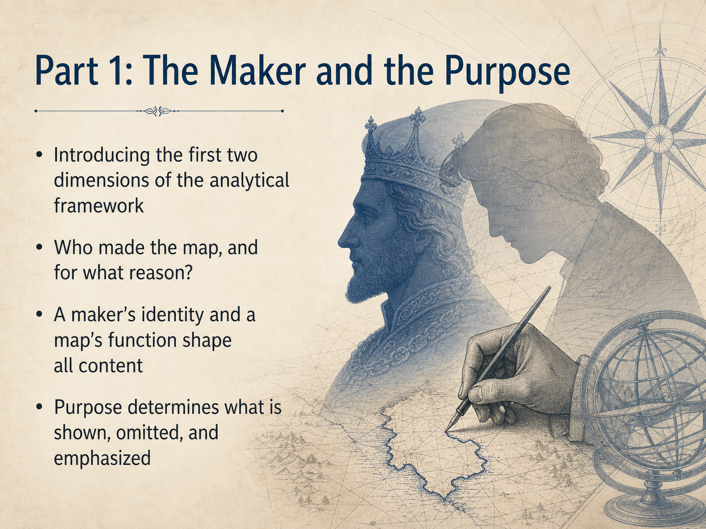
- 02Part 1: The Maker and the PurposeNow let's turn to the first two dimensions of our analytical framework. Whenever you encounter an old map, the very first questions to ask are: Who made it, and for what reason? These aren't just background details. A maker's identity and the map's intended function shape everything you see on the page. Think about it. A military engineer, a land speculator, and a missionary each create very different documents, even of the same place. The purpose of the map determines what the maker chooses to show, what they leave out, and what they choose to emphasize. A navigation chart will highlight coastlines and hazards while ignoring inland features completely. A tax map might exaggerate fertile farmland and shrink barren mountains. As we move forward, keep this principle in mind: before you trust what a map says, you must understand what it was built to do. Next, we'll explore that maker in more depth with "The Mapmaker: Who Speaks Through the Map?"
 2 min
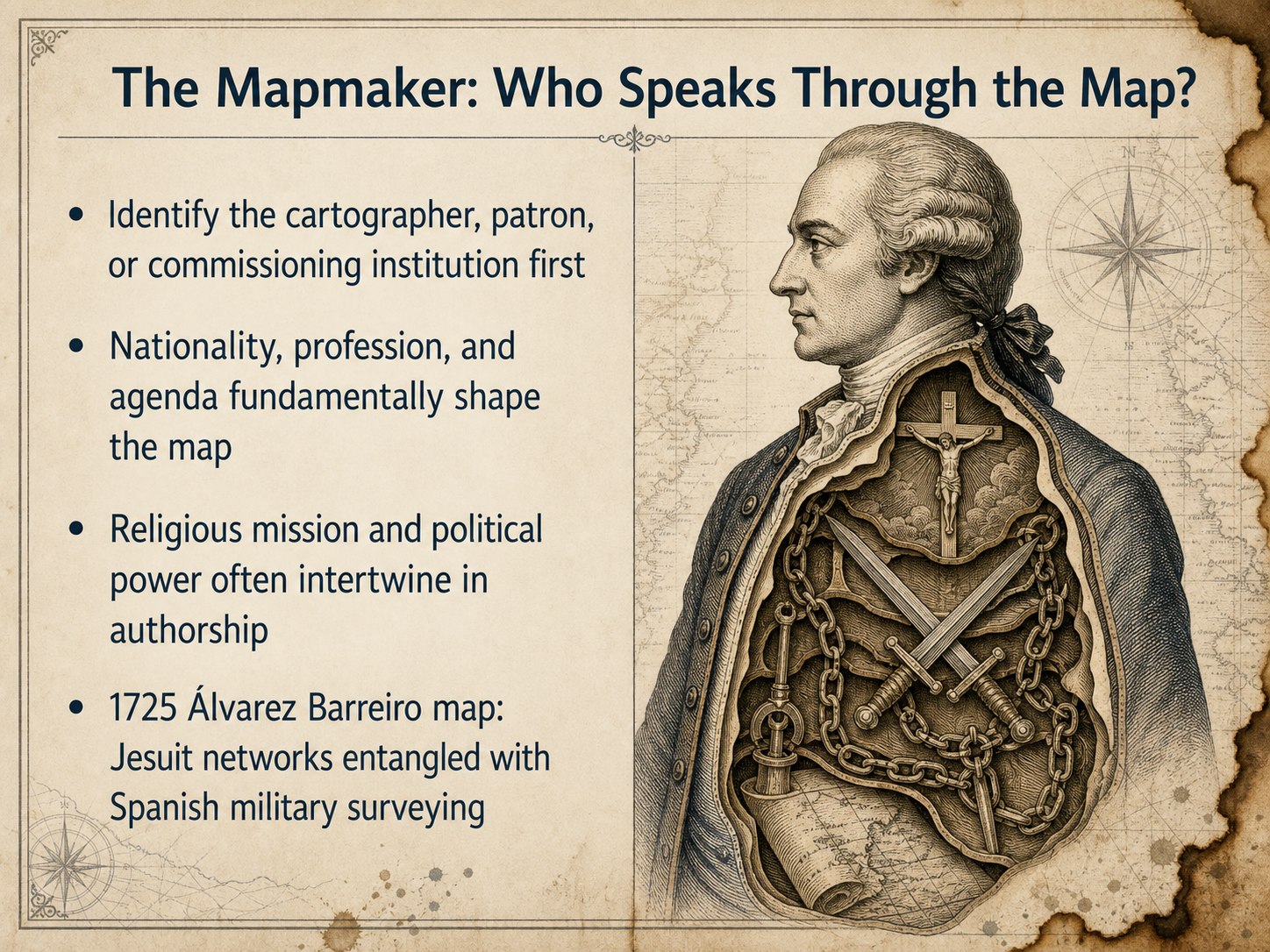
2 min - 03The Mapmaker: Who Speaks Through the Map?Let's turn now to the mapmaker. Ask yourself: who actually speaks through this map? Start by identifying the cartographer, the patron, or the commissioning institution. Their nationality, profession, and agenda fundamentally shape what you see on the page. In many historical maps, religious mission and political power are tightly intertwined in the authorship. Notice how a single map can serve both the church and the crown. Take the 1725 map by Álvarez Barreiro. He was a Spanish military engineer, yet his detailed surveys depended heavily on the on-the-ground knowledge of Jesuit missionary networks. As you inspect the map, consider how this dual allegiance might have influenced which places are recorded accurately, and which are left out. Now, let's move from the mapmaker to the map's purpose: was it designed for persuasion, navigation, or control?
 1 min
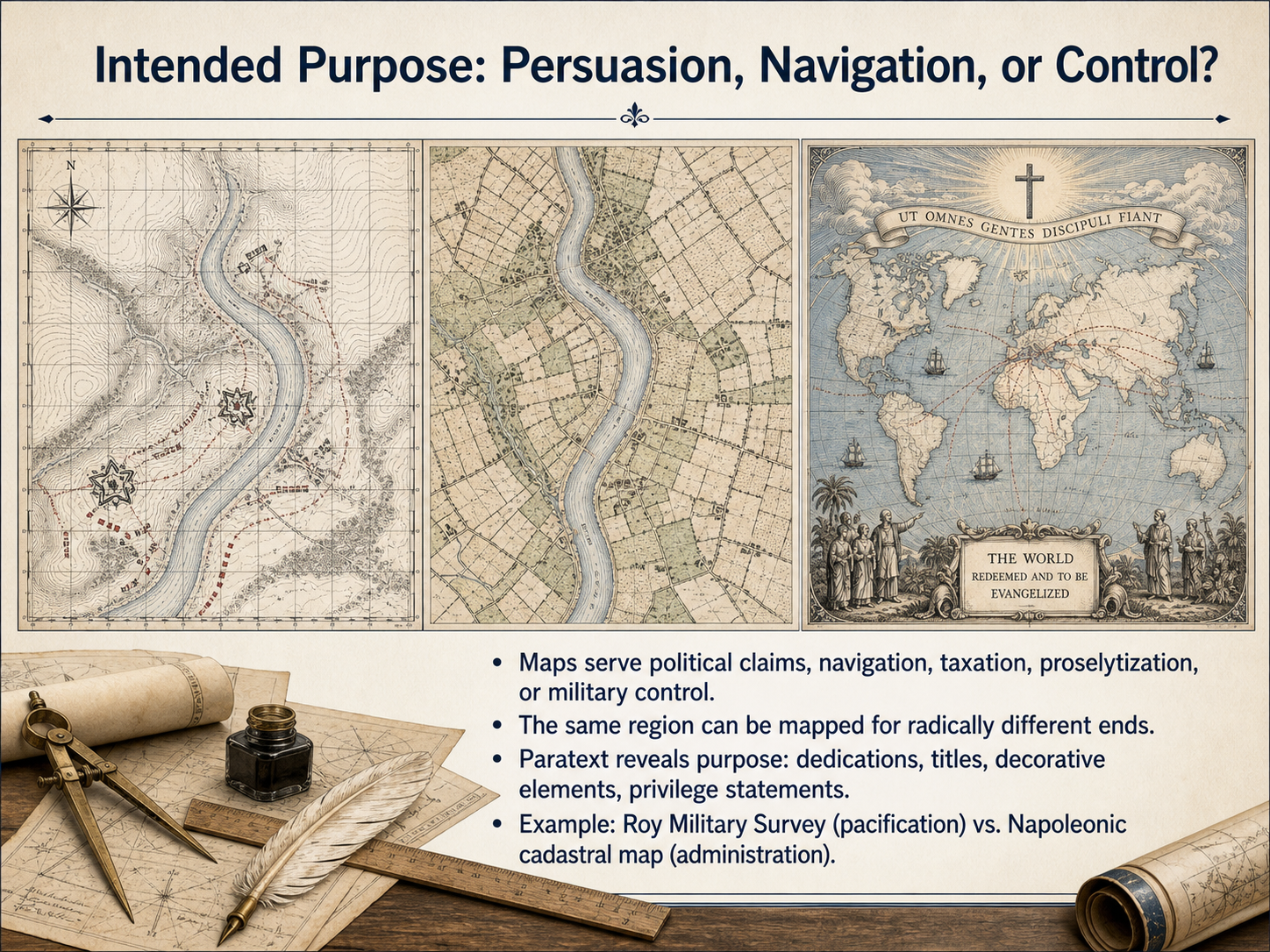
1 min - 04Intended Purpose: Persuasion, Navigation, or Control?Let's shift our focus from the mapmaker's identity to something equally revealing: the map's intended purpose. As a historical detective, you need to ask yourself: was this document designed to persuade, to navigate, or to control a population? Maps are never neutral. They serve political claims, enable tax collection, plan military campaigns, or even further a religious mission. Think about it—the exact same region can be mapped for radically different ends. A key clue lies in the paratext, those elements surrounding the main map. Notice the dedication, the elaborate title cartouche, decorative illustrations, or even a royal privilege statement. These are not just decoration; they are signals of intent. For a concrete example, compare two maps of the same terrain. The Roy Military Survey of Scotland was created after a rebellion to identify and pacify strategic locations. In contrast, Napoleonic cadastral maps parceled land into precise units for systematic taxation and administration. One map is an instrument of security, the other a tool for building a bureaucratic state. Always let the paratext guide you to the map's true objective. Next, we'll move deeper into the construction of the map itself in Part Two: The Visible and Invisible Content.
 2 min
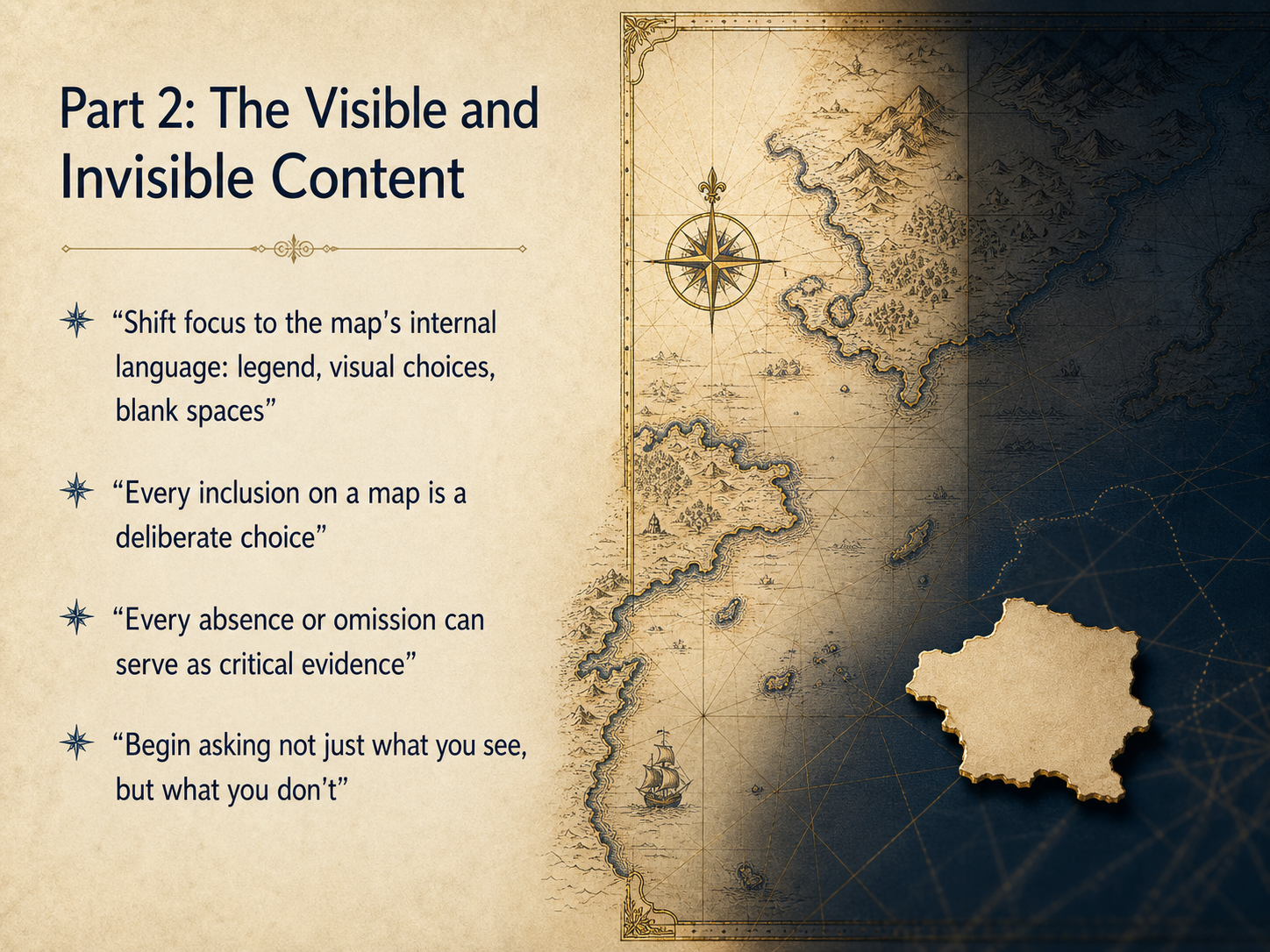
2 min - 05Part 2: The Visible and Invisible ContentNow we shift our focus to the map's internal language. This means looking beyond the geography and examining the legend, the visual choices, and even the blank spaces. As a historical detective, you must treat every inclusion on a map as a deliberate choice by its maker. Ask yourself, why is this feature labeled and not another? Why was this specific color or symbol chosen? Equally important, train your eye on what is missing. An absence, or an omission, can serve as critical evidence of the map's purpose or perspective. So begin asking not just what you see, but what you don't. In the next section, we will put this into practice by decoding the legend specifically, looking at symbols, scale, and strategic silences.
 1 min
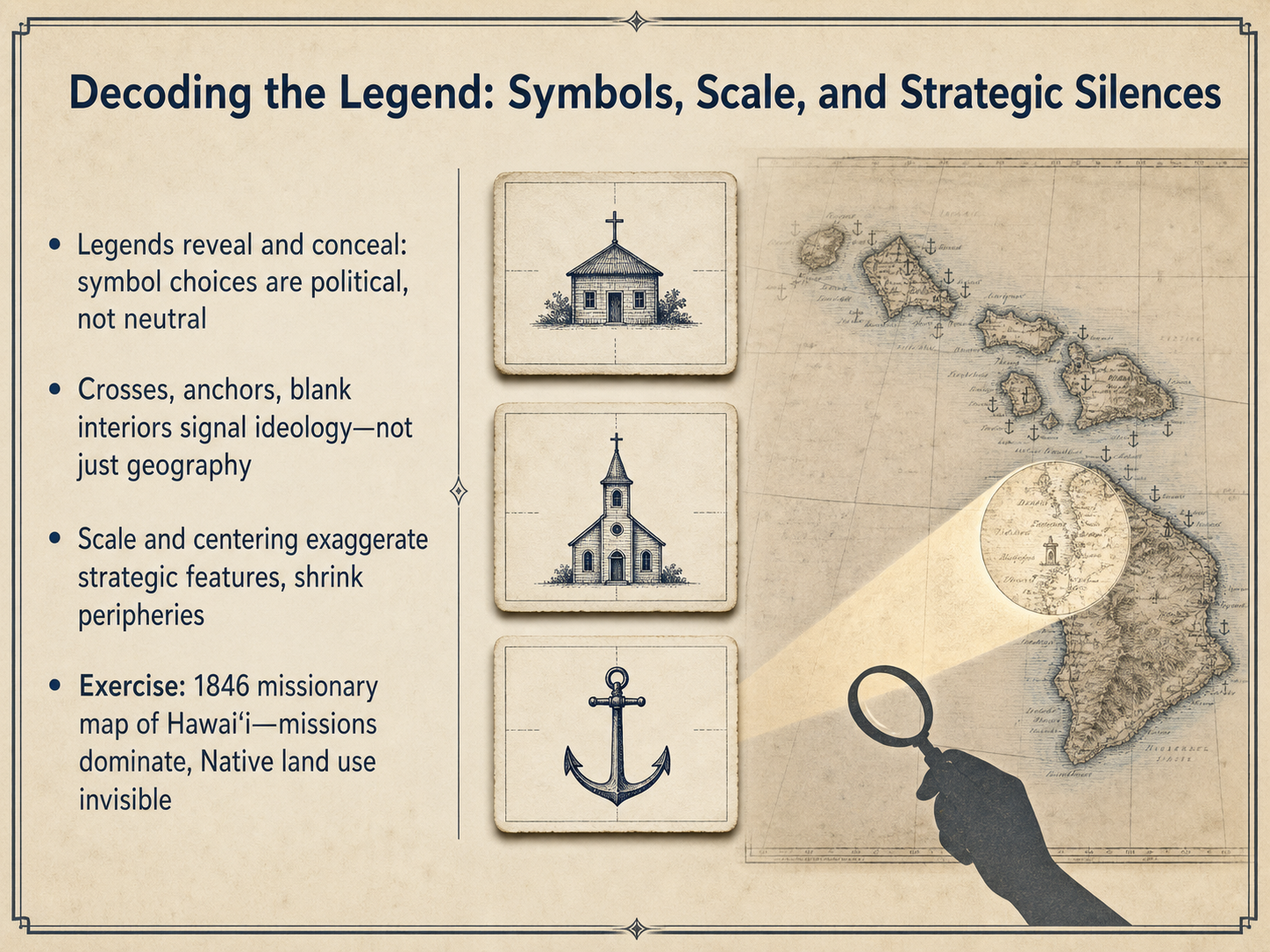
1 min - 06Decoding the Legend: Symbols, Scale, and Strategic SilencesLet's move to the legend. It may look like a simple key, but a legend is an argument. Ask yourself: what choices did the mapmaker make here? The symbols are not neutral. A cross marks a mission, an anchor marks a harbor. These choices signal ideology and strategic interest, not just geography. Notice what is prominent. Scale and centering can exaggerate features the creator considered important and shrink entire regions at the periphery. Try this with an 1846 missionary map of Hawai‘i. The map highlights mission stations with bold symbols and written place names. Look closely. Native Hawaiian land use, cultivation patterns, and sacred sites are almost completely invisible. The legend reveals a worldview, and it conceals another. Next, we will examine deliberate omissions and ask what the map leaves out.
 2 min
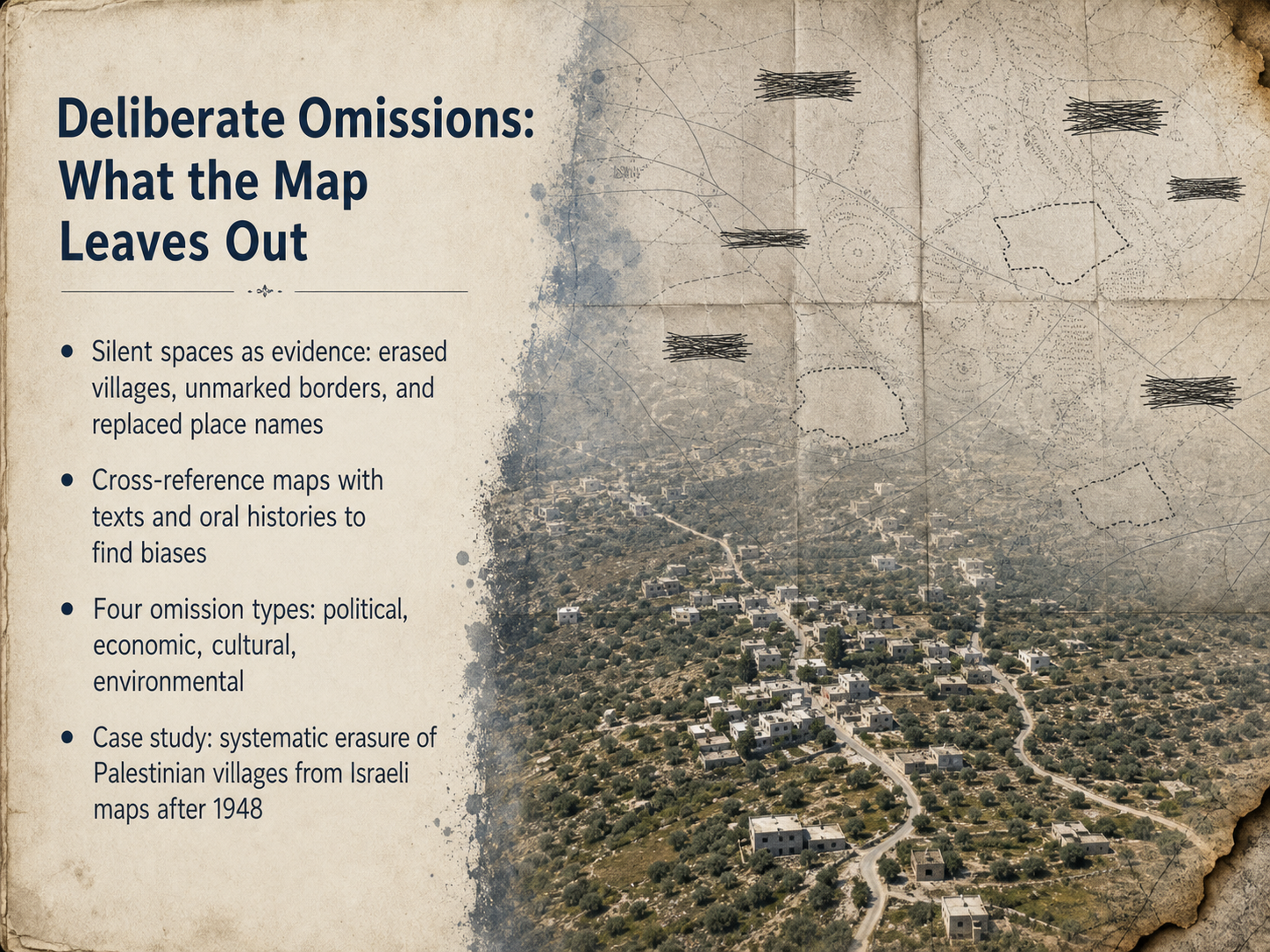
2 min - 07Deliberate Omissions: What the Map Leaves OutNow, let's shift our focus to what is deliberately not shown on a map. These silent spaces are often the loudest pieces of evidence. Ask yourself: whose villages have been erased? Which borders are left unmarked? Notice when place names suddenly change, overwriting a former presence. To find these biases, you must cross-reference the map with written records and oral histories. We can group these omissions into four categories: political, economic, cultural, and environmental. Consider a concrete case study: the systematic erasure of Palestinian villages from Israeli maps after nineteen forty-eight. Look for the absence of structures, the renaming of landscapes, and the disappearance of local roads. These visual gaps are not accidents; they are deliberate historical arguments. Next, we will apply this same critical eye to colonial maps, examining how indigenous persistence survives by reading the blank spaces.
 2 min
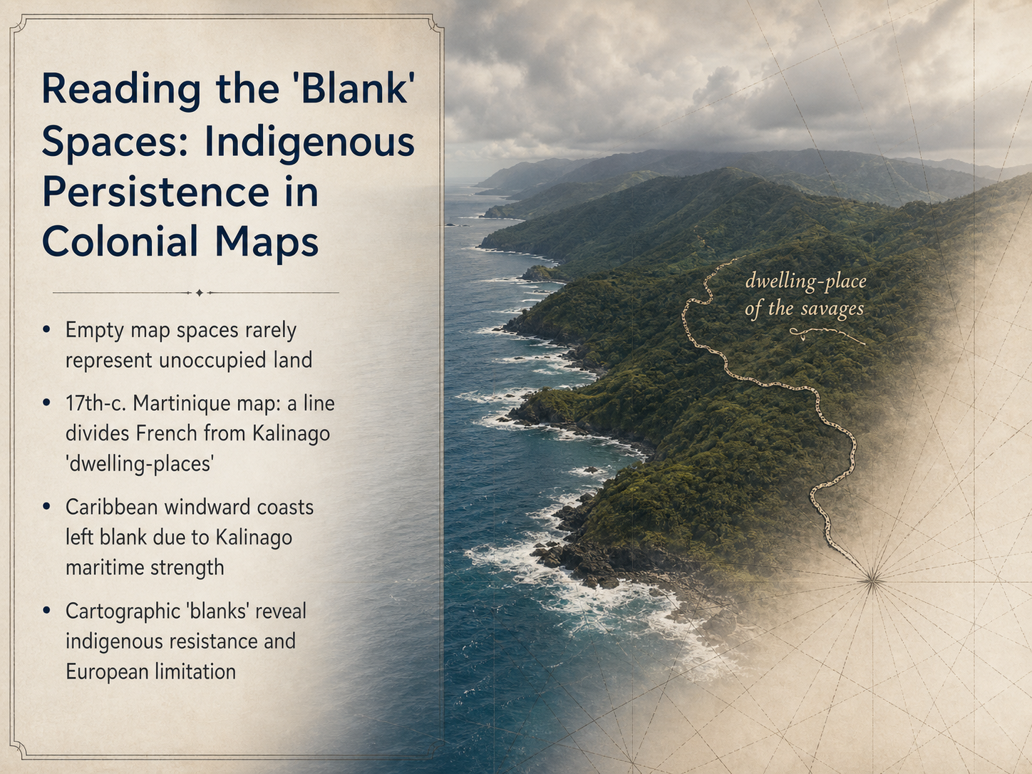
2 min - 08Reading the 'Blank' Spaces: Indigenous Persistence in Colonial MapsNow let's turn to what a map doesn't show. Notice the seemingly empty spaces on this seventeenth-century map of Martinique. Ask yourself: do these blank areas truly mean nothing was there? In colonial cartography, empty space rarely represents unoccupied land. Look closely at the line dividing French settlements from Kalinago dwelling-places. The mapmaker had to acknowledge indigenous presence right on the map. And consider the windward, or eastern, coasts of the Caribbean shown here. These are left blank not because they were empty, but because Kalinago maritime strength made those shores too dangerous for European surveyors to approach. So what looks like absence is actually evidence of indigenous resistance and the very real limits of colonial power. The cartographer's silence speaks volumes when you learn to read it. Next, we will broaden our view in Part Three: The Frame and the Context.
 2 min
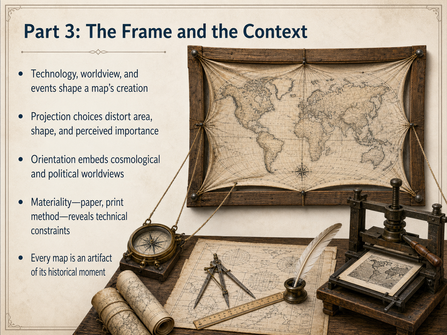
2 min - 09Part 3: The Frame and the ContextNow we turn to the frame and the context. A map is never created in isolation. Technology, worldview, and contemporary events all leave their mark. Ask yourself what tools were available to the mapmaker, and how their cultural or political moment shaped what they drew. Consider projection choices. Every flat map distorts reality. Notice which landmasses appear larger or centered. These decisions can exaggerate area, alter shape, and embed a sense of perceived importance. Orientation is equally revealing. Ask why north sits at the top, or why some maps place east—or even south—in that position. This often reflects cosmological beliefs or political hierarchies. Finally, look at materiality. Handmade paper versus printed sheets, woodcut versus copperplate engraving—these reveal technical and economic constraints. Every map is an artifact of its historical moment, holding evidence in its very materials. Next, we'll build on these ideas and examine perspective and projection as a geometry of power.
 1 min
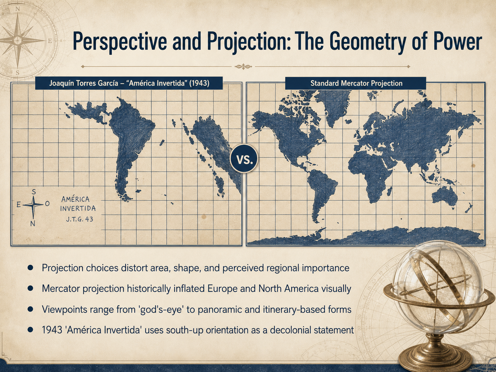
1 min - 10Perspective and Projection: The Geometry of PowerNow let's turn to something that might seem purely technical, but is actually deeply political: the geometry of a map's projection. Ask yourself, when you look at a flat map, what gets stretched and what gets shrunk? Every projection makes choices. Notice how the familiar Mercator projection, a classroom staple for generations, dramatically inflates the size of Greenland and North America, while compressing the landmass of Africa and South America near the equator. This wasn't a neutral design decision; it visually magnified European territory. Beyond area, we must also consider the viewpoint itself. Is the map presenting a detached, god-like view from above, or perhaps a journey along a road where only what's immediately visible matters? As historical detectives, we have to ask: whose perspective is the center of this story? A powerful example comes from 1943, with Joaquín Torres García's 'América Invertida.' By simply placing south at the top, he made a clear decolonial statement, reorienting the viewer and challenging the unspoken assumption that north naturally means 'up.' Next, we'll build on this idea of orientation with a deeper look at why North isn't always up, and what other cosmologies maps can reveal.
 2 min
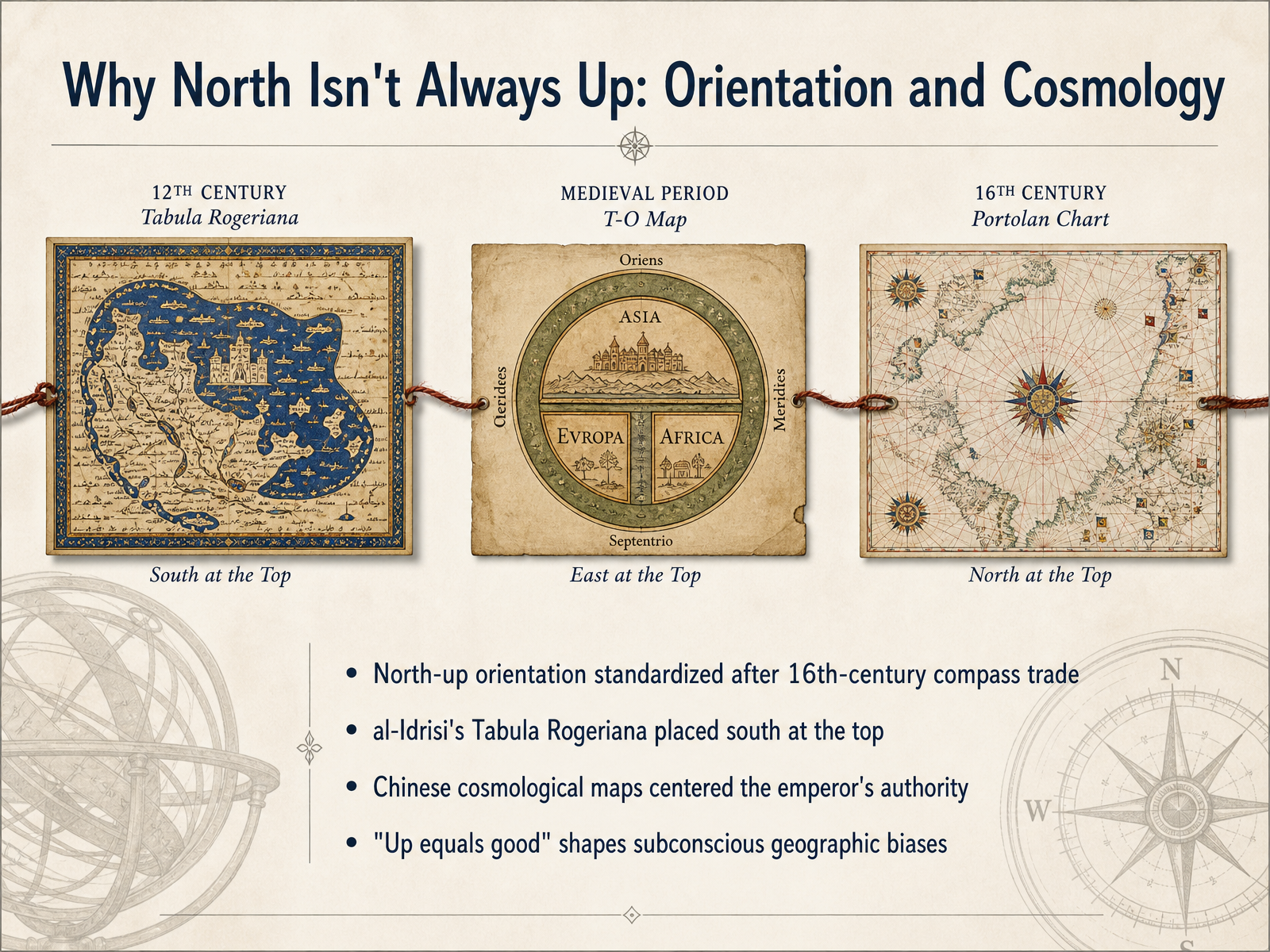
2 min - 11Why North Isn't Always Up: Orientation and CosmologyLet's continue with a question you might not have considered before. Why do we automatically assume north belongs at the top of a map? This choice is far from universal and reveals a great deal about the mapmaker's world. Ask yourself, what does the map's orientation tell me about the culture that produced it? The north-up standard we use today only solidified after the sixteenth century, driven largely by the European compass trade. Before that, maps pointed in many different directions. For example, notice how the twelfth-century Tabula Rogeriana, created by the scholar al-Idrisi, places south at the top. This was a deliberate choice, not an error. In Chinese cosmological maps, the center and top often represented the emperor's authority, positioning him as the pivot of a hierarchical world, not just a point on a compass. This teaches us a critical lesson. The phrase 'up equals good' can subtly shape our own subconscious geographic biases, making some regions seem naturally superior or inferior. Let the orientation be your first clue to the creator's perspective. Now, let's pull all these visual clues together and place the map back in its moment by examining the historical context that shaped it.
 2 min
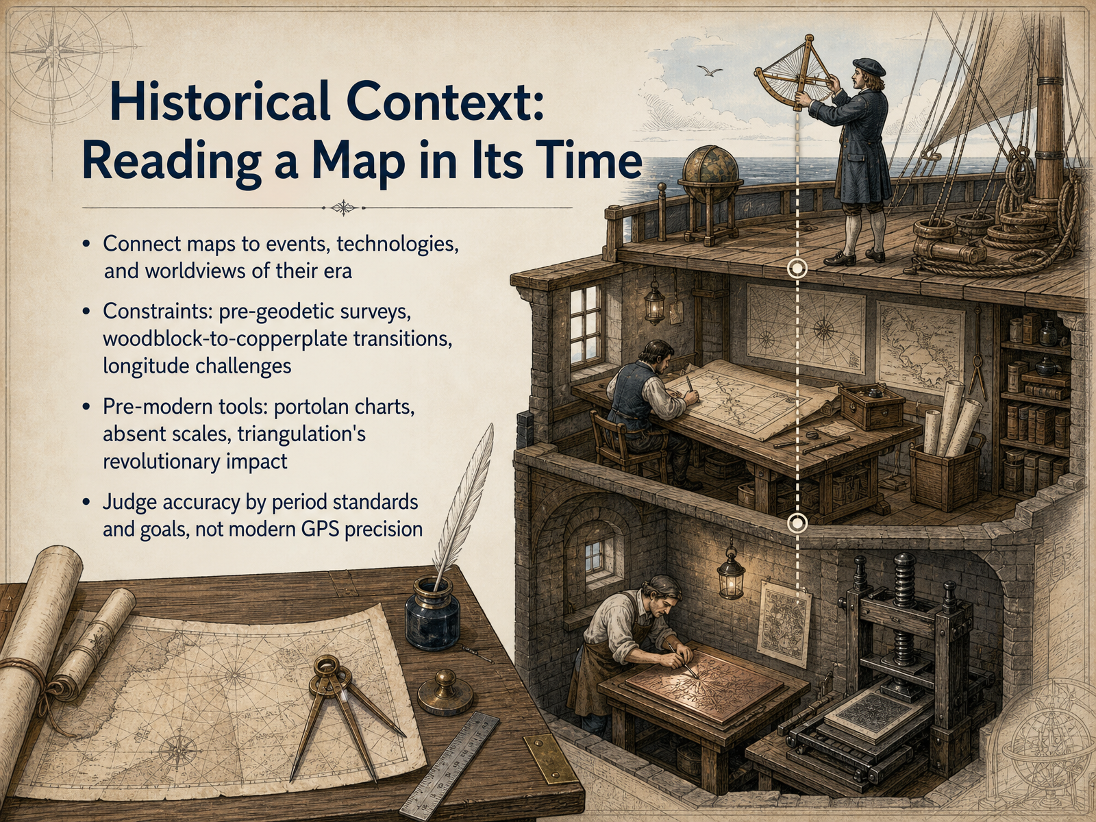
2 min - 12Historical Context: Reading a Map in Its TimeShifting our focus now, let's place the map firmly back into its own moment. To really read a map, we have to connect it to the events, the available technologies, and the very worldview of its era. This means understanding the real constraints the mapmaker was working under. Imagine creating a national survey before geodetic measurements were standardized, or in the middle of a technological shift from woodblock printing to copperplate engraving. And for centuries, a mapmaker’s greatest intellectual battle was the longitude problem, a challenge that made east-west distances dangerously unreliable. So ask yourself, what tools did they have? We see navigation aids like portolan charts with their beautiful rhumb lines, but often with no consistent scale. We later see the revolutionary impact of triangulation, a method that finally allowed surveyors to measure vast distances with startling precision. This is your key takeaway for analysis: you must judge a map’s accuracy not by our modern GPS standard, but by the period's own standards and the map's intended goal. A map that fails our precision test might have been a complete success in its own time. Now, let’s put all your detective skills together as we move into Part 4: Synthesis and Application.
 2 min
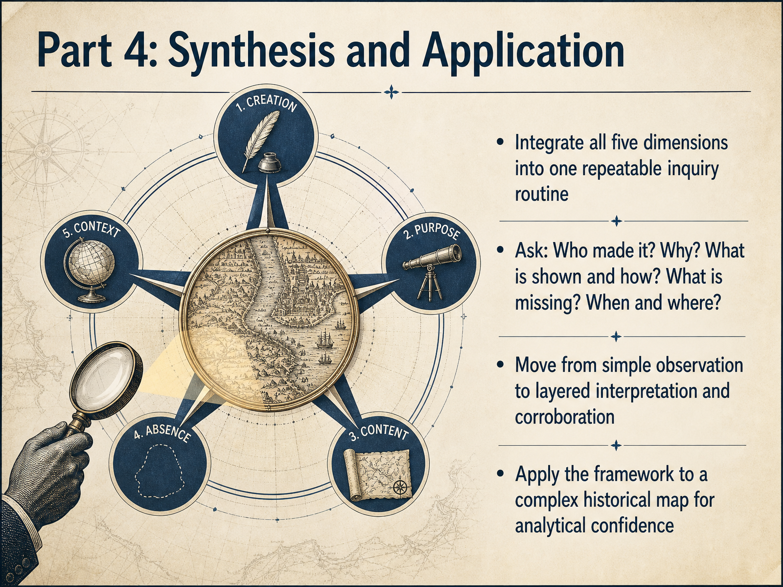
2 min - 13Part 4: Synthesis and ApplicationSo we've explored each dimension separately. Now let's bring them together into one repeatable routine. Think of this as your analytical checklist whenever you encounter a historical map. Ask yourself: Who made it? Why was it created? What is shown, and how is it depicted? What is missing or left out? And when and where does this map sit in time and place? Start with simple observation. Describe what you literally see before jumping to conclusions. Then move to layered interpretation. How do the choices the mapmaker made shape your understanding? Finally, seek corroboration. Compare this map with other sources from the same period. Does it confirm or challenge what you already know? We're going to apply this full framework now to a complex historical map. Work through the five questions methodically, and you'll build real analytical confidence. Let's put it into practice with a structured questioning toolkit designed for any map you encounter.
 1 min
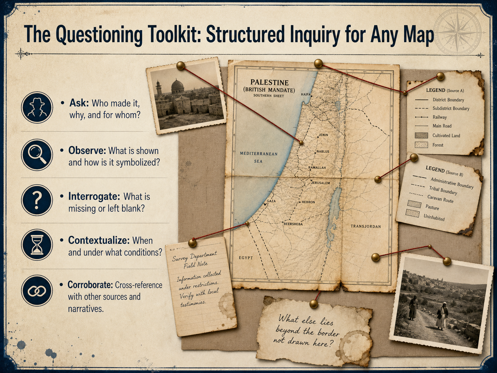
1 min - 14The Questioning Toolkit: Structured Inquiry for Any MapNow we have a structured way to unpack any map. Think of this as your questioning toolkit. First, ask yourself about the map's origins. Who made it, why did they make it, and who was the intended audience? These questions immediately reveal the map's purpose. Next, observe what is actually shown and how it is symbolized. Notice the colors, the line styles, the labels, and the scale. Then, interrogate what is not there. What territories, peoples, or routes are missing or left completely blank? Those silences are often just as revealing as what is drawn. After that, contextualize the map by asking when it was made and under what specific conditions. Was it created during a conflict or a period of exploration? Finally, corroborate. Cross-reference the map with other sources and narratives to test its claims. This toolkit turns you from a passive viewer into an active historical detective. Let's bring this framework directly into your own work in our final discussion.
 2 min
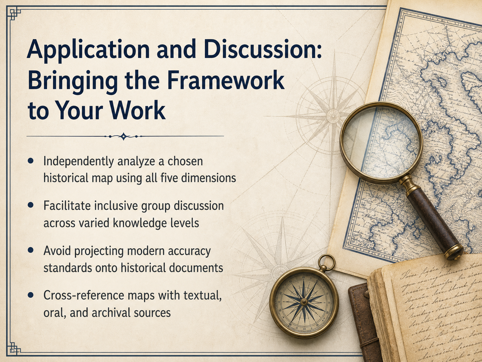
2 min - 15Application and Discussion: Bringing the Framework to Your WorkNow it is your turn to put the full framework into practice. Choose a historical map and work through all five dimensions we have explored—maker, purpose, legend, silences, and context. Ask yourself: who created this, for whom, and what choices did they make? Notice how every label, every blank space, and every boundary line reflects a deliberate decision, not neutral truth. Then, bring your observations into a group discussion. Start with simple, open questions so that everyone can contribute, regardless of their prior experience with maps. Draw on what you can see first, then gradually layer in insights from related sources—texts, oral histories, or archival records. Most importantly, resist the temptation to judge the map by modern standards of accuracy. Instead, ask what the map can teach us about the worldview of its own time. Your goal is not to find a single correct answer, but to ask richer historical questions. Thank you for joining this journey as a historical detective. Carry this lens with you—the next map you encounter will never look the same.
 2 min
2 min
Take the deck with you
Download this course as a file — free, no sign-up needed.
- PDF handoutEvery slide page, ready to print or share.16 pages · 6.7 MBDownload
- Narrated PowerPointThe deck that presents itself — every slide carries the digital human's narration video.16 pages · 17.3 MBDownload
- PowerPoint slidesThe full deck as a .pptx — open it in PowerPoint, Keynote, or Google Slides.16 pages · 6.7 MBDownload
Free to use in your own training — please keep the PersonWise credit page at the end.
Have your own deck? Turn it into a course