Begin
14 pages · ~28 min
Presentation Design Fundamentals
Master presentation design fundamentals to create clear, visually engaging slides that enhance communication and audience impact.
A digital instructor presents all 14 pages. Hold “Ask” at any point and ask out loud — the answer comes from this course. No sign-up needed.
What you’ll learn
- 01Presentation Design FundamentalsWelcome to Presentation Design Fundamentals. I am glad you are here, because this is a skill that shows up everywhere. Whether you are prepping a board deck, a classroom slide, or a social post, the way you design your visuals shapes how people perceive you and your message. Research tells us something encouraging. Well designed slides do not just look nicer. They improve comprehension, they build credibility, and they help people remember what you said long after you finish. In fact, strong visuals can make a presentation more than forty percent more persuasive. That is a real advantage, and it is one you can learn. Over the next few slides, we will work through the core building blocks. Structure, hierarchy, typography, color, and imagery. You will also get a practical workflow that takes you from a rough outline all the way to a polished deck. You do not need to be a designer to do this well. You just need a clear, repeatable process. Let us start by looking at why slide design directly affects retention and persuasion.ingentaconnect.compure.psu.eduutppublishing.com+21 min
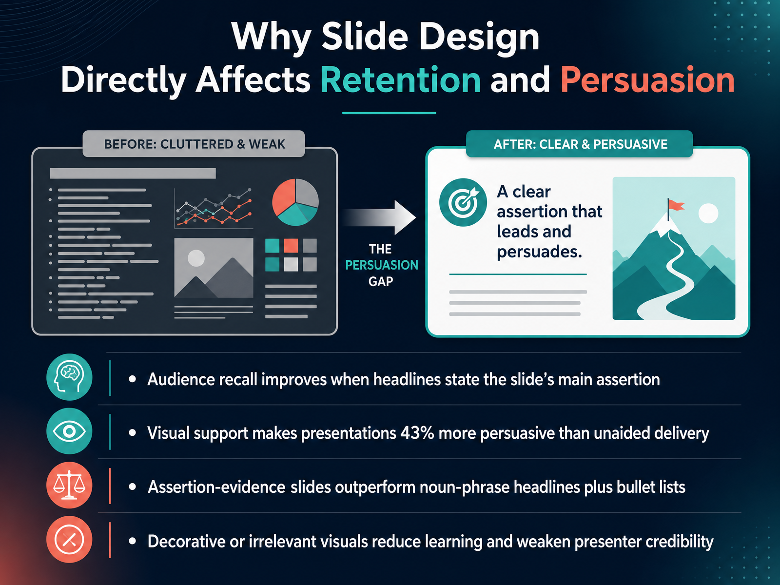
- 02Why Slide Design Directly Affects Retention and PersuasionNow, let's talk about why the design choices you make on a slide actually change what your audience remembers and how they respond. The first key point is about headlines. When the headline of your slide states the main assertion, like a full sentence that delivers the key takeaway, your audience's recall improves significantly. It tells them exactly what to focus on. Next, visual support is powerful. Research from the University of Minnesota and 3M found that presentations using visual aids were forty-three percent more persuasive than unaided delivery. That's a huge shift in influence. Third, the structure matters. Slides built around an assertion and visual evidence consistently outperform the typical format of a vague phrase headline followed by bullet points. Audiences understand more, and they retain that understanding for longer. Finally, be careful with decoration. Irrelevant images, decorative backgrounds, or overly prominent logos don't help. They actually reduce learning and can weaken your credibility as a presenter. So, the design is not just cosmetic. It is a core part of how your message is processed. Next, we'll explore how the audience brain actually processes a slide.
 ingentaconnect.compure.psu.eduutppublishing.com+21 min
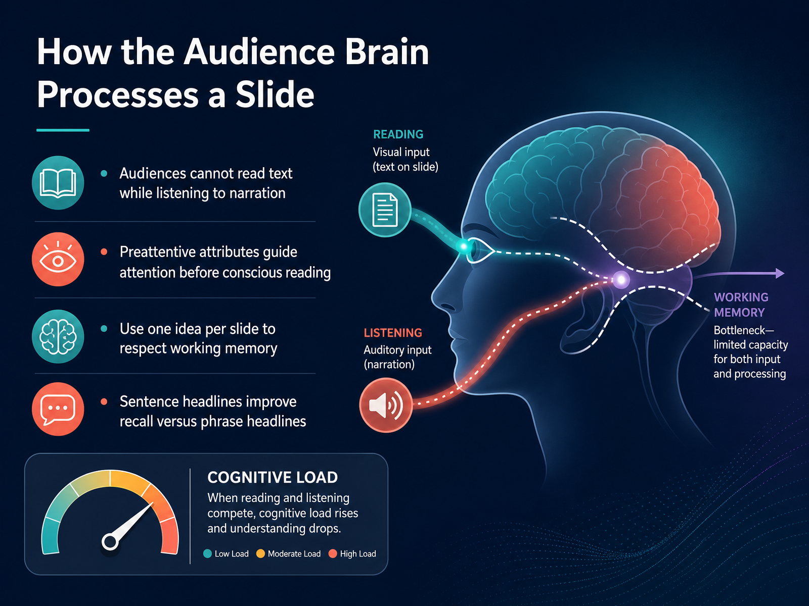
 - 03How the Audience Brain Processes a SlideNow let's look at how someone's brain actually processes the slide in front of them. This is where design becomes a cognitive tool, not just decoration. First, your audience cannot read text while listening to you talk. When you put paragraphs on a slide, they have to choose between reading and listening, and usually they miss both. So keep on screen words to a minimum. Second, preattentive attributes like color, size, and position guide attention before conscious reading even begins. This means the most important element should visually stand out first, because the eye scans before the brain reads. Third, respect working memory by using one idea per slide. When you're prepping a board deck, a classroom slide, or a social post, one clear point per slide is easier to follow and easier to remember. Fourth, use sentence headlines rather than phrase headlines. A headline that states the main assertion, like 'Customer churn rose sharply in quarter three,' improves recall far more than a label like 'Quarter three results.' The sentence gives the audience a conclusion, not just a topic. That simple change makes your slide memorable on its own. Up next, we'll build on this with the four core design principles: contrast, alignment, repetition, and proximity.
 ingentaconnect.compure.psu.eduutppublishing.com+21 min
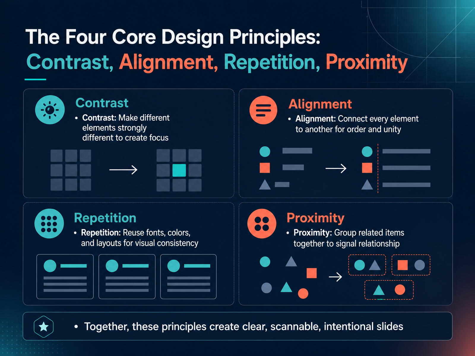
 - 04The Four Core Design Principles: Contrast, Alignment, Repetition, ProximityNow let's move into the heart of slide design. These are the four core principles that separate a clear, intentional slide from a messy one. Think of them as your visual checklist. The acronym is CARP. C for contrast. Make different elements strongly different. If your headline is bigger than the body text, make it obviously bigger. That difference creates focus. A for alignment. Connect every element to something else. When a title, an image, and a caption share the same edge, the slide feels orderly instead of scattered. R for repetition. Reuse the same fonts, colors, and layouts. It gives your deck a consistent identity, whether you are prepping a board deck or a classroom lesson. P for proximity. Group related items close together. If a label sits near its chart, people instantly understand they belong together. When used together, these four principles make your slides clear, scannable, and intentional. Next, we will look at how whitespace and visual hierarchy guide the eye even further.
 slideshare.netslideserve.comslideserve.com+21 min
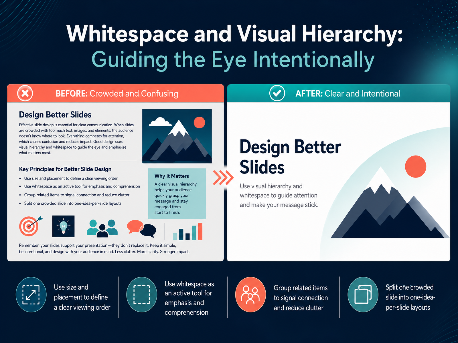
 - 05Whitespace and Visual Hierarchy: Guiding the Eye IntentionallyLet's talk about guiding your viewer’s eye. When you design a slide, you control where people look first, second, and third. You do this through size and placement. A large headline immediately signals importance. A smaller caption in the corner signals supporting detail. That is a clear viewing order. And whitespace is not empty space. It is an active tool. When you leave breathing room around a key statistic or a short sentence, you isolate it. You tell the audience, this matters. Grouping related items also creates visual connection. If a chart label sits right next to its chart, people understand they belong together. If they are far apart, the relationship feels unclear. So if you are prepping a board deck or a classroom slide and you see too much content competing for attention, split it up. Move one idea to its own slide. One idea per slide keeps the message sharp and the design calm. When you combine intentional whitespace with clear hierarchy, your audience can follow your thinking without working hard. Up next, let’s apply these ideas to structuring your whole presentation as a narrative.
 slideshare.netslideserve.comslideserve.com+22 min
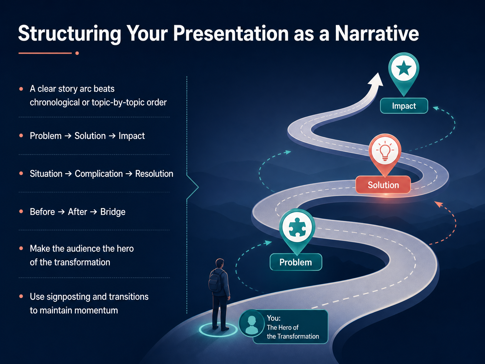
 - 06Structuring Your Presentation as a NarrativeNow let's think about how to organize all of that into a story. The most effective presentations don't just list information. They follow a clear narrative arc. Instead of moving chronologically or topic by topic, try shaping your content around a simple structure. One common approach is problem, solution, impact. You start with the challenge, introduce your idea, and then show what changes as a result. Another option is situation, complication, resolution. Here you set the context, introduce what's making things difficult, and then present the path forward. You might also try before, after, bridge. That means showing where things are now, where they could be, and then explaining how to get from one to the other. Whichever frame you choose, keep one thing central. Make your audience the hero of the transformation. They should see themselves moving from the current state to a better one. And as you guide them through that journey, use signposting and clear transitions to maintain momentum. Phrases like, so what does this mean for you, or, now that we've seen the problem, help people follow your logic. This narrative spine keeps your presentation focused and makes it easier for the audience to stay with you. Next, we'll look at how typography can support that message and make your slides easier to read.
 rekarda.comgithub.comduarte.com+22 min
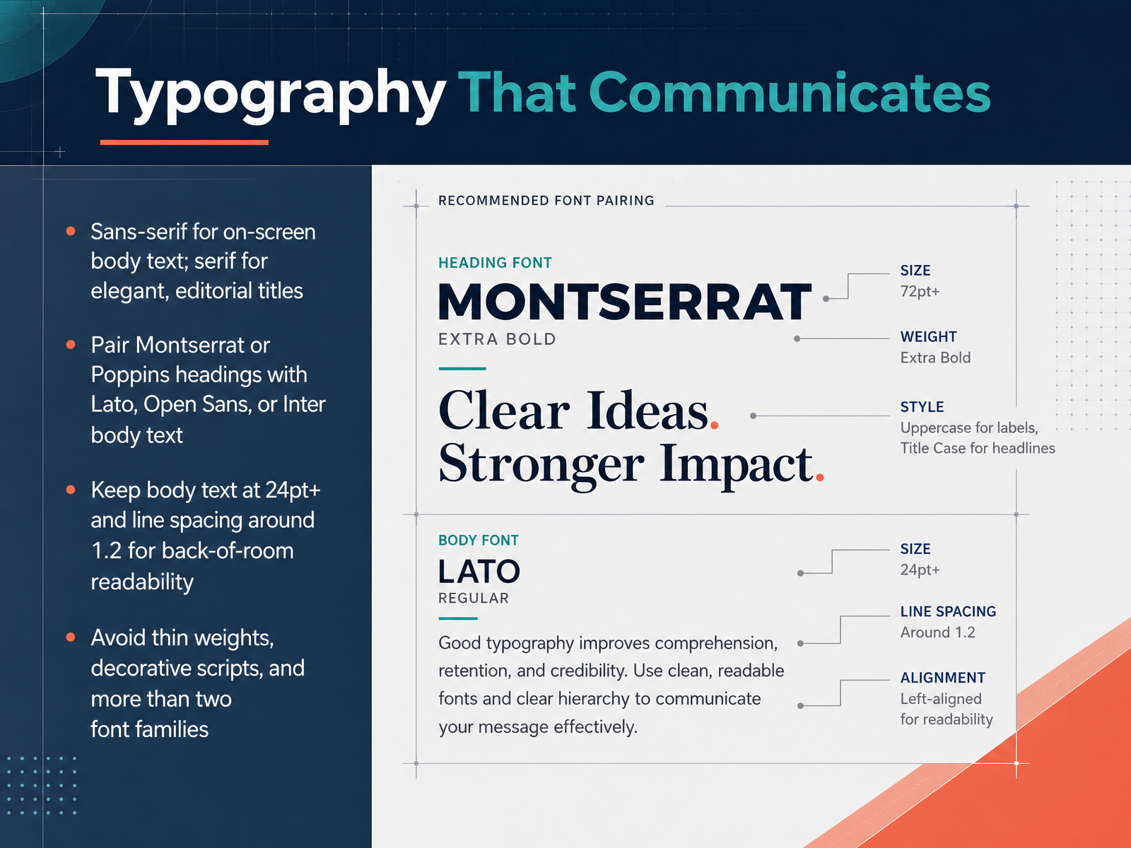
 - 07Typography That CommunicatesNow, let's talk about typography, because the fonts you choose do a lot of quiet work. The core idea is simple. For most of your on-screen body text, choose a clean sans-serif font. It stays readable from the back of the room. If you want a more elegant or editorial feel, save a serif font for your big titles. A great, safe pairing is to use Montserrat or Poppins for your headings, and pair it with Lato, Open Sans, or Inter for the body. This gives you clear hierarchy without visual chaos. And size matters just as much as style. Keep your body text at twenty-four points or larger, with line spacing around one point two, so lines don't feel cramped. Finally, avoid a few common traps. Stay away from very thin weights and decorative script fonts, and try to limit yourself to no more than two font families across the entire deck. Two fonts, used consistently, will make your slides feel calmer and much more professional. Next up, we'll build on this by looking at color and contrast for clarity and accessibility.
 slidescorner.comvisme.comadegooddesigns.com+22 min
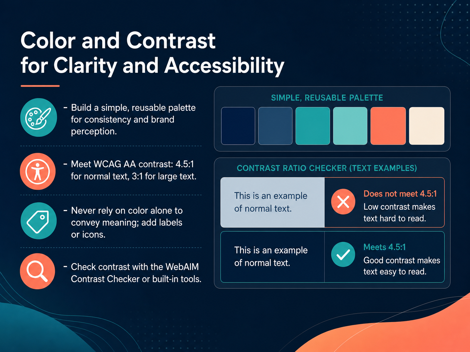
 - 08Color and Contrast for Clarity and AccessibilityNow, let's talk about color and contrast, because clear visuals are about more than just looking good. A simple, reusable palette is your best friend here. When you prepping a board deck, a classroom slide, or a social post, a consistent palette builds a stronger brand perception and keeps your design feeling cohesive. But the most important rule is accessibility. To meet WCAG AA standards, you need a contrast ratio of at least four point five to one for normal text, and at least three to one for large text, like headings. And please, never rely on color alone to convey meaning. If you highlight a key metric in red, add a label or an icon, because not everyone sees color the same way. To check your work, use the WebAIM Contrast Checker, or the built-in accessibility tools in your software. A quick check can make the difference between a slide that confuses and a slide that connects. Up next, we'll look at using images and visual aids that actually support your message.
 1 min
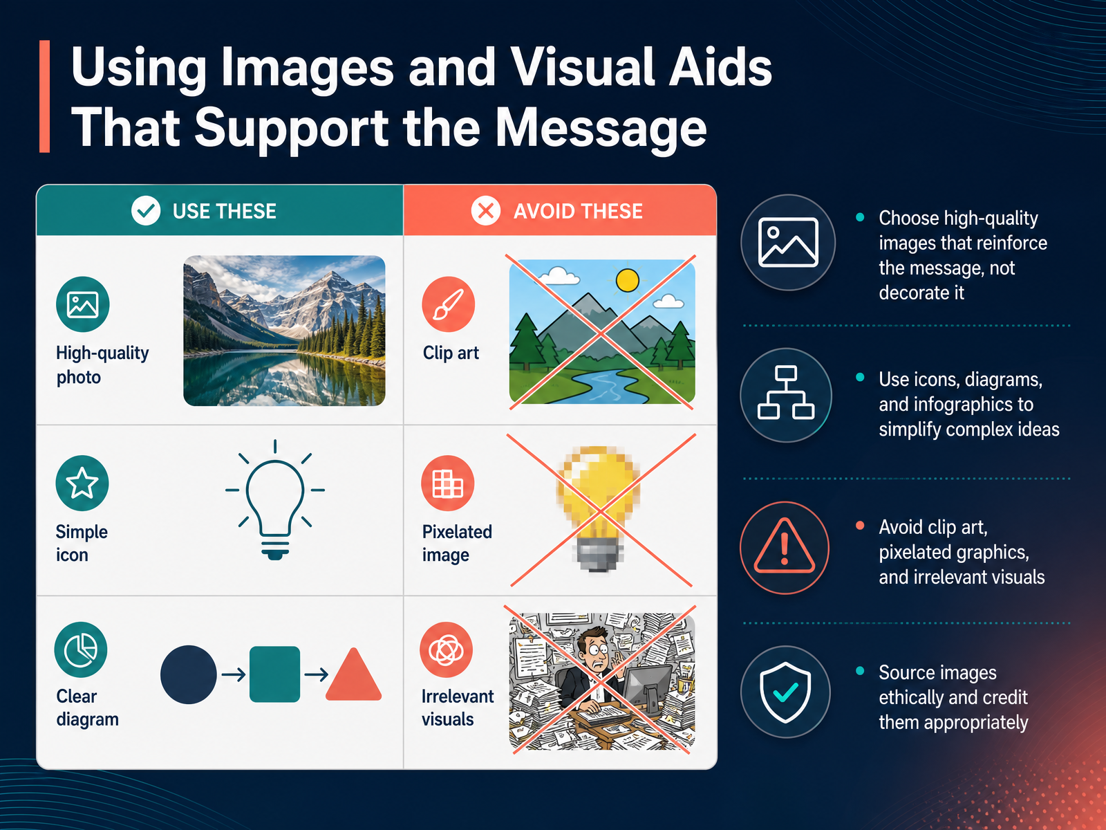
1 min - 09Using Images and Visual Aids That Support the MessageLet's talk about the visuals you choose and how they can either strengthen your message or quietly work against it. A great image isn't just decoration. It should clarify, emphasize, or explain the point you're making. When you're prepping a board deck, a classroom slide, or a social post, ask yourself a simple question. Does this visual help my audience understand faster? If the answer is no, it's probably adding noise, not value. Icons, diagrams, and simple infographics are especially useful for breaking down complex ideas into shapes and relationships people can grasp at a glance. But be selective. Avoid clip art, pixelated graphics, and anything that feels like filler. Those choices can make even a strong message look unpolished. And finally, use images ethically. Source them from reputable libraries and credit creators properly, just as you would cite a written source. When your visuals do real work, your slides feel cleaner and your message lands with more confidence. Next, we'll build on this by looking at how to design charts and graphs for rapid comprehension.
 1 min
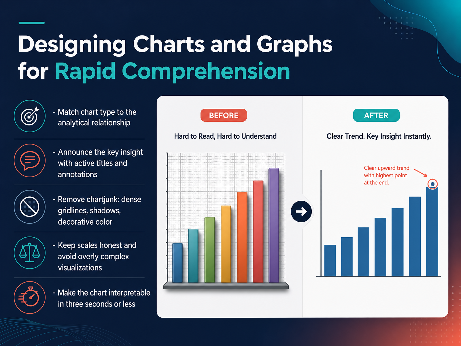
1 min - 10Designing Charts and Graphs for Rapid ComprehensionNow let's focus on charts and graphs. The goal is rapid comprehension. Your audience should understand your visual within about three seconds. To make that happen, start by matching the chart type to the relationship you're showing. Use a bar chart for comparisons, a line chart for trends over time, and a simple pie chart for parts of a whole. Second, announce the key insight directly. Instead of a generic title like 'Sales by Region,' try 'West Region Leads Sales Growth.' Use annotations to point out the most important data point. Third, remove chartjunk. Dense gridlines, shadows, and decorative colors only add visual noise. If an element doesn't help explain the data, delete it. Fourth, keep your scales honest. Avoid overly complex visualizations that look impressive but are hard to read. Let the data speak for itself. And finally, test your chart with the three second rule. If a first time viewer can't restate the headline quickly, simplify it. Up next, we'll explore how to adapt these design choices to your specific context and audience.
 1 min
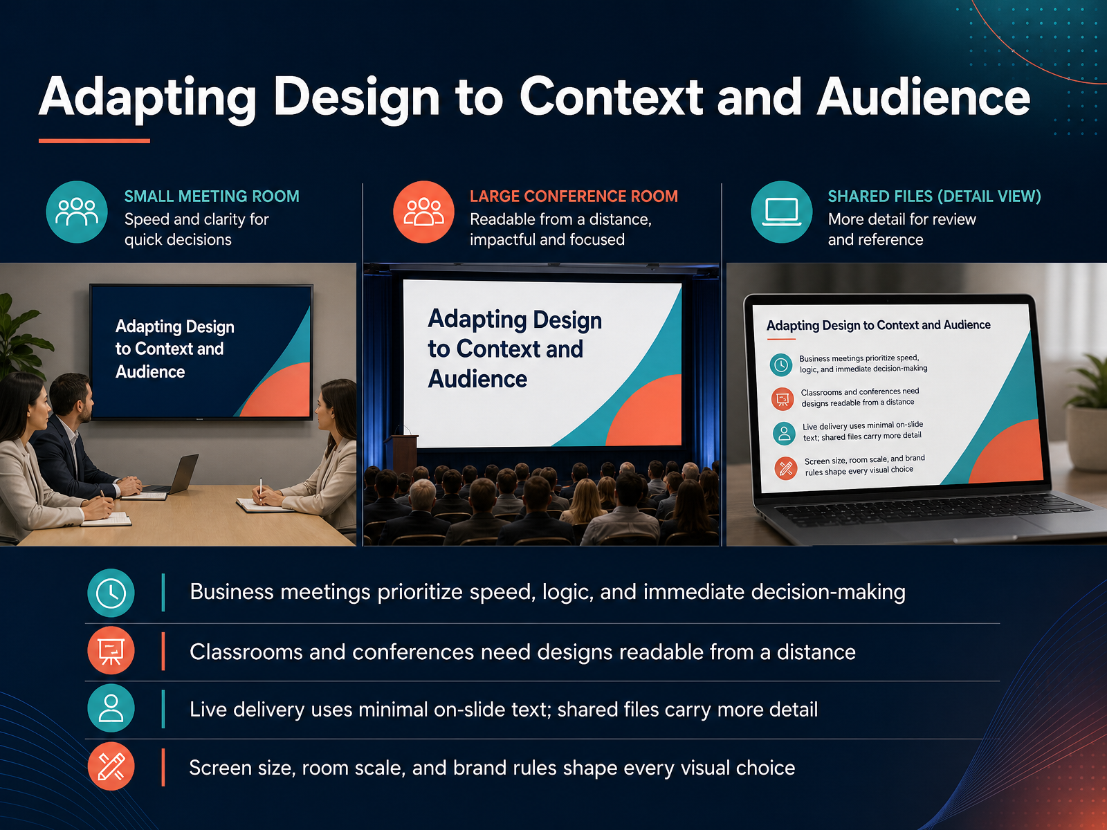
1 min - 11Adapting Design to Context and AudienceNow let's think about where your presentation will actually live. The same design doesn't work for every room or every screen. In a business meeting, people want speed. They want to see the logic and make a decision, so your slides should get to the point fast. In a classroom or a conference, you need to design for distance. That means bigger text, stronger contrast, and visuals that are easy to read from the back of the room. If you're presenting live, keep the on-slide text minimal. Your voice should carry the detail, not the slide. But if you're sending the file for someone to read later, include more written context because you won't be there to explain it. And always remember the practical limits. Screen size, room scale, and brand rules all shape your choices. A phone screen cannot hold the same detail as a large monitor, and a tight brand guide may restrict your colors and fonts. So before you design, ask one simple question. How will this be seen, and by whom? That answer should guide everything you place on the slide. Next, let's look at common slide design mistakes and how to fix them.
 rekarda.comgithub.comduarte.com+21 min
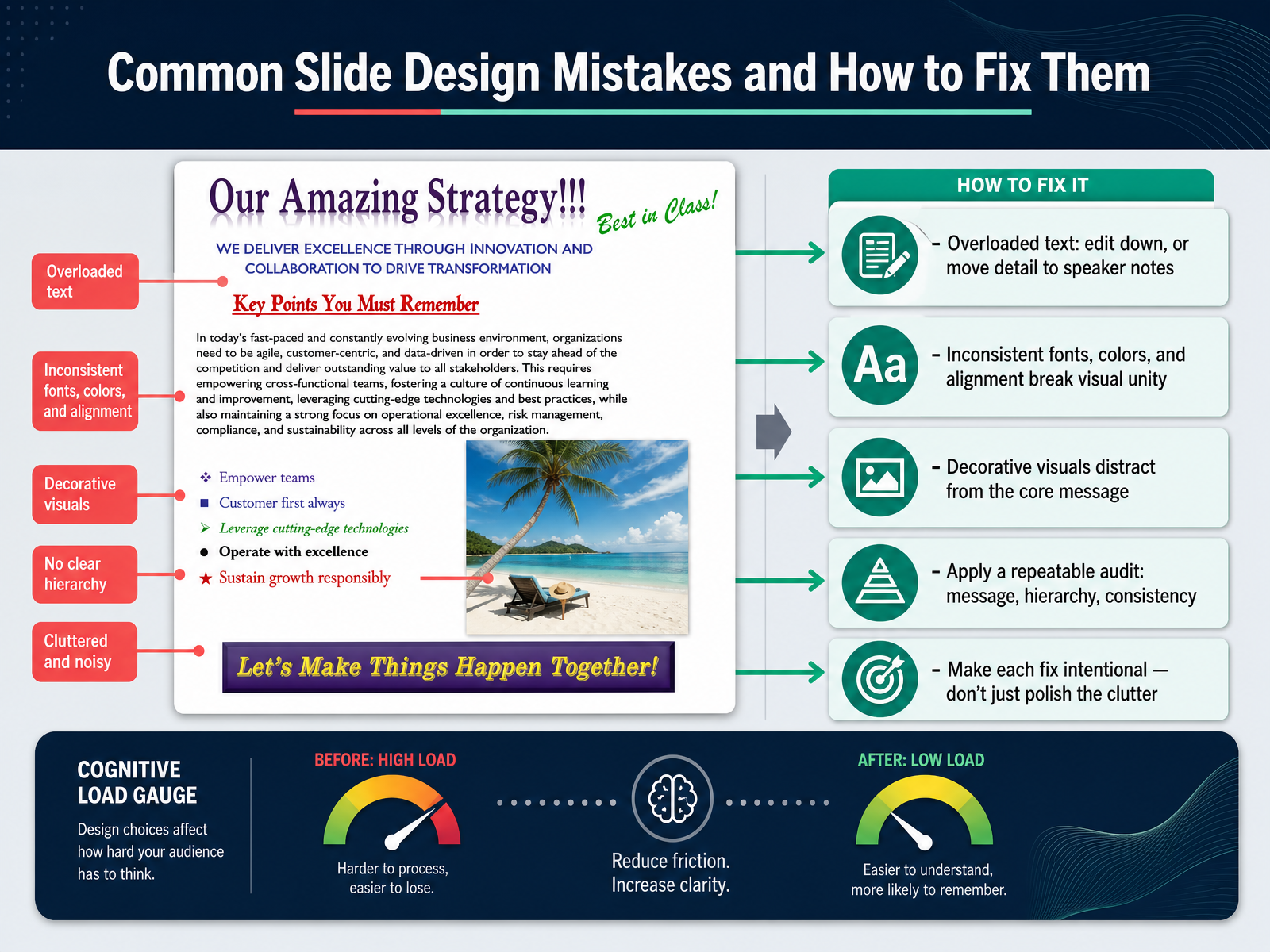
 - 12Common Slide Design Mistakes and How to Fix ThemNow let's talk about the mistakes you might run into, and how to fix them fast. The first one is overloaded text. If a slide looks like a document, your audience will read instead of listen. Edit it down, or move the detail into your speaker notes. Second, watch for consistency. When fonts, colors, or alignment change from slide to slide, the deck loses its visual unity. Pick a small set of choices and repeat them. Third, be honest about decorative visuals. If an image is only there to fill space, it probably distracts from the core message. A relevant visual supports the point. A random one competes with it. Here is a simple audit you can run on any slide. Check the message first, then the hierarchy, then the consistency. And make each fix intentional. The goal is not to polish clutter. The goal is to remove it. Next, we will bring all of this together into a practical workflow, from outline to finished deck.
 slideshare.netslideserve.comslideserve.com+21 min
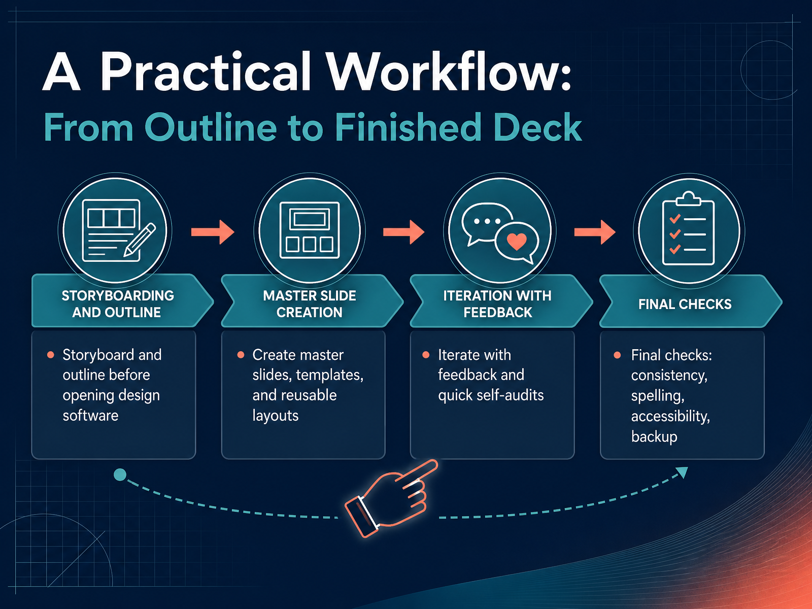
 - 13A Practical Workflow: From Outline to Finished DeckLet's pull this together into a workflow you can actually use. Before you open your design tool, storyboard on paper or in a simple outline. Sketch one idea per slide and check that the flow makes sense. Then build a master slide and reusable layouts so your deck feels consistent from start to finish. Once you have a draft, share it for honest feedback and run a quick self-audit. Look at all slides side by side. Ask if anything feels crowded, misaligned, or visually off. Finally, do your closing checks. Confirm spelling, accessibility, and consistency. Save a backup copy somewhere you can reach quickly. This rhythm keeps you moving without getting lost in the details. Next, we will apply these fundamentals to your next project.
 2 min
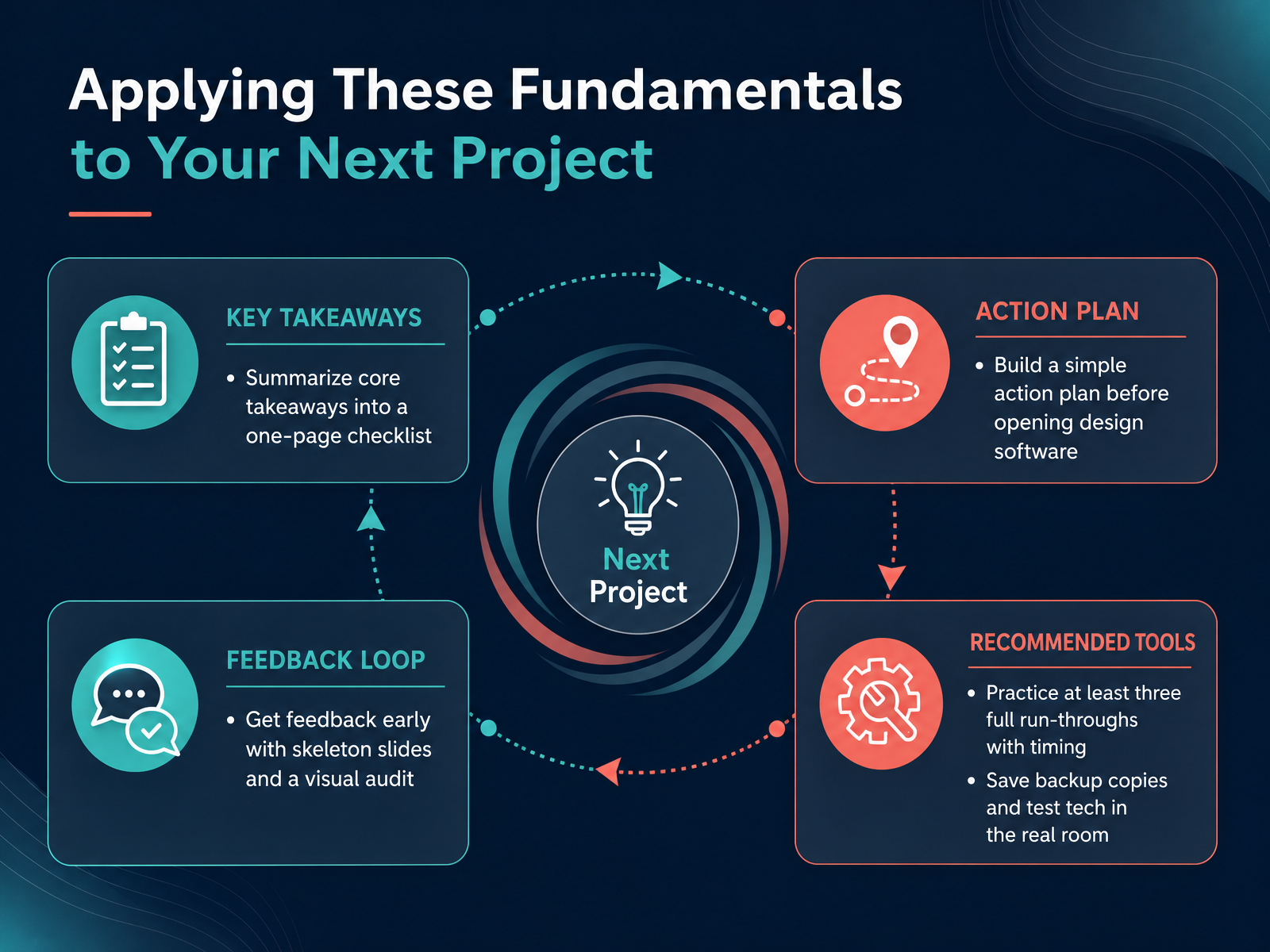
2 min - 14Applying These Fundamentals to Your Next ProjectSo, let's bring all of this together for your next project. Before you open any design software, pause and build a simple plan. Start by summarizing your core takeaways onto a one-page checklist. This helps you see the story clearly. Then, create a basic action plan. Decide on your main message and the job of each section. Once you have a rough idea, get feedback early. Use skeleton slides with just titles and basic text. A quick visual audit at this stage can save you hours later. After you have designed your slides, practice at least three full run-throughs with timing. This is not just about memorizing your speech. It is about making sure your pacing feels natural and your content fits the time you have. Finally, protect your work. Save backup copies in more than one place. And if you can, test the technology in the actual room where you will present. Check the projector, the clicker, and the audio. This prevents last-minute surprises. You now have a complete, practical workflow. Thanks for joining me. Now, go build something clear, confident, and truly useful for your audience.
 1 min
1 min
Take the deck with you
Download this course as a file — free, no sign-up needed.
- PDF handoutEvery slide page, ready to print or share.15 pages · 3.6 MBDownload
- Narrated PowerPointThe deck that presents itself — every slide carries the digital human's narration video.15 pages · 14.6 MBDownload
- PowerPoint slidesThe full deck as a .pptx — open it in PowerPoint, Keynote, or Google Slides.15 pages · 3.5 MBDownload
Free to use in your own training — please keep the PersonWise credit page at the end.
Have your own deck? Turn it into a course
Sources consulted
Web sources consulted while building this course.
- How the Design of Headlines in Presentation Slides Affects Audience Retention — ingentaconnect.com
- How the design of presentation slides affects audience comprehension: A case for the assertion-evidence approach - Penn State — pure.psu.edu
- Effect of Differing PowerPoint Slide Design on Multiple-Choice Test Scores for Assessment of Knowledge and Retention in a Theriogenology Course | Journal of Veterinary Medical Education — utppublishing.com
- Persuasion and the Role of Visual Presentation Support: The UM/3M Study — cs.furman.edu
- Short communication Effects of applying multimedia design principles in PowerPoint lecture redesign — sciencedirect.com
- CARP Design Principles | PPT — slideshare.net
- PPT - Mastering the C.A.R.P. Method: Principles for Effective Instructional Design PowerPoint Presentation - ID:2120066 — slideserve.com
- PPT - The Four Principles of Design PowerPoint Presentation, free download - ID:407618 — slideserve.com
- Instructional design/CARP/Applying the Design Principles - Wikiversity — en.wikiversity.org
- Design Principles — isbe.net
- Presentation storytelling frameworks — rekarda.com
- giving-presentations/references/story-structure.md — github.com
- How to move presentation audiences with structure and story | Duarte — duarte.com
- Make Your Presentations Pop. Think Like A Screenwriter! — carollempert.com
- SCR Framework Worksheet: Situation, Complication, Resolution – The Good Deck — thegooddeck.com
- The Best Fonts for Presentations in 2026 — SlidesCorner — slidescorner.com
- 26 Best Fonts for Presentations In 2026 [PowerPoint or Not] — visme.co
- Best Fonts for Presentations (2026 Picks) — madegooddesigns.com
- Top 10 PowerPoint Fonts for 2026 | TypeSmith | TypeSmith — typographysmith.com
- The Best Font for a Presentation (and How to Use It) — depicts.com