Begin
14 pages · ~28 min
Presentation Slide Design Best Practices
Learn to design professional business presentation slides with effective layout, visual hierarchy, and clear messaging.
A digital instructor presents all 14 pages. Hold “Ask” at any point and ask out loud — the answer comes from this course. No sign-up needed.
What you’ll learn
- 01Business Presentation Slide Design PracticesWelcome. I'm glad you're here, because this course tackles a problem every manager, consultant, and sales leader faces: turning a deck into a decision. This isn't about making prettier slides. It's about moving your stakeholders to act. We'll start with a simple idea. Great presentations are built on three pillars: a strategic narrative, visual clarity, and delivery that respects your audience's priorities. We'll focus on the first two in depth, and show you how your delivery ties them together. Throughout this course, you'll learn practical techniques you can apply to your very next deck. We'll move fast, and we'll skip the theory that doesn't help you win the room. Here's our promise: by the end, you'll know how to make your data tell a story that lands with executive-level impact. In the next slide, we'll look at why most business decks fail before the presenter even opens their mouth.verdanabold.comvisualbest.codeckary.com+22 min
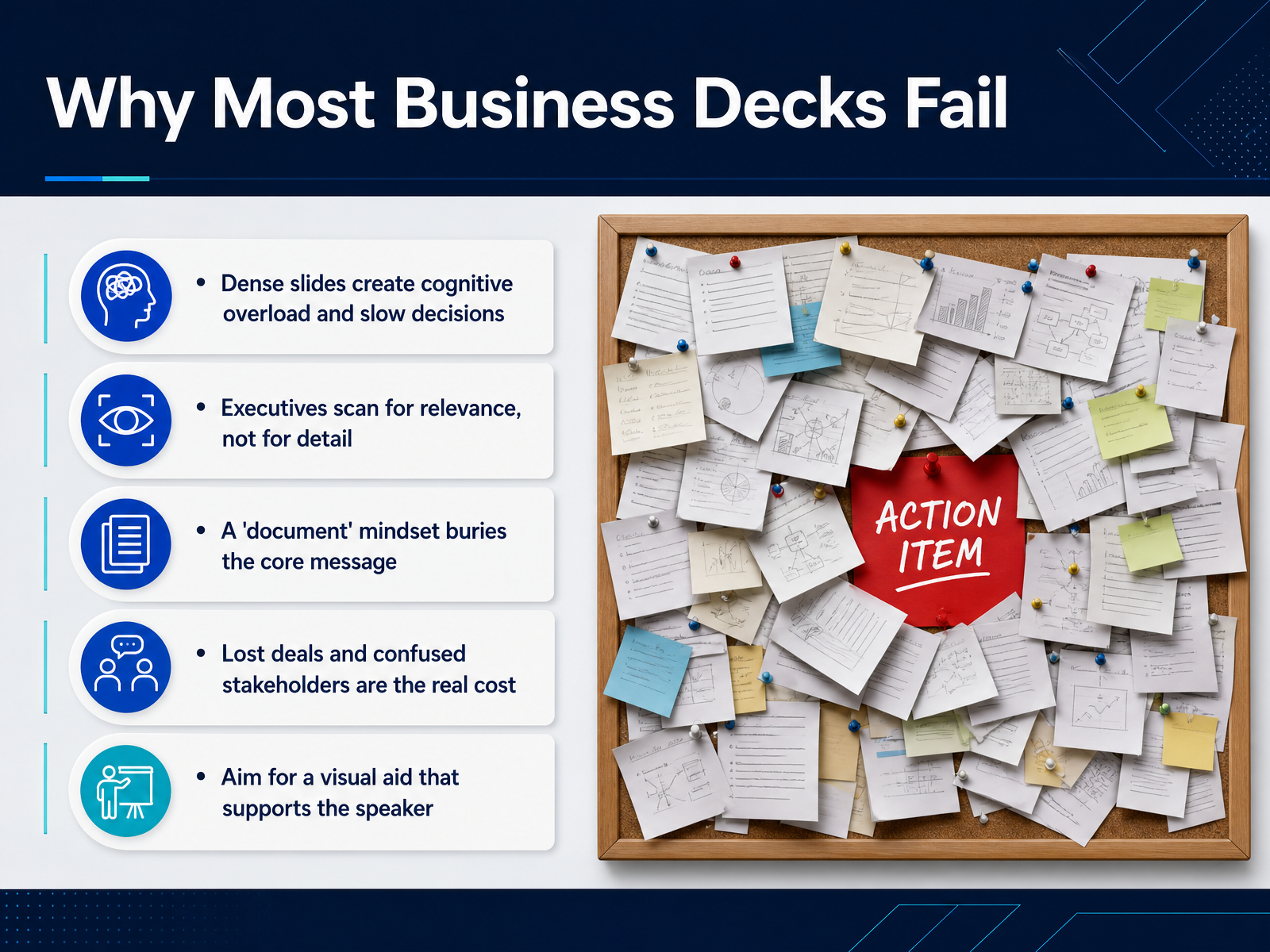
- 02Why Most Business Decks FailLet's look at why most business decks fail. The biggest reason is cognitive overload. When a slide is dense with text and data, your audience's working memory shuts down. Executives don't read slides. They scan for relevance. They want to know, does this matter, and what do you need from me. If they can't find that in a few seconds, they'll mentally check out. The root problem is a document mindset. Many presenters build the deck like a written report. They bury the core message under layers of background and detail. The real cost isn't just a boring meeting. It's lost deals, delayed decisions, and confused stakeholders who walk away without a clear next step. Your slides are not the presentation. They're a visual aid that supports you, the speaker. When the deck tries to carry the entire message, both the deck and the speaker fail. So the shift is simple. Lead with the answer. Build your slide around a single point, and let the visual support your voice. Let's move into how to do that. Next, we'll talk about leading with the answer, using the pyramid principle.
 sage.cnpereading.comwinningpresentations.cominsight.kellogg.northwestern.edu+21 min
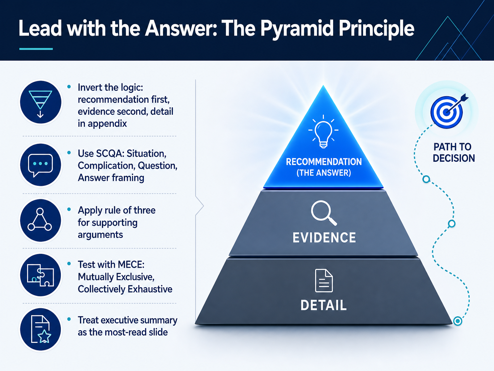
 - 03Lead with the Answer: The Pyramid PrincipleThis principle changes the entire architecture of your argument. Most people build a case from the ground up: data, analysis, then finally the recommendation. Flip that. Lead with the answer, plain and simple. Your stakeholders are busy. They want to know what you recommend and why, before they invest another minute. So open with the recommendation, then support it with evidence, and push the heavy detail into an appendix. To frame that opening quickly, consider the SCQA approach: Situation, Complication, Question, and Answer. Here is an example. Situation: we have grown twenty percent annually for five years. Complication: growth is now slowing as core markets saturate. Question: how do we sustain momentum? Answer: we enter a new market in the next quarter, starting with enterprise clients. That single framing tells the audience exactly where you are taking them. Now, when you build your supporting arguments, discipline matters. Use the rule of three. Humans can reliably hold about three ideas at once, so pick your three strongest reasons and stop there. More than three means you have not synthesized your thinking enough. Finally, test those three points for overlap and coverage. Make them MECE: Mutually Exclusive, Collectively Exhaustive. No two points should say the same thing, and together they should leave no major objection unaddressed. This is also why your executive summary is the most critical slide in the deck. Many senior leaders will read only that page. Make sure it delivers the full answer, supported clearly, in under a minute of reading time. Get this structure right, and every slide that follows simply proves a point you have already made. Next, let us turn to the unit of the slide itself: one idea, one insight, one slide.
 slideworks.iowinningpresentations.comdeckary.com+22 min
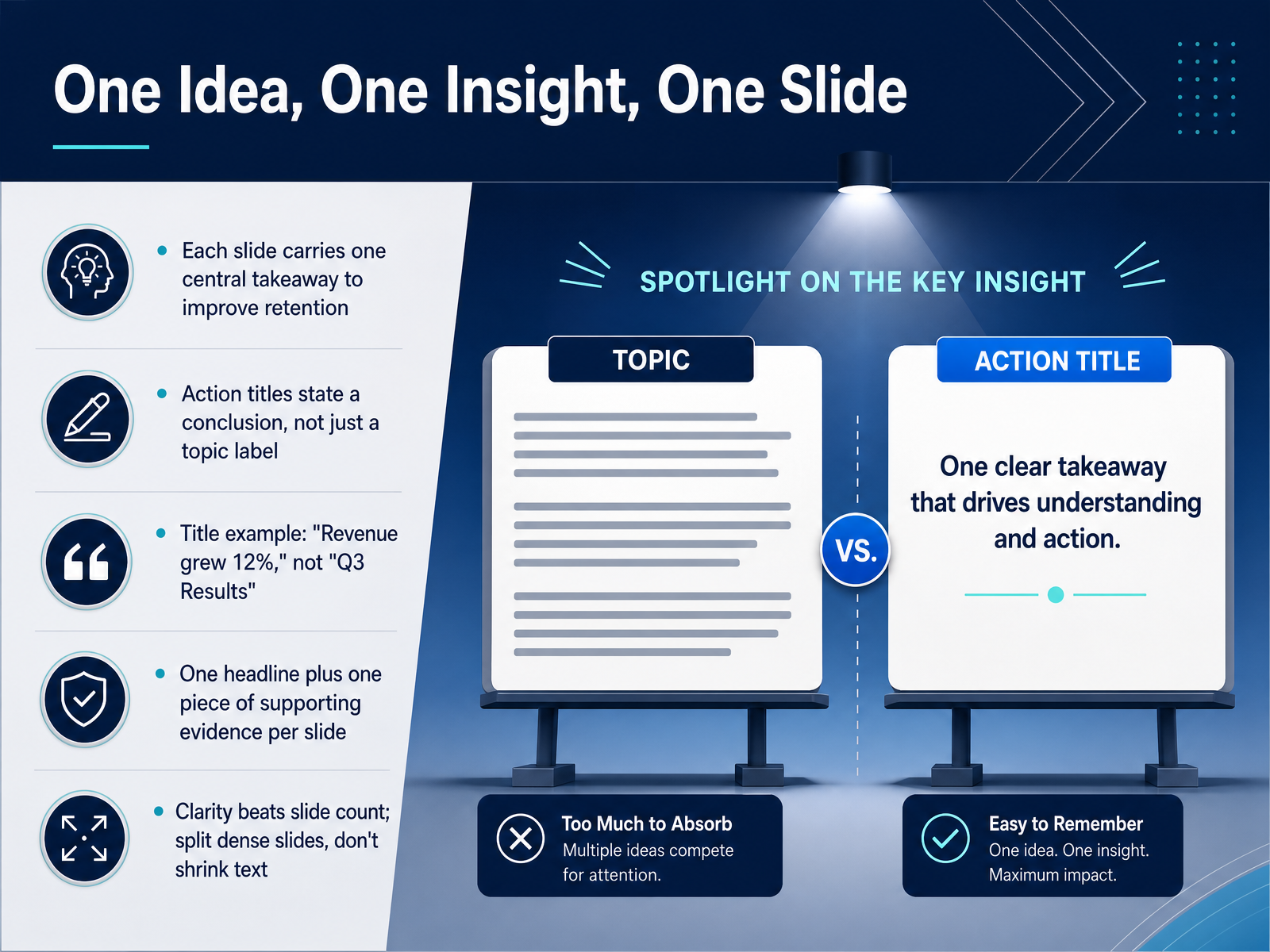
 - 04One Idea, One Insight, One SlideNow, let's talk about a discipline that separates persuasive decks from confusing ones: one idea, one insight, one slide. The principle is simple. Each slide should carry a single takeaway, and its title should state the conclusion, not just describe the topic. Instead of a title like, Q three results, write, Revenue grew twelve percent. That headline tells your audience what to conclude, before they even look at the evidence. Underneath that headline, include one piece of supporting proof. One chart. One data point. One concise summary. When you feel the temptation to add a second point, resist it. Split it onto another slide. A common fear is that more slides make a presentation feel long or repetitive. The opposite is true. Clarity beats slide count. If your only choice is shrinking the text or splitting the slide, always split it. Your audience processes ideas one at a time. Give each one the space to land. Up next, we'll build on this by shaping slides that lead the eye exactly where you want it: creating visual hierarchy that guides the eye.
 journals.plos.orgpmc.ncbi.nlm.nih.govcs.cmu.edu+22 min
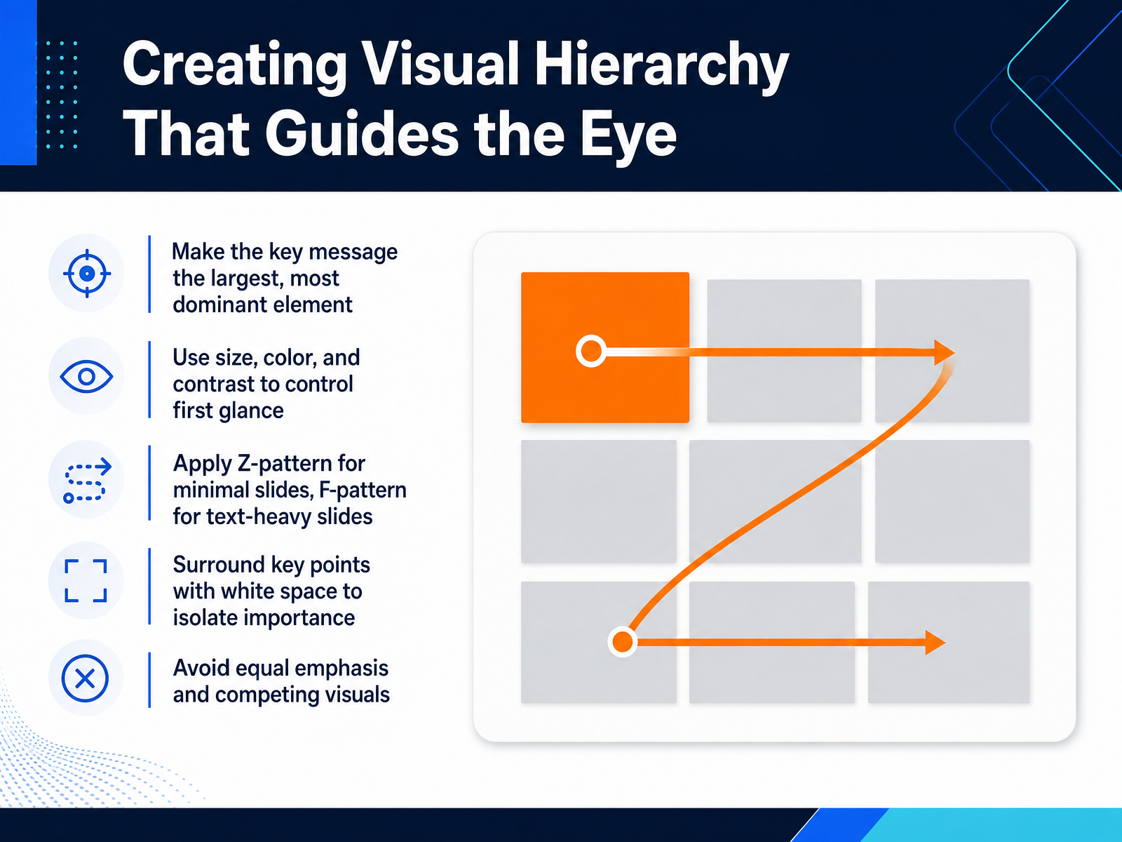
 - 05Creating Visual Hierarchy That Guides the EyeYour slide has one job, and that job is to tell the audience where to look. Visual hierarchy is how you make that happen. Start by picking the one message that matters most, then make it physically dominant. That could mean much larger text, a bold color, or stronger contrast. The eye goes to the biggest, brightest element first. So if your key number is smaller than a decorative graphic, your audience is looking at the wrong thing. For cleaner, more visual slides, use a Z-pattern to guide attention from top left across to the right, then down. For text-heavy slides, an F-pattern works better because people scan the top and the left edge. Also, give your key point room to breathe. Surrounding it with white space isolates it and signals importance. Avoid giving every element equal weight. If everything shouts, nothing gets heard. Next, we will look at typography and color as clarity tools.
 paulmansfield.netsage.cnpereading.com1 min
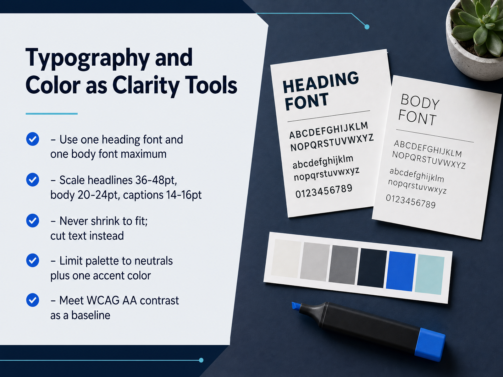
 - 06Typography and Color as Clarity ToolsNow let's talk about how typography and color can actually make your message clearer. The simplest rule is restraint. Use one font for headlines and one for body text, no more. That alone removes a lot of visual noise. For sizing, keep headlines between thirty-six and forty-eight points, body text between twenty and twenty-four, and captions between fourteen and sixteen. And here's the rule that matters most when you're building a deck for stakeholders: never shrink the text to fit the slide. If it doesn't fit, you have too much text. Cut it. The point is the argument, not the word count. For color, limit yourself to neutral tones and one accent color. That accent should be reserved for what you want people to remember. One pop of color is memorable. Four pops of color are a distraction. And make sure your contrast meets accessibility standards, so everyone in the room can read the slide, even from the back. Once your text and color are working for clarity, the next step is making your data just as easy to digest. Let's move to data visualization for decision-making.
 2 min
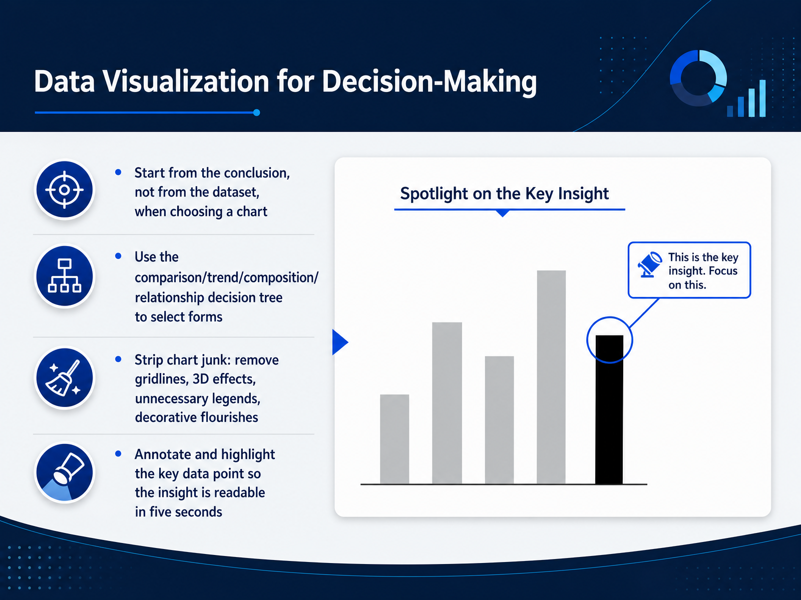
2 min - 07Data Visualization for Decision-MakingNow let’s talk about data visualization for decision-making. The first rule is simple: start from your conclusion, not your dataset. Before you pick a chart, write the takeaway as one sentence. That sentence tells you which relationship matters, and the relationship determines the form. If you are comparing categories, use a bar chart. If you are showing change over time, use a line chart. If you are showing parts of a whole, use a composition chart, and if you are testing correlation, use a scatter plot. With these four branches, most business choices resolve quickly. Then strip away chart junk. Remove gridlines, three-dimensional effects, unnecessary legends, and any decoration that does not carry information. A clean chart signals that your argument is strong enough to stand on its own. Finally, annotate the key data point. Highlight the bar, line, or segment that supports your conclusion, and add a short label explaining what it means. Your audience should read the insight within five seconds. If they cannot, simplify the visual or split it into two charts. Let’s move next to building a narrative that drives decisions.
 verdanabold.comvisualbest.codeckary.com+22 min
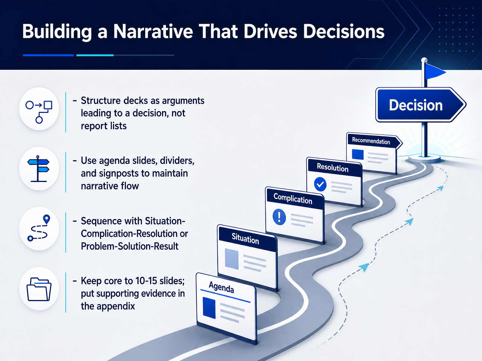
 - 08Building a Narrative That Drives DecisionsLet's talk about building a narrative that drives decisions. Your deck should feel like an argument, not a report. Every slide should exist for one reason: to move your audience closer to saying yes. Start by thinking about the decision you want. Then structure your slides to make that decision feel logical, even inevitable. Use agenda slides and section dividers as signposts. They tell people where they are in the story, which keeps everyone focused. For the core storyline, lean on proven flows. Situation, Complication, Resolution works well. Or use Problem, Solution, Result. Keep it simple. And remember the discipline: keep the core deck to ten or fifteen slides. Move the supporting data and deep analysis to the appendix. If a slide doesn't help drive the decision, cut it. That restraint signals confidence. Now, once you have the structure right, the next step is tailoring that structure to the people in the room. Up next, we'll cover designing for your audience, specifically the difference between executive and technical stakeholders.
 verdanabold.comvisualbest.codeckary.com+22 min
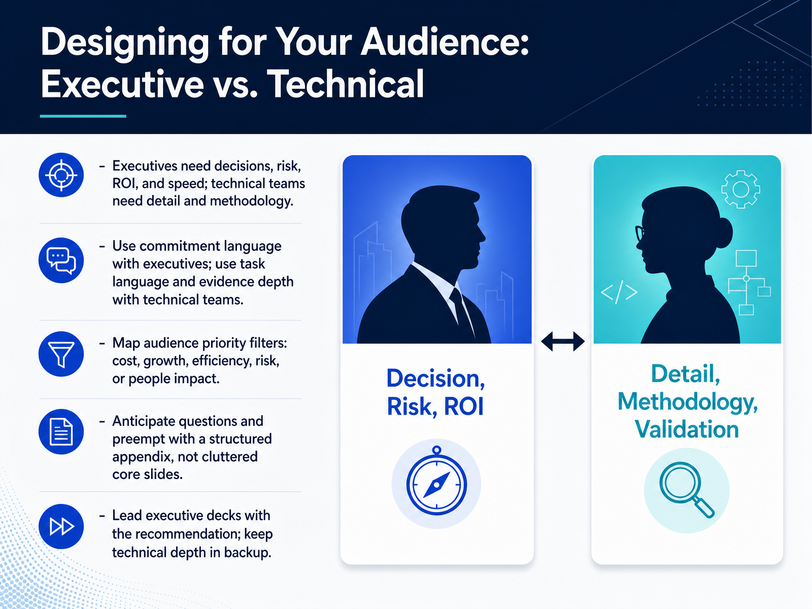
 - 09Designing for Your Audience: Executive vs. TechnicalNow let's talk about the sharpest distinction in presentation design: executive versus technical audiences. These two groups are not just different in title. They're different in the question they're asking when they open your deck. An executive wants to know, should we do this. A technical reviewer wants to know, does this actually work. So the same content needs two different architectures. For executives, lead with your recommendation. State the decision you're asking for, the return, the risk, and the timeline. Use commitment language. Not "we're looking into this" but "we are committing to this outcome by Q3." For technical teams, lead with the evidence. Show your methodology, your data, and the depth behind your reasoning. Task language works here, because they need to assess whether the work holds up. One more thing that helps both audiences. Map the priority filters in the room. Finance will scan for cost. Sales will listen for growth. Operations will focus on efficiency. Legal will hunt for risk. If you don't know which filter dominates, ask before you build the deck. And when you anticipate the tough questions, don't clutter the core slides with every answer. Park the detail in a structured appendix. That keeps the main deck clean and gives you a ready path when someone asks for proof. Next, we'll apply these moves to two high-stakes settings: board decks and sales pitches.
 2 min
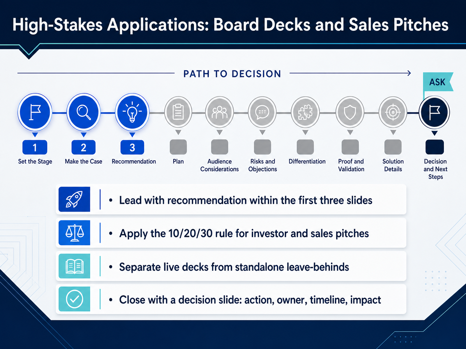
2 min - 10High-Stakes Applications: Board Decks and Sales PitchesNow let's look at high-stakes settings like board decks and sales pitches. The rules here get sharper. Lead with your recommendation within the first three slides. Senior audiences don't want to wait ten minutes for the point. State what you're asking for, then back it up. For investor and sales pitches, apply the ten twenty thirty rule. That's ten slides, twenty minutes, and a minimum thirty point font. It forces you to prioritize and keeps the deck breathable. Also, separate your live deck from your leave-behind. A slide projected in the room should be lean, with just one point. The leave-behind can carry the detail and work without you there to narrate it. And never end with just a thank you. Close with a decision slide. Spell out the action, the owner, the timeline, and the impact. That converts your presentation into a clear path forward. Next, we'll explore designing for asynchronous and mobile consumption.
 verdanabold.comvisualbest.codeckary.com+22 min
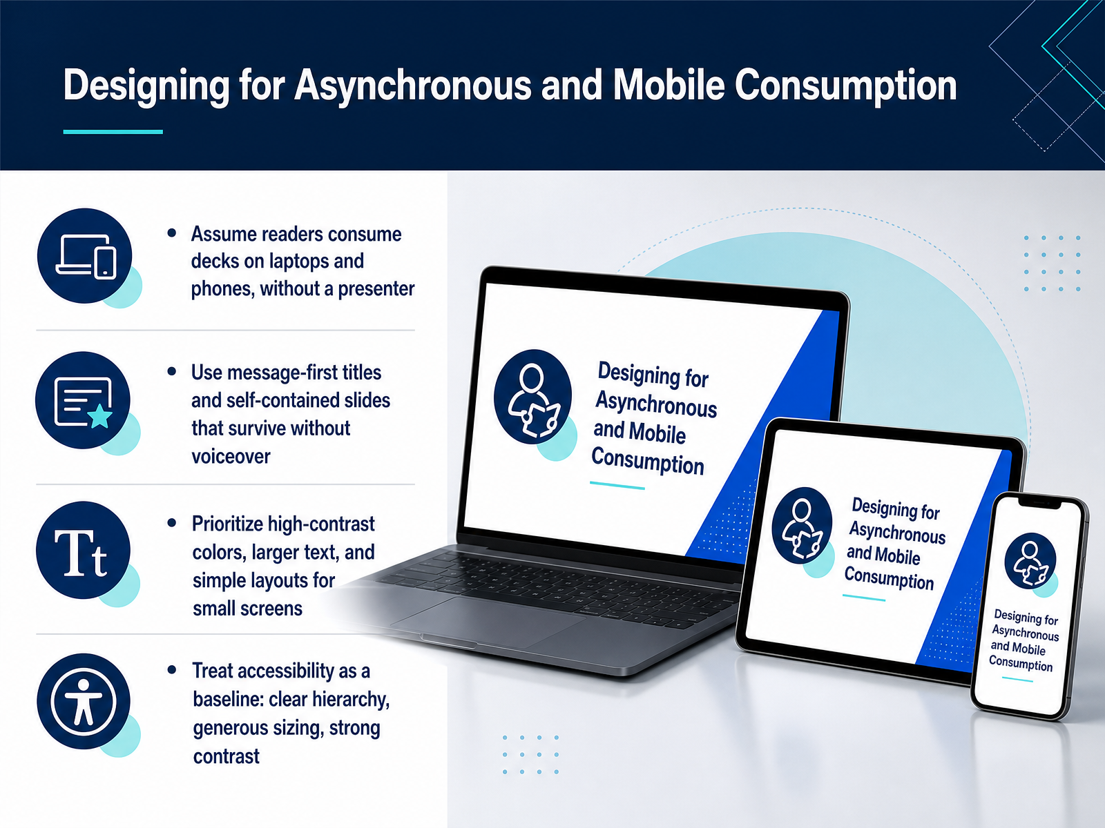
 - 11Designing for Asynchronous and Mobile ConsumptionNow let's talk about a reality that's easy to overlook. Many people will see this deck without you in the room. They'll be reading on a laptop, or scrolling through slides on a phone. That means every slide has to stand on its own, like a well-written brief. Start with message-first titles. If your title says the main takeaway, a reader can understand the entire argument just by flipping through the deck. Think about the phone screen. Dense layouts and small text become unreadable. So use larger text, high-contrast colors, and simple layouts. If it works on a phone held at arm's length, it works everywhere else. And frame accessibility as a baseline, not a bonus. Clear hierarchy, generous sizing, and strong contrast don't just help people with visual impairments. They make the deck clearer for every stakeholder. Design it once, for the smallest screen and the busiest reader. Let's continue by looking at that workflow on the next slide, which covers time-saving workflow and tooling.
 verdanabold.comvisualbest.codeckary.com+21 min
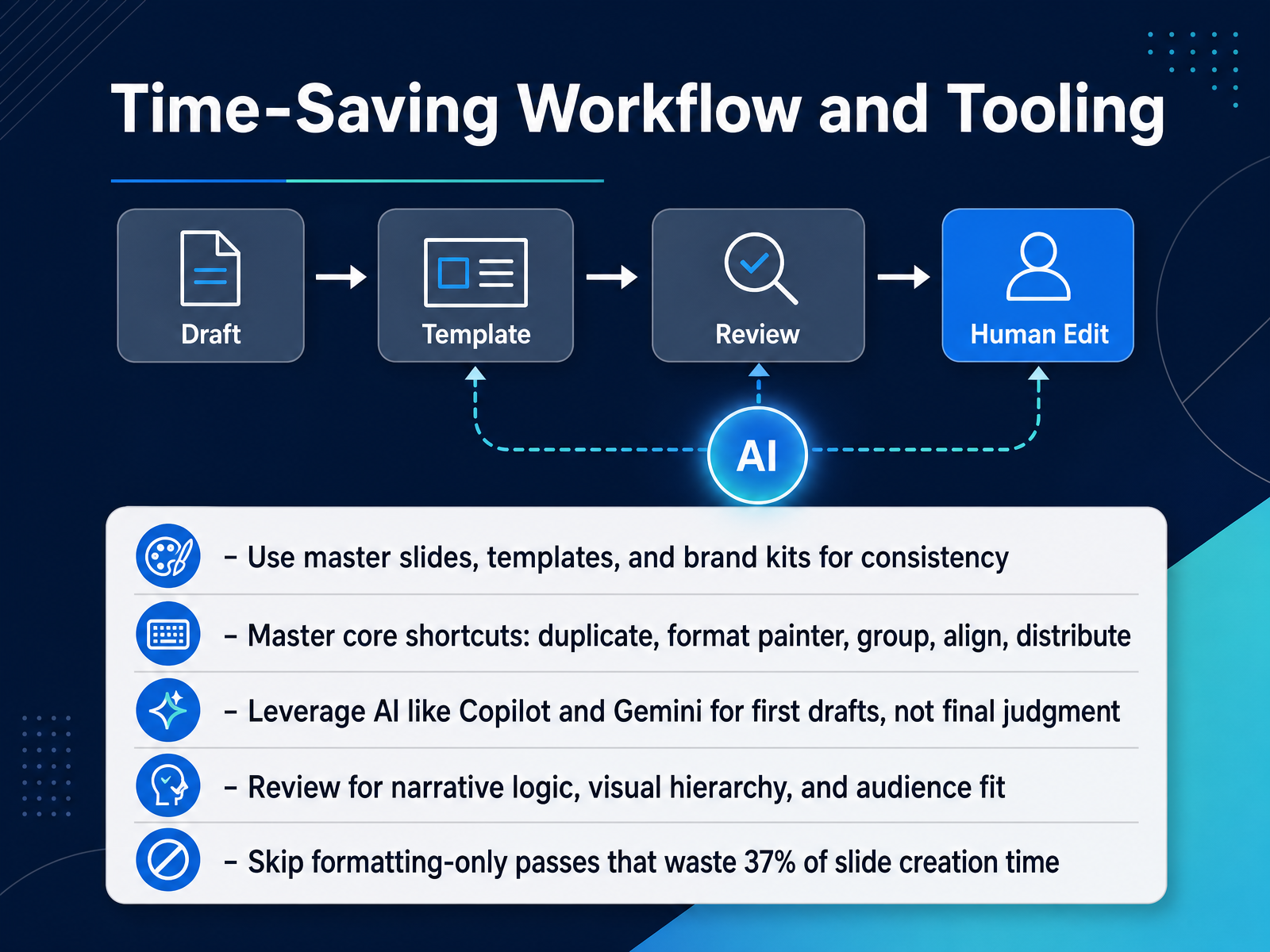
 - 12Time-Saving Workflow and ToolingLet's talk about how you build this without burning an entire afternoon. The fastest path starts before you touch a single shape. Set up your master slides, your templates, and your brand kit. This removes hundreds of small decisions about fonts and colors so you can focus on the narrative. Next, learn a handful of shortcuts. Duplicate, format painter, group, align, and distribute. These five commands will save you more time than any plugin you can buy. Use AI tools like Copilot or Gemini for the first draft. Let them assemble the rough structure and the initial text. Just remember, you are the final judgment. The machine drafts, you decide. Once the draft is in place, spend your review time on what actually matters. Check the narrative logic. Check the visual hierarchy. Check if the slide fits the audience. And one more thing. Stop doing formatting-only passes. Research shows presenters waste roughly thirty-seven percent of slide creation time on adjustments that add no value to the content. Trust the template and move on. Up next, we are going to apply this mindset to a very specific task: auditing and redesigning existing decks.
 2 min
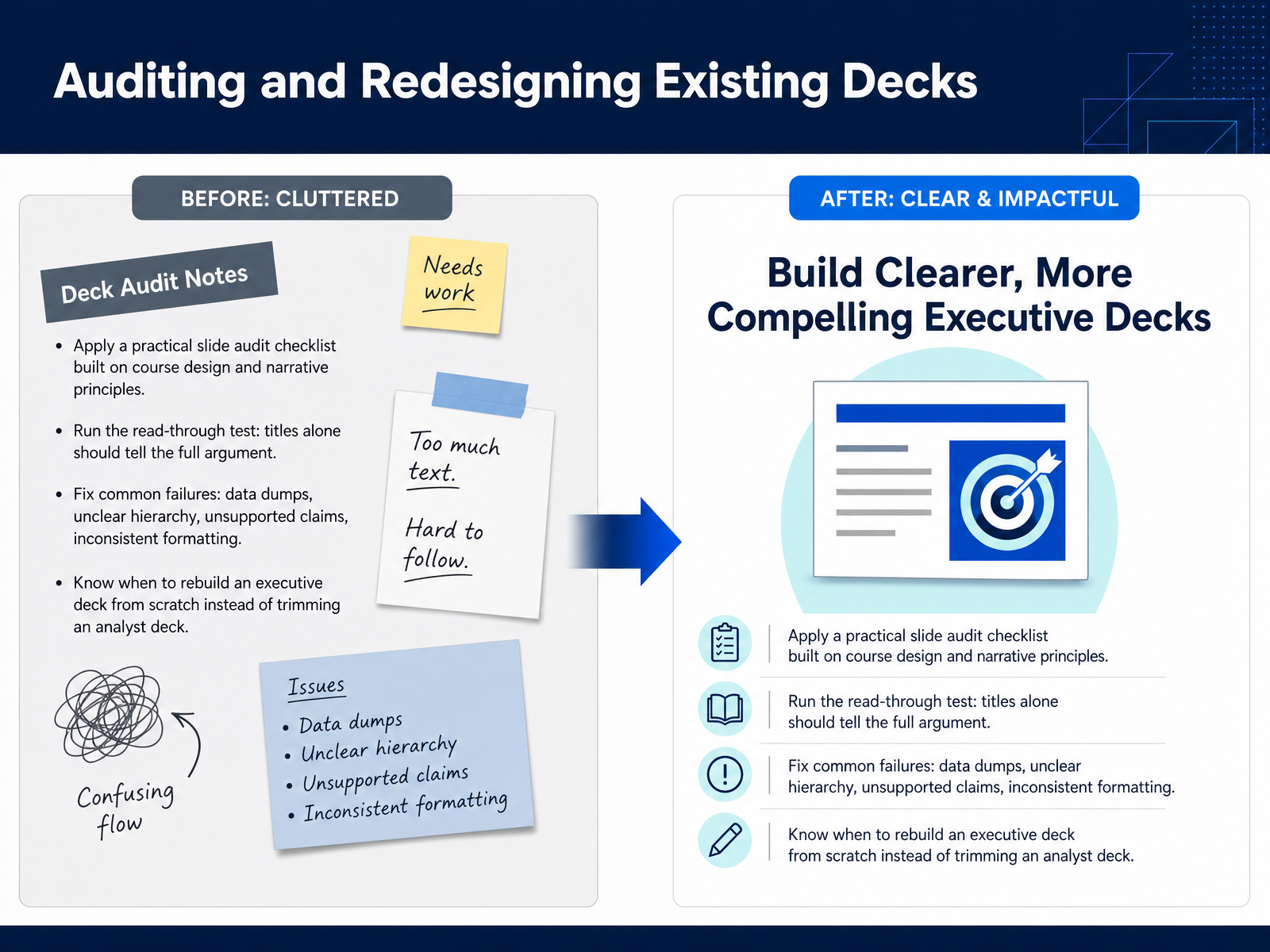
2 min - 13Auditing and Redesigning Existing DecksNow we turn to the decks already sitting on your drive. Auditing an existing presentation starts with the read-through test. Strip out the charts, the tables, and the body text. Read only the slide titles in order. If those titles alone do not tell the full argument and lead to a clear recommendation, the deck is not finished yet. Fix the most common failures first. Look for data dumps where every chart has equal weight and no stated insight. Check for unclear hierarchy, where the audience cannot tell what matters most. Flag any claim that appears without evidence behind it. And scan for inconsistent formatting that makes the deck feel assembled rather than designed. Then make the hard call. Some decks can be repaired with better action titles and fewer, stronger visuals. Others were built as analyst decks, meant to show the full journey of the analysis. If your stakeholders need a decision, that deck will never work by trimming slides. Rebuild it from the recommendation down, with supporting evidence in the body and the detail moved to an appendix. In our final module, I will help you turn all of this into your own course wrap-up and personal action plan.
 slideworks.iowinningpresentations.comdeckary.com+22 min
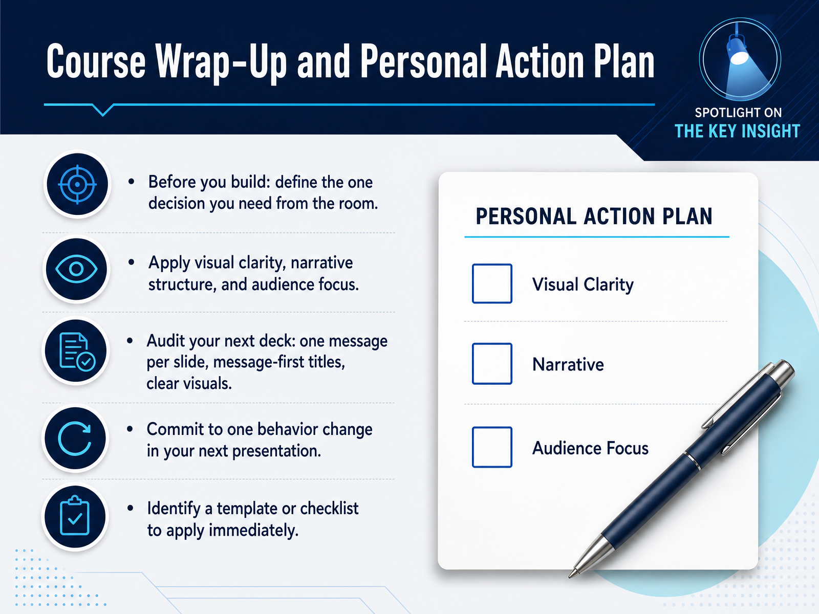
 - 14Course Wrap-Up and Personal Action PlanHere is the discipline that turns everything we covered into better decks. Before you build, define the single decision you need from the room. That is your target. Then apply the three shifts we worked through: visual clarity, narrative structure, and audience focus. When you audit your next deck, check three things. One message per slide. Message-first titles. And clear visuals that support the point instead of decorating it. Now commit to one behavior change in your next presentation. Not five. One. Maybe you will rewrite every topic title as a full sentence. Maybe you will cut one chart per slide. Pick the change that solves your biggest recurring problem. Finally, identify a template or checklist you can apply immediately. That converts intention into action. So here is the summary. Decide what the room must do. Build every slide to support that decision. Keep the message single, the titles active, and the visuals purposeful. Then commit to one concrete change and apply it right away. Thank you for completing this course. Walk into your next presentation with a sharper argument and a lighter slide deck. That is how you earn clarity, trust, and faster decisions.
 verdanabold.comvisualbest.codeckary.com+22 min
Take the deck with you
Download this course as a file — free, no sign-up needed.
- PDF handoutEvery slide page, ready to print or share.15 pages · 3.4 MBDownload
- Narrated PowerPointThe deck that presents itself — every slide carries the digital human's narration video.15 pages · 14.0 MBDownload
- PowerPoint slidesThe full deck as a .pptx — open it in PowerPoint, Keynote, or Google Slides.15 pages · 3.2 MBDownload
Free to use in your own training — please keep the PersonWise credit page at the end.
Have your own deck? Turn it into a course
Sources consulted
Web sources consulted while building this course.
- Complete Guide to Executive Pitch Design Best Practices in 2026 — verdanabold.com
- Best Corporate Presentation Design Examples And Ideas in 2026 — visualbest.co
- How to Make Consulting Slides: MBB Design Guide | Deckary — deckary.com
- Business Presentation Guide: Structure, Slides, and Delivery | Deckary — deckary.com
- Executive Slide Design: What Board-Level Presentations Actually Look Like — winningpresentations.com
- Cognitive and Graphic Design Principles for Creating Well-Organized,Visually Appealing Slide Decks — sage.cnpereading.com
- Why "Data-Driven" Presentations Often Backfire With Executives — winningpresentations.com
- Do People Really Understand Your Data Visualizations? — insight.kellogg.northwestern.edu
- What Is Cognitive Load Theory? | Articulate — articulate.com
- Data Presentation Mistakes That Cost You the Room — insyncr.com
- The Pyramid Principle - Consulting Toolbox (with Examples) — slideworks.io
- The Minto Pyramid Principle: How McKinsey Structures ... — winningpresentations.com
- The Pyramid Principle: How to Structure Presentations to Executives - Beyond the Backlog — beyondthebacklog.com
- The McKinsey Pyramid Principle: A Practical Guide for Non-Consultants | WisdomDeep Digital — wisdomdeep.com
- Ten simple rules for effective presentation slides | PLOS Computational Biology — journals.plos.org
- Ten simple rules for effective presentation slides - PMC — pmc.ncbi.nlm.nih.gov
- Designing Effective Presentations — cs.cmu.edu
- How One Topic Per Slide Makes Presentations More ... — slidestack.com
- Evidence-Based Presentation Design Recommendations — multimedia.ucsd.edu
- Visual Hierarchy in Slide Design: Guiding Your Audience’s Eye to What Matters Most – PAUL MANSFIELD — paulmansfield.net