Begin
15 pages · ~30 min
Designing Presentation Slides: Practical Workflow
Learn a practical workflow to design clear, professional presentation slides. Designed for professionals, this training covers structuring content, visual hierarchy, and slide layout for impactful communication.
A digital instructor presents all 15 pages. Hold “Ask” at any point and ask out loud — the answer comes from this course. No sign-up needed.
What you’ll learn
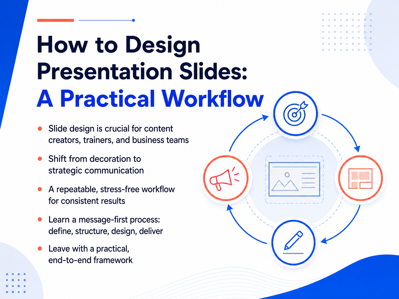
- 01How to Design Presentation Slides: A Practical WorkflowWelcome. If you have ever stared at a blank slide, wondering where to start, this course is for you. Whether you create content, train teams, or lead business meetings, you know that good slides matter. But design is not about decoration. It is about strategy. In the next few minutes, you will learn a practical workflow that takes the stress out of building decks. We will follow a message-first process. Define what you need to say, structure your argument, design with restraint, and deliver with confidence. You will leave with a repeatable framework that works every time, so you can stop guessing and start presenting. Let's begin. First, we need to address the core mental model that flips everything on its head. Message first, design second.madegooddesigns.compresentations.ailayoutscene.com+22 min
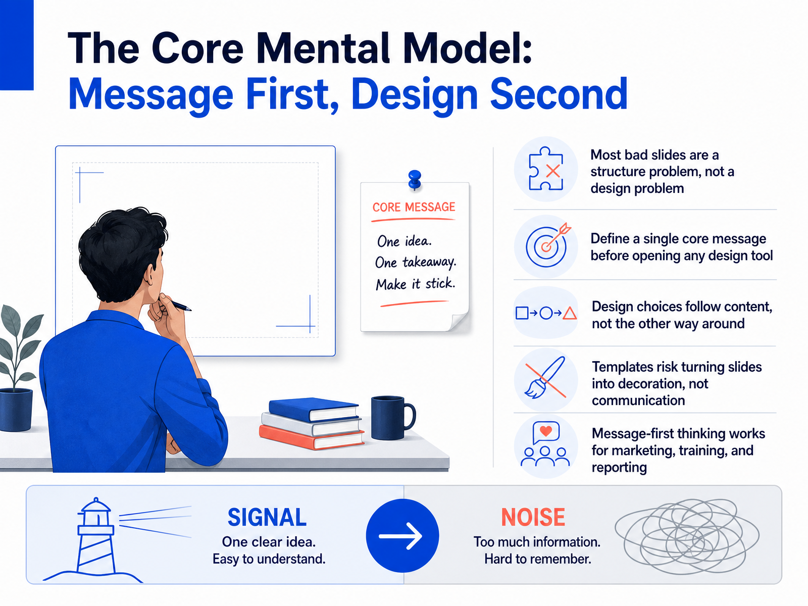
- 02The Core Mental Model: Message First, Design SecondSo here's the mental model that changes everything: message first, design second. Most bad slides aren't a design problem — they're a structure problem wearing a design costume. Simple restyling won't fix a slide that doesn't know what it's saying. Before you open any design tool, define a single core message. Ask yourself: what's the one thing this slide must accomplish? Design follows content, not the other way around. Every choice about layout, type, and color should serve that message. Templates can be dangerous here — they can turn your slides into decoration instead of communication. A template should never dictate what you say; your message should dictate how the template is used. This message-first thinking works across marketing, training, and reporting. It's universal. So the real work starts before the design work. Now let's get practical: how do you define that message? Start with your audience, your goal, and the outcome you want them to act on. And that's exactly what we're covering next.
 madegooddesigns.compresentations.ailayoutscene.com+22 min
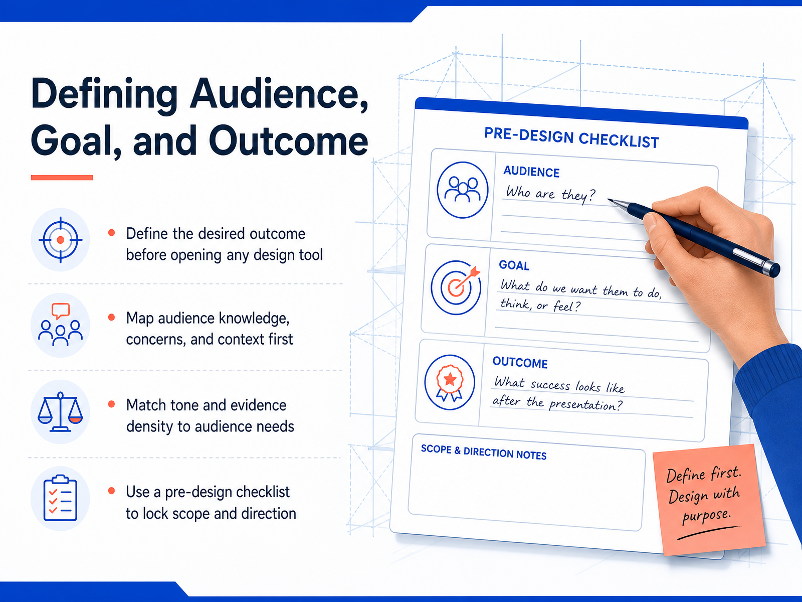
 - 03Defining Audience, Goal, and OutcomeNow let’s talk about the step that happens before you even open your design tool. Define your audience, your goal, and the outcome you want. Start with the outcome. Ask yourself: what should the audience think, feel, or do by the end of this presentation? That answer drives everything. Next, map your audience. What do they already know? What are they worried about? What context are they coming from? The tone you use, and how much evidence you show, should match their level. If they’re experts, skip the basics. If they’re new, keep it simple and show more proof. Use a quick pre-design checklist to lock in the scope. Audience, goal, and outcome. Write them down before you touch a template. That small step keeps your deck focused and saves you hours of rework later. Once that’s set, you’re ready to shape the story itself. That’s next, structuring your content into a clear narrative.
 madegooddesigns.compresentations.ailayoutscene.com+21 min
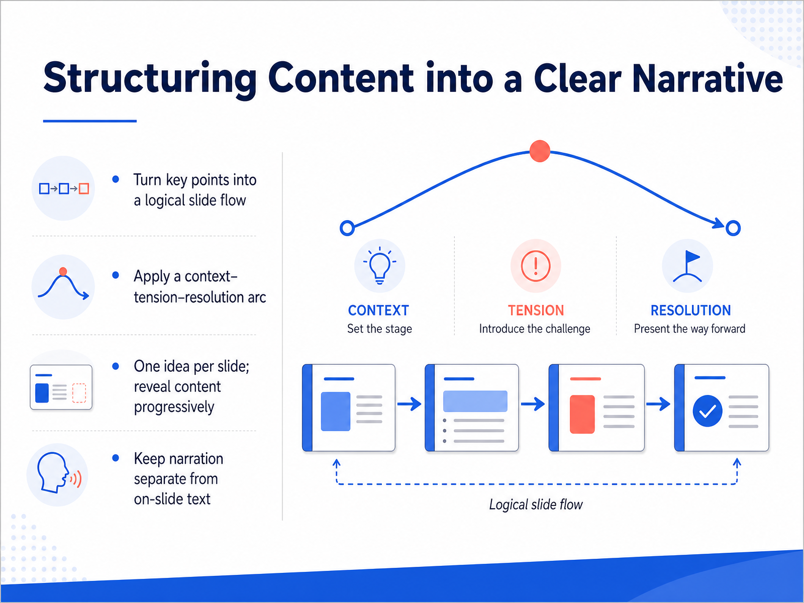
 - 04Structuring Content into a Clear NarrativeNow let's talk about turning your content into a clear narrative. Think of your deck as a story, not a data dump. A reliable pattern is context, tension, resolution. Start with where things stand, introduce the problem or opportunity, then present your solution. And here's the golden rule: one idea per slide. If you find yourself explaining three things, split them up. Your audience can only hold one thought at a time. Also, reveal content progressively. Don't show everything at once; bring points in as you speak. This keeps attention on you, not on the screen. Finally, keep your narration separate from the slide text. The slide shows the headline and the key takeaway. You, the speaker, provide the story and the details. If the slide does all the talking, nobody needs you there. So remember: logical flow, one idea per slide, progressive reveal, and keep the spoken word distinct from the written text. That's the backbone of a persuasive deck. Next, we'll look at how to write headlines that make your point land in seconds.
 madegooddesigns.compresentations.ailayoutscene.com+22 min
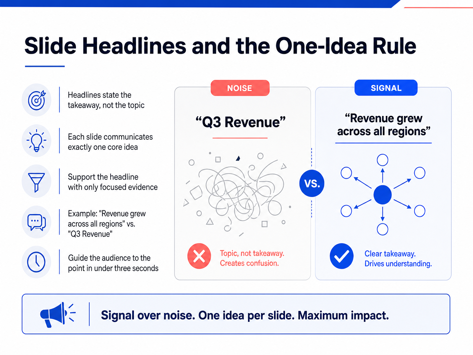
 - 05Slide Headlines and the One-Idea RuleNow let's talk about your slide headlines. This is the fastest change you can make to improve your entire deck. Here's the rule: your headline should state the takeaway, not just the topic. So instead of writing 'Q3 Revenue,' write 'Revenue grew across all regions.' See the difference? One makes the audience work. The other gives them the point instantly. And that connects to the one-idea rule: each slide communicates exactly one core idea. Just one. If you catch a slide carrying two or three ideas, split it into separate slides. Then, support that single headline with only focused evidence. If a data point doesn't directly support the headline, cut it or move it to the appendix. The goal is simple: your audience should understand the point of each slide in under three seconds. The headline does the heavy lifting, and your content just confirms it. Next, we'll look at visual hierarchy and how to guide attention with intent.
 madegooddesigns.compresentations.ailayoutscene.com+22 min
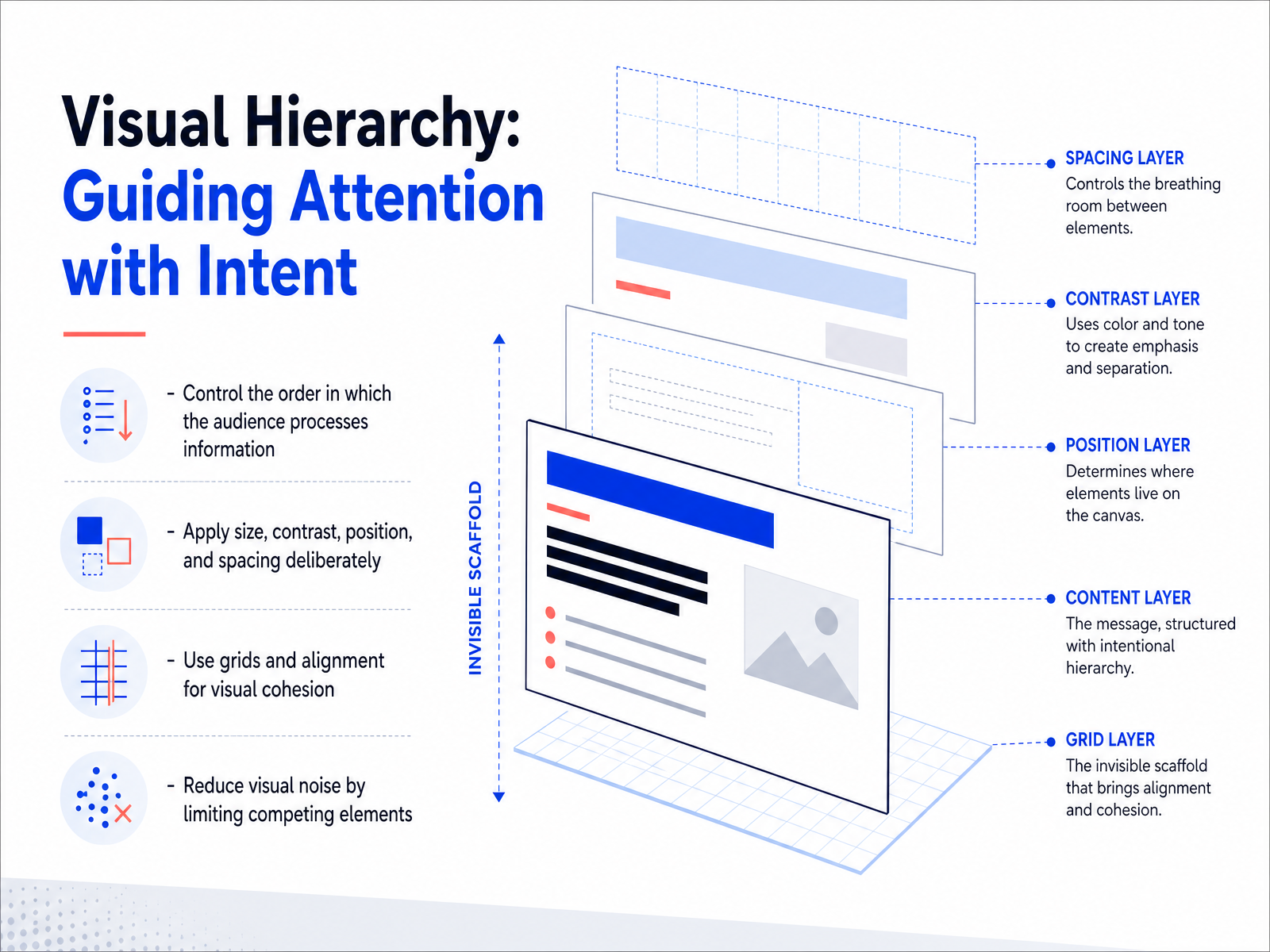
 - 06Visual Hierarchy: Guiding Attention with IntentNow let's talk about visual hierarchy. This is about controlling where your audience looks first, second, and last. The goal is to arrange elements so the most important message gets processed first. You can do this with a few simple levers. First, use size. The biggest element should be your key message. Make it significantly larger than the supporting details. Second, use contrast. A bold accent color or a dark text on a light background will draw the eye instantly, but use it sparingly. Third, position matters. Your audience will naturally scan the top left corner first, so place your main point there. And finally, spacing. Giving an element generous white space tells the audience it deserves focus. Think about a slide with a single bold headline, one strong image, and a short takeaway line. That slide guides the viewer effortlessly. So, reduce the visual noise. Cut the competing elements. If everything is bold, nothing is bold. Decide what matters most and give it the visual weight. This intentional structure is what makes a presentation feel professional and persuasive. Up next, we'll look at layout systems and whitespace in more depth.
 madegooddesigns.compresentations.ailayoutscene.com+21 min
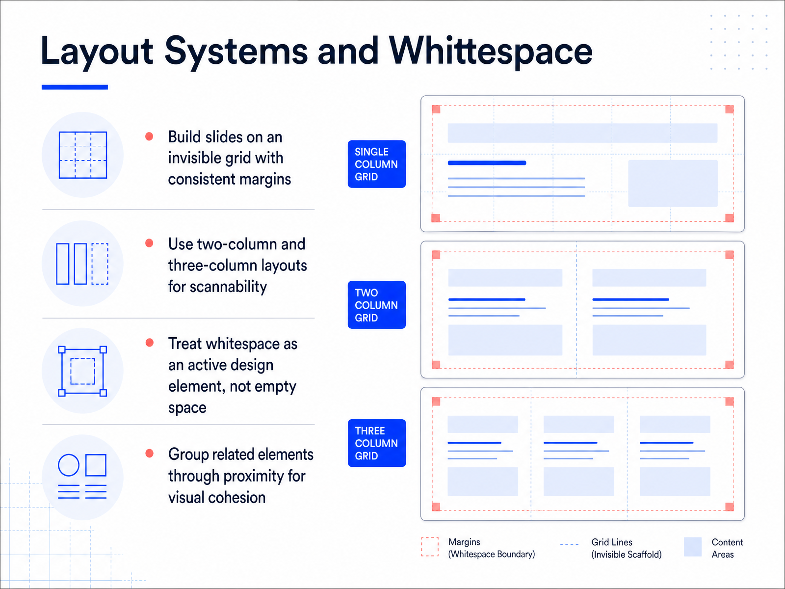
 - 07Layout Systems and WhitespaceNow let’s talk about layout systems and whitespace, because this is where most slides start to fall apart. The fix is simple: build every slide on an invisible grid. Set consistent margins on all four sides, and align every element to that grid. This makes the deck feel deliberate, not improvised. For most content, a two-column layout works well — text on one side, visual on the other. If you have metrics to group, go with a three-column layout so the numbers stay scannable at a glance. Now, here’s the part people get wrong: whitespace is not empty space. It is an active design element. It gives your point room to breathe and it signals confidence. Crowded slides read as anxious. So don’t feel pressured to fill every corner. And finally, use proximity. Group related elements close together, and keep unrelated things apart. That visual closeness shows the audience what belongs together without using a single label. When in doubt, cut something out and let the whitespace work for you. Next, let’s look at typography and readability.
 madegooddesigns.compresentations.ailayoutscene.com+22 min
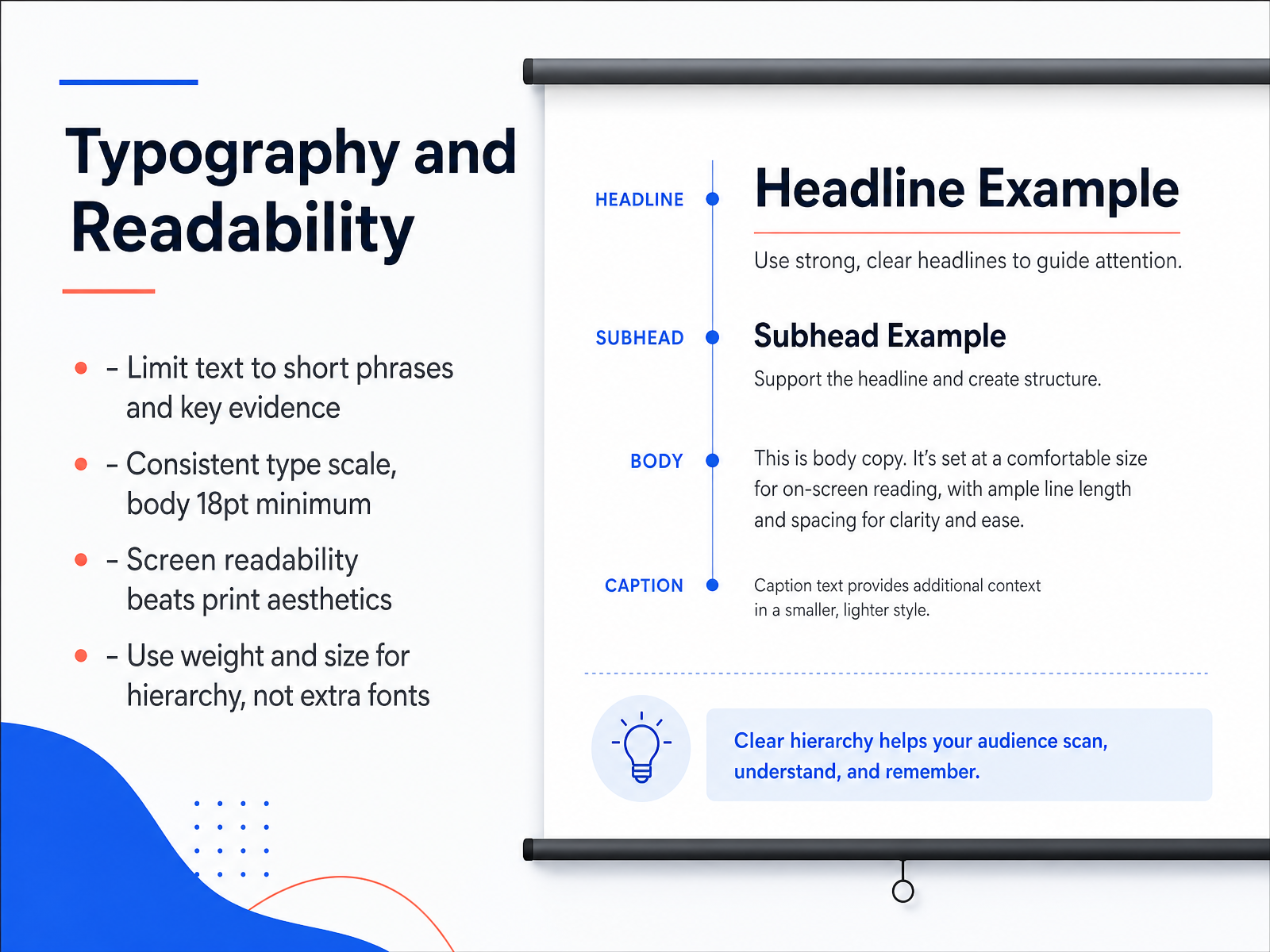
 - 08Typography and ReadabilityNow let's talk about typography and readability. This is where most slides either earn trust or lose it. The first rule is simple: limit your text to short phrases and key evidence. If you find yourself writing full sentences, that's a signal to move that detail into your speaker notes. The second rule is consistency. Lock a type scale and keep your body text at eighteen points or larger. That size is the minimum for a reason, it keeps the back row with you. Remember, screen readability always beats print aesthetics. A font that looks elegant on paper can look thin and washed out on a projector. So test it, and when in doubt, go bigger. Finally, use weight and size to build hierarchy instead of adding more fonts. Bold the headline, keep the supporting text regular. One typeface, two weights, that's all you need. A clean hierarchy makes your message scanable in seconds. So, lock your sizes, respect the minimum, and let the font weights do the work. Next, let's talk about using color with purpose and restraint.
 madegooddesigns.compresentations.ailayoutscene.com+21 min
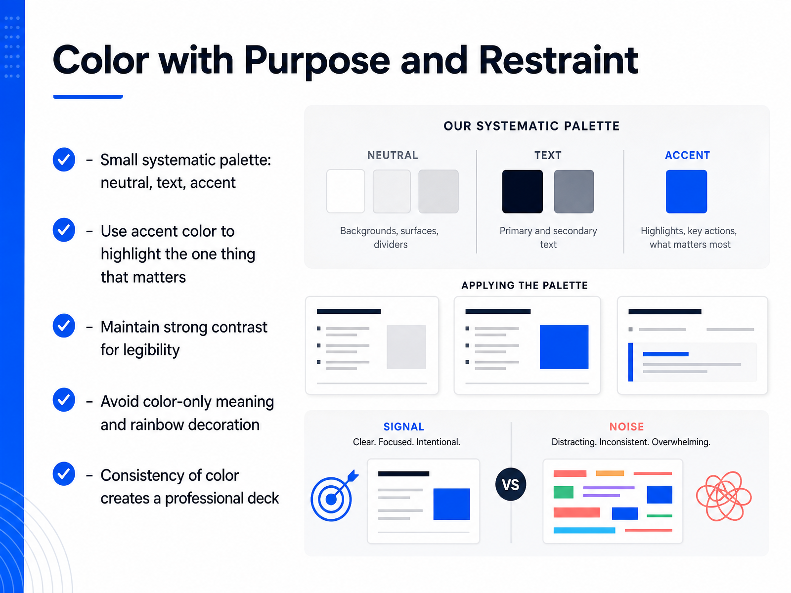
 - 09Color with Purpose and RestraintNow, let's talk about color, but not the way you might think. The goal here isn't to make things pretty, it's to make things clear. Start with a tiny palette. A neutral background, a dark color for your text, and one single accent color. That's it. You use that accent sparingly, to highlight only the one thing on the slide that matters most. Think of it like a highlighter on a page; if you mark everything, you've marked nothing. Always make sure your text stands out against the background with strong contrast. And never rely on color alone to convey meaning. Someone with color blindness, or a washed-out projector, should still understand your point. Consistency across all slides is what turns a collection of slides into a professional deck. Use the same colors for the same jobs every time. Restraint is your secret weapon here. Two colors used deliberately will always look sharper than five used randomly. So, keep it disciplined, and your message will pop. Up next, we'll look at how to use visuals, diagrams, and icons to support your message without cluttering it.
 madegooddesigns.compresentations.ailayoutscene.com+21 min
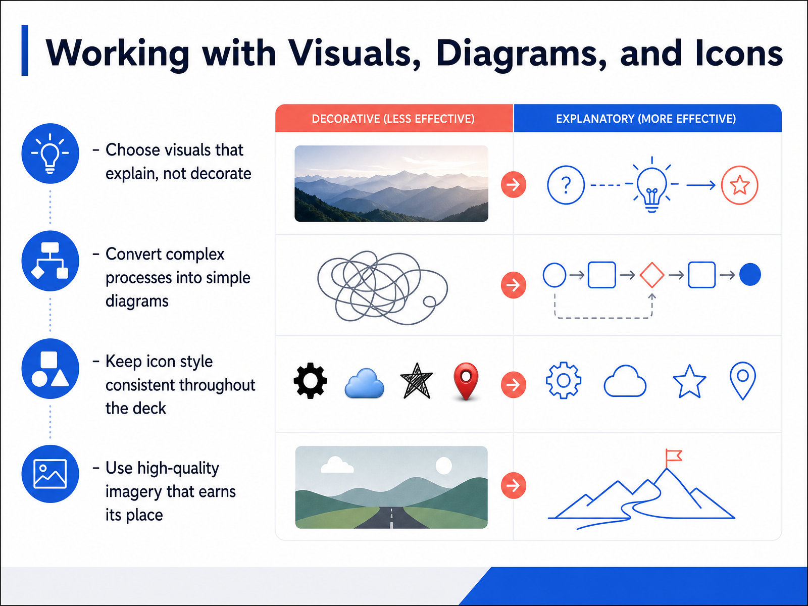
 - 10Working with Visuals, Diagrams, and IconsNow let's talk about working with visuals, diagrams, and icons. First rule: choose visuals that explain, not decorate. If an image doesn't help you make your point, cut it. A generic stock photo of a handshake tells your audience nothing. Instead, use a real product shot or a meaningful photo that reinforces what you're saying. Diagrams work the same way. When you have a complex process, don't dump a wall of text on the slide. Break it into a simple flow, maybe three or four boxes with arrows. Your audience should grasp the process in seconds, not minutes. Icons are handy, but here's the catch: keep the style consistent throughout the whole deck. If you use filled icons on one slide and outlined icons on the next, the deck feels sloppy. Pick one style and stick with it. In short, every visual should earn its place. If it doesn't add clarity, it's just noise. Next, let's look at how to make your data visualization actually tell a story.
 madegooddesigns.compresentations.ailayoutscene.com+21 min
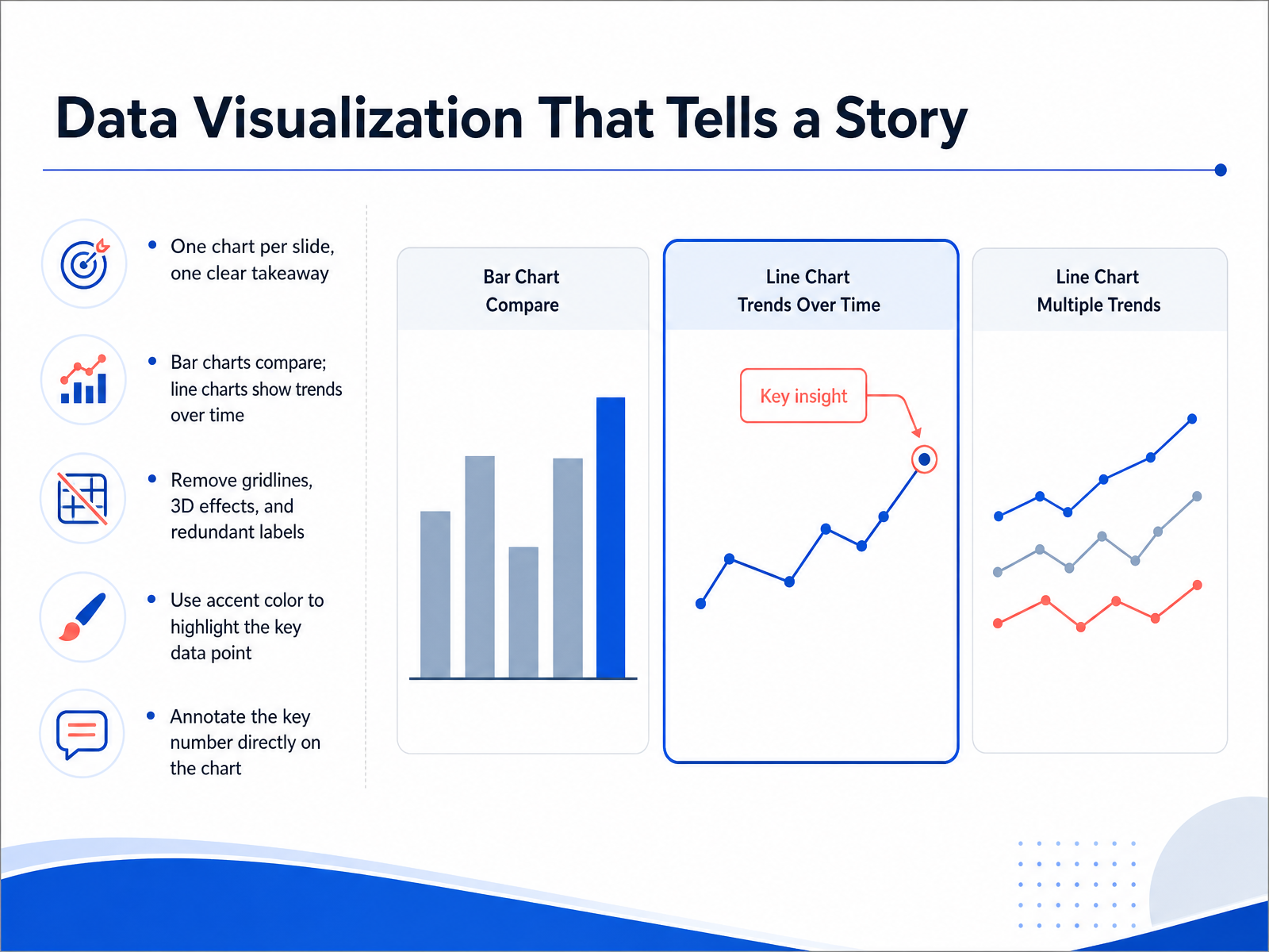
 - 11Data Visualization That Tells a StoryNow let's talk about making your data tell a story. The golden rule is simple: one chart per slide, with one clear takeaway. If you're comparing categories, use a bar chart. If you're showing change over time, use a line chart. And please, stay away from 3D effects and heavy gridlines — they only add noise. Instead, use your accent color to highlight the key data point, and label that number directly on the chart. For example, if your sales grew by 30 percent, put a bold callout next to that bar that says '30 percent growth.' That way, even someone glancing at the slide for two seconds gets the point. This is what makes your data memorable. Next up, we'll look at how templates and master slides can keep your whole deck consistent and on brand.
 madegooddesigns.compresentations.ailayoutscene.com+21 min
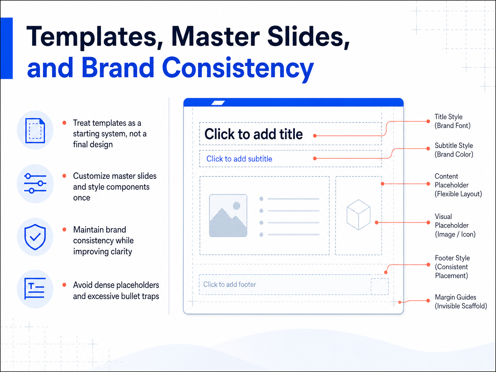
 - 12Templates, Master Slides, and Brand ConsistencyLet's talk about templates, master slides, and brand consistency. Think of a template as a starting system, not a final design. It gives you a solid foundation, but you still need to build the actual house. The smart move is to customize your master slides and style components once. Set your headline font, your body text size, your accent color, and your layout grid. Do it once, and every new slide you create will automatically follow those rules. This keeps your deck visually coherent, and it keeps your brand consistent without you having to think about it. But here's the key point: avoid dense placeholders and excessive bullet traps. If your template forces you into a wall of text or six bullet points per slide, it's working against you. A good template enforces restraint. It forces you to keep slides clear and focused. So set up your masters to give you structure, not clutter. The result is a professional, on-brand deck that you can assemble quickly, because all the design decisions were made before you even started. Next, we'll look at designing for accessibility and multiple contexts.
 madegooddesigns.compresentations.ailayoutscene.com+21 min
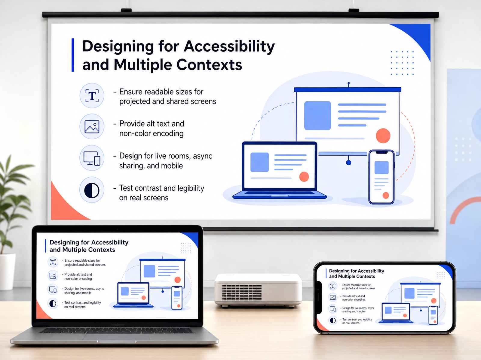
 - 13Designing for Accessibility and Multiple ContextsThink about every place your deck might actually be seen, because it won't just be in one room. Body text should rarely drop below twenty-four points, and if you're projecting, test it from the back of the room, not your laptop screen. Remember that your audience may be reading your slides asynchronously, so add descriptive alt text to every meaningful image or chart. And never rely on color alone to make a point, you could label your data directly, or add simple patterns to your charts, so the message comes through for everyone. Your deck will likely be viewed on a phone or a shared screen at some point, so keep layouts simple, avoid dense columns, and use high-contrast colors that hold up under bad lighting. Before you call it done, take a few minutes to test your contrast and legibility on a real projector or a small monitor, not just the editing view. These small checks ensure your carefully designed slides actually work in the real world, and that everyone in your audience can follow along. Next, let's walk through the final stage: finishing, reviewing, and exporting your deck.
 madegooddesigns.compresentations.ailayoutscene.com+21 min
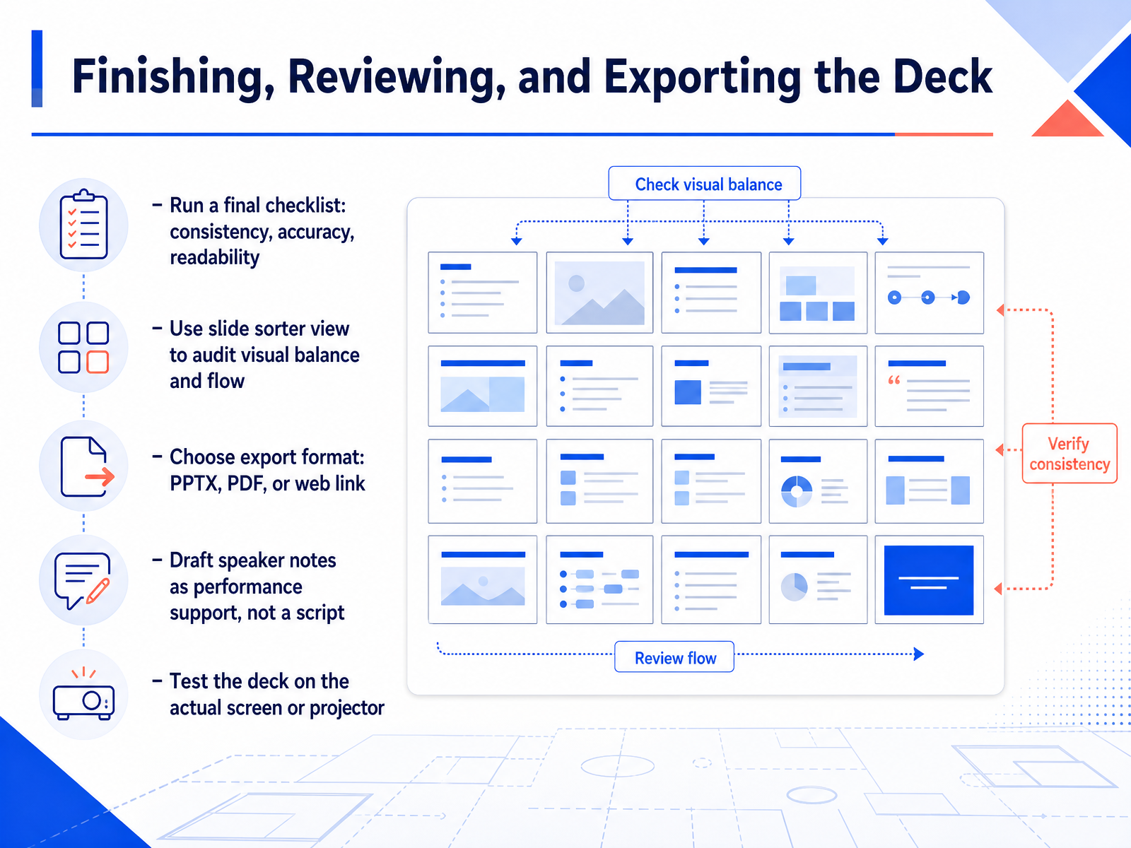
 - 14Finishing, Reviewing, and Exporting the DeckYou've designed every slide, but the work isn't done yet. Now it's time to finish, review, and export. Start with a final checklist. Look for consistency across fonts and colors, make sure every number is accurate, and confirm each slide is readable from the back of the room. If a slide feels crowded, simplify it. Then switch to slide sorter view. This shows your entire deck as thumbnails, so you can spot visual imbalance or a broken flow at a glance. When you're ready to share, choose your export format. PPTX for editing, PDF to preserve the design, or a web link for easy access. Draft speaker notes as performance support, not a script. Use them to jog your memory on key points, not to read word for word. Finally, test the deck on the actual screen or projector. Colors shift and text can clip, so verify everything before you go live. Once it passes, you're ready. Next up, we'll cover delivery, pacing, and continuous improvement.
 madegooddesigns.compresentations.ailayoutscene.com+22 min
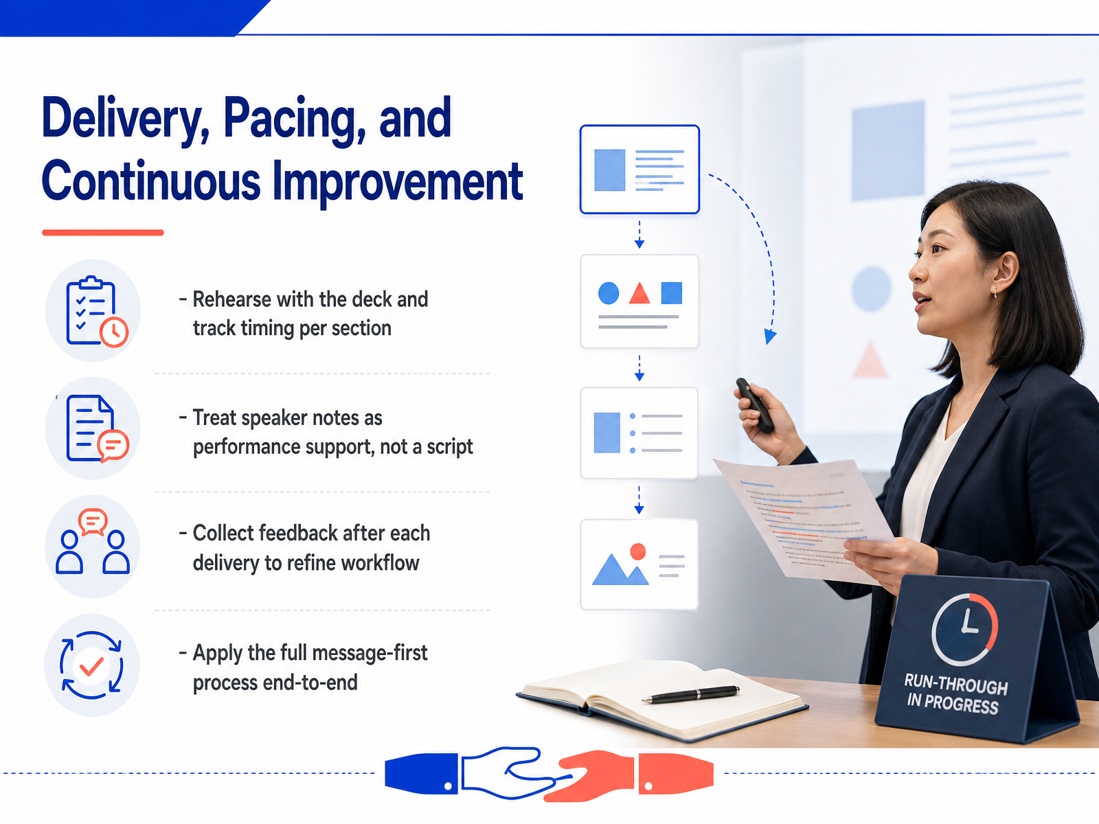
 - 15Delivery, Pacing, and Continuous ImprovementYou've built a deck the right way, but the work doesn't stop when the last slide is done. Now it's time to deliver, pace yourself, and keep improving. First, rehearse with the deck and track timing for each section. You want to know where you tend to run long, so you can adjust before you're in front of a real audience. Next, treat speaker notes as performance support, not a script. They're there to jog your memory, not to be read word for word. After each delivery, collect feedback. Ask what worked, what didn't, and what confused people. Then use that input to refine your workflow for next time. Finally, apply the full message-first process end to end, every single time. Don't skip the narrative step, even when you're in a hurry. That consistency is what separates good decks from great ones. So go ahead, build your next presentation with confidence. Start with the message, design with restraint, and deliver with purpose. You've got this.
 madegooddesigns.compresentations.ailayoutscene.com+21 min
Take the deck with you
Download this course as a file — free, no sign-up needed.
- PDF handoutEvery slide page, ready to print or share.16 pages · 3.4 MBDownload
- Narrated PowerPointThe deck that presents itself — every slide carries the digital human's narration video.16 pages · 14.6 MBDownload
- PowerPoint slidesThe full deck as a .pptx — open it in PowerPoint, Keynote, or Google Slides.16 pages · 3.3 MBDownload
Free to use in your own training — please keep the PersonWise credit page at the end.
Have your own deck? Turn it into a course
Sources consulted
Web sources consulted while building this course.
- Presentation Design: A Complete Guide for 2026 — madegooddesigns.com
- Presentation Design Best Practices for Better Slides in 2026 — presentations.ai
- Beyond Bullet Points: Your Definitive Guide to Impactful Presentation Design in 2026 - Layout Scene — layoutscene.com
- PowerPoint design ideas and tips for 2026 — powerpoint.cloud.microsoft
- Creating Presentations with AI: The Best Tools & Workflow for 2026 | Gökhan Meriç — gokhanmeric.com